

Summary
- The change in Google Maps on Android Auto had a big impact due to the limited screen space on many Android Auto devices.
- Google responded to feedback quickly by reverting to the previous design after users expressed frustration.
- Google could more thoroughly address the layout issue by offering decluttering options or other customization.
Google’s gigantic user base means it doesn’t take long for feedback to get loud. Android Auto fans reminded us all of that a week ago, when the vehicle-centric version of Google Maps began defaulting to a centered view when not actively guiding you to a destination. The update obscured large parts of the map near the vehicle icon, causing something between a hullabaloo and uproar among drivers. A week later, Google has responded to the outcry by reverting to the previous design (via 9To5Google).
Related
15 essential Android Auto apps every driver and passenger needs
Going for a drive? Take these apps with you
Fixing a small, but not-so-subtle change
It really is the little things
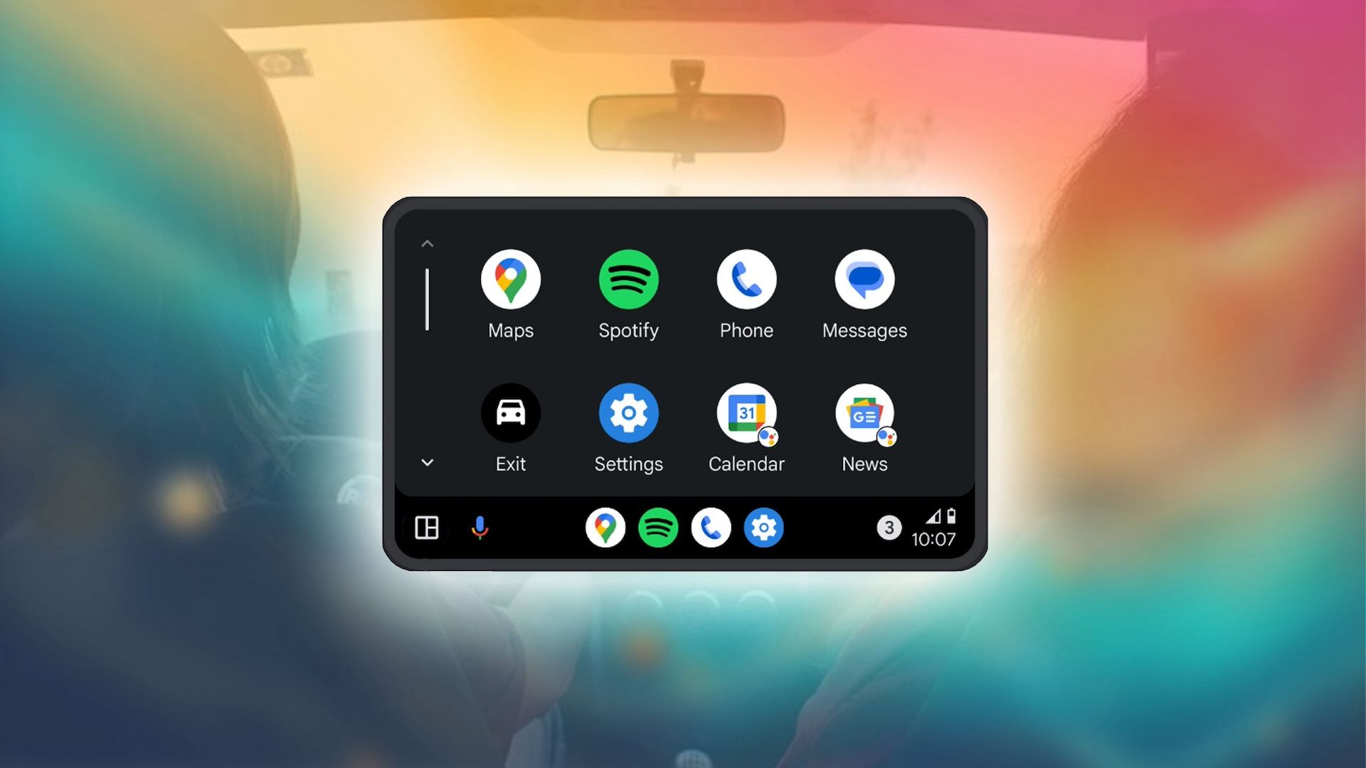
It was a change so slight that, at first glance, you might not have even realized what was different. Instead of centering on the vehicle icon closer to the side of the screen, opposite the suggested destinations menu, the icon moved to square in the middle.
In theory, maps and centered icons go well together. In this case, however, the destinations menu remains large and in charge of a significant amount of screen space given the typically small sizes of Android Auto-enabled head units. The change didn’t affect active navigation, but a good number of drivers use Google Maps passively and don’t always set their destination.
Related
8 Android Auto settings you didn’t know you needed to change
Get more control over Android Auto with these setting changes
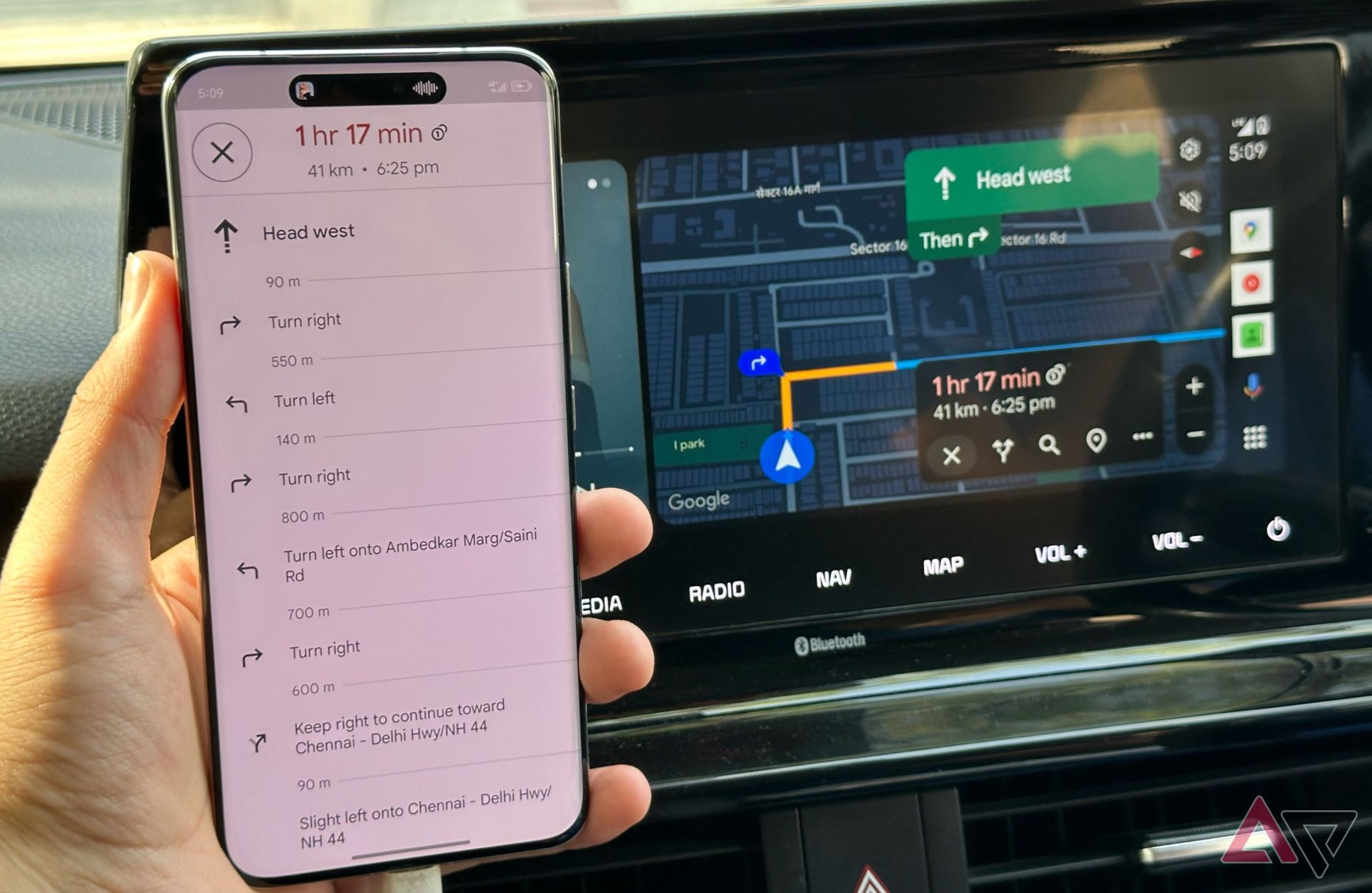
In response to myriad complaints, including a relatively popular thread in the r/AndroidAuto subreddit, Google has begun rolling back the change. Comments around the web indicate that some people are still waiting for the faulty fix to finally get fixed. But an increasing number of Android Auto users report that the previous layout has returned, placing the vehicle icon on the side of the screen, so you can once again see the streets nearest you.
The real problem with Google Maps for Android Auto
Google’s minor, wrong move exposed a bigger gripe
The Android Automotive dev kit, where savvy programmers tailor apps for in-car infotainment systems.
There’s no word on whether Google will address the actual problem behind the updated implementation, which is the opaque suggested destinations box linked to the search bar. Normally small Android Auto displays don’t scale menu items much — which helps ensure drivers can easily read them — giving the destinations panel a somewhat unreasonable portion of the display’s limited real estate.
For that matter, as Will Sattelberg pointed out in previous reporting, none of the visual elements cluttering up the main Google Maps view are all that critical. Google could, theoretically, hide it all behind a single “show controls” button. As multiple user accounts suggested, it could add transparency to the destinations panel, or make the option to hide the menu (and display only the search bar) permanent, instead of one-time-only like it is now.

Related
5 things Google needs to fix on Android Auto
These are the essential fixes Android Auto desperately needs right now
Even more granular, it could give users the option to choose between layouts, or to customize the screen, so each driver has exactly the info they need. Any of those solutions might take a little extra work, but, apparently, the alternative is having to roll back a change that nobody asked for or knew about until it started interfering with map use. Happily, Google does pay attention, and is in the process of pushing the fix as we speak.