I’ve written extensively about how Android skins are becoming increasingly like iOS with each passing year. This problem extends to multiple Android manufacturers, and I’m not saying Apple doesn’t also poach plenty of features and designs from Android. It’s a trend where companies are most comfortable moving towards the center to avoid offending anyone with their software. They don’t want to release anything too bold or different in hopes of alienating long-time users or scaring off potential new customers.
It wasn’t always this way. The pre-Nougat Android days were filled with interesting and unique skins that made you feel like you were using a device made by Sony, Motorola, and others. Here are my favorite Android skins that consistently deliver a pang of nostalgia.
3 HTC Sense
You have to start with the GOAT
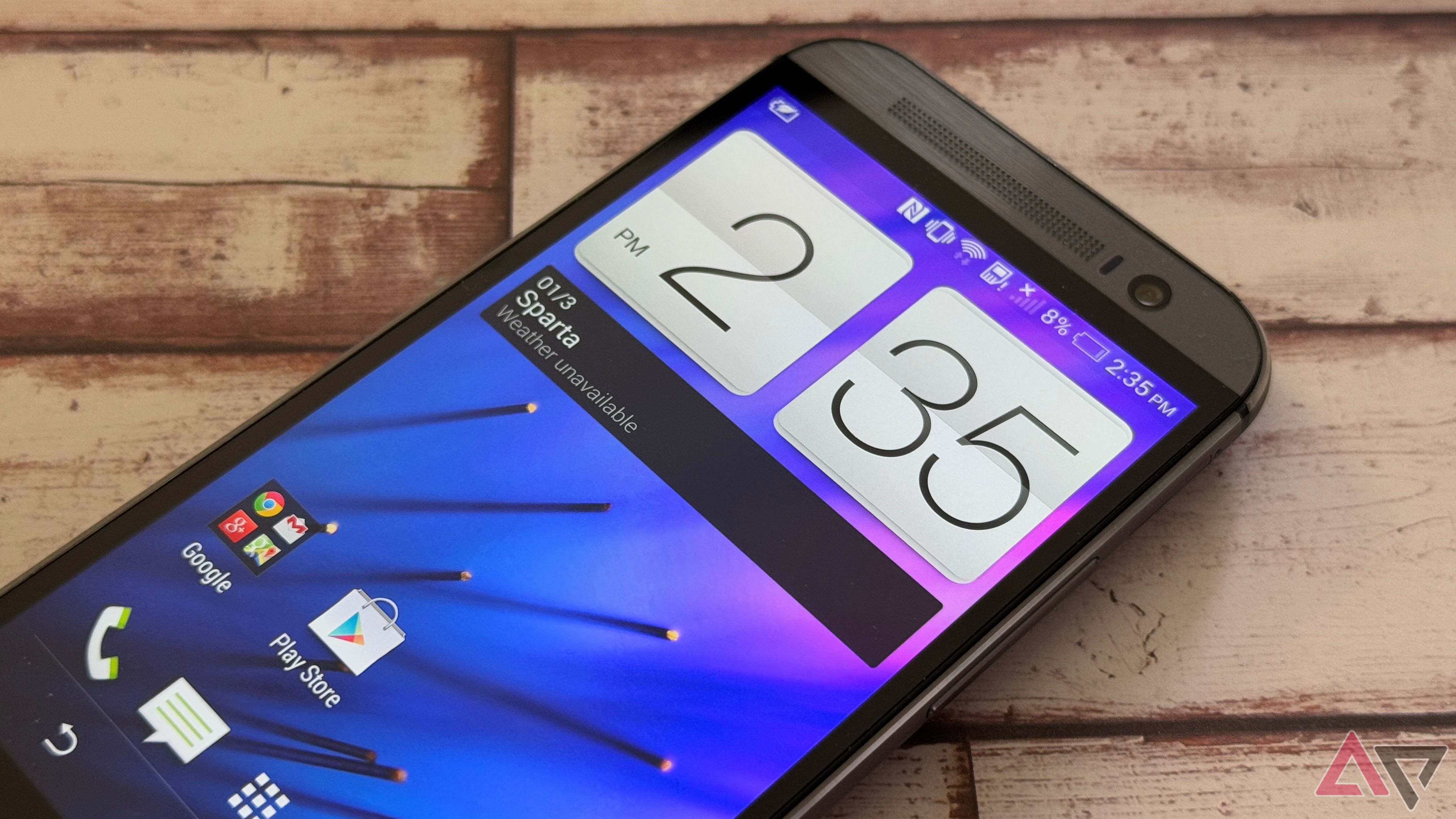
It’s impossible to discuss earlier Android UIs without mentioning HTC Sense. It was the gold standard for the first half of the 2010s. For many people, it was synonymous with Android during that period. You couldn’t sit through a TV commercial break without an ad for an HTC Evo, and at the center of it was HTC Sense. Using Sense UI 6.0 on my HTC M8 was a dream, and it made Android KitKat a better experience.
If you used an HTC smartphone, you know that Sense UI’s appeal goes beyond the clock and weather widgets. Unlike many of its contemporaries (one of which is on this list), HTC Sense ran beautifully. It was one of the first times that animations were done well on early Android phones, and the widgets added seamlessly to the user experience instead of dragging it down. HTC Sense was user-friendly. For all the praise we’ve given Google for making Pixels more appealing to first-time users, HTC tried to lure iPhone users over 10 years ago.
HTC’s apps were also well done, without the rough edges we saw from other companies. The company didn’t forget that Android is about customization, and you could make your HTC look the way you want with plenty of wallpaper and other options. HTC normalized many of the items we take for granted. I still look fondly at my HTC Evo 3D because of my amazing time with the HTC Sense.
2 MotoBlur
At least Motorola tried something
I’m an unapologetic disciple of Windows Phone. I loved the platform and am still amazed that Android manufacturers don’t adopt some of its design elements. It was fantastic at combining the social aspects of life with news and weather information and presenting it at a glance on the home screen.
Motorola tried something similar with MotoBlur. It displayed multiple social media feeds, messages, and email accounts across the home screen. MotoBlur put notifications from several sources into one feed. With a single scroll, you could see messages from two different email accounts, Facebook, and Twitter. It was ideal if you had one device for personal and work use, as MotoBlur allowed you to log in to multiple email accounts and see messages from them in one feed.
As innovative as MotoBlur was, its performance was awful. The Motorola Photon 4G carousel sometimes felt like it moved at one frame per second, and social media feeds often bogged down the system. Animations were not polished, and the performance wasn’t powerful enough on those older devices. I’ve always enjoyed Motorola software, and I think the recent switch to Hello UI has gone well for the company, but there will always be something about MotoBlur that I feel is worth revisiting.
1 Sony Xperia UI
The entire Sony product family felt integrated
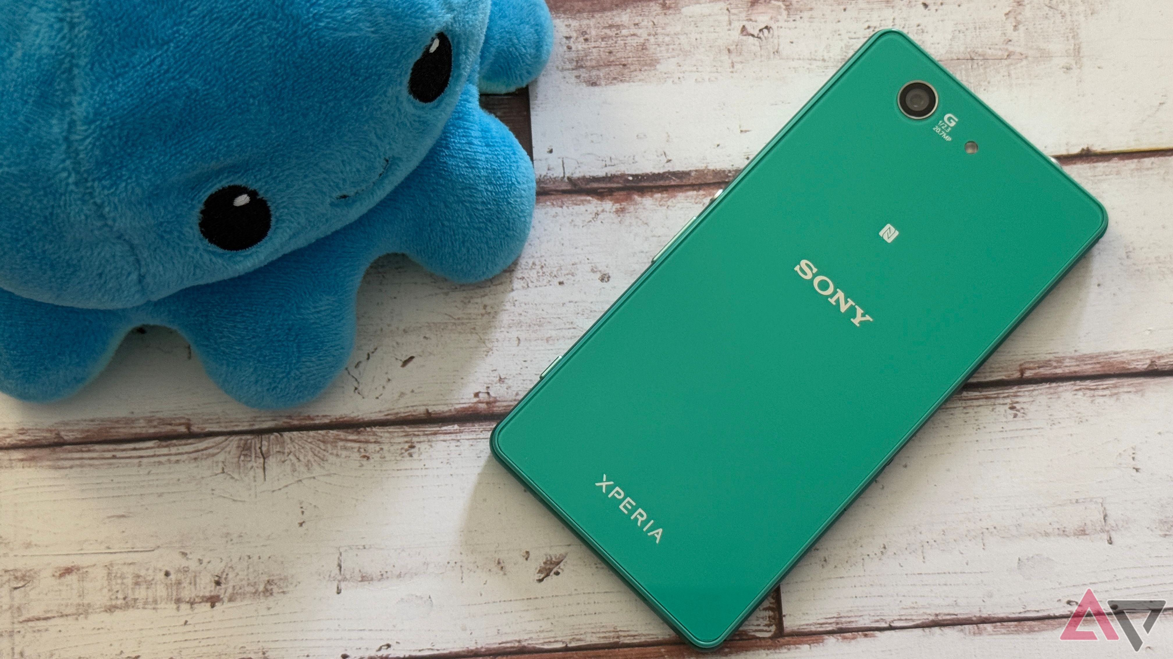
I remember powering up my Sony Xperia Z3 Compact for the first time and loving the software. Sony struck the perfect balance between mostly stock Android and a few unique touches that added to the experience. While it didn’t feature the unmistakable XrossMediaBar, prominent during the height of the PlayStation 3, it had an aesthetic similar to that of the PlayStation 4 and other Sony media devices of the period. It was colorful and vibrant, with attractive widgets and Sony apps. Current Sony phone software has shades of previous eras, but it feels different.
The Xperia UI featured PlayStation 4 remote play by default, and Sony included a Walkman app for listening to music. Unlike phones today, it felt like a Sony device, and I enjoyed that the company included other IPs from its catalog of products. I’ve always had a soft spot for Sony smartphones, and the software UI was a significant reason.
I’m not saying go back to when phones didn’t work
Thankfully, my nostalgia doesn’t cloud my common sense. I don’t want Android to return to a time when you didn’t know if your phone would work properly, with awful performance and crashing apps. Smartphones have enough performance to run even complicated UIs smoothly, and I’m sure engineers from Google and Samsung could figure it out. It seems companies want to spend more time on initiatives like Galaxy AI. I understand the business appeal of wanting unoffensive and friendly software for all users, but I’d hope that competition would spark companies to try something different. Until then, I’ll sit with my HTC Evo and dream.


