

User interfaces used to be annoying in small ways. Now they’re openly hostile.
UIs are getting optimized to extract clicks, consent, data, and money. Every app seems to borrow the same annoying tricks.
Enough is enough. It’s time to push back and stop pretending this is good design.
These patterns exist to benefit companies, not users, and that’s the problem.
Ads that won’t let you leave without a fight
I’m so done with playing hide-and-seek to close a mobile ad. You open a news app or a casual game, and suddenly a full-screen ad takes over the screen.
You spot a grey-on-grey X and tap it. But instead of closing, you get redirected to the Play Store. Why? That tiny little X is part of the ad image designed to fool you.
But wait, the situation gets uglier. After you finally learn the trick and tap the real functional X, the ad doesn’t go away.
You get a second screen that says “Reward in 5 seconds …” with a countdown timer. You’re held hostage by a UI that ignores what you want.
Passive-aggressive design that mocks users

Credit: Lucas Gouveia/Android Police | Rembolle/Shutterstock
Designers have figured out how to turn our emotions against us. It’s called Confirmshaming. I was browsing a fitness supply site for workout gear when a pop-up showed up with a discount offer.
The “No” button said, “No, I don’t want to stay fit” instead of “No thanks.” That’s bad copy trying to guilt you into buying.
Emotional manipulation like this might work in the short term, but it destroys trust over time. When an interface openly mocks me, deleting the app is the only option.
The surprise review pop-up and forced app reviews
![]()
Credit: Lucas Gouveia / Android Police
Imagine sitting at a restaurant, about to take a bite, when the chef comes out, grabs you, and shouts, “How does it taste?”
That’s how some apps behave. Just as I’m using the product, a prompt pops up asking for a review.
Even trickier is the pre-filter step. “Are you enjoying the app?” Tap “Yes,” and they want a public rating. Tap “No,” and you’re redirected to a private feedback form where your complaints stay hidden.
This tactic breaks user experience and skews the app’s ratings while hiding honest criticism.
The cancellation maze is designed to keep users
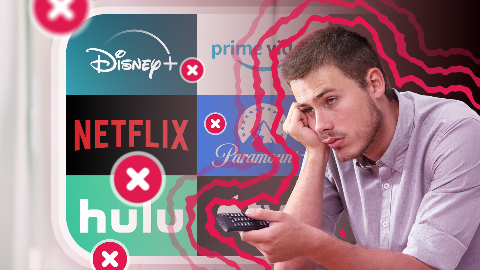
Signing up for a streaming service takes less than two seconds. Canceling, on the other hand, is a different experience. You have to work your way through a labyrinth.
If your business model relies on people forgetting to cancel because the process is too painful, you are a scammer. This kind of passive aggressiveness also shows up in the buried skip buttons.
When you install a new app, the “Start Free Trial” button is bright and takes up a third of the screen.
Meanwhile, the option to actually use the free version isn’t even a button. It’s a tiny grey-on-grey text barely visible in a corner somewhere (more on this below).
The faded grey-on-grey text that makes users miss key info
I’m pretty sure modern UI designers all have perfect eyesight working on $5,000 calibrated monitors.
That is the only explanation for the grey-on-grey text that is currently making the internet unreadable.
In the pursuit of minimalism, they have given up contrast. It can be annoying, but sometimes it crosses into manipulation.
Faded grey text helps hide critical details like subscription terms, extra fees disclaimers, warnings about data sharing, and more.
It’s a sneaky way to bury the fine print and push users toward what the company really wants you to do. Thankfully, accessibility laws are pushing back, mandating better contrast.
Adding AI where it’s not needed
![]()
Credit: Lucas Gouveia / Android Police | fizkes / Shuterstock
We are currently suffering through the AI-washing era, where every developer feels the need to add a large language model into products that don’t really need them.
I don’t want to open a grocery list app and see a sparkle icon floating over my milk and eggs. Menus that used to be instant now lag because they’re busy loading suggestions from the cloud.
I’m pro AI, but this trend has gone too far. Not everything needs AI.
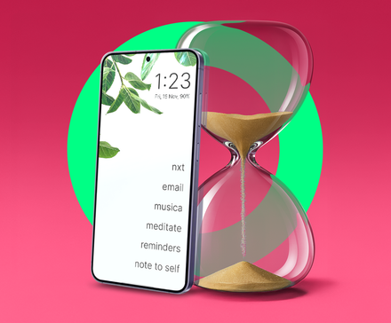
Countdown timer trick that triggers FOMO

Credit: Samsung
When there’s a timer or inventory counter by the checkout, your casual shopping becomes a pressure-packed mission.
You stop paying attention to the details, barely look at the return policy, and pay because you’re scared you’ll miss out.
The truth is, if you tap refresh, that countdown timer resets. This whole thing is psychological manipulation.
A good product doesn’t need to scare customers into buying.
User experience needs to come before metrics
When I look at the state of UI, I see a lot of user hostility. We focus on clicks, conversions, and data points, but forget the human behind the screen.
We need to stop chasing trends and get back to basics. We need software that simply works. No AI magic wand will fix a poor user experience.