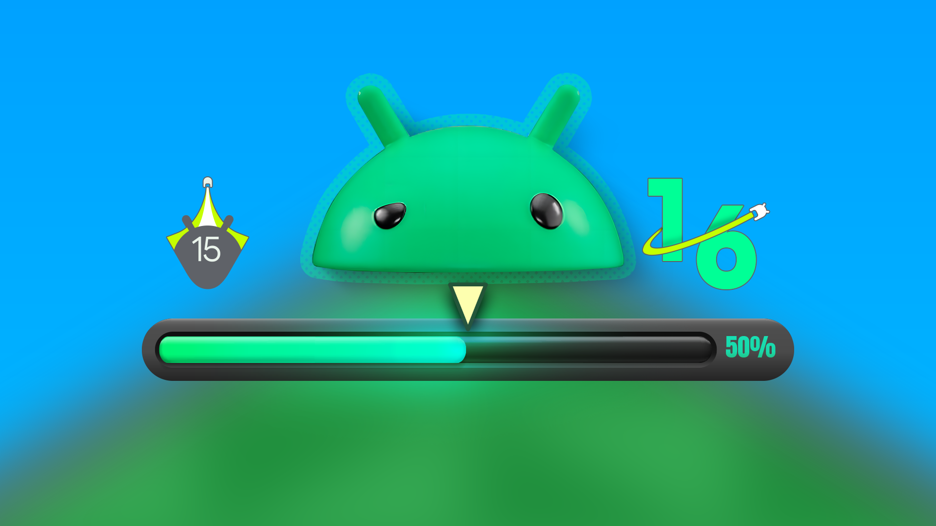
Google’s ongoing love affair with iterative design continues, and Android 16 is the latest canvas. While the platform’s biggest recent UI tweak — a revamped quick settings menu and redesigned volume and brightness sliders — didn’t land until the eleventh hour of Android 16’s beta cycle, Google clearly isn’t done yet. A subtle but notable tweak is quietly rolling out via the latest beta, and it’s aimed at something we all interact with: the permissions dialog (Source: AssembleDebug for Android Authority).
Keeping critical features looking fresh
Sometimes a little goes a long way
First spotted after the June Google Play system update, this refreshed permissions prompt only appears for users running Android 16 QPR (Quarterly Platform Release) Beta 2.1, which dropped just last week. It’s a small change, but one that reflects Google’s ongoing effort to unify the look and feel of the OS.
The new dialog swaps its previously bright background for a darker hue, with bold white text that pops against the contrast. Functionally, it’s the same, but visually, it feels more polished and consistent with the broader Material You ethos. Buttons now sport wider spacing and rounder corners, harmonizing with the aesthetic used in Android’s other UI elements introduced over the past few months.
It’s the kind of refinement that might go unnoticed by the average user, but for those paying attention (and running the latest beta), it’s another sign that Android is slowly but surely tightening its design language. Shoutout to AssembleDebug and Android Authority for putting together a helpful side-by-side comparison, which highlights just how much more readable and modern the updated dialog looks.
Source: Android Authority
For those eager to see the changes for themselves, you’ll need to manually trigger the latest Google Play system update, which was released earlier this week. Just head to Settings → System → Software updates → Google Play system update on your Pixel device. Once installed, a quick reboot should enable the new permissions dialog system-wide.
While it may not be as flashy as the revamped quick settings panel, this updated dialog shows that even the smallest UX elements are getting a little more love in Android 16. Whether this change will stick through the next quarterly release remains to be seen, but for now, it’s a welcome bit of visual polish for those living on the bleeding edge.