

Material You is the third evolution of Google’s Material Design design language that launched at Google I/O 2014. At Google I/O 2025, the company will release the next evolution of this design language. This new version is called Material 3 Expressive, suggesting that it might be a tweaking of Material Design 3 rather than a similarly dramatic redesign.
Even if Material 3 Expressive doesn’t shake up the Android UI experience the same way as Material You did in 2021, there’s still a lot it can do to improve the Android experience for everyone. We’ve seen some hints and suggestions about what we might see from Material 3 Expressive, but these look to be only the tip of the iceberg.
Related
Material You: What it is and what we love about it
The most personal design you could imagine, without lifting a finger
5
Improved readability for vital apps
The Settings app shouldn’t be exciting, but it should be easy to use
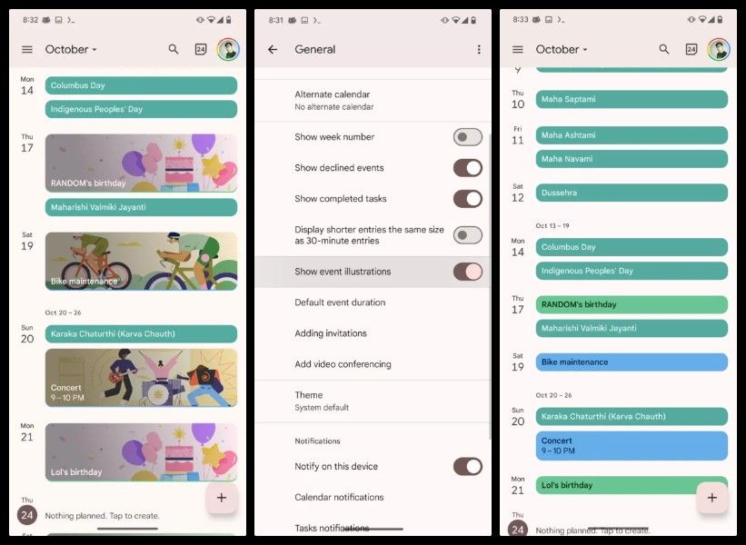
Hidden in the Android 16 Beta 3 launch in March 2025 was a redesigned Settings app tagged internally as “Expressive.” This Settings app featured clearly separated boxes for sub-menu items, arrows to indicate sub-menus, checkmarks to show when a toggle is on, smaller font sizes for headings, and better use of white space.
None of these features are particularly exciting, but they make it much easier to quickly find the setting or information you need. Many times I’ve hunted through the Settings app for a sub-menu or toggle that wasn’t clearly defined, and this change should make it easier to find items. Below you can see screenshots of the redesign, compared to the current Material You look.
To be clear, we’re not certain whether this will be part of Material 3 Expressive or an update just for the Settings app. However, the changes to sub-menus indicate a clear shift in design language, suggesting that we could see this change across multiple apps.
Simple visual cues like we see here can be a massive help, especially for people who are less confident with navigating the menus of their Android apps. While I’m not sure this change counts as “Expressive,” it’s nevertheless something we would love to see more of across system apps, Google apps, and third-party apps.
4
Clear indicators of switch settings
A simple icon is all we need
Material You gives UI designers plenty of options for their app’s toggles, switches, buttons, and other UI elements. However, thanks to the minimalist design language of Material You, it can sometimes be unclear whether you have a button selected or not.
A lot of this comes down to the skill of the UI designer in question. While Material You’s assets are designed to be as clear as possible, poor design choices can result in a confusing user experience. It’s impossible to “fix” this problem, but adding more visual cues can help.
In the redesigned Settings app above, you can see checkmarks that appear when a switch is toggled on. While it’s easy to tell whether a switch is toggled on in Material You, it’s a useful design change that can be applied to other UI elements for greater effect.
Adding icons to switches and buttons makes it easy to tell at a glance whether a setting is enabled or not, regardless of how the app is designed. This design makes buttons more expressive and has the added benefit of breaking up the walls of text that can fill up app menus.
3
A shift away from muted color palettes to useful indicators
Sometimes it’s best to stick with the classics
![]()
One of Material You’s greatest successes was its implementation of colour theming across your Android phone. App icons, wallpapers, menus, and buttons could all share the same color palette. This gives your phone a neat and uniform look, but it does have its downsides.
Forcing every UI element to share the same color palette can make important information blend into the background. Also hidden within Android 16 Beta 3 was a dynamic battery icon that changed color based on its status. White indicates your phone has sufficient battery but isn’t charging, green that your phone is charging, and red that your phone is low on battery.
These colors do not blend in with the pastel tones of Material You, but that’s a good thing. With these changes, I can see the status of my battery at a glance from across the room.
The battery indicator is the simplest example of how Material 3 Expressive can break its minimalist color palette for clearer UI design. Expanding this theme to other elements of the status bar, like the Wi-Fi and network indicators, should be a priority for Google if it wants to make expressive UI elements. It would also be fantastic to see more interesting applications. For example, categories in the Settings app could be highlighted in contrasting colours if they contain important information like a privacy issue.
2
A fresh approach to themed icons
Themed icons are boring and flat in Material You
![]()
Themed icons match your app icons to your phone’s theme. Compatible apps have an alternate monochrome colour scheme, which Android can color in to fit in with the rest of your phone. It’s a great way to create a coherent look for your phone while making your apps challenging to find.
The drive towards minimalism has made it hard to identify apps from the same brand. Google’s white, blue, red, green, and yellow theme makes its apps instantly recognizable, but they blur together into a multicolored mess when grouped. Material You’s themed icons magnify this problem by coloring every compatible app with the same shade with black accents.
The result is a feature that I tried to enjoy for many months, then eventually gave up on. It just makes using my phone more confusing, and I’m not sure I wanted my phone to look more boring in the first place.
To make Material You icons more friendly, Google should give us greater control over how we theme our icons (dare I say, let us express ourselves?) Allowing us to group apps under individual themes would let us create a coherent look without turning our home screens into monochromatic soup. I’m all for Google suggesting a variety of themes, but forcing it on us is frustrating. Adding dark mode and light mode tints like in iOS 18 would also be a huge step in the right direction.
1
Customizable app icon shapes
Bring them back
![]()
Android 16 looks to bring back alternative app icon shapes, but you have to choose from a limited selection. It’s nice to see a feature return that we have long waited for, but it could be more. Allowing us greater choice over our app icons, plus more freedom for app placement on home screens, would let us truly express ourselves.
What does Google want to achieve with Material 3 Expressive?
At Google I/O 2025, the company will show off Material 3 Expressive for app developers. It states that the goal of the presentation will be for UX designers to “Learn how to use the new emotional design patterns to boost engagement, usability, and desire for your product.”
It’s hard to see how any of the UI changes we’ve seen appear in Android betas could be considered “emotional design,” but perhaps this is just part of the overall goal for Material 3 Expressive. Nevertheless, we’ve got a lot to be hopeful for at Google I/O 2025.