Summary
- YouTube has quietly updated the Shorts sidebar with a minimalist design, changing filled icons to hollow ones.
- This minor UI tweak aims to enhance the viewing experience by reducing clutter and allowing users to focus more on the content.
- Some users on social media indicate that they’ve had the refreshed UI ‘for a while now,’ while a large number of users, including us at AP, gained it earlier today.
YouTube Shorts are an annoyance for some, and an easy way to get a quick dopamine hit for others. The constant influx of new bells and whistles for Shorts means that the bite-sized video content sub-brand of YouTube is here to stay, and that too within the main YouTube app, whether we like it or not.

New button in YouTube Shorts makes it easy to find related long-form videos
A good idea with poor execution
For reference, within the past three months alone, the Instagram Reels or TikTok alternative has received several new updates that have helped propel it to the front and center of the YouTube app. Back in October, the streaming giant upped Shorts’ video length limit from 60 seconds to 180 seconds (3 minutes), helping creators tell longer stories while sticking to the Shorts format. Come December, YouTube started testing out a new search bar/search icon within Shorts that linked users directly to long-form videos about topics connected to the Short’s theme.
Now, YouTube’s latest update to Shorts doesn’t aim to direct users towards longer-form content. Instead, it aims to enhance the Shorts viewing experience with a minor yet effective UI tweak.
This might have already rolled out to you
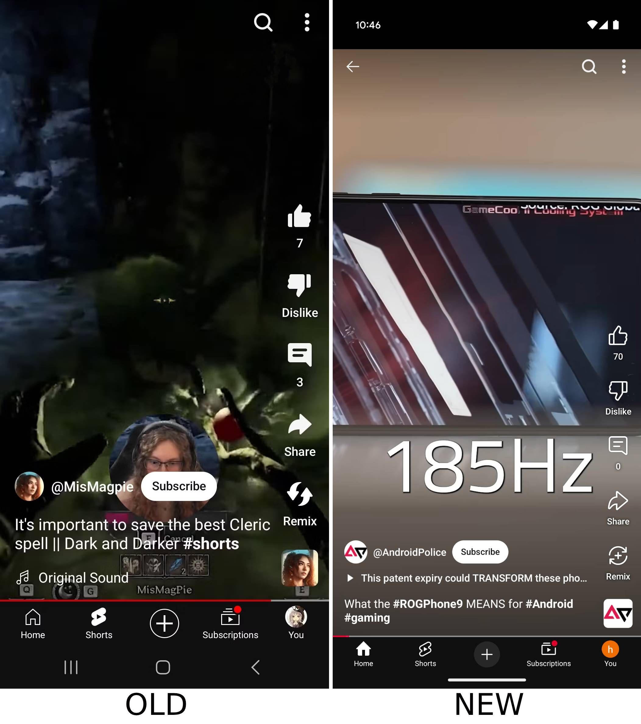
The change essentially converts the filled-in icons on the right-aligned sidebar into hollow ones, letting you see more of what you want to see. Additionally, it also gives a more minimal look to the Remix Short button. The change rolled out for me earlier today, on both Android and iOS on Premium and non-Premium accounts. Staff at AP confirmed that they’re seeing the new sidebar too, but couldn’t point out when exactly the change was rolled out to them. We’re seeing the change on YouTube version 19.50.40.
Interestingly, YouTube hasn’t acknowledged the UI tweak anywhere, and even its YouTube Labs page, where it highlights early access experimental features, is completely blank. A simple Reddit search, however, reveals that a large number of users started seeing the new UI today, while an equally large number of users have had access to the UI “for a while now.” More importantly, though, the consensus is that the new UI looks better, and I couldn’t agree more.


