Key Takeaways
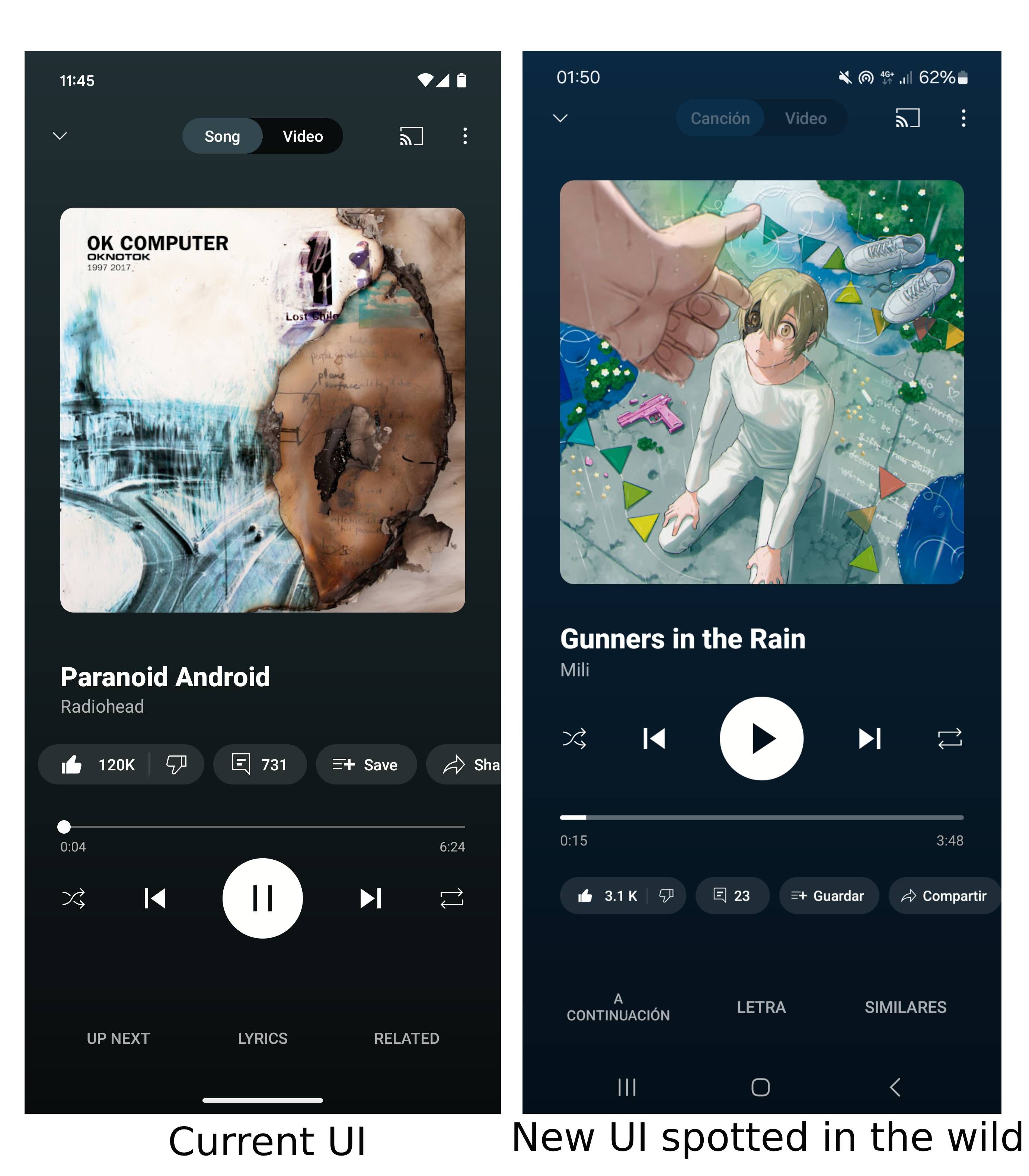
- YouTube Music seems to be testing a new design for its Now Playing page, which repositions the primary playback controls directly below the song title and artist name.
- The row housing the like/dislike, comments, save, etc. buttons has been moved to the bottom.
- It remains to be seen whether the UI tweak is part of a limited test or if it will eventually make its way to all YouTube Music users.
YouTube Music is no stranger to constant UI tweaks, and that’s why we’re not surprised by a new change that puts the app’s playback controls on a pedestal.
For reference, in the past few months alone, the music streaming giant has been spotted tweaking the look of its artist page with Material Design 3 guidelines, its bottom sheet has been tweaked to have more rounded edges, while regular YouTube’s pink progress bar has made its way to YouTube Music too.
Now, as spotted by user Jumfrov on Reddit, and highlighted by 9to5Google, it looks like YouTube Music might be coming after the app’s Now Playing page. Currently, the page surfaces the selected song’s album cover right at the top, followed by the song’s name and the artist. Right below that sit buttons to like/dislike the track, comments, options to save, share, or download the track, followed by a YouTube Radio button.
Playback controls, in the current UI, sit at the very bottom, but users like Jumfrov and Hammond_Robotics_ are already spotting a change that relocates them to the top, right under the artist’s name.
We’re not seeing the change on our end
Even though the new button placement might take a while to get used to, the change largely makes sense. Considering that playback buttons, including play/pause, shuffle, previous song, and next song are primary controls, and used the most on the Now Playing screen, them being highlighted up-top is justified. On the other hand, relegating the row housing actions like comments, like/dislike, to the bottom is understandable, as long as they remain visible — which is the case with this change. Tertiary controls like Up Next, Lyrics, and Related retain their position at the very bottom.
It’s worth noting that we’re running YouTube Music’s latest v. 7.28.51 build, but we’re still on the old/current UI. It remains to be seen whether the UI tweak is part of a limited test or if it will eventually make its way to all YouTube Music users.


