As long as I can remember, One UI has followed a maximalist design approach. It was an “add the feature first, figure out where it should go later” philosophy.
That led to menus stacked on menus, settings you had to hunt for, and enough toggles to make your head spin.
Each delay, each confusing menu, and each extra toggle drained your attention, making the whole experience feel heavier than it should.
One UI 8 represents a subtle shift for Samsung. One UI 8 feels like Samsung finally took a breath and reset its priorities.
Instead of packing the software with even more stuff, this version focuses on making everything easier to use.
One UI 8 makes notifications less attention-hungry
The biggest attention trap on any phone is the notification panel. When you drag it down, you get hit with a wall of alerts, and suddenly you’re scrolling without even realizing it.
One UI 8 approaches this differently by keeping essential information visible in a way that doesn’t interrupt whatever you’re doing. The best example of this change is Now Bar.
Instead of hiding real-time activity behind a long list of alerts, the phone displays information such as media progress and live updates directly in the status area.
You can see what is happening at a glance and keep moving without stopping to dig through the notification shade.
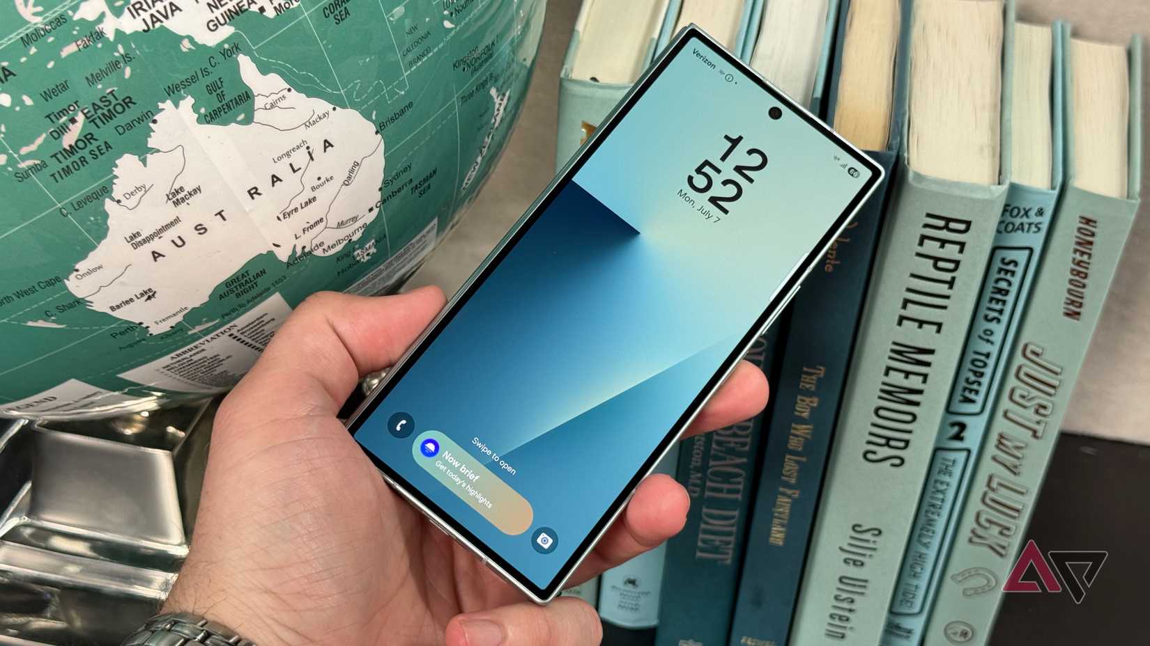
This is complemented by Now Brief. The info appears right where it makes sense, so you absorb it without breaking focus.
Why the new 10/90 multitasking layout feels lighter
The classic 50/50 split has always felt heavier than it needs to be because your brain tries to manage two full screens at once.
One UI 8 adds the10/90 layout that gives you a clear priority. The main app stays front and center, and the smaller app sits in a narrow section that works like a monitoring pane.
In this setup, the main app remains front and center, occupying the vast majority of the screen to keep your attention where it matters most.
Meanwhile, the smaller app is confined to a narrow strip along the side.
This design makes multitasking more intuitive by prioritizing what you really need to see while keeping secondary content easily accessible.
The new AI helpers in One UI 8 manage the small stuff
Another attention killer is often the little maintenance chores your phone expects you to do. One UI 8 shifts some of that load to AI, letting the system clean up after itself in a way that feels almost invisible.
The proactive part of the system comes through Now Nudges. These little helpers learn your routine and jump in when they think you might need something.
This is still unreleased and surfaced only through early leaks tied to Android 8.5, but it gives a good idea of where Samsung wants to take the experience.
File Manager also got a small quality-of-life upgrade. If you want to rename a file, it will suggest a name based on what it thinks the file is about.
Context-aware updates on your lock screen
The lock screen in One UI 8 now adapts to your situation. The contextual lock screen shows different info depending on where you are or what time it is.
It integrates updates like traffic and reminders from Now Brief. The clock face on the lock screen now moves around to avoid covering important parts of your wallpaper.
It’s a small but thoughtful touch that keeps your photos or custom backgrounds looking great without distraction.
One UI 8’s animations are easier to follow
Even when software runs fast, it can still feel tiring to use. A big part of that comes down to how things move on screen. When animations are stiff and move at a constant speed, they look unnatural.
One UI 8 switches to non-linear animations to make the experience feel more natural and fluid. These animations speed up quickly at first and then slow down as they finish, kind of like how things move in the real world.
This ease-out style helps UI elements gently settle into place, making it easier for your brain to follow and accept the motion. It also helps you understand the layout.
When you unlock the phone, the Always On Display shifts aside to reveal the Lock screen, which then zooms away to show the Home screen.
Because these movements are consistent and logical, it’s easier to predict what’s happening and how different parts of the interface connect, so navigating feels less mentally demanding.
The upgrade that respects your attention
One UI 8 is a thoughtful exercise. It sticks to calm technology’s core principle. The right amount of technology is just enough to fix the problem.
The main achievement here is understanding that the best feature in today’s attention-heavy world is simply getting out of the way.


