This article was published as a part of the Data Science Blogathon.
Introduction
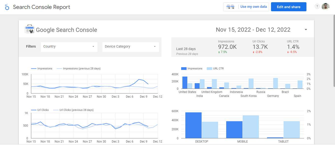
In today’s digital world, data is generated at a swift pace. Data in itself is not useful unless we present it in a meaningful way and derive insights that help in making key business decisions. Business Intelligence (BI) tools serve the purpose of converting raw data into information. The information is in the form of reports and a dashboard which summarizes key business questions and helps the decision-makers to take quick actions. One such BI tool is Google Looker Studio, formerly called Google Data Studio. It takes data from multiple sources like BigQuery table, excels, csv, etc., and converts it into high-quality reports and dashboards. In this article, we will understand the life cycle of Looker Studio and its deployment.
Google Looker Studio Overview- BI tool
Google Looker Studio, formerly called Google Data Studio, is a powerful BI tool for creating interactive reports and dashboards. It is a self-managed BI solution. It can ingest data from different sources like BigQuery table, excel, etc. Its uses are:
1. Descriptive Analysis: It is useful for generating summaries about the data samples. It is useful for understanding the distribution of the data. In order to understand data attributes, we can have frequency distribution, mean, and variability. Frequency distribution counts the happening of the attribute. Mean is useful for identifying the gaussian distribution of points, whereas variability provides dispersion.
2. Data Preparation: As we know, data resides in different tables. It is identified which tables/variables to choose, and then data is merged from different tables. Sometimes data have different sources. This is taken care of by the Looker Studio. Another useful feature for data preparation in Looker Studio is to create variables on the fly.
3. Data Visualization: It is the process of converting charts into graphs, tables, charts, etc. It is the key to fast and accurate data-driven decision-making. Users can interact with Visualization, which is very easy to share.
Life Cycle of Looker Studio
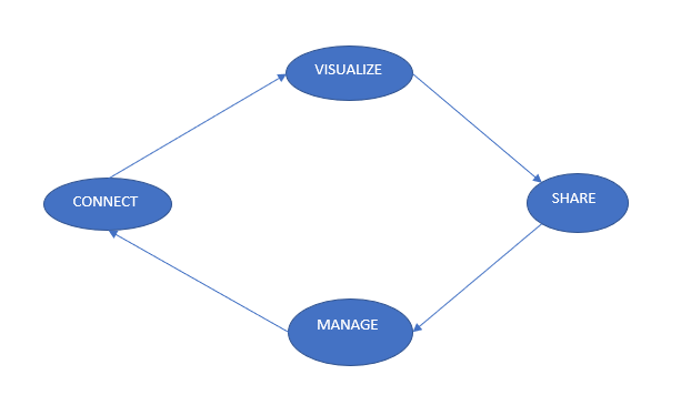
Any project we do has a life cycle. It is the time from start to end. Looker studio’s life cycle consists of these 4 elements: Connect, Visualize, Share and Manage.
1. Data Connection:
Organizations have data at multiple locations. In order to fetch data to looker studio, it must be attached through a proper connector. The connector joins your source data and the looker studio. You can connect to sources like BigQuery, Databases, Google sheets, local csv/excel files, etc.
BigQuery & Looker Studio both are part of GCP, and here we will understand in step by step process how to connect to the data source. BiqQuery is a cloud-based data warehouse system that stores the data in a columnar format. The steps for data connection are given below:
1. Sign in to Looker Studio: Go to the google search bar and type looker studio. Click on Looker Studio Overview and sign in.
2. Click the Create Button and then Report. : On the top left corner, you will see a create button. Click on it. You will see a dropdown list. Click the Report from the list.
3. Select Big Query as the connector: As discussed earlier, we have connectors based on the location of the data source. Pick the connector where your data resides. Here, we will click on BigQuery.
4. Select your Project, Dataset, and table: In Big Query, the structure is: Project – Dataset and table. Our Project name is redeemanalytics, Dataset: Analytics, and table: CustomerScore.
5. Click on add to Report: Clicking the button will start the connection process, and you will see the blank canvas.

You will see the canvas given below after executing all the steps.
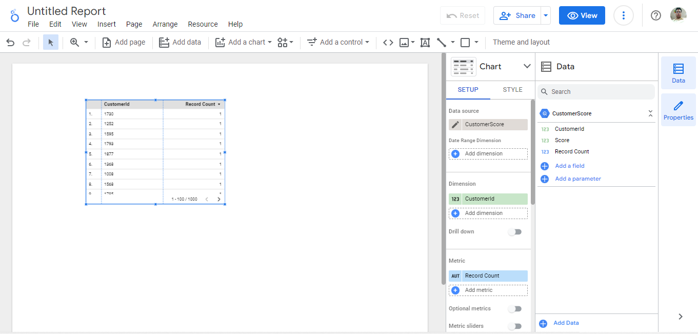
a. Title: The Top left label is called Report Title. It represents the subject of the Report and provides an idea to the user of what the report is all about.
b. Right Pane(Data): Data Pane consists of the data source attributes. For Example, in our CustomerScore data table, we have two features, CustomerId and Score. We can drag and drop these features to the SetUp Pane to visualize.
c. SetUp Pane: Charts of interesting variables are dragged and dropped here. It consists of Dimensions and Metrics. Dimensions include text, date, time, etc, and it is green in color. Metrics are numbers, percentages etc, and are shown in blue.
d. Canvas: It is the region where charts and graphs are made. We can see in the above image that we have a table having two columns customerId and Record Count.
2. Visualize
After Connecting to the data source, the next step is to provide interactive visualization to the business users so that they can take concrete actions. Creating visualization in Looker Studio is very easy. We need to drag and drop the variables in the SetUp pane and select the char of our interest. Here I will show you how to create interactive Visualization.
a. Click the Title of the Report and change it to Customer Score.
b. We can group the customers by adding a new field. Click the Add a field button in the Data Pane. Add the Field Name and in the formula, write the CASE expression.
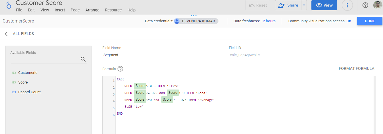
This is called the calculated field and is used when you want to create the variable of interest on the fly. Here we are creating a calculated field named: Segment. It groups the customers based on the score.
c. Click the bar chart under the chart pane and drag and drop the Segment field in the dimension & the metric portion.
d. Click the table under the chart pane and drag and drop CustomerId & Segment under the dimension & score under the metric portion.
e. Adding control provides the users to filter the report. It comes in forms like drop-down filters, sliders, check-box, etc. Click on Add a Control to include the requisite filters.
f. Styling improves the visual aesthetics of the report and is one of the important parts of the visualization. Click on the graph or filter and then click on the style pane. Under the Style, there are things that we can do, like changing font color, size, etc. You can experiment with the features and apply them.
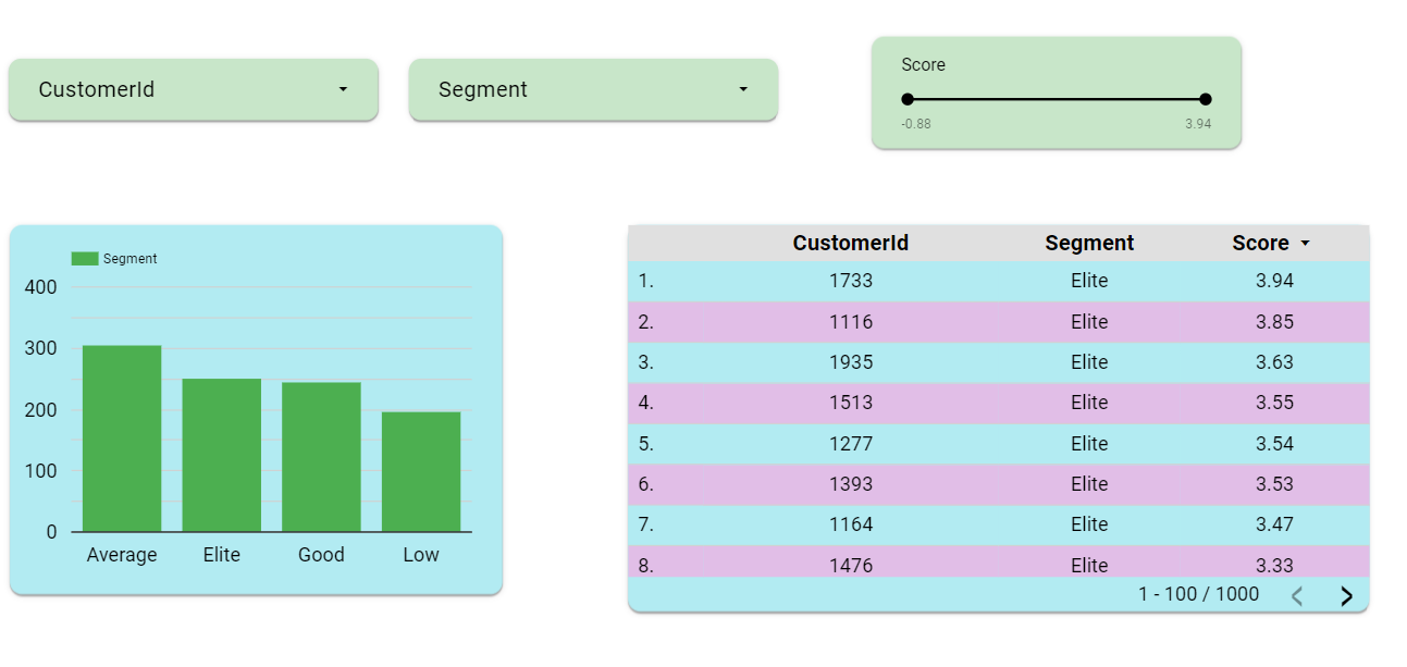
g. Users can interact with the report by clicking on the filter. But how will your users get access to your report/dashboard? Here comes the process of sharing, which we will discuss in the next paragraph.
3. Share:
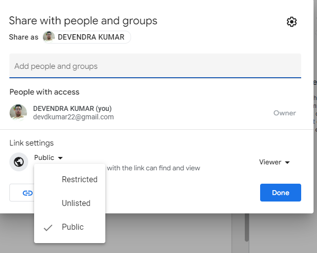
You must understand the role of users before sharing it. If you are sharing it with the public, you can create the link, and anyone can access it. You can also give editing rights to users working on this project. For key Persons, it is advisable to invite them through email Id access and provide them with the view mode. Here are the steps to share your work:
a. Click on the Share in the top right corner and click on the Get report link.
b. Click on the view sharing setting and provide access as per your requirement. Click the Copy link button and then Done.
c. Now, you can paste the link I am sharing here with all of you. Click on the button given below and have some fun with the visualization.
4. Manage:
It consists of managing your account and providing extra features to control and see how your Reports and dashboards are working. You can delete your reports and account. You can manage your users and give them different roles as per their needs. It means you can have full control over your data, and you control reliability and security. Here in the image, you can see that you can manage your data by giving access as per your wish.
Use Case- Chicago Taxi Trips
Dataset
This dataset consists of taxis in Chicago. Private companies operate these taxis, and in this dataset, there are details of the company, their taxi, operating duration, location, and fares, etc. The schema of the dataset is given below. This dataset is part of a publicly available dataset.
Dashboard
We must keep in mind the key questions before creating the dashboard.
1. Trip Duration: What is the average & max Trip Duration?
2. Trip Total: What is the average & Max Trip Total?
3. Payment type: Which payment types are used by the users often?
4. Trip Count: Companies providing a larger number of trips?
5. Total Trip Cost Per Km?
We are creating the dashboard as discussed in this article mentioned above(Looker Studio Life Cycle). After applying all the steps our dashboard is ready.
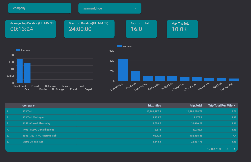
You can access the dashboard by clicking the button:
Conclusion
In this article, we understood Looker Studio. It is a powerful BI tool. Looker Studio’s life cycle consists of Connect/Visualize/Share/Manage for data-driven decisions. We did hands-on to create the dashboard for Chicago Taxi Trips and answered key business questions.
The key takeaways are:
1. Whenever data-driven decisions are the need of the hour, a BI tool like Looker Studio is the appropriate solution. Data-driven decisions are completely based on data and are very accurate in key business decisions. We answer the questions by analyzing the data.
2. Data Visualization plays a key role in delivering insights in a crystal clear way. Graphics say a lot more than words. Visualization is based on the sound principles of image perception. It must provide the answers clearly and concisely.
3. It’s important to ask key business questions before making a report or dashboard. Right business questions open the door to the right business strategy. Questions must align with the company’s mission and provide value to the company. In our example, we asked 5 business questions and provided answers in an appealing visualization.
The media shown in this article is not owned by Analytics Vidhya and is used at the Author’s discretion.


