

There is one specific behavior on Samsung phones that drives me up the wall: the Recents menu.
Visually, the standard setup looks sleek, but functionally, it’s a disaster for productivity, especially on a massive 6.8-inch display. Why am I forced to swipe four times just to switch to an app I was using thirty seconds ago?
It’s a complete rip-off from iOS and feels like a waste of screen real estate.
I realized I was wasting minutes every day just hunting for apps, until I flipped a single switch in Samsung’s Good Lock suite.
By changing the Task Changer layout to a simple grid, I didn’t just change the look of my phone; I finally fixed the broken multitasking flow.
The problem with the default
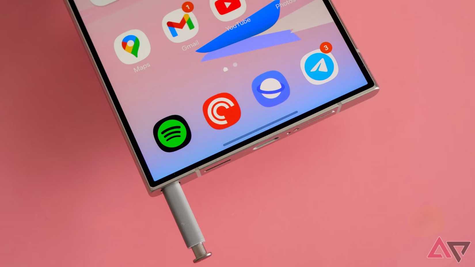
Let’s talk about the default Recents menu on Android. It is the part of the OS I interact with hundreds of times a day.
On the surface, the horizontal carousel — which every Pixel, Samsung, and iPhone uses by default — looks slick. It has those buttery smooth 120Hz animations and puts the current app front and center.
It looks fantastic in marketing commercials, but for actual productivity? It’s far from perfect. Here is my issue.
I’m holding a massive slab of glass. My phone has a 6.8-inch display that costs as much as a decent laptop. Yes, the operating system decides that the best way to utilize this canvas is to show me one app at a time. It feels like a waste of pixels.
If I want to switch to an app I used five minutes ago — which is usually just four or five slots back in the stack — I have to perform this thumb gymnastic.
That might sound like nitpicking, but when you are bouncing between Slack, Chrome, OneNote, and X all day, you need a better view to fly through them.
Good Lock to the rescue
It is baffling to me that Samsung hides this level of power inside an optional app in the Galaxy Store. But maybe that’s what makes finding it feel so rewarding.
The specific tool that saved my day is called Home Up. Even after you install Good Lock, you have to download this specific module, open it, and dig into a sub-menu called Task Changer.
It is buried three layers deep — completely invisible to the average user.
Instead of Task Changer, you get a few different flavors: List, Stack, Vertical List. But the one I locked onto is Grid.
Enabling this simple toggle instantly transforms the Recent Apps screen from a horizontal treadmill into a 2×3 dashboard. Suddenly, I’m not looking at one app, I’m looking at six.
The slim list option is too text-heavy and dry, while the vertical view requires too much swiping. Grid retains the app cards, so I can still recognize an app by its snapshot.
Now, when I swipe up to switch tasks, I don’t have to hunt. My email, calendar, notes, and browser are all just sitting there, waiting to be tapped.
I know exactly where my Notes app sits in the grid, and I can tap it unthinkingly due to muscle memory.
Extra customization options
Samsung’s Good Lock team didn’t just give us a new layout; they gave us the toggles to fine-tune it. In the Home Up add-on, you can tweak the home screen, gesture settings, edge panel, and even boost the share manager.
This is just the Home Up module. You can even go ahead and download LockStar to take your lock screen experience to the next level. Edge lighting+ is another neat add-on to customize your own edge lighting style from Good Lock.
There are dozens of such customization options buried in Good Lock. I highly recommend spending some time with Good Lock to get the best out of it.
This brings me to the real reason I keep buying Galaxy phones, even when I prefer the Google Pixel’s camera or iPhone’s polished apps.
Using a Pixel or an iPhone feels perfectly fine. It’s nice, clean, and everything works – but you aren’t allowed to make many changes.
Using a Samsung phone with Good Lock feels like an ideal Android experience. I can fundamentally change a core system animation like the multitasking menu — without rooting the phone or installing sketchy software.
This is why One UI wins. It treats me like a power user who knows what they want.
Mastering One UI
It’s strange to think that such a minor visual adjustment can have such an impact on how a phone feels, but that’s the beauty of Good Lock. Changing the Task Changer to a Grid view removed a micro-friction I faced dozens of times a day.
If you have a Samsung phone and access to Good Lock, do yourself a favor and try this layout for 24 hours. After your muscle memory adjusts to seeing six apps at a glance, the current layout will feel slow, and you won’t want to go back.
Aside from that, here are other tweaks you can make to One UI using Good Lock.