

Summary
- A Play Store update is moving Search functionality to its own tab.
- The new Search tab serves as another avenue for content discovery, offering suggested search terms.
- The update appears to be a server-side change, but we expect to see it more widely soon.
The Play Store is getting a bit of a visual tweak. 9to5Google reports that the Play Store’s search bar, previously featured prominently at the top of the store’s Games, Apps, and Books tabs, is being replaced with a new Search tab accessible from the app’s bottom navigation bar.
While we haven’t spotted the new change on any of our own devices at AP yet, 9to5 provided screenshots of the new layout in action. The newly added Search tab serves as another avenue for exploring content on the Play Store, displaying a grid of chips that feature search terms that “You might like,” plus another section devoted to browsing games by genre. There’s also, of course, a search bar present in the Search tab, so you can still type specific search queries.
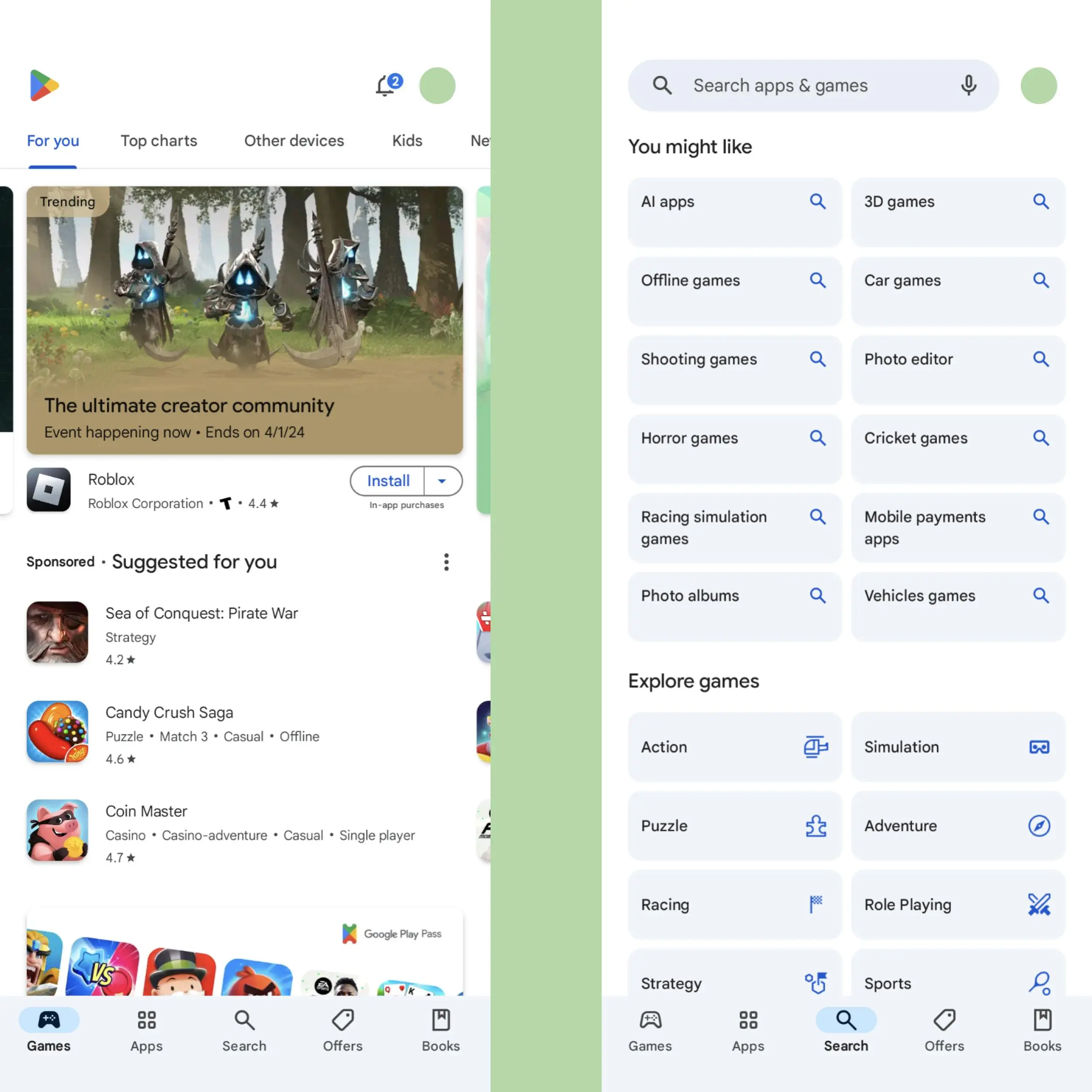
It’s not a terribly exciting change. Relegating search functionality to its own tab means that searching for an app or game you’re looking for takes an additional tap compared to the previous setup, and the space where the search bar used to live on the Games and Apps tabs is now simply blank. Strangely, the Books tab is unchanged, and still features a search bar.
Not a user-friendly approach
A less convenient search experience
It seems likely the impetus behind the change is to expose users to more content they might not otherwise see as they navigate to the newly annoying-to-reach search bar. With search only accessible from its own tab, you’ll see that new grid of suggested search terms each time you set out to find a specific app — and, if Google and app developers are lucky, you might tap one and end up downloading an app you hadn’t initially intended to.
Some other apps take a similar approach to search. Spotify, for example, has a similar Search tab, where you’re presented with not only a search bar, but options for browsing the streaming service’s broad content offerings beyond what you’re specifically trying to find. It’s hardly the most nefarious example of a dark pattern in UX design, but it’s not especially user-friendly, either.
As some users are seeing the new design before others, this seems like a server-side change. But assuming Google’s set on this new Play Store search design, you should expect to see it on your own devices soon. Hooray?
AI-generated app highlights are now live on the Google Play Store
How AI summaries will impact user perception has yet to be gleaned