

We’ve been asking for this forever. Specifically, the vocal minority of us who live in the Good Lock forums have been in negotiations with the software developers in Suwon.
We didn’t want the moon zoom. We just wanted to scroll through our apps the same way we scroll through Twitter, Reddit, TikTok, and literally every other content feed on the planet.
Samsung listened, and One UI 7 finally introduced vertical scrolling, but it felt like a beta test to me. The feature was there, yet the experience wasn’t. It lacked the fluidity I’d come to expect from Samsung.
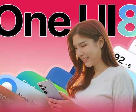
Now we’re on One UI 8, the supposed polish update. The app drawer looks nicer, and the redesigned search bar, but I’m still sticking with my third-party launcher.
The vertical app drawer still feels broken to me
When the Samsung community begged for a vertical app drawer, we weren’t asking for a change in the axis of movement.
We wanted organization. That’s the part third-party launchers get right. A naked vertical drawer just moves the mess into a new direction.
The old horizontal system, for all its flaws, had the advantage of spatial indexing. Human memory is spatial. We remember where things are better than we remember what they are named.
Spatial memory is an ancient survival mechanism. Missing a calorie-rich resource or a predator’s territory was historically fatal, whereas forgetting an abstract name carried no survival cost.
In the horizontal One UI, you knew that Spotify was on page 2, in the upper-right corner. It was muscle memory encoded in position.
However, when you switch to a naked vertical list, you destroy that map. Especially if there’s nothing left for your muscle memory to hold onto.
The position of an app in a vertical list is dynamic. It changes depending on what you installed yesterday.
If you install a new game that starts with “A,” every single app below it shifts. Spotify is no longer where your thumb thinks it is. It has moved three millimeters down.
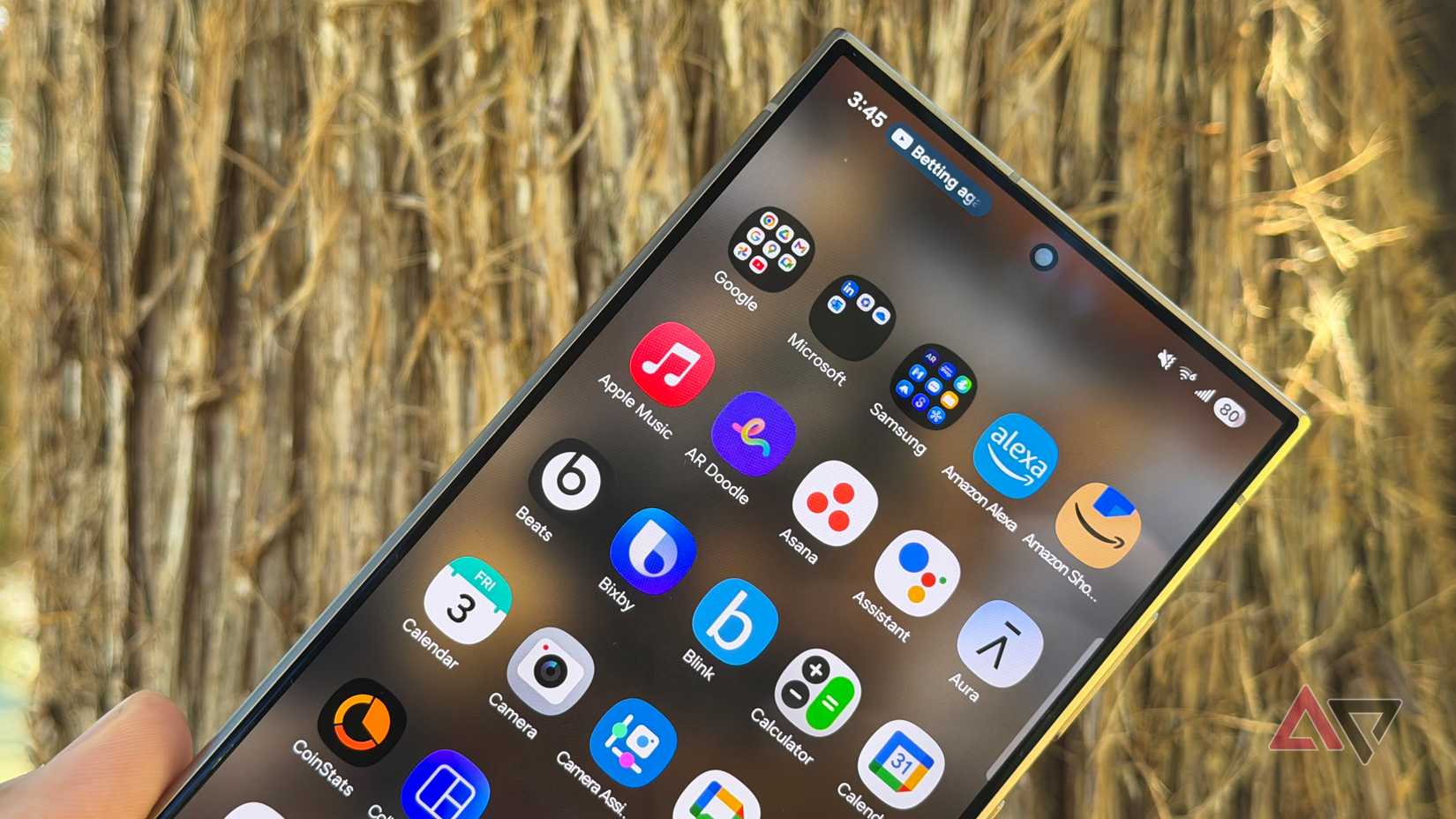
Samsung has tied its vertical drawer to alphabetical sorting. If you want the vertical scroll, you must accept that.
This is a bizarre limitation. Why can’t I have a vertical list where my most-used apps are pinned, followed by the rest in order?
The only fix is foldering your apps. But that comes with its own flaws.
Folders hide app icons behind a container. Even with peek icons showing what is inside, you lose that quick scan for familiar colors and shapes.
On top of that, folders have their own scrolling. If you put 20 apps in a folder to keep your main drawer clean, you end up replicating the very problem you tried to solve.
Opening the app drawer feels random every time
Another annoying part of using the new drawer is the saved state behavior. In a well-designed vertical drawer, every time you open it, you should start at the top. This creates an anchor point for your search.
Samsung, however, has decided that the drawer should remember exactly where you left off.
If I scroll down to the “W” section to open WhatsApp, then go back to my home screen, and five minutes later I want to open Audible, I shouldn’t have to scroll all the way back up.
Yet every time I open the drawer, I have to pause and orient myself. Am I at the top? Am I in the middle? Is the app I want above or below me? It makes the navigation feel unpredictable.
Samsung’s app drawer still loses to third-party launchers
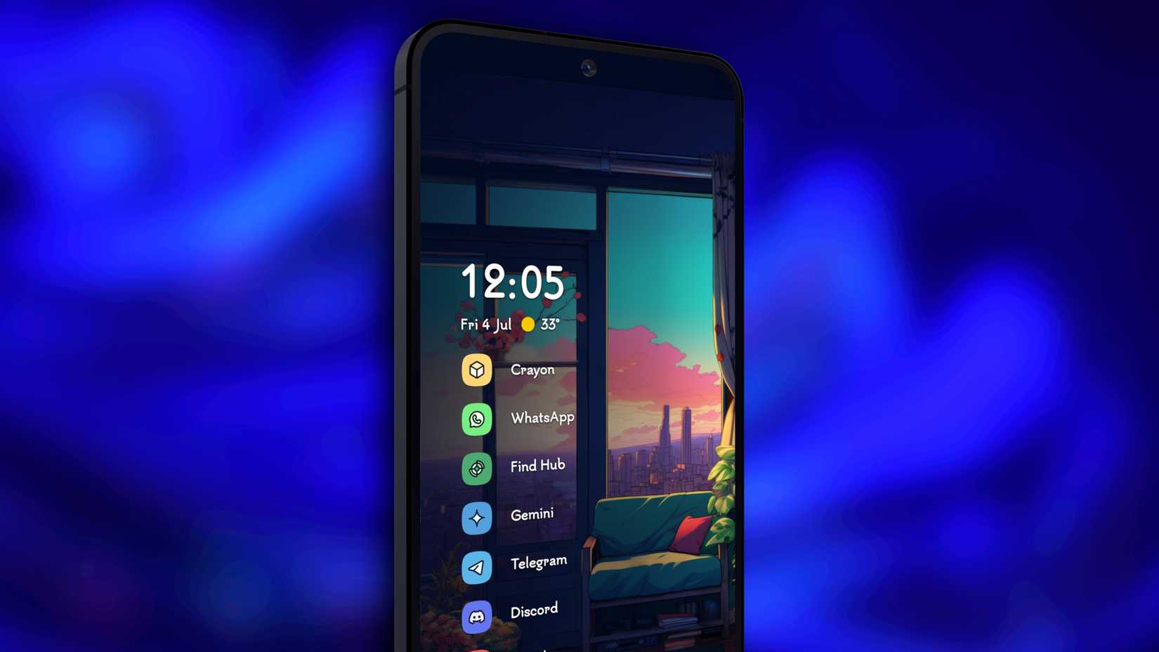
Credit: Niagara Launcher
Third-party launchers have understood these limitations. They knew that a flat list of 200 icons wouldn’t work.
Some add a dynamic top row that bypasses the alphabetical sort. The top icons are floating based on your app usage or manual pins.
Others let you create tabs in the app drawer or set a 7×8 grid if you want. They understand that if I have myopia, I might want big icons. But I might also want to see my entire digital life at a glance.
What I want to say is that, no matter how they do it, they all put more control in your hands, and that’s exactly what Samsung still lacks. Now, to be fair, we still have Good Lock.
Good Lock is where they hide the features they are too afraid to put in the main settings menu. But honestly, it’s not much different from a third-party add-on. It’s just made by Samsung.
I still can’t fully commit to third-party launchers
Why don’t I switch to third-party launchers and get what I want? Well, this is my dilemma.
Third-party launchers don’t play nice with the Android system. You may experience a microsecond of lag or a jarring snap when swiping home when using them.
In contrast, Samsung’s One UI 8 has fluid opening and closing animations. Third-party launchers simply cannot replicate this because they lack access to the core system’s animation framework.
So we are forced to choose between utility (a tabbed, organized drawer in Nova) or fluidity (the buttery-smooth animations of One UI 8).