

One of the best browsers I tried in 2025 was the Zen Browser.
This minimalist browser was designed to reduce distractions and maximize performance, and it came with a host of nifty tools and a beautiful UI.
While I eventually decided it wasn’t for me, I found myself longing for the browser’s sleek vertical tab layout.
Now, Chrome has finally caught up with modern browser UIs; vertical tabs are here.
Vertical tabs aren’t exclusive to Zen Browser. Firefox and Edge both support this feature, but they never clicked for me the same way Zen Browser’s did.
Perhaps it was because I’m so familiar with the Chrome experience, which makes this update the perfect time to revisit this feature.
![]()
How to enable Chrome’s vertical tabs
You’ll need to use an experimental build to try them
Google introduced vertical tabs to Chrome’s beta branch in January 2026, but quietly removed the feature days later.
It’s unclear whether this decision was due to instability or a mistaken update, but the good news is you can still access it in Chrome Canary.
Chrome Canary is the daily-updated version of Chrome aimed at developers.
It offers early looks at in-development features, but it can be unstable as a result.
Therefore, it is likely that you will encounter bugs with vertical tabs while using Chrome Canary.
- Download Chrome Canary.
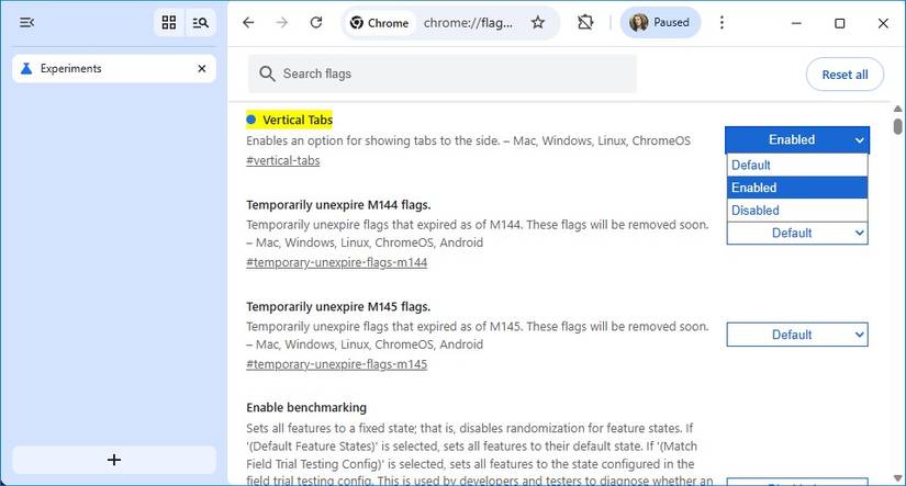
- Enter chrome://flags/#vertical-tabs in the browser’s address bar.
- Click the drop-down menu next to Vertical Tabs.
-
Select Enabled from the menu.

- Restart the browser.
- Right-click the blank area above the address bar.
- Select Move tabs to the side.
You can reverse this process by right-clicking the vertical tab bar and selecting Move tabs to the top.
Make the most of Chrome’s vertical tabs
Established features have more functionality with vertical tabs
Enabling vertical tabs does more than move your tabs from the top to the side of your screen.
Just as most other browsers have discovered, a vertical tab layout creates space for more UI elements that are hidden behind pop-up windows or keyboard shortcuts in a horizontal layout.
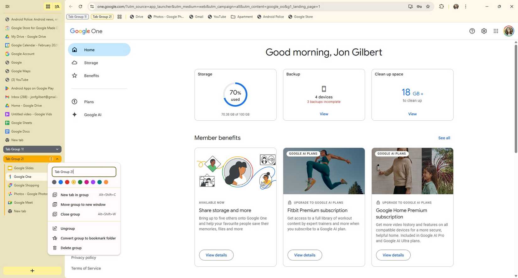
The vertical tab layout retains the Tab groups button, but adds two more buttons.
In the upper-left corner is a button that collapses the vertical tabs into a slim bar that leaves enough horizontal space to display tab icons.
Next to the Tab groups button is the Tab search button, which was previously accessible only via the Ctrl+Shift+A shortcut.
Finally, at the bottom is the New tab button.
Enabling vertical tabs doesn’t add any new buttons or tools to your tabs, but it does open the door to new organization options.
The first thing I noticed was that I can fit more tabs onto my screen. I can fit 29 vertical tabs on my screen and still read their names.
With a horizontal layout, I can only fit 12 tabs before I have to start relying on icons to tell them apart.
Tab groups also make a lot more sense with a vertical tab layout. Not only does a drop-down menu make more sense for tab groups, but Chrome also places shortcuts for your groups next to your bookmarks.
A horizontal layout has the same functionality, but with vertical tabs, there’s also a button to convert your tab groups into a bookmark folder. This latter feature is also present in the horizontal layout in Chrome Canary.
Vertical tabs bring Chrome into the modern age
Better late than never
Google’s apps have started to feel clunky and old-fashioned in recent years.
The Material 3 Expressive update for Android was a massive step forward, but inside its apps, things feel dated, especially when compared to younger alternatives.
I recently replaced many of my Google Android apps with open source alternatives for this reason.
Should you switch to Chrome Canary just for vertical tabs? Probably not.
The browser crashed twice while I was taking screenshots for this article (testing how many tabs I could move at once would tax even the stable Chrome browser). It’s not recommended for regular work or personal use.
However, I was impressed with the effectiveness of Chrome’s vertical tabs.
Admittedly, it would have been hard to get wrong, given how many examples of vertical tabs Google could draw on during development, but I’m grateful it didn’t use the extra screen real estate to cram in a Gemini tool.
Still, this feature is in development, so there’s still time for Google to ruin it before it launches on the stable build of Chrome.
There are plenty of alternatives to Chrome, so it needs to modernize
It’s hard to make a convincing argument that Google has improved Chrome in recent years. It seems that all Google cares about is how many places it can stuff a Gemini tool.
I’m deeply grateful to see the development team introduce a practical tool to compensate for questionable AI features.
I discussed the Zen browser earlier in this article, which made a compelling case for ditching the Chromium environment altogether.
But even amongst familiar names like Edge and Firefox, there is enough competition to make Chrome look tired and old.
Yes, you can remove AI features and telemetry data reporting, but Chrome needs to catch up on modern browser features to stay ahead of the competition.
Vertical tabs are the first step, but I’ll be the first to admit it’s a significant one.