

The split notification shade, where notifications and quick settings are divided into two at the top of the screen, has become an irritating standard on most Android phones since it arrived in early 2025.
While I dislike it on Android phones, I have found a place where it works really well, and it has saved me from dismissing it from my mobile life completely.
It turns out, the natural home of the split notification and quick settings view is on a tablet.
A good feature made worse
More swipes, less convenience

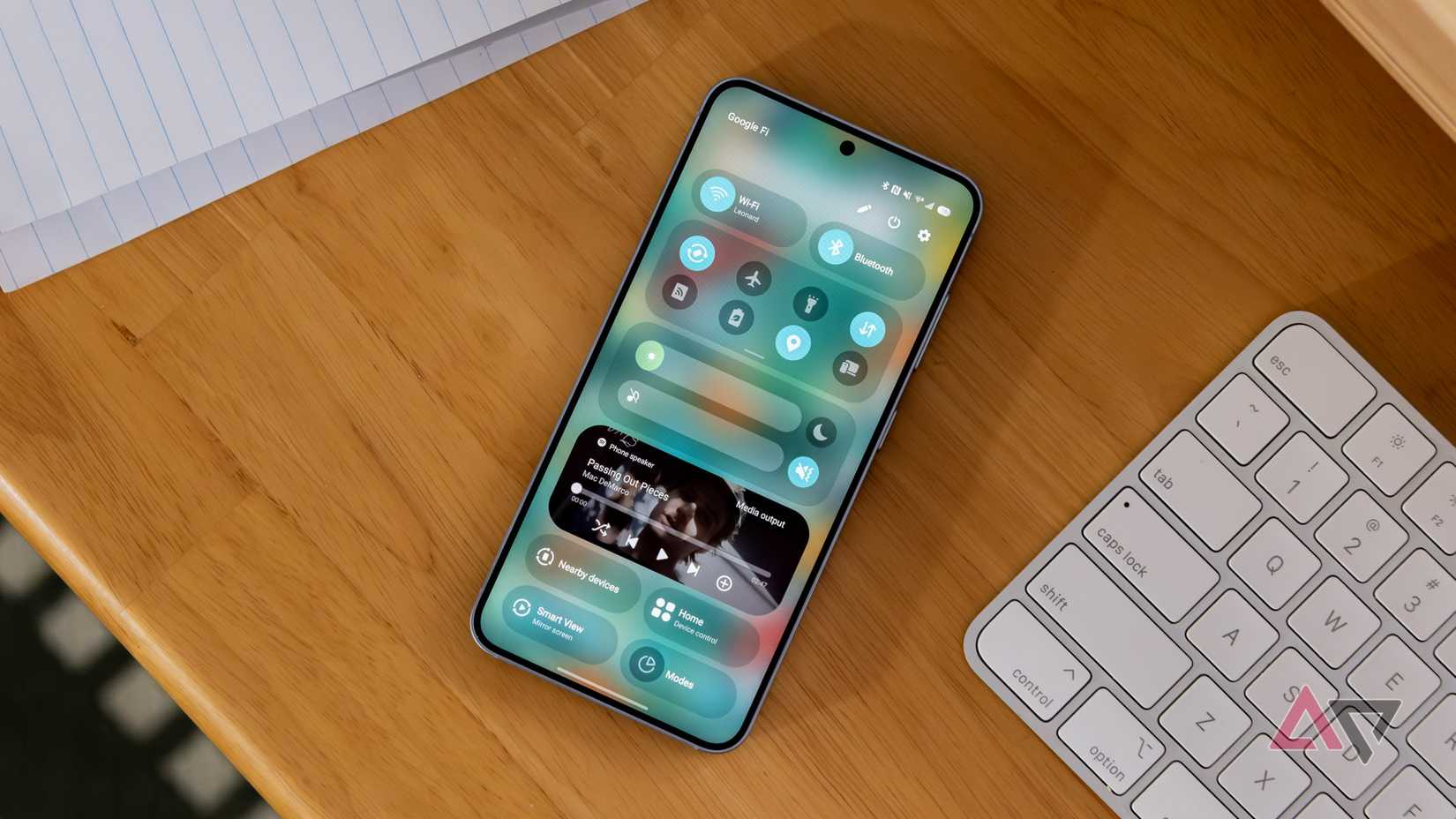
For those perhaps unfamiliar with the feature, here’s what it does.
Once upon a time, notifications sat below quick settings on a single page viewed when you swiped down on the screen.
Swipe down a second time, and more quick settings options would appear, while notifications would be condensed.
This delightfully simple system was easy to understand and, crucially, able to be used even when holding a phone with one hand.
It worked regardless of screen size, wasn’t impacted by hardware dimensions, and it was the quickest way to find two highly important screens without unnecessary effort.
This made it ripe for reimagining, because things that work well can’t just be left alone. The result is a 50/50 split, with quick settings accessed by a down swipe on one side of the screen, and notifications on the other.
It’s the perfect example of making a good feature worse.
Not all changes are good
Give me the classic way every time
Changing the feature wasn’t just a software developer’s desperation to fix things that didn’t need fixing.
Apple had also been experimenting with a split Control Center and Notification Center in iOS and iPadOS, and Android phone makers didn’t want to be left out of all the software tweaking fun.
The problem is, the new system is rubbish. I’ve lost count of the times I’ve swiped down on the screen to see my notifications and got quick settings instead, or vice versa.
There’s no obvious visual delineation between the two sections, it’s a pain to use with one hand, and I’ve yet to hear anyone tell me they prefer it to the old way of doing things.
It’s no longer a feature I didn’t think about because it worked so well, and is instead a source of frustration unless I make a conscious effort to get “right.”
Thankfully, you can revert to the “classic” way of interacting with the notification shade, which sometimes feels like an admission on the manufacturer’s part that the “new” way is worse than the old way.
Which neatly brings me to how well the split notification shade works on a tablet, mostly because it highlights why it doesn’t work well on a phone.
Holding it right
Being all thumbs

I’ve spent quite a lot of time with various tablets recently, with the OnePlus Pad Lite and Honor MagicPad 3 being the standout models.
While I was watching a video, I discovered just how natural and well-designed the split notification shade feels on a larger screen, particularly when the tablet is held in landscape orientation.
It has to do with the way you hold a tablet, which is often with both hands, one on either side of the screen.
My thumbs fall naturally on the left and right sides, and a quick downward swipe shows the notifications or quick settings. It feels comfortable, logical, and a fast way to access the information I want.
In other words, all the things that the feature is not on a phone. You don’t have to swipe from the very top of the screen either, and swiping up to hide the shade is a short gesture, making it fluid and fast.
Even better, it feels similarly natural when the tablet is in portrait or landscape orientation.
Plus, because the screen is big, I can reach out and swipe in exactly the right place to access notifications or quick settings when the tablet is on a stand, and I’m using a keyboard.
Remember, this is to access information which is usually glanceable, so quick access is essential. It’s a completely different experience on a tablet than it is on a phone.
The one place I wouldn’t switch back
A positive software change

All this said, manufacturers continue to improve the split view on phones.
In Samsung’s One UI 8, I like that a downward swipe anywhere on the screen shows notifications.
Still, it’s awkward when the quick settings view requires a swipe from the very top of the screen to show, and if you’re not very precise, you just end up seeing notifications again.
In Xiaomi’s HyperOS, you don’t have to swipe down from the very top of the screen, but you do still have to be fairly precise about which side of the screen you swipe.
These frustrations and inconsistencies, combined with muscle memory from years of using Android in one particular way, mean I usually use the classic view for notifications and quick settings on an Android phone.
However, I love the split view on an Android tablet, where it makes great use of the screen size, and that I’m using the most natural gestures to get the information I require.
I almost wish it were solely an Android tablet feature, and the classic view was still the default option when you set up a new Android phone.
I wanted to point this out because the split notifications and quick settings view in Android gets a lot of very justified hate, so when I found a place where it made absolute sense and improved the user experience, I felt it needed highlighting.
It also shows why software customization is so important, because it’s possible to use the feature on the device where it works, and ignore it on the device where it’s useless.