

Buying a Google Pixel means getting Android as Google intended it to be. Pixel phones are known for their clean, smooth experience without the extra bloatware other manufacturers add.
However, the experience falls short where it matters. The home-screen launcher is the weakest link, and I’ll explain why, despite everything the Pixel phones get right, their launcher is my least favorite on Android.
Pixel Launcher nails performance, but stops there
Before I get into the issues, it’s only fair to acknowledge what the Pixel Launcher gets right. First is performance. The Pixel Launcher is responsive across the board.
Animations are fluid, transitions are clean, and gestures respond well. This is a notable advantage. Most third-party launchers have struggled with small but noticeable stutters.
Since Google controls the software and hardware, it can deliver a polish that third-party developers often can’t match. The second benefit is its tight integration with the Material You theming engine.
When you change your wallpaper, the entire interface adapts to the new colors. It’s an easy, automated way to make the phone feel personal without any setup.
That’s where the upsides end. When you try to customize anything beyond what Google allows, you quickly run into limitations that are hard to ignore.
This goes against what Android is supposed to stand for. This lack of flexibility puts it behind many third-party launchers and competitors like One UI.
The Pixel Launcher prioritizes Google services over flexibility
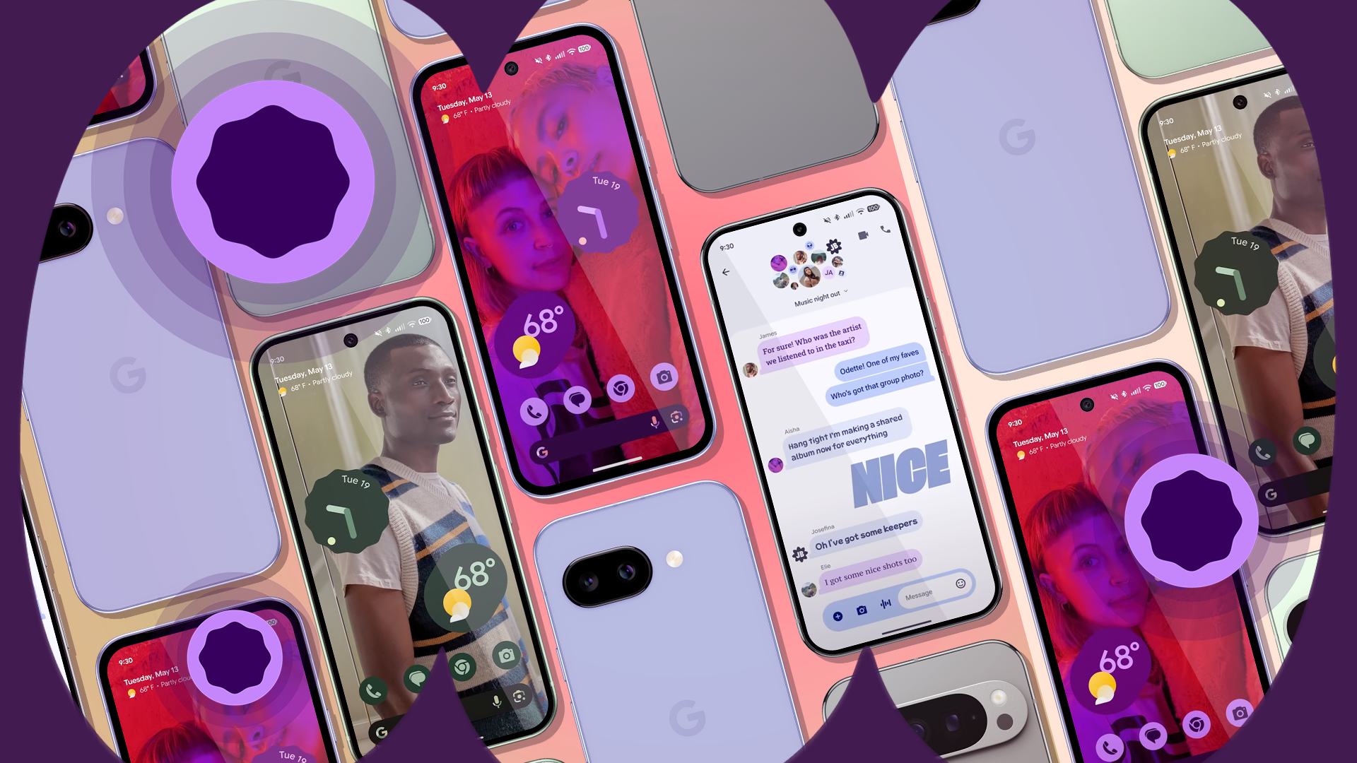
One of the most frustrating parts of the Pixel Launcher and one of the most common user complaints is its use of permanent UI elements. I’m talking about the At a Glance widget at the top and the Google Search bar at the bottom.
Neither can be moved nor removed, which is a waste of space from a user’s perspective. The At a Glance widget shows useful information like weather or calendar events, but it doesn’t disappear even if you turn off all its features.
The search bar is the same story. It’s locked in at the bottom, with no hiding or repositioning option. These two elements take up valuable screen space and feel more like forced ads for Google.
This is intentional. Google chose to prioritize its services over user control. That says a lot. The Pixel Launcher falls short for anyone who values a clean or fully customizable home screen.
The contrast with a launcher like Nova is night and day. Nova is built around user control. It gives you a blank home screen and lets you decide how everything looks and works.
Every element can be moved, replaced, or deleted. Users’ willingness to rebuild the Pixel experience using third-party launchers — without the locked widgets — says much about what they value.
Basic organization tools are still missing

The Pixel Launcher’s rigid layout options make everyday organization harder than necessary. The maximum option is 5×5. On a large phone like the Pixel 8 Pro, this leaves gaps between icons and wastes screen space.
Users have been asking for years, even on Google’s own Issue Tracker, for more flexible options like a 5×6 grid. On top of that, you can’t place icons or widgets between grid lines. You also can’t overlap or stack widgets.
These features are now available on other launchers like Samsung’s. The same lack of flexibility applies to the app drawer. It’s a basic vertical list with no folder support and no tabs to separate apps into categories. It’s a mess for users with many apps.
Plus, the suggestions row at the top, which can’t be turned off, is another example of Google making layout decisions on your behalf, whether you want them or not. There’s also no way to hide apps from the app drawer.
The only built-in option is Private Space, which requires creating a locked secondary profile. It’s a bulky solution to a simple problem.
A third-party launcher like Nova makes the difference immediately clear. Nova gives detailed control over layout and organization.
You can set grid sizes up to 12×12, place icons and widgets between grid lines, and overlap widgets to build more complex layouts.
The app drawer is fully customizable as well. You can group apps into folders, add tabs for categories, and choose between vertical or horizontal scrolling. It gives you full control, something the Pixel Launcher doesn’t.
Long-time Android features are still unsupported
The final failure category is the most insulting to long-time Android users. The Pixel Launcher doesn’t let you use third-party icon packs.
Instead, Google offers Themed Icons, which only work if app developers support them. Many don’t, resulting in a messy home screen with a mix of themed and default icons.
Gestures are just as limited. You can swipe down for notifications and swipe up for the app drawer, and that’s it. There’s no option to double-tap to lock the screen, no two-finger gestures, no custom actions.
And finally, there’s no built-in way to back up or restore your home screen layout. If you switch phones or reset your device, your setup is gone.
This isn’t a case of asking for niche, power-user features. This is the baseline. Almost every major third-party launcher supports the features the Pixel Launcher lacks.
Samsung proves customization and simplicity can coexist
Some defend the Pixel Launcher by saying stock Android is meant to be simple, as if wanting basic customization means you should look elsewhere.
That argument doesn’t hold up considering that other manufacturers offer more flexible experiences.
Take Samsung’s One UI Home. It used to be criticized for being bloated and slow under TouchWiz, but today it’s a stable, mature interface. Even without add-ons, it gives users more options than the Pixel Launcher.
The difference is hard to ignore with Samsung’s Good Lock app suite. Good Lock includes modules like Home Up, which lets you change the app grid, add folders in the app drawer, switch between horizontal and vertical scrolling, and even redesign the recent apps screen.
You can also tweak the share menu, lock screen, and notification panel.
Google continues to limit users in the name of minimalism, while Samsung shows that simplicity doesn’t have to mean missing features.
You can fix the Pixel Launcher’s flaws in minutes
The Pixel Launcher isn’t bad from a technical standpoint, but falls short in ways that matter to many users. Thankfully, Android doesn’t force you to stick with it.
One of the platform’s biggest perks is that you can change your launcher entirely. If you find the defaults too limiting, don’t settle.
Try something different. These launchers are our favorites. Try Nova if you want full control over every detail. Go with Niagara for a clean, minimalist setup. Prefer smart shortcuts and quick gestures? Action Launcher might be the right fit.
Each offers a different take, but all give you the freedom the Pixel Launcher lacks.