Summary
- Google App UI is being refined by moving key tools like add to collection and share buttons to a new bottom bar for a less-cluttered look.
- The shift to a bottom bar makes frequently used actions like sharing more accessible, especially when you’re one-handing your device.
- The new UI is currently in beta (version 16.1.41) and applies to webpages opened via search and Discover, but not those accessed through Google Lens or Circle to Search. A wider release is expected soon.
The Google App for Android is a lot more than just a simple search bar. It allows seamless access to tools like Google Lens and voice search, alongside being the home for your Discover feed and powering the Google Assistant.
The Google App experience closely mimics Chrome, at least when it comes to browsing webpages. However, that could soon change.
The app recently gained a dedicated notifications tab in its bottom bar, complete with distinct ‘New For You,’ ‘Today,’ and ‘Earlier’ sections. Now, Google seems to be further refining the app’s UI — this time, by moving some things around.
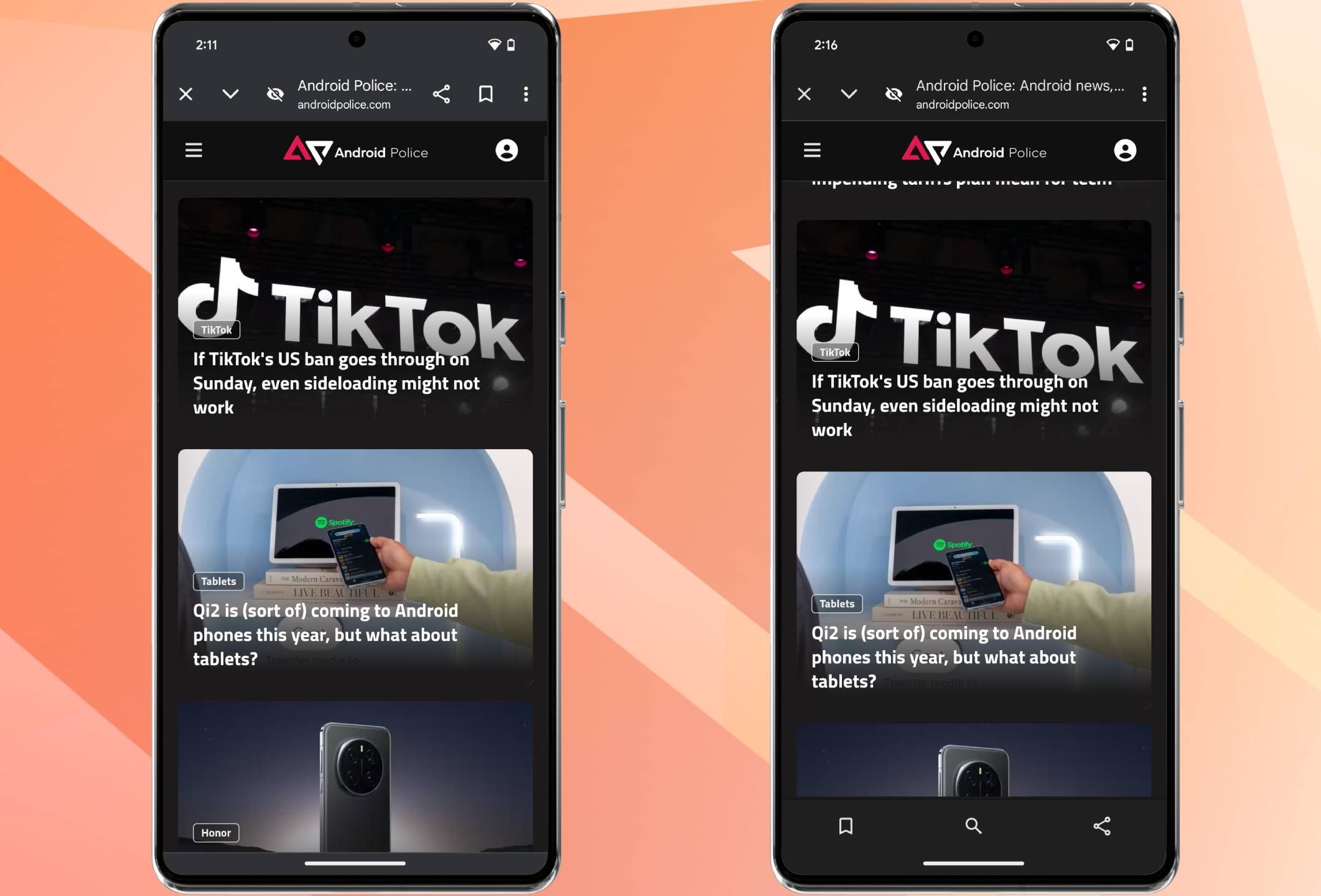
First highlighted by 9to5Google, the Google app is tweaking the Chrome Custom Tabs it uses to display search results and Discover articles. In stable right now, the Custom Tabs feature, for the lack of a better word, a congested layout. It crams buttons for several tools, including buttons for closing and minimizing tabs, site information, page name and domain, share, add to collection, and more, in the app’s top-aligned toolbar, as seen in the (left) screenshot below.
In the app’s latest beta, however, Google seems to be testing a new bottom-aligned bar, with some key tools migrated over to it. Note: this isn’t the Google App’s bottom bar. Instead, it is a new bottom bar for the Chrome Custom Tab that the app uses to display webpages.
A cleaner look for the app
As seen in the screenshot above, Google app version 16.1.41 beta (right) features a prominent bottom bar with the add to collection, search, and share buttons, freeing up a lot of space on the app’s top-aligned toolbar. Not only does this give the Chrome Custom Tab a less-cluttered look, it also makes accessing commonly used tools like the share button easier to access, especially when using the device one-handed. Additionally, the bottom bar isn’t persistent — it goes away as soon as you start scrolling through a webpage.
The new UI is visible across webpages opened via the app’s search bar and Discover articles. Notably though, pages opened via Circle to Search or Google Lens still surface the old UI.
If you want immediate access to the new UI, sideloading Google app version 16.1.41 beta is your best option. Alternatively, the tweak appears to be ready for a wider rollout, so stable channel users can expect the update shortly.


