

Google took a significant step in updating its iconic ‘G’ logo earlier this year, albeit unofficially, introducing a gradient to the iconic four-color logo. The updated logo was first spotted on the Google app for iOS, with the Android version following suit shortly after.
It was then spotted on the google.com favicon the same month, suggesting that a broader redesign was on the cards. Well, that day has finally arrived, with Google announcing the company-wide adoption of this new logo in a blog post today.
![]()
Credit: Google
This updated logo “represents all of Google — both our brand and the company — and visually reflects our evolution in the AI era,” the search juggernaut said. Although it’s a minor visual change compared to the solid block of four colors distributed across the ‘G’ logo, this is the first logo redesign/update by Google since September 2015.
Not as significant as the 2015 redesign, but we’ll take it
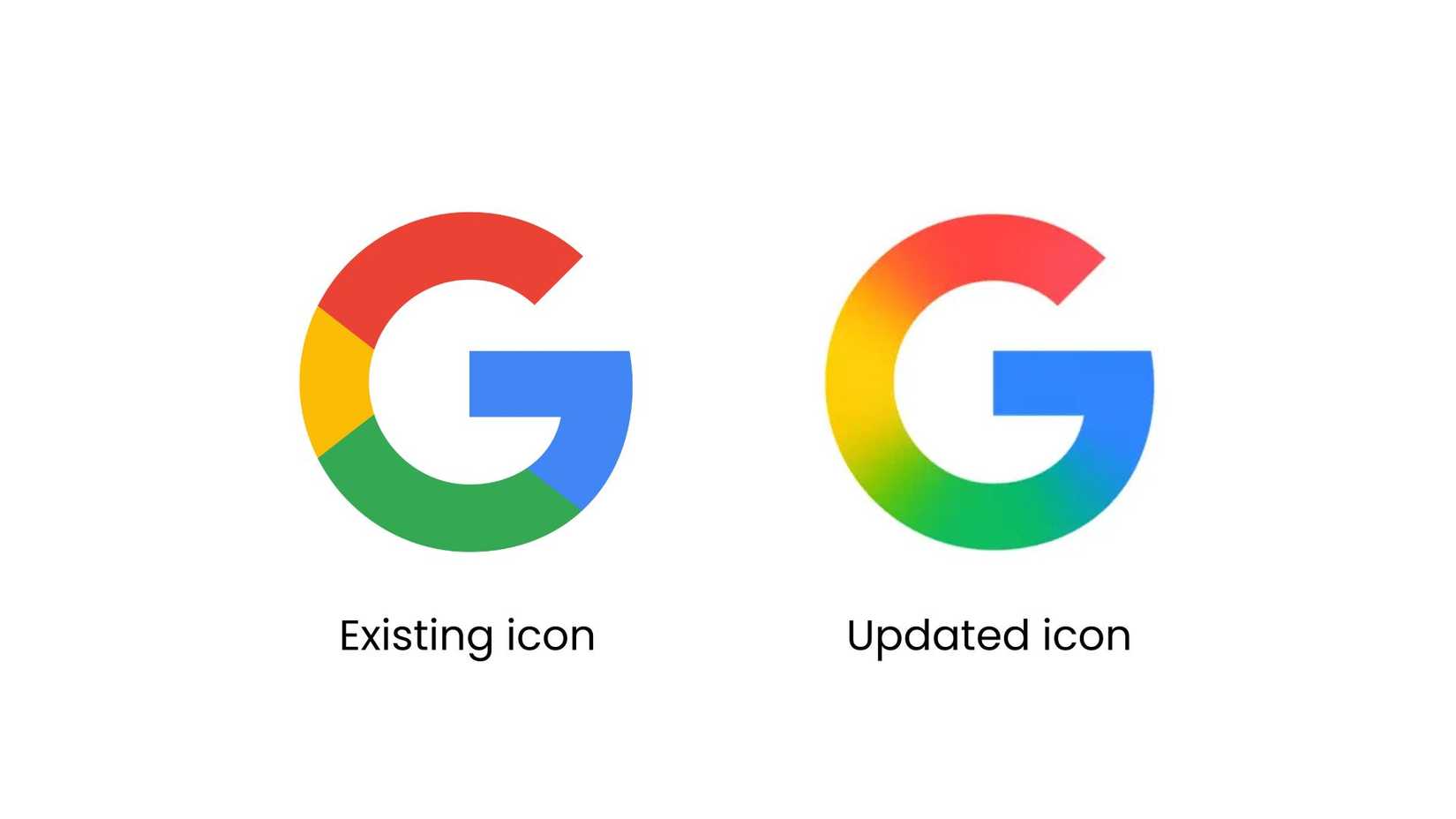
One might argue that the 2015 redesign was a bigger upgrade, as Google also released a video at the time detailing the evolution of the company and its products since inception. By contrast, this current logo refresh has largely gone unnoticed, primarily due to the similarities with the logo that it will now replace.
However, the revised logo design will appear if you look closely at certain elements of your smartphone. For instance, the Google Search bar on the Pixel Launcher’s home screen has featured this gradient ‘G’ logo for a while now, as has the Google Search home screen widget.
![]()
Credit: Google
The evolution of the Google logo until 2015
Google notes that the update also made its way to the Gemini “spark” in June, first on the Gemini app’s splash screen, and later in other elements of the app. However, the official announcement only happened today.
Although we’ve been aware of this redesign for quite a few months now, Google says it will “continue” to bring this updated logo across its other products and services.
What are your thoughts on this design refresh?