

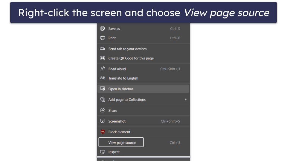
While Android offers plenty of note-taking apps, Google Keep remains a consistent favorite thanks to its simple interface, cloud syncing, and cross-device accessibility across smartphones and laptops. At one point, though, it seemed like Google had abandoned the app — updates were scarce, and its future looked uncertain.
But that changed as Google began rolling out updates for the Keep app on Android earlier this year, including a Material 3 Expressive redesign for the Wear OS version. Now, it appears the same visual refresh is finally arriving on the smartphone version of Keep.
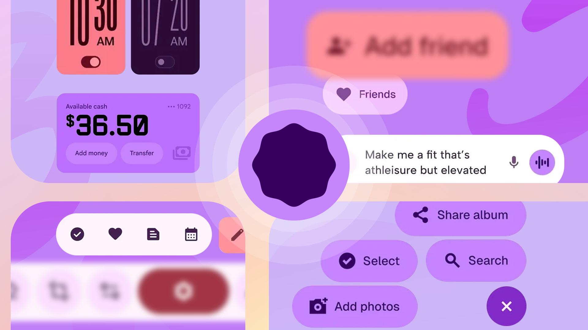
First spotted by users on Telegram (via Android Authority), Google seems to be rolling out a new update (version 5.25.252.00.90) for the Keep app on Android with Material 3 Expressive design elements. The redesign isn’t as radical as the Gmail makeover we saw last month, but Material 3 Expressive UI changes can be seen throughout.
Your Google Keep notes are about to get a fresh coat of paint
The search bar no longer houses the account switcher or the three-line menu. Both have been given their own space in the top bar, and the text for the search bar has been updated to “Search Keep.” Other Material 3 design elements are visible on the note-taking screen, where buttons now feature rounded corners and a contrasting colored background.
As with other Material 3 apps, Keep now supports Dynamic Theming, extracting colors from your wallpaper and applying them to the app. The top toolbar icons are also larger with the same rounded and colored background styling.
The new UI appears to be rolling out with the latest Play Store update, though it seems to be a server-side change. My Pixel 9 Pro, running the same version and the latest Android 16 QPR1 Beta 2.1, doesn’t have the new UI. However, in the typical Google fashion, the company could be rolling it out gradually.