It’s been roughly two months since Google began rolling out a revamped ‘bouncy’ look for the Gemini overlay on Android, and it looks like the tech giant’s design ambitions aren’t halting there.
The AI assistant, which will completely replace Google Assistant by the end of the year, is clearly at the center of the entire Android experience, at least when you look at it from Google’s view. That’s likely why the tech giant finds it important to keep the tool’s appearance fresh, even when some of us are still getting used to the previous overhauls.
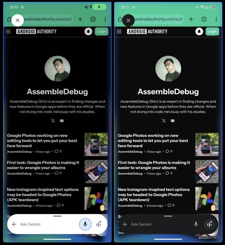
The new overlay was spotted within the Google app’s version 16.41.34 build by the folks over at Android Authority, and while it doesn’t significantly change how the overlay appears on the screen (it still bounces up), it does change the surrounding color schemes.
For reference, when you currently pull up the Gemini overlay, it highlights Google’s primary colors circling around the prompt box. With what Google seems to be testing, the flagship colors might be going away, while the circling animation might encompass a bigger portion of the screen.
Ditching Google Assistant’s color scheme
The new animation in testing, as seen in the short video above, retains the prompt box’s bouncy entry into the screen, paired with Gemini’s classic blue/purple hue circling the entire phone screen (not just the overlay).
I personally find the in-testing UI to be visually less appealing than the current implementation. However, I also understand why Google would want to ditch the classic colors, as they are tied to the Google Assistant identity that Gemini is actively trying to replace.
For what it’s worth, the development has only been found in code. Google hasn’t officially said anything about the potential change just yet. Whether the edge-to-edge animation rolls out widely, or whether it gets shelved remains to be seen.


