Summary
- Google Discover is testing a new full-width layout for articles, replacing the familiar card-based design with margins.
- This potential redesign stretches article images across the entire screen, eliminating the curved-edge cards and visual breaks, which some find less aesthetically pleasing and potentially impacting image context.
- While Google recently implemented other design tweaks to Discover that were well-received, this latest change is rolling out widely but inconsistently, sparking debate about its visual appeal and alignment with Material 3 principles.
The Discover Feed is often the first place Android users head to every morning, right after they’ve gone through their pending notifications. The starting point, conveniently located on the panel to the left of your launcher’s home screen (also available via the Google app), not only gives you access to finance, sports, and weather-related updates, it also presents a curated list of articles tailored based on your Google account data (Search history, browsing history, app activity, and more).
Soon after Google started rolling out new overflow menus for the Discover Feed, paired with sleeker article cards with no horizontal dividers, the tech giant now seems to be rolling out yet another Discover UI tweak — and this one isn’t really that visually appealing.
We were happy with the recent tweaks. Getting rid of the horizontal article separator, fitting the article title in a co-joined box with the header image, and moving share and like icons into a dedicated overflow menu were all great changes that gave the Discover Feed a modern look.
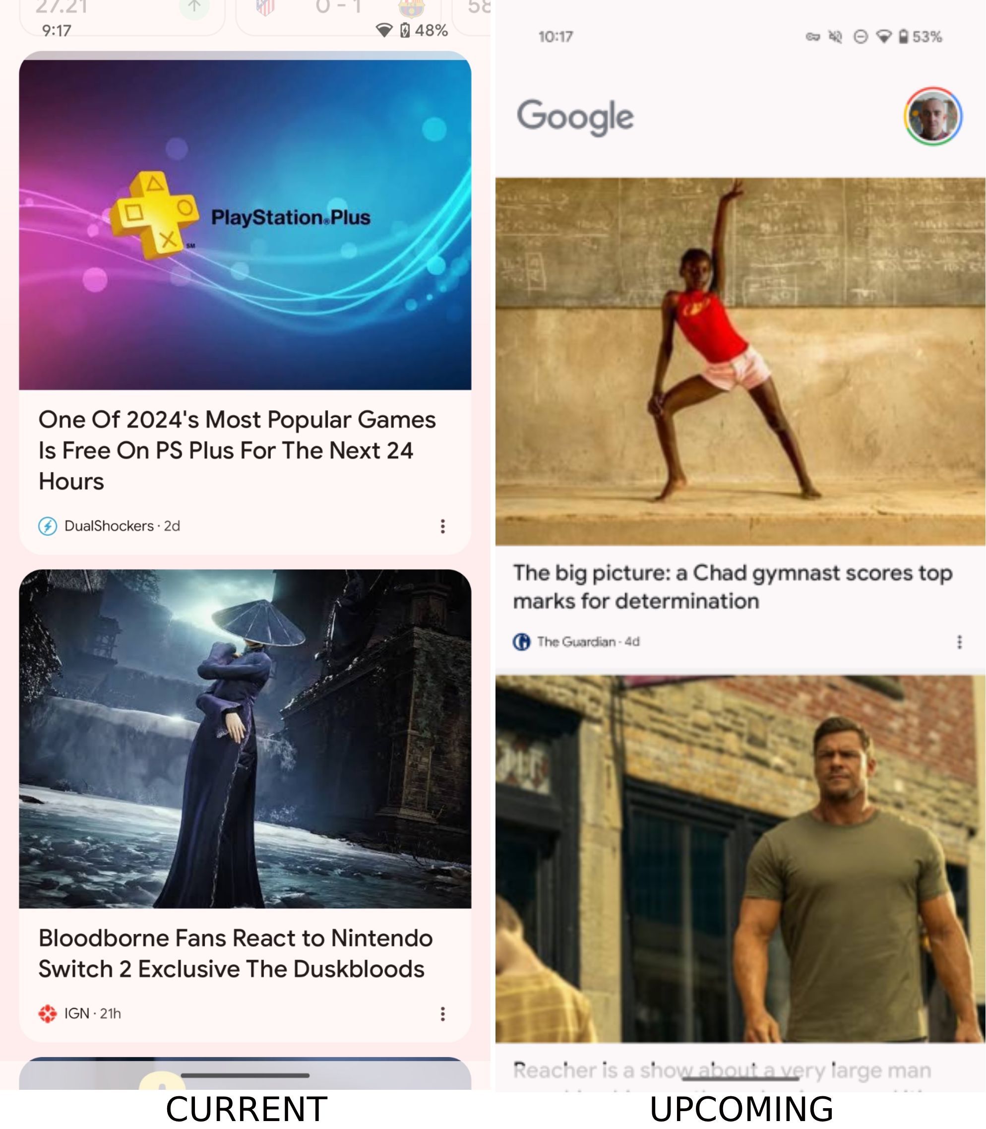
Now, however, Google seems to be testing — and even rolling out — a significant visual departure, one that ditches the curved-edge card-based layout in favor of a full-width one, as spotted by the folks over at 9to5Google.
The full-width takeover
The new layout, seen in the second screenshot above, stretches featured articles’ images to take up the full-width of the display. First believed to be a bug, the change has begun making its way to a “vast array of Android devices,” which might suggest that this is indeed an intended change. For what it’s worth, I’m running the latest Google app version 16.12.40, and the change hasn’t arrived for me yet (and I hope it stays that way).
By ditching the original layout for the featured image, the new design simultaneously also gets rid of the curved card for the article title, with seemingly no visual break between the title and the next featured article’s header image. The design clearly looks out of place and not something we’d expect from a company that is rapidly integrating cleaner Material 3 design changes in almost all of its other apps and services.
Is the new edge-to-edge Discovered Feed layout available on your device? Do you prefer it over the previous iteration? Let us know in the comments below!


