
Summary
- Android 16 Beta 3 hints at a revamped Settings menu, placing sub-menu items into Material You-themed cards for clearer visual separation and improved navigation, extending the Android 15 Settings home screen design.
- The redesign introduces arrow icons to indicate sub-pages and adds an ‘X’ to disabled toggles, providing clear visual cues for improved user understanding.
- Sub-menu headers are now positioned at the top of the screen, maximizing screen real estate and allowing for more settings to be visible at a glance, a significant improvement over Android 15’s less efficient header placement.
Google has made good on its word. The tech giant, back in November 2024, said that Android 16 would reach Platform Stability in March 2025. Beta 1 came out in January, followed by Beta 2 in February. Like clockwork, Android 16 Beta 3 came out today, finally bringing the upcoming operating system into its Platform Stability phase.
It’s only been a few hours since the drop, and we’re sure there’s going to be a lot to discover with this one, complete with hints for what users can expect with stable Android 16 and/or even with Android 17.
From what has already been spotted, Beta 3 brings a new text outline accessibility feature for users with low vision, in addition to support for Auracast, which should enable multiple compatible earbuds and hearing aids to simultaneously receive audio from a single source.
Now, as highlighted by credible Android analyst Mishaal Rahman in a report for Android Authority, the latest beta is also hiding a revamped Settings menu, one that will bring Android 15’s redesigned Settings UI to all attached sub-menus.
Related
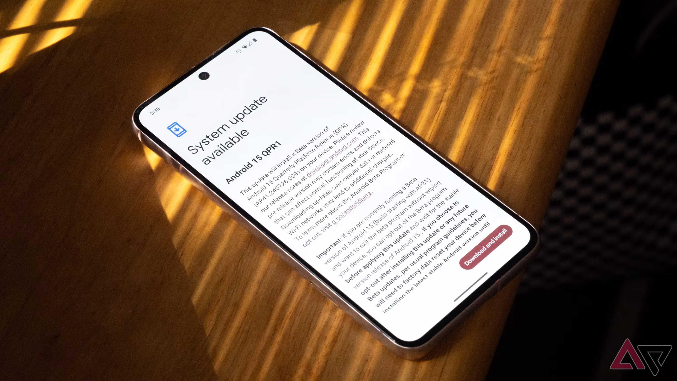
Android 15 QPR1 Beta 2 is here with a redesigned Settings menu and new keyboard switcher
The December Pixel Feature Drop will be a big one
According to Rahman, the new design, which isn’t active for all by the way, is a more “expressive” alternative to what we have now — one that places sub-menu items into Material You-themed boxes with curved edges and clear separation. This provides clearer distinctions between sub-menu options, essentially mimicking the Settings home screen.
The redesign makes it intuitive to figure out whether an item has an additional sub-page, which only surfaces when you tap the setting item for it. Google has done this by introducing arrows, as seen in the ‘Connected devices’ and ‘App notifications’ screenshots below.
You’ll see more visual cues if this redesign comes to life
Additionally, you also might have spotted that toggles that have been disabled now not only surface in their usual grayed-out look, but also feature an ‘X’ to denote their inactive state. The grayed-out look is normally enough to denote that the toggle is disabled, but adding a clear ‘X’ marking on it should add valuable secondary confirmation, especially for those with color vision deficiency.
Lastly, each sub-menu now has prominent headers that are placed at the very top — right next to the back arrow button. For reference, with Android 15, Google wasted a lot of screen real estate by positioning the page’s header roughly a quarter of the way down from the top of the display. By positioning the header right at the top, complete with a smaller overall font, the same page is now able to highlight more items at first glance.
Seeing the redesigned menus in stable Android 16 would be a welcome improvement, though it’s unlikely that this lands with the final release in Q2. Google still likely needs time to refine the UI, and the fact that it isn’t enabled by default with Android 16 Beta 3 suggests that this could very well be reserved for a future quarterly update.