

Google is determined to make even the ‘boring’ parts of Android look good. We often overlook some parts of native Google apps because we don’t use them too often, but for the few moments that we do, Google wants the experience to feel polished.
One of the native app features that most users don’t use too often is the Contacts app‘s contact sharing, which is now receiving a fresh coat of paint to bring it in line with the rest of the app.
The last time the Contacts app got a makeover was back in August 2025.
![]()
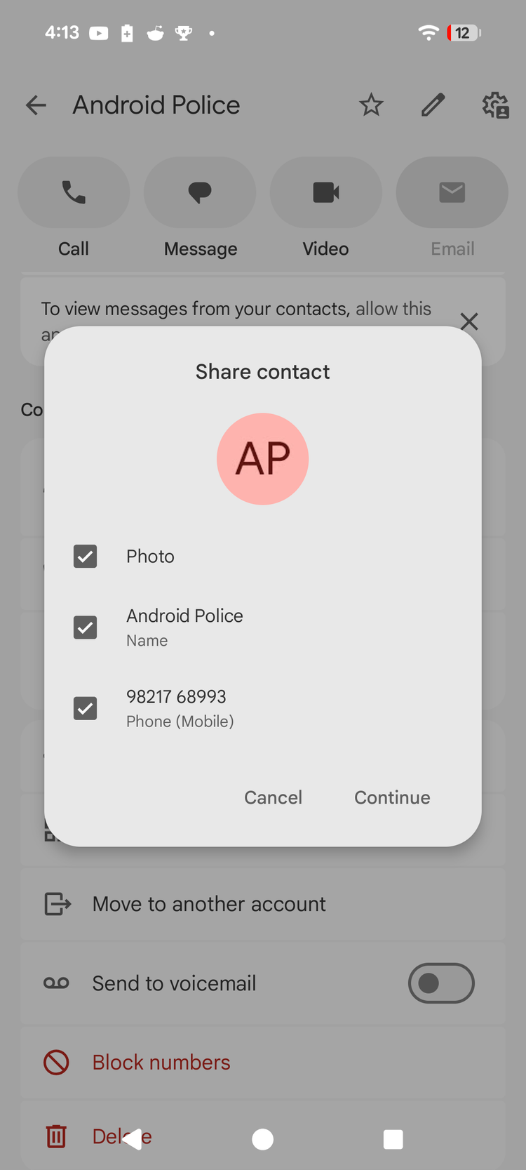
Here’s what the Contacts app’s sharing UI looks like right now:
Here’s what the Contacts app’s sharing UI is being updated to:
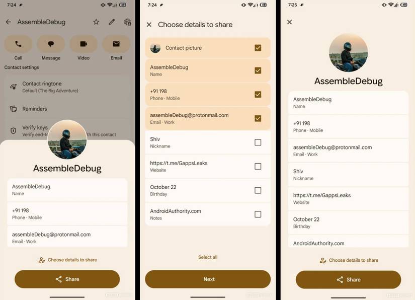
Credit: Android Authority
The screenshot above highlights what contact sharing looks like with version 4.71.82.856460119 of the Contacts app, as highlighted by the folks over at Android Authority. It’s worth noting that the new UI isn’t available to me on my Pixel 8, despite updating to the new app build.
Regardless, the images shared clearly highlight what the implementation will look like. When you go to a contact screen and tap share, a new sheet will now slide up from the bottom. It will highlight said contact’s basic information, including their name, phone number, and email (if added).
You can choose to share these details, or tap the new ‘Choose details to share’ button to tweak selections. This highlights other information tied to that contact, including their nickname, website, birthday, and attached notes. You can then tick additional details to share, as seen in the second screenshot above.
Is the change live for you with the latest Contacts build? Let us know in the comments below!