

It shouldn’t come as a complete surprise anymore, but it’s always a welcome change when a new UI update hits one of Google’s popular apps. Over the past few months, we’ve seen Material 3 Expressive take over the look and feel of Google’s products and services, providing a much-needed visual boost.
Many are excited to say the least, especially when it comes to the new customizations available on Android 16. But today, Gmail is getting a new update that brings more visual changes to the app. This isn’t the first Material 3 Expressive update for the app, so you’ll want to think of these latest changes as just some minor refinements that are also getting a wider rollout.
Refinements, refinements, refinements
Source: 9to5Google
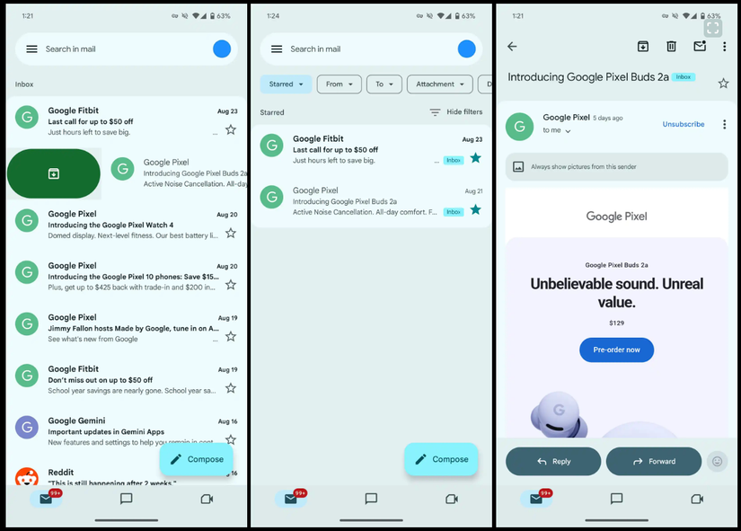
The news comes from 9to5Google, and if you’ve been waiting for changes to the Gmail app on Android, now’s going to be the time to check them out. When it comes to things you should look out for, well, Google’s utilizing an approach that makes it easier to understand each individual section of an app to make interacting with parts more seamless.
While the changes might not be evident at first glance, you can get a better idea of this when you pop into an email, and the subject, sender, and body of the email have visual borders using colors and shapes. The UI also utilizes new pill-shaped buttons for most interactions, removing the hard lines that used to be present in the app.
9to5Google notes that while there is a possible change coming to the search bar in the app, that isn’t present in this latest release. So you can bet there will be more changes made to this app in the near future. If you’re interested, you can now head to the Play Store to get the latest update. While it’s nothing too interesting, it does get us a step closer to the final product.