

In this post, I’ll explain how to convert time-series signals into spectrograms and scaleograms, which are image representations of those signals that contain both frequency and time information. In a future post, we’ll use the images created here to classify the signals. I’ll explain the intuition and math used to create these images, and I’ll show you the corresponding Python code.
There’s no special pre-requisite to understand this post, other than basic math skills (such as 2D graphs and complex numbers) and basic machine learning concepts (such as training neural networks). If you already understand the FFT (Fast Fourier Transform), that will help. But if you don’t, or if you’ve forgotten the details, I’ll give you a refresher of the aspects that matter in the context of this post.
You can follow along and see the complete code for this project on github.
Dataset
Let’s start by understanding the structure of the dataset we’ll be using. This dataset includes recordings captured by a smartphone’s accelerometer and gyroscope sensors while subjects performed different activities with the smartphone strapped to their waist. People were asked to carry out the following six activities: walking, walking upstairs, walking downstairs, sitting, standing, and laying. While people performed each of these tasks, the researchers recorded the x, y, and z components of the total acceleration, body acceleration, and angular velocity measured by the phone sensors, resulting in nine signals. These signals were then pre-processed by applying noise filters, and sampled in sliding windows of 128 readings with 50% overlap.
Below we can see the nine signals measured by the smartphone’s accelerometer and gyroscope while a subject was standing:
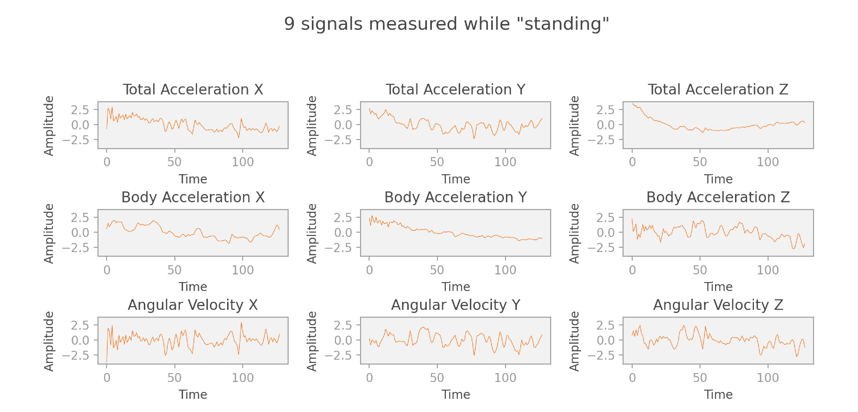
In the end, each data point of our dataset consists of nine sequences of 128 readings each, labeled with an activity such as “standing.”
Signal
Our ultimate goal is to classify each of the input signals according to the corresponding activity. What if we simply input the raw signals to a neural network that is capable of doing multiclass classification? Sounds like the simplest solution to the problem!
It turns out that it’s not so easy. Imagine that we have two signals of people walking at the same pace, but their steps are out of sync. We could simulate this by taking a signal and shifting it a bit forward in time to create another signal. Intuitively, if we look at both graphs, we know that if the first one represents a walk, the second one probably does too. But the neural network doesn’t have that same intuition. When comparing the two graphs point by point, the neural network will detect big differences in each reading. So it won’t be immediately obvious to the network that the signals represent the same activity.
It seems that if we could find a way to ignore the precise timing of signal changes, but preserve the information of the shape of the signal (frequency and amplitude), we could solve this problem. It turns out that there’s already a mathematical solution for this problem: the Fourier transform!
The Fourier transform
A detailed explanation of the Fourier transform would require a whole post or sequence of posts to do it justice. In this section, I’ll focus on the basic information you need to understand spectrograms and scaleograms. If you’re already familiar with the Fourier transform, you can safely skip this section.
As I mentioned in the previous section, each signal in our data source is a function of time. The Fourier transform is a mathematical transform that is able to convert each of those time-based signals into new signals that are a function of frequency. The most widely used implementation, the Fast Fourier Transform (or FFT), is simply a clever algorithm that can calculate a Fourier transform in O(nlog(n)) instead of O(n2) as was the case with earlier algorithms.
Let’s illustrate this concept by considering a simple example in detail. We have two periodic signals:
- Signal 1 has a frequency of 2 Hz, because we can fit two complete oscillations in one second.
- Signal 2 has a frequency of 10 Hz, and about half the amplitude compared to signal 1.
We then define a third signal as the sum of these two signals.
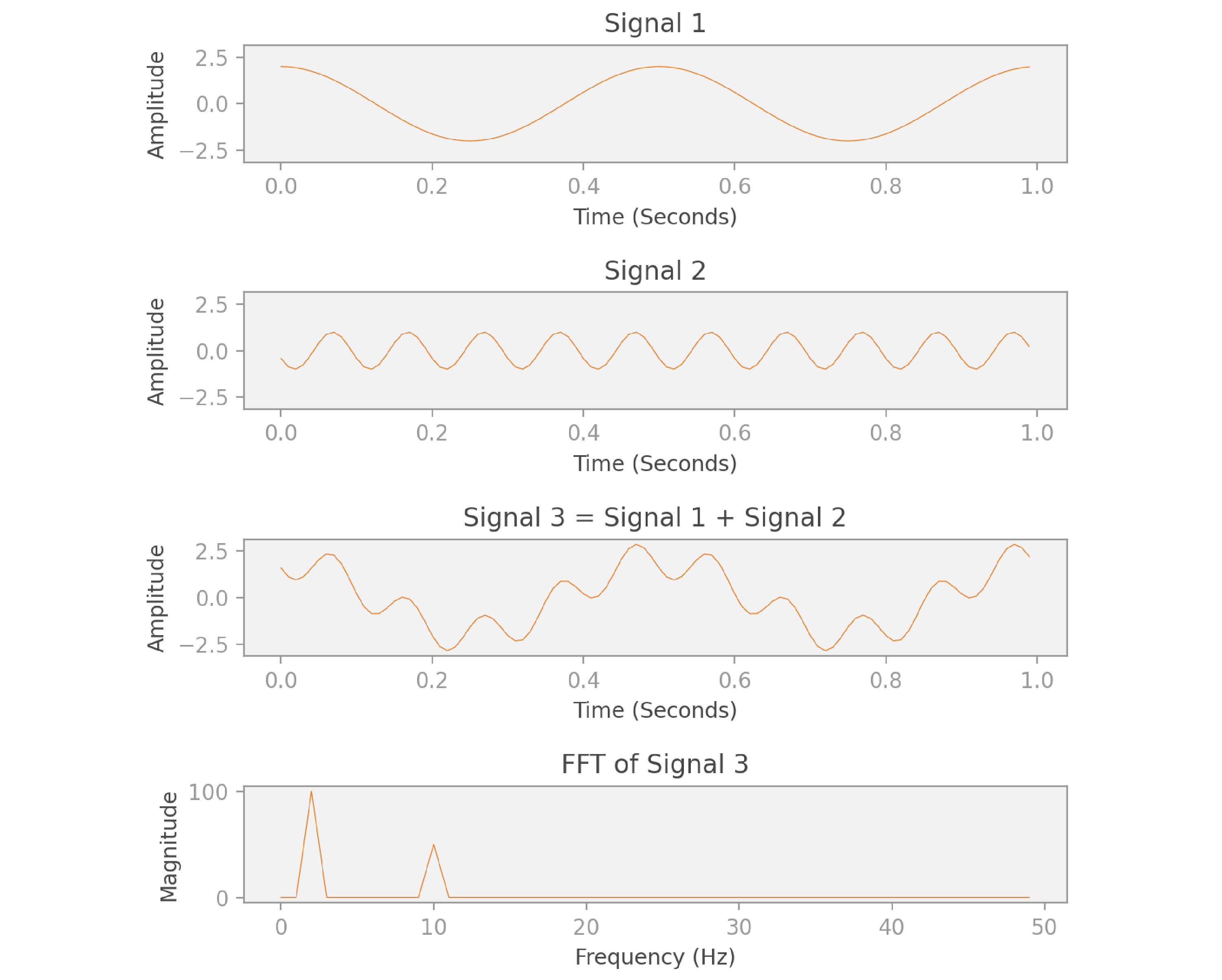
As you can see in the image, the FFT of signal 3 gives us a function of frequency. The shape of this FFT is interesting: it peaks at 2 Hz and at 10 Hz. What the FFT is telling us is that signal 3 can be decomposed into two other signals, one that oscillates with frequency 2 Hz, and another with 10 Hz. We know this to be true, because that’s how we constructed signal 3 to begin with! Notice also that the magnitude of the peak at 10 Hz is half the magnitude of the peak at 2 Hz, which reflects the relative amplitudes of the two original signals.
This is exactly the information we were looking for: a description of the signal in terms of its shape, ignoring time and phase differences. What’s interesting about the Fourier transform is that it can be calculated for (almost) any signal — even if the signal is not periodic, it can be decomposed into a weighted sum of periodic functions (sines and cosines) that closely approximate it!
Now let’s look at the formula for the Fourier transform of function :
![]()
As you can see, the Fourier transform is a function F of angular frequencies w— for each frequency, it produces a single value that aggregates information for the entire domain of the original signal f(t). If you’re interested in understanding this mathematical formula in detail, I highly recommend this video on the topic from “3 Blue 1 Brown.”
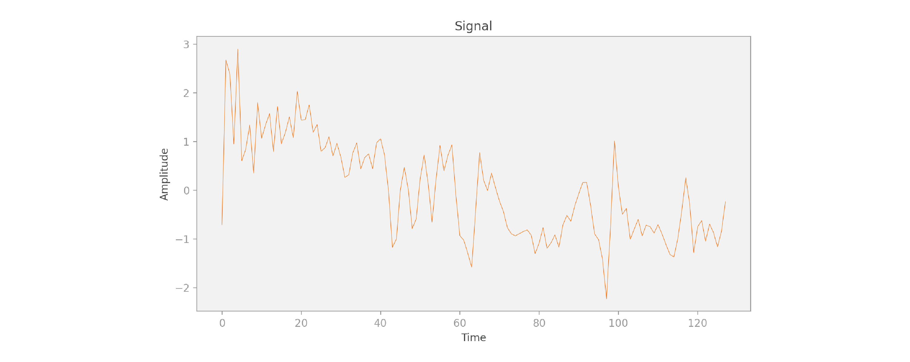
Let’s now consider the first signal of our first data point in this project, the coordinate of the total acceleration while a subject was standing:
And now let’s compute the FFT of the signal:
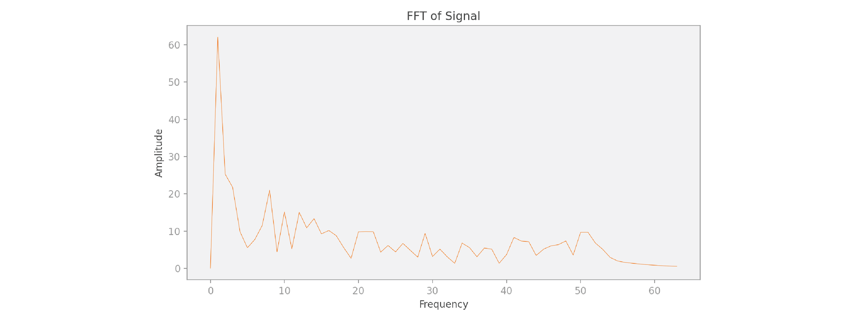
Because the shape of this input signal is so much more complicated than our previous simple example, we need to add up many more periodic signals of different frequencies to properly represent it. But we can still do it, even though the signal is not periodic!
Coming back to the classification problem we’re trying to solve: we could just input the FFT of the signals into a neural network — we’d likely get pretty good results with that approach. But we can do better. With the FFT, we gain frequency information, but we lose all time information. It’s a harsh tradeoff. Maybe there’s a solution that allows us to provide both frequency and time information?
The Gabor transform and spectrograms
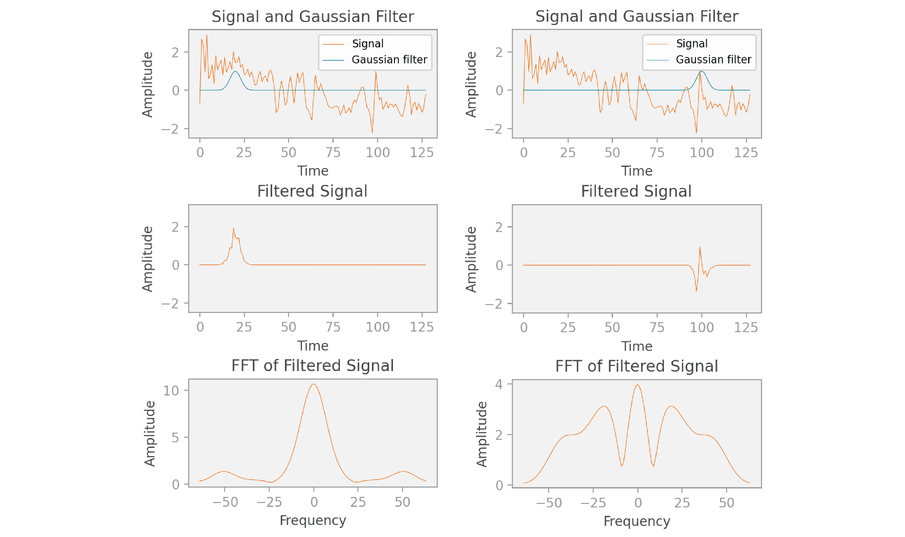
One strategy to retain both frequency and time is to use a Gabor transform, also called a short-time Fourier transform (STFT). The Gabor transform computes the FFT on a moving window of time, and can be visualized using a plot of amplitude as a function of frequency and time, which we call a spectrogram.
When calculating a Gabor transform, we perform the following operations for time t from 0 to n (in our scenario n = 128 ):
- We center a filter function g at time t. Usually, we use a Gaussian function as the filter, as is shown in the image below, but other filters can be used instead.
- We multiply the original signal f and the filter g for all values T, resulting in a filtered signal of the same length as the original signal. This filtered signal keeps the original signal’s information around time t, and ignores the rest of the information.
- Finally, we take the FFT of the filtered signal, which shows the frequencies present during the window of time highlighted by the Gaussian filter.
We demonstrate this idea for times t = 20 and t = 100 in this image:
You may have noticed that the FFT graphs shown here have both positive and negative frequencies and are even (symmetric) functions, while the FFT graph shown in the previous section had only positive frequencies. In reality, the FFT in the previous section looks similar to the FFT shown here, but I chose to display only the positive frequencies to focus on explaining the core concepts. More precisely, the FFT is composed of complex numbers, and if the original signal is real (as in our scenario), then the corresponding FFT is always “conjugate symmetric.” This means that its real part is an even function (mirrored across the y axis), and its imaginary part is an odd function (mirrored across the x axis and then the y axis). In this post, instead of considering the real and imaginary parts separately, we take the magnitude of each complex number returned by the FFT, which also turns out to be an even function. We use the magnitude because we’ll need real values for the step that comes next, where we’ll be visualizing the Gabor transform as a spectrogram image.
Once we’ve placed the Gaussian function g at each time value t and finished the calculation of our Gabor transform, we end up with FFTs, each with 128 values just like the original signal. Therefore, we end up with 128 x 128 individual values. These values can be represented in an image called a spectrogram, as shown below:
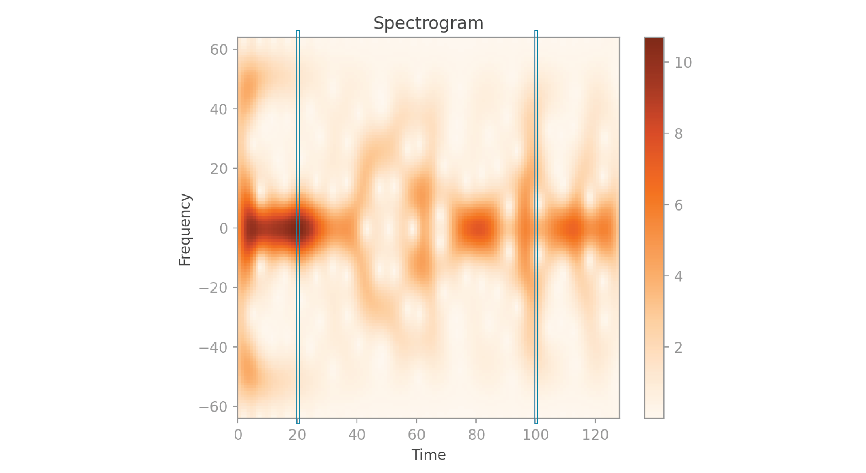
Here’s a good way to visualize how this spectrogram was created: at t = 0, you perform the sequence of calculations explained earlier, and get back the 128 amplitudes calculated by the FFT. Each of these values can be represented as a pixel in the spectrogram, with the brightness of the pixel corresponding to the amplitude. You place this sequence of pixels in the spectrogram’s left-most column, corresponding to time 0. You then move on to t = 1, perform the same calculations, and fill in the pixels in the next column at time 1. And so on, for all 128 times.
Notice that the spectrogram is vertically symmetric. That’s because each column contains the magnitude of the values of an FFT, which we saw earlier is an even function. I’ve highlighted the columns at times 20 and 100, which correspond to the calculations we saw in the earlier graphs. If you look closely, you’ll notice that the frequencies with higher amplitude in the FFT graphs correspond to the darker pixels in the spectrogram.
Let’s now look at the code that I used to create the spectrogram shown above:
activity/src/1_generate_grams.py
import numpy as np

def _create_spectrogram(signal: np.ndarray) -> np.ndarray:
    """Creates spectrogram for signal, and returns it.

    The resulting spectrogram represents time on the x axis, frequency
    on the y axis, and the color shows amplitude.
    """
    n = len(signal)  # 128
    sigma = 3
    time_list = np.arange(n)
    spectrogram = np.zeros((n, n))

    for (i, time) in enumerate(time_list):
        # We isolate the original signal at a particular time by multiplying
        # it with a Gaussian filter centered at that time.
        g = _get_gaussian_filter(time, time_list, sigma)
        ug = signal * g
        # Then we calculate the FFT. Some FFT values may be complex, so we take
        # the absolute value to guarantee that they're all real.
        # The FFT is the same size as the original signal.
        ugt = np.abs(np.fft.fftshift(np.fft.fft(ug)))
        # The result becomes a column in the spectrogram.
        spectrogram[:, i] = ugt

    return spectrogram

def _get_gaussian_filter(b: float, b_list: np.ndarray,
                         sigma: float) -> np.ndarray:
    """Returns the values of a Gaussian filter centered at time value b, for all
    time values in b_list, with standard deviation sigma.
    """
    a = 1 / (2 * sigma**2)
    return np.exp(-a * (b_list - b)**2)
As you can see in the code above, we receive a signal of length n as a parameter, and initialize a spectrogram of size n x n. The time_list represents the time values where we’ll center the Gaussian filter. For each value in time_list, we create a Gaussian filter g centered at that time, with standard deviation sigma. We then multiply signal by g to get the filtered signal. And finally, we take the FFT of the filtered signal and insert the result in a column of the spectrogram.
One thing to note is that the result of the fft function consists of the positive frequencies followed by the negative ones, which is not an intuitive way to visualize this data. Therefore we call the fftshift function, which gives us the negative frequencies followed by the positive frequencies, with zero at the center. Also, since the values in the FFT result are complex, we take their magnitude using np.abs, so that we can use them as pixel values in the spectrogram.
Let’s now look at the 9 spectrograms corresponding to the 9 signals from earlier:
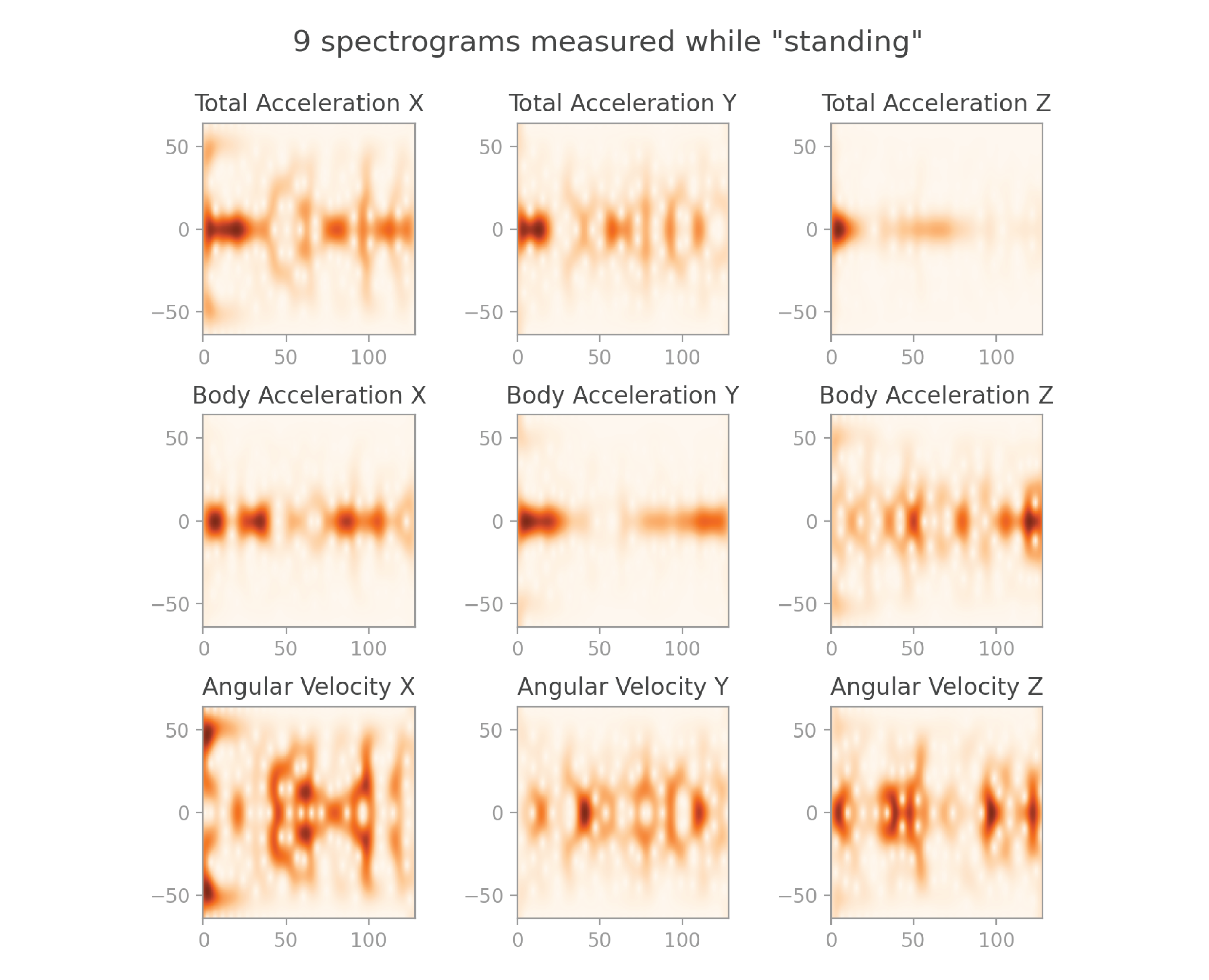
They make pretty images! But also, they pack a lot more useful information than the original signals.
Let’s now take a look at the equation for the Gabor transform:
![]()
This equation may seem complicated at first glance. But now that you understand the intuition of this operation well, let’s use that knowledge to unpack the building blocks of this equation:
- In the first step, we center the Gaussian function g(T) at a particular time t:
 The formula actually includes the complex conjugate of this shifted Gaussian function:
- In our case, we can ignore this because our Gaussian function includes only real values. If that were not the case, we would have to take this into consideration.
- We then multiply the shifted Gaussian by the original signal at each time t:

- And finally, we take the Fourier transform of this expression. Remember that the Fourier transform of a function h(T) is:
 Therefore, the Fourier transform of our expression is:
![]()
Spectrograms are a great way to visualize the frequencies present in the signal over time. However, they have a major drawback: once you choose a value for sigma, the Gaussian filter will be most effective at detecting a certain frequency, and worse at detecting much lower frequencies and at localizing much higher frequencies.
Imagine that one of the frequencies that make up your original signal is a very wide wave (which represents a very low frequency). If the Gaussian filter is much narrower than that wave, it won’t be able to filter and detect that low frequency for any of the time windows. One way to mitigate this problem is to use a wide Gaussian filter. However, with a wide filter, we retain less time information because our sliding window is much larger. So it’s a tradeoff: if we’re concerned about retaining low frequencies we choose a wide filter; if we’re concerned about retaining time information we choose a narrow filter.
Wouldn’t it be great if we had a solution that didn’t require us to make such a tradeoff?
The wavelet transform and scaleograms
That’s where wavelets come in: they capture frequencies over time just like Gabor transforms, but they don’t require us to compromise on how precise our time information is, or the range of frequencies they detect. In the same way that a Gabor transform can be visualized by a spectrogram, a wavelet transform can be visualized by a scaleogram.
The mechanism used in a wavelet transform is a bit different from a Gabor transform. In a Gabor transform, we multiply the original signal with a Gaussian filter that is translated in time. In a wavelet transform, we multiply the original signal with a wavelet — except, the wavelet is not only translated in time, but also scaled in width! Small-scale wavelets allow us to capture high frequencies within precise time intervals, and large-scale wavelets allow us to capture low frequencies across longer time intervals.
When calculating a wavelet transform, we perform the following operations for each time t from 0 to n, and for n different scale values s (where n = 128 in our case):
- We scale the wavelet V according to the parameter s and center it at time t. The wavelet displayed in the graphs below is a “Mexican hat wavelet,” but there are many other commonly used wavelets we could have chosen instead.
- We multiply the wavelet and signal together, to get a filtered signal.
- We compute the integral (or the sum, in the discrete case) of the filtered signal. So, the final result is a scalar.
The figure below illustrates this idea. The graphs in the top row illustrate two translations of a narrow wavelet, and the graphs in the bottom row illustrate two translations of a wider wavelet.
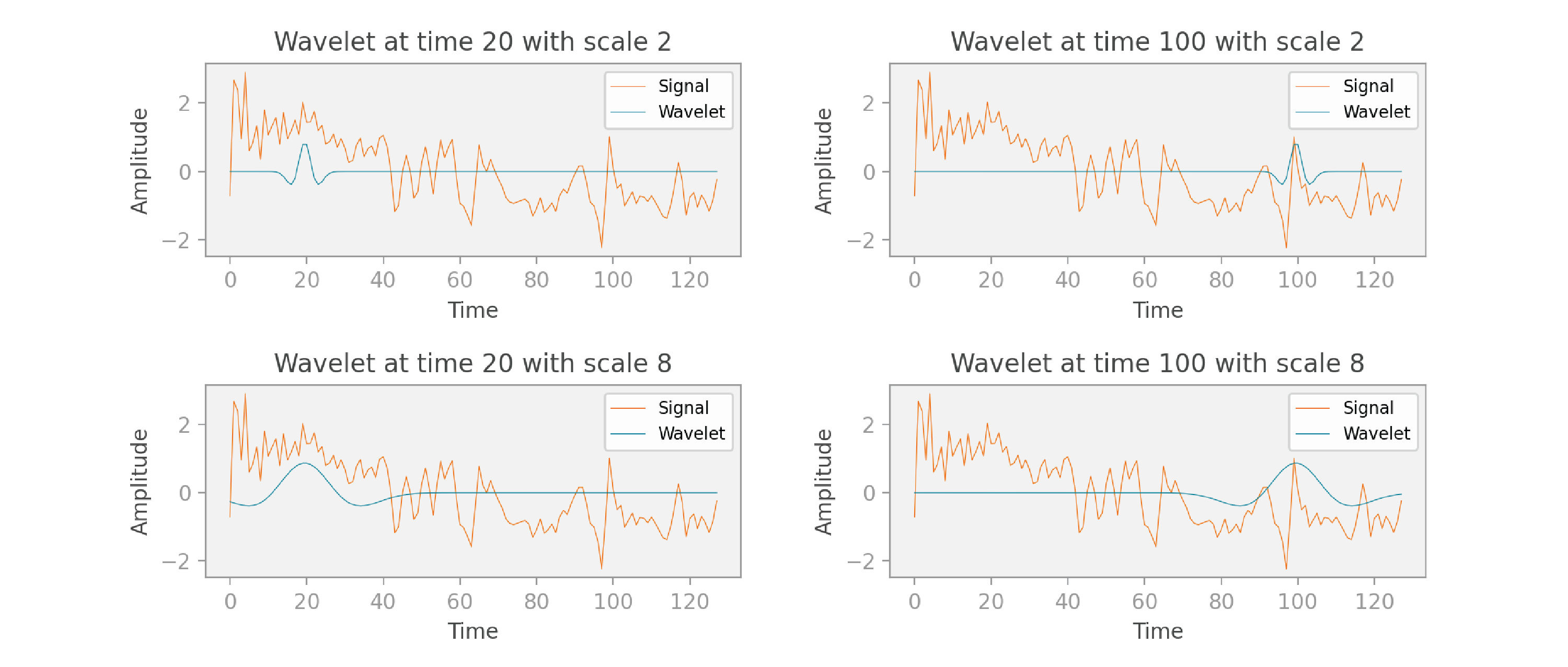
Let’s now think about the dimensions of the scaleogram we’ll create to visualize these computations. As I mentioned, the final result of a single pass of the computations is a scalar. We perform those computations for n translations and n scales. Therefore, the scaleogram has n x n values, and it can be represented as a 2D image. In the scaleogram below, I’ve outlined four pixels — these correspond to the four graphs in the previous figure. You can see that these are the values obtained at times 20 and 100, and at scales 2 and 8.
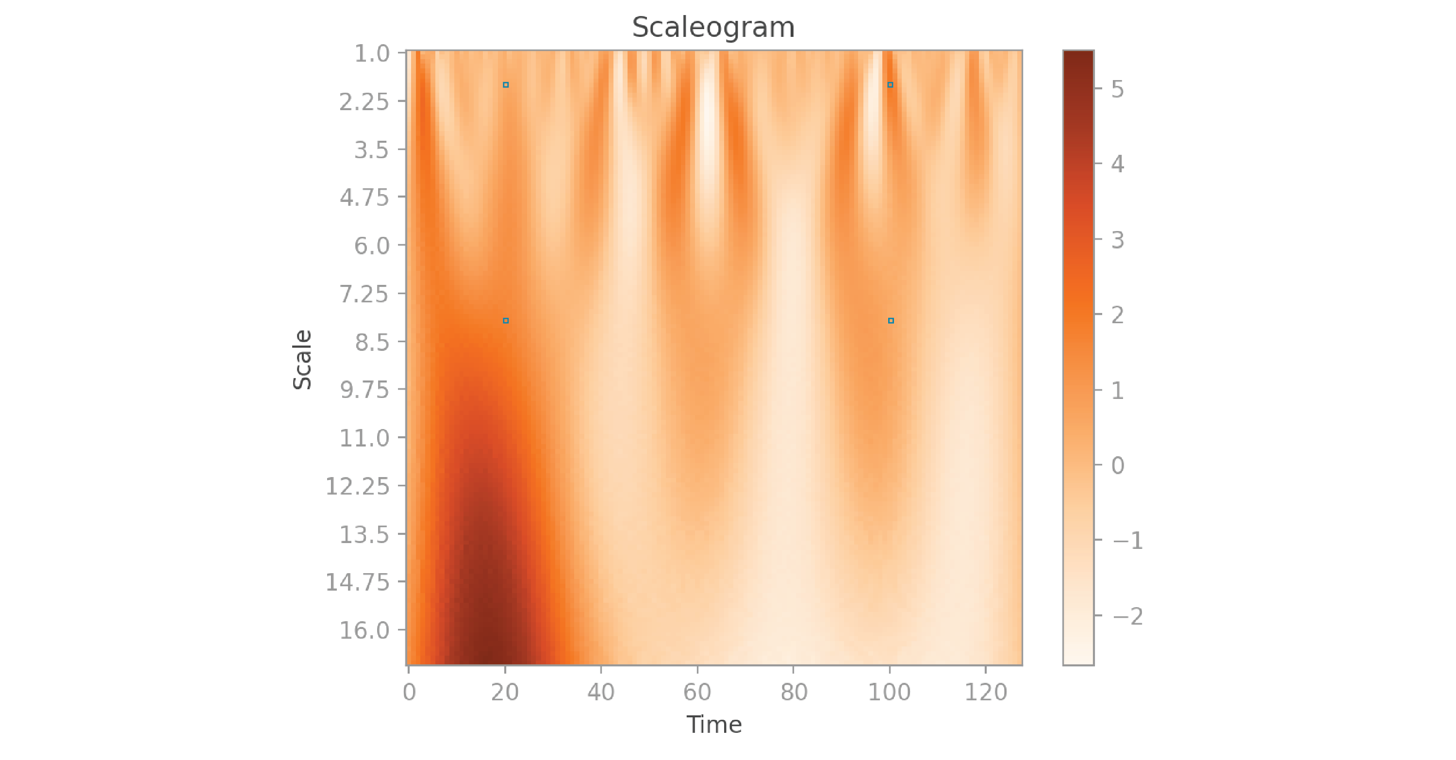
In a spectrogram, the horizontal axis corresponds to time, the vertical axis corresponds to frequency, and the color represents the amplitude. A scaleogram is similar, but the vertical axis corresponds to the wavelet’s scale. You can think of the scale parameter of a scaleogram as playing a similar role to the frequency in a spectrogram, but with an inverse relationship: the higher the scale, the lower the frequency. However, because wavelets have widths that vary with scale (unlike the fixed-width Gaussian in the spectrogram formulation), scaleograms are better able to detect low frequencies and better able to localize high frequencies than spectrograms.
Writing the code to create a scaleogram from scratch would be a little more complicated than creating a spectrogram. In this project, I’ll use the popular pywavelets package, which is imported as pywt in the code below:
activity/src/1_generate_grams.py
import pywt
import numpy as np

def _create_scaleogram(signal: np.ndarray) -> np.ndarray:
    """Creates scaleogram for signal, and returns it.

    The resulting scaleogram represents scale in the first dimension, time in
    the second dimension, and the color shows amplitude.
    """
    n = len(signal)  # 128

    # In the PyWavelets implementation, scale 1 corresponds to a wavelet with
    # domain [-8, 8], which means that it covers 17 samples (upper - lower + 1).
    # Scale s corresponds to a wavelet with s*17 samples.
    # The scales in scale_list range from 1 to 16.75. The widest wavelet is
    # 17*16.75 = 284.75 wide, which is just over double the size of the signal.
    scale_list = np.arange(start=0, stop=n) / 8 + 1  # 128
    wavelet = "mexh"
    scaleogram = pywt.cwt(signal, scale_list, wavelet)[0]
    return scaleogram
As you can see, the cwt function of the pywavelets package performs a wavelet transform to produce a scaleogram. We need to give it three pieces of information: the original signal, a list of scale values, and the shape of the wavelet we want to use. The original signal comes straight from our dataset, and is passed here as a parameter. I specify “mexh” as the type of wavelet because I’m using a Mexican hat wavelet, as I mentioned before. I did a few calculations to come up with a good list of scales. In the pywavelets package, scale 1 gives us a wavelet with 17 sample values. In this scenario, the scales I’m using range from 1 to 16.75, so the wavelets have a minimum width of 1 x 17 = 17 and a maximum width of 16.75 x 17 = 284.75. Our signal contains 128 values, therefore the widest wavelet is more than wide enough to cover our entire signal. There’s no rule that determines the narrowest and widest wavelets you should pick — I recommend experimenting with the scales and checking to see if you get good results. Looking at visualizations of the scaleograms helps: they should capture significant details of the original signals at small and large scales.
Let’s take a look at the scaleograms generated for the nine signals shown at the beginning of this post:
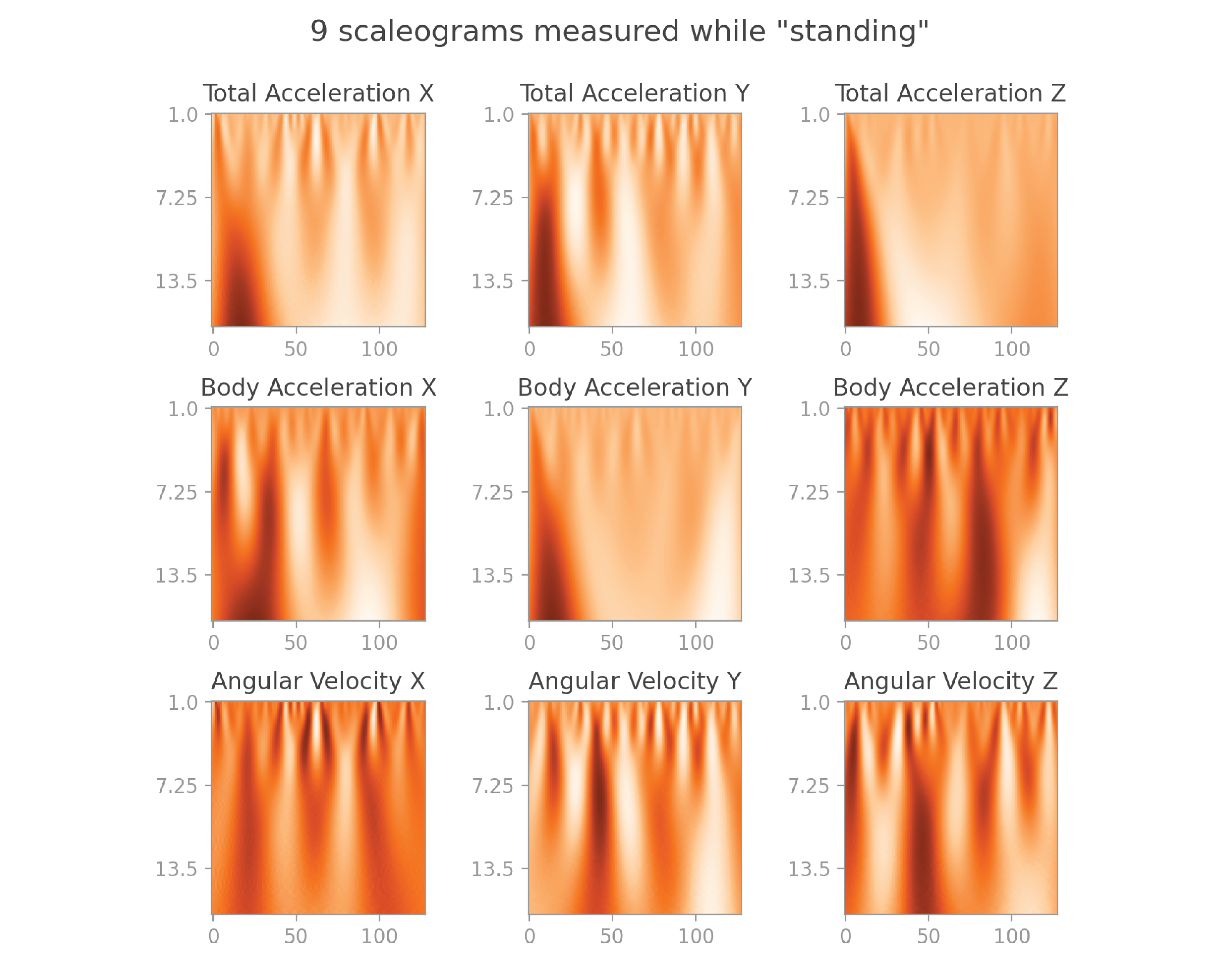
They also make beautiful visuals, and capture even more information than spectrograms.
Here’s the equation for the continuous wavelet transform:
Here, V is called the “mother wavelet,” and can be any wavelet function you’d like (such as the Mexican hat wavelet). In the Gabor transform scenario, the filter is only translated, so we only need a single parameter t to control the translation. In the wavelet tansform scenario, we need two parameters: s to scale the wavelet and t to translate it.
Similarly to the Gabor transform, we take the complex conjugate of the Vs,t function, giving us Vs,t-. Because the wavelet we use has real values only, this doesn’t change our calculations.
We then multiply the signal f by our translated and scaled wavelet Vs,t, and calculate the integral over all time values t to get W(s,t).
Application
Now that we have computed spectrograms and scaleograms from the original signals, what can we do with them? Well, the spectrograms and scaleograms are just images, so we can use them to train a simple CNN. Remember that each group of nine signals has a label that represents an activity such as “standing.” We can train a CNN such that, when given a group of nine images as input, the neural network will accurately predict the activity they represent. I will show you how to do this in my next post, so stay tuned.
Conclusion
In this post, we started by discussing the limitations of using raw time-series data when training a neural network for a classification task. You then learned about two techniques that help us work around those limitations: you learned how to use a Gabor transform to visualize a signal as a spectrogram, and how to use a wavelet transform to visualize a signal as a scaleogram. We covered the intuition, code, and mathematical formulas for these operations. We ended by outlining the practical application for this work, which we’ll cover in the next post.
You can find the complete code for this project on github.
Article originally posted here by Bea Stollnitz. Reposted with permission.
![]() Bea Stollnitz is a Principal Developer Advocate at Microsoft, focusing on Azure ML. She enjoys exploring machine learning techniques and frameworks, and she’s particularly interested in topics at the intersection of AI and Applied Math. You can find her technical blog at https://bea.stollnitz.com/blog
Bea Stollnitz is a Principal Developer Advocate at Microsoft, focusing on Azure ML. She enjoys exploring machine learning techniques and frameworks, and she’s particularly interested in topics at the intersection of AI and Applied Math. You can find her technical blog at https://bea.stollnitz.com/blog