Introduction
Telstra is Australia’s largest telecommunications network. Telstra Network Disruptions (TND) Competition ended on 29th February 2016. This was a recruiting competition.
At Analytics Vidhya, I’ve been experimenting with several machine learning algorithms from past 2 months. It was my time to test the waters. I tried several algorithms and approaches in this competition. And, I ended up securing 106 Rank out of 974 Participants.
Though I missed the benchmark of a rank in Top 10% participants, I feel satisfied after learning several tips, best practices and approaches from several Kaggle masters via discussion forums.
If there is one take away from the competition, it is this – “Predictive Modeling is not just about using advanced machine learning algorithms, but more about data exploration and feature engineering.”
Here is my complete solution for this competition. I used XGBoost and my own ML library. I used Python in this competition. You can learn Python using this complete tutorial.
Important Points
- The idea here is to share the approach. Hence, I’ve not included codes in this article. But, you can find them in my iPython notebooks on GitHub. I’ll refer to individual files in this article for your ease of understanding.
- I’ve used my own ML library which is a wrapper for sklearn and pandas. It allows me to perform many tasks in single line of code. You can set it up on your system using simple steps:
- Download the AJ_ML_Library repository on GitHub.
- Make a folder with the name ‘AJ_ML_Library’ in your Python site-packages folder. I use a mac OS X and path for me is /Users/aarshay/anaconda/lib/python2.7/site-packages. Please search it on your system.
- Paste the contents of the repository in this folder. It should have the following files:
- __init__.py
- exploration.py
- feature_engg.py
- models_classification.py
- models_regression.py
- *.md (markdown files containing documentation)
- Restart your python session and you’re good to go
Table of Contents
- Understanding the Problem and Generating Hypothesis
- Data Loading and Exploration
- Feature Engineering and Attempts to find the “magic feature”
- Ensemble and Stacking Techniques
- Final Results and What I missed (or learnt)
1. Understanding the Problem and Generating Hypothesis
The idea behind this step is to think broadly about the problem WITHOUT looking at the data. This helps us to think about the problem without getting biased.
What’s the Problem ?
Telstra wants help. The problem is to predict the severity of service disruptions on their network. In other words, we are supposed to predict if a disruption occurred is a momentary glitch or total interruption of connectivity. To make this easy, a data set of service log is provided.
This will help Telsra to enhance customer experience by providing better connectivity. The accurate predictions of service disruptions will help Telstra serve customers better.
For this problem, I further searched on Telstra. We know that its the largest telecommunication service providers in mobile phones, broadband, landline as well as digital TV. Also, we know the problem.
Let’s try to think about parameters from a user’s perspective which can potentially influence this factor:
- Location – Some locations might be more prone to failure than others
- Weather – There are higher chances of failure in overcast or rainy conditions
- Time of the Day – Failure chances may be higher during peak hours when there is high traffic on network
- Maintenance Activity – Telstra might be running some background checks and analysis which can cause the network to hang up momentarily.
- Power Failure – Though servers always have power backups, but they might fail in extreme conditions
- Server Breakdown – Hardware fault
- Natural Disaster – Disasters like earthquakes can severely impact connectivity
- Number of Users at a Location – Areas with high number of users might be better connected as compared low usage areas which may have less connectivity
These are just a few examples to get you thinking and you can perform hypothesis further. Let’s look at the data now and see what we have got!
2. Data Loading and Exploration
Data set is available for download here. Let’s have a good look at the data and summarize the key points:
- AIM: Determine the severity of faults in Telstra’s network at a particular location and a particular time instance, which are represented by the ‘ID’ variable in all files.
- Multi-Class Problem: It’s a multi-classification problem. There can be 3 outcomes:
- 0 – No fault
- 1 – Minor fault
- 2 – Major fault
- Available data files:
- train.csv – the training set for fault severity
- test.csv – the test set for fault severity
- sample_submission.csv – a sample submission file in the correct format
- event_type.csv – event type related to the main dataset
- log_feature.csv – features extracted from log files
- resource_type.csv – type of resource related to the main dataset
- severity_type.csv – severity type of a warning message coming from the log
Let’s have a look at the individual files and derive some insights.
File 1 – train.csv (and test.csv)
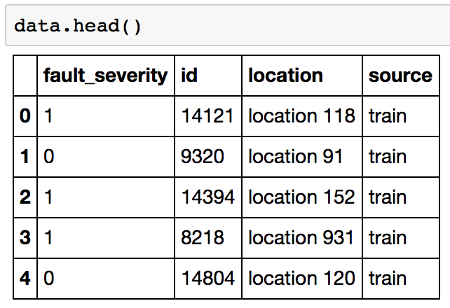
Generally, I tend to combine both the train and test files for analysis by adding a source feature which keeps record of where the observation belongs. After combination, the data looks like:
Columns:
- id: unique identifier for each location and time stamp
- location: unique identifier for each location
- fault_severity: outcome variable
Key observations:
- 18552 unique id (train: 7381 | test: 11171)
- 1126 unique locations
Key inferences:
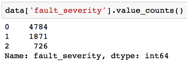
- Imbalanced class problems, evident from following:
- The train data doesn’t directly have any feature apart from location. So we have to use the other files, create features for each ‘id’ and map them back into this file.
File 2 – event_type.csv
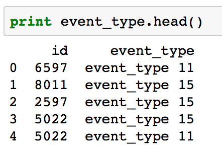
Data Dimension: 31170 (rows), 2 (columns)
Data Snapshot:
Initial Observations:
- 18552 unique id (same as train and test combined)
- 53 unique events
Inferences:
- Since, the number of rows are greater than the number of unique IDs, there are multiple events being recorded at each id. Hence, we have to combine this data at ‘id’ level before merging with the original dataframe.
- There are 53 unique values which might not all be significant. So we can consider exploring this further.
File 3 – log_features.csv
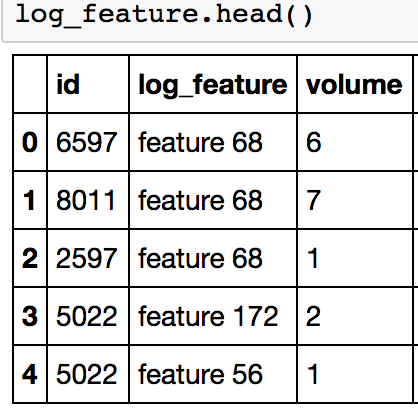
Data Dimension: 58671 (rows), 3 (columns)
Data Snapshot:
Initial observations:
- 18552 unique id (same as train and test combined)
- 386 unique events
- An additional volume column which specifies a quantity associated with each variable
Inferences:
- Similar to event_type, we have to combine this data at ‘id’ level before merging with the original dataframe.
- There are 386 unique values and we should think further on which values to incorporate in the model.
File 4 – resource.csv
Data Dimension: 21076 (rows), 2 (columns)
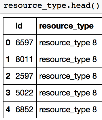
Data Snapshot:
Initial Observations:
- 18552 unique id (same as train and test combined)
- 10 unique events
Inferences:
- Similar to event_type, we have to combine this data at ‘id’ level before merging with the original dataframe.
- There are fewer unique values here
File 5 – severity_type.csv
Data Dimension: 18552 (rows), 2 (columns)
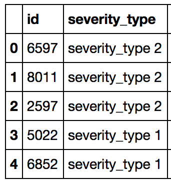
Data Snapshot:
Initial observations:
- 18552 unique id (same as train and test combined)
- 5 unique events
Inferences:
- It has only 1 value for each id
- We can either keep it as a single array, or make dummy variables
Lets move to preparing this data for first analysis.
3. Data Preparation & Modelling
The first step was to clean and map the given data and prepare test and train files. The idea is not do something new but simply use the available information and make a model which will act as the baseline to test further modifications.
Data Preparation
The data preparation step involves making features from different information files and mapping them back to the train and test files. The codes can be found in the data_preparation_1 iPython notebook from my GitHub repository.
I adopted the following approach for event_type, resource_type and log_features file, all of which had multiple occurrences for each id:
- Map the location and fault severity into the file
- Find the following for each unique entity in file:
- count
- percentage of observations in train data
- mode of the fault_severity
- Decide the number of sparse features to create using this information
- Club the remaining into whether they have mode of severity as 0, 1 or 2
The overall idea is to keep categories which occur a certain minimum number of times and club the rest. This is done to ensure that the rules are made on certain minimum number of samples. The same can also be enforced using model parameters. But, taking all the unique entities would give ~450 features and models would run really slow.
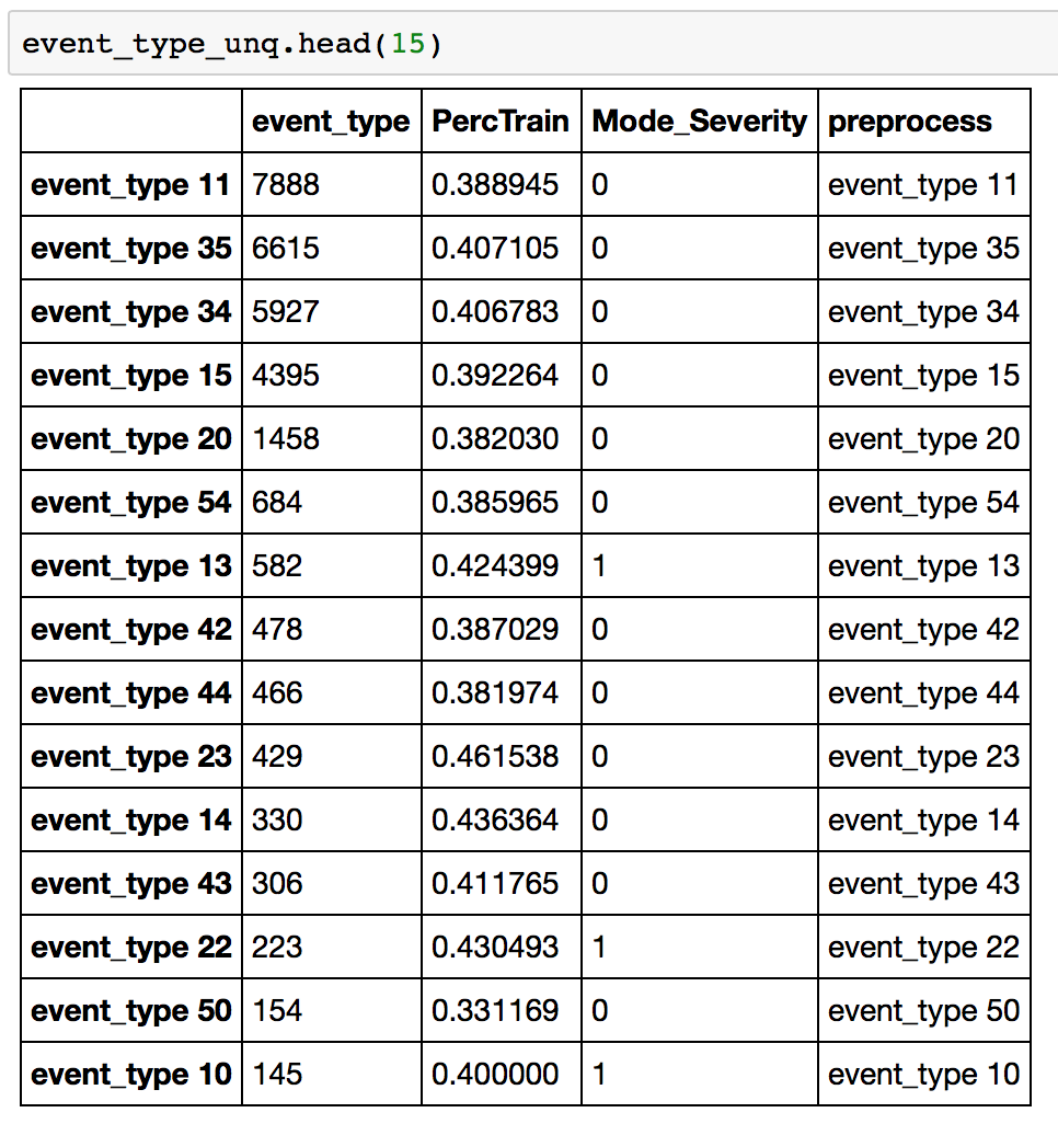
Let’s take an example of event_type. I created a dataframe of unique entities which looked like:
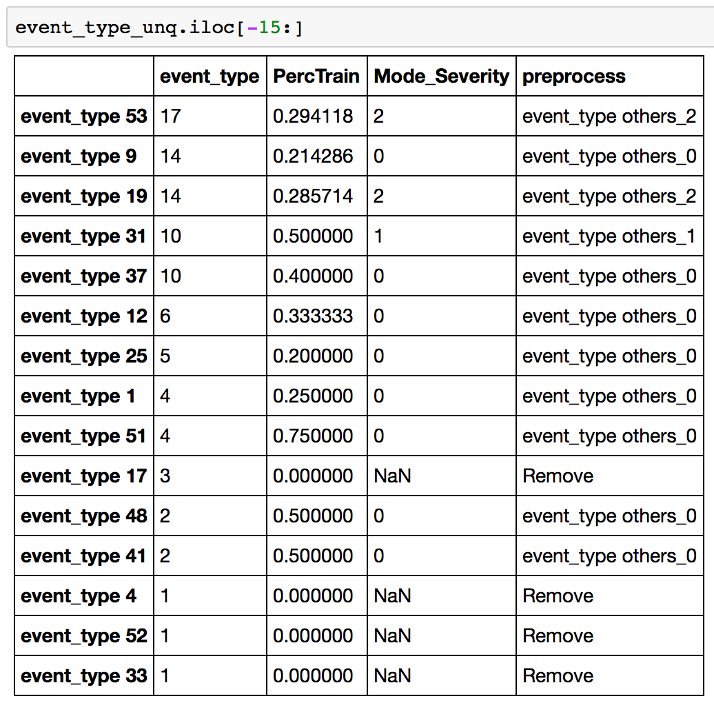
First column is the count, then the percentage in train, then mode of fault_severity and then the final decision taken. This data is sorted by count and you can see that the higher counts are all kept as it is in “preprocess” column. If we look at the lower end of this table:
Here, you find the low count entities have been combined into “event_type others_0/1/2”. Also, the ones only present in test file are removed. Finally sparse features are made by mapping this table into original data.
Similar steps have been performed for other files as well. Some points to note:
- log_features has an additional “volume” information. So in that sum of volume has been considered instead of counts
- resource_type and severity_type had small number of unique entities and thus sparse features were created for all of them
Handling Location
Though location should ideally be converted to sparse features, but it has too many unique values – 1126 to be precise. So following steps were taken:
- A location_count feature added which records the number of occurrences for each location
- Location was converted into numeric. Though it isn’t logically a numeric variable, but kept just to try out in the model. There might be some relations between locations which can improve model performance.
Modeling
This data was used to make the first model using xgboost. I used xgboost here directly because one of my aim during this competition was to learn xgboost. Also, I started learning it around 10 days before end of competition and I didn’t get much time to experiment. I couldn’t have got a better opportunity!
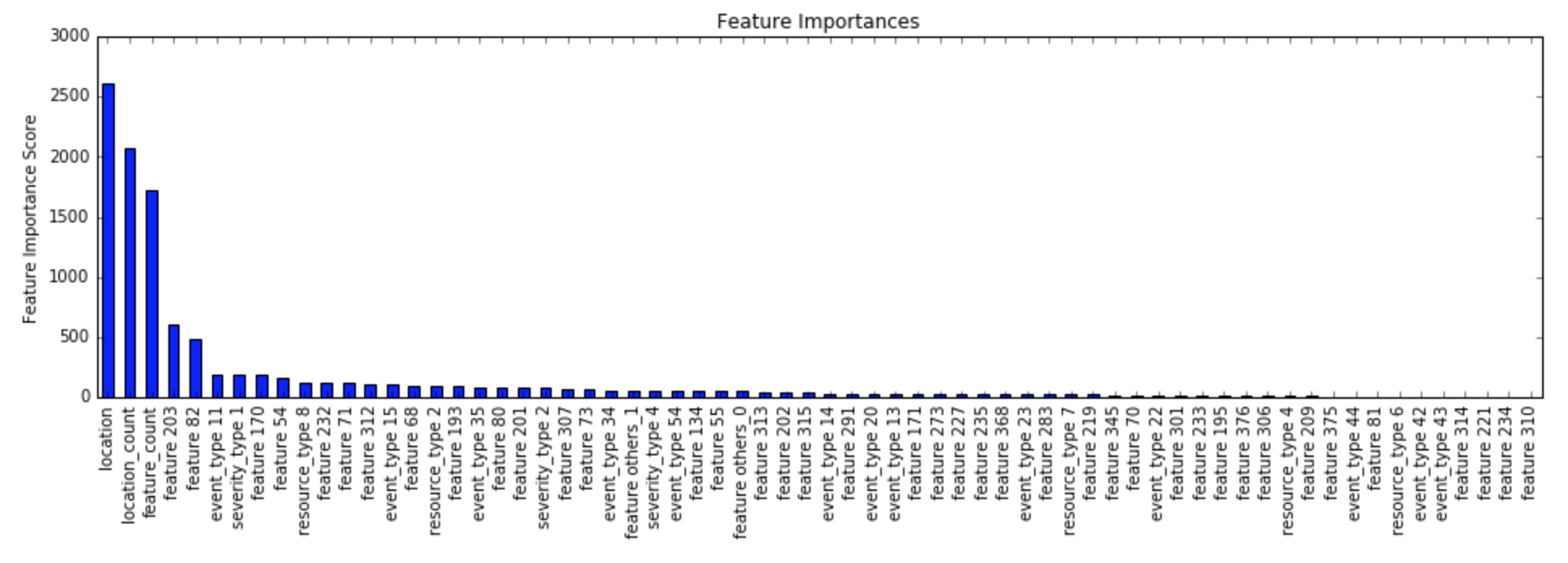
I tuned a xgboost model with the data set. I could see that the numeric coding of location was actually working as location was the most significant variable in my first model:
The final model build was using the following parameters:
- ‘learning_rate’:0.01,
- ‘n_estimators’:2000,
- ‘max_depth’:6,
- ‘min_child_weight’:1,
- ‘gamma’:0,
- ‘subsample’:0.7,
- ‘colsample_bytree’:0.6,
- ‘objective’: ‘multi:softprob’,
- ‘num_class’:3,
- ‘eval_metric’:[‘mlogloss’],
- ‘missing’:-1,
- ‘nthread’:4
The CV score was:
- Mean CV: 0.4946188
- std CV: 0.0145252550325
It scored 0.50710 on the public leaderboard. I was still in the bottom 50% with this score and there was a lot to improve upon.
4. Feature Engineering & Attempts to find the “magic feature”
After making my first submission, I noticed something strange. The leaderboard had a peculiar trend. The top ~15 people had a score 0.42-0.44 and below that it was all above 0.48. There was a abrupt change from 0.44 to 0.48 with nothing in between. This was a clear indication of leakage!
If you’re wondering what is leakage, it is nothing but some information which was not supposed to be present but got overlooked by mistake. It can be of various kinds, for instance:
- A highly predictive feature which directly depends on the outcome itself. It can also be understood as some quantity which cannot be determined without observing the outcome. In other words, something not available when actually making the prediction but provided in data by mistake. A very naive example would be to predict the value sales of a product and the volume sales being given. You can’t tell the volume unless the person has actually bought the product but the data creator forgot to remove this information.
- Presence of time-trend in that data. Taking similar example, if the data provided is sorted by sales, then the numeric ID or count of the instance will become highly significant. Again, this information cannot be used while practically implementing the solution, but is a data preparation error.
Type 1 is easy to find because the algorithm will automatically detect it for us. However, Type 2 is really hard to find and requires some serious exploration. In this case, it was definitely type 2 for two reasons. One, the algorithm didn’t detect something very different and two, we were expecting some time information in the data which was not given. So there are high chances that people found some time-trend in the data.
I tried various things on my file:
- Sorted data by ‘id’ and adding id as the variable in model
- Reverse sorting data by ‘id’
- Creating lag_features of the severity in previous instance (on both 1 & 2)
- Creating patterns of log_features, i.e. the ones which were present or not present in a particular row. (on both 1 & 2)
- Lag features of patterns (on both 1 & 2)
- Sequences of severity type, i.e. the kinds of severity type which occurred in the last 5 instances (on both 1 & 2)
The intuition for #4 and #6 came from a thesis report which I read on analyzing telecommunication networks. The pattern features came out to be important in the feature importance chart but there was no significant probably. Apparantly, xgboost was already learning about such patterns without those features.
When all efforts were in vain, I created some other features which gave slight improvements in performance:
- Count of specific features by location
- Combine resource type 8 and 2
- Check if the previous location is the same
You can have a look at the various things I tried in the feature_engineering_1/2/3 iPython notebook in my GitHub repository.
5. Ensemble and Stacking Techniques
I was still in range of 0.5 mark with these efforts. Towards the end, I started thinking about creating ensemble models. The most basic form is to create 10 different models with the same parameters and different seeds and average their results. I was surprised to see that my performance suddenly improved to ~0.499 with this kind of ensembling. I did this for all my good performing models and averaged them again. This also lead to some slight improvement.
Then I read about stacking technique. Stacking is nothing but using the output of the model as input and then running again. But there is a catch here, you should always use out-of-fold predictions, else there will be serious over-fitting. The typical process I followed is:
- Divide training data into 2 halves using stratified shuffle sampling
- Make a model on H1 (first half) and use it to predict outcomes of H2 (second half)
- Make a model on H2 and use to predict on H1
- Make a model on full training set and use it to predict on test set
- Use these predictions for making models.
I tried first by stacking xgboost with another xgboost, i.e. the model made on each half was an xgboost and the model on the predicted outcomes was also an xgboost. This gave slight improvement.
Then I tried making different models in intermediate step. I made random forest and extra-trees classifier model with ‘ginni’ and ‘entropy’ losses. Then, I used the xgboost model to stack their outcome. This gave me a good boost to ~0.498.
You might be wondering that so much effort for 0.499 to 0.498! But yes this is what Kaggle competitions are all about – extracting every bit of performance possible. And it gave me a good 50-100 position boost. Also, these models are more robust and the chances of performing good on private leaderboard are high.
Making the final submission
Now I had to choose my model for final submission. While reading on how to do it, Kaggle masters suggested to determine a combination of CV and leaderboard score. Something like this:
(#observations in train)*CV-score + (#observations on public)*Public-LB-score
Another trick I tried here was to make ensemble of all of my ‘good’ models, i.e. ones ~0.498 mark. The ones which I created with ensemble to 10 models of different seeds. I was surprised to get a jump from 0.498 to 0.493 using this. I was really starting to understand the power of ensemble and how robust can different models be. I finally submitted this model and the next best. Without any surprises, the top model performed best and gave me a private leaderboard score of 0.485.
This can be found in the ‘ensemble_models’ iPython notebook at the GitHub repository.
5. Final Results and What I missed (and learnt)
My final rank was 106 out of 974 participants, which is ~11% from top. I was sad that I missed the top 10% mark but was still satisfying as this was my first attempt at Kaggle. I was still very curious to see what that “magic feature” was which I couldn’t spot. I was praying that it shouldn’t turn out to be something very simple which I missed. You know, it hurts a lot.
It was exactly what I didn’t expect. I was looking at the wrong place. I mapped information from all the additional files into the train and test file. All my attempts were in this while the trend was safely hidden in those additional files. Those files were sorted by location and then by time. Just creating a simple index out of it gave a performance of 0.42! I was kicking myself for missing out on that, but still learnt a lot.
A very interesting and informative blog has been written by the Daria Vasyukova (aka dune_dweller) who ranked 31 in the competition.
Apart from this, I have hand-picked some interesting features made by top performers from Kaggle forums and summarized them here for you:
- Reverse ordering by location was significant in the model
- The leakage was so significant that even a guy (Beluga) who started 9 days before the competition ended up at rank 7
- Relative ranks for each location helped in improving model performance
- Statistical values (mean, median, min, max and std) of the feature volumes for each ID helped in enhancing the model
- Lag features of fault severity (10 spots before and after the current ID) was helpful. Note that this is based on the order as present in the extra files
- Difference for each feature based on the next and previous record
- Closeness of a particular row with that of another with a known fault_severity
- Totals of specific feature volumes
You can read further about the approaches from Kaggle forum.
End Notes
In this article, I described my approach in a recent Kaggle competition – Telstra Network Disruption, where the type of disruption had to be predicted. The competition was a good one and required some out-of-the-box thinking more than predictive modeling. Though I didn’t do wonders, but it was a good learning experience. I’m sure this will help you in making some informed decisions in your upcoming data science competitions.
Did you like the methods shared here? Did you also participate and used some other ideas not mentioned here? Please feel free to drop a note in the comments and I’ll be glad to discuss.


