Introduction
Churn prediction is probably one of the most important applications of data science in the commercial sector. The thing which makes it popular is that its effects are more tangible to comprehend and it plays a major factor in the overall profits earned by the business.
Let’s get started!
What exactly is Churn Prediction?
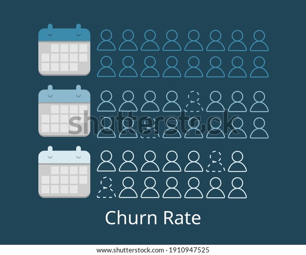
Churn is defined in business terms as ‘when a client cancels a subscription to a service they have been using.’ A common example is people cancelling Spotify/Netflix subscriptions. So, Churn Prediction is essentially predicting which clients are most likely to cancel a subscription i.e ‘leave a company’ based on their usage of the service.
From a company point of view, it is necessary to gain this information because acquiring new customers is often arduous and costlier than retaining old ones. Hence, the insights gained from Churn Prediction helps them to focus more on the customers that are at a high risk of leaving.
The output in the case of Churn prediction is a simple yes or a no. That makes it a classification problem where you have to predict 1 if the customer is likely to churn and 0 otherwise.
Why does Churn occur?
Many factors influence the reasons for a customer to Churn. It may be the fact that there’s a new competitor in the market offering better prices or maybe the service they are getting has not been up to the mark, so on and so forth.
Hence, there is no correct answer as to why exactly the customer wants to churn because as you can see there are many influencing factors.
A data scientist’s job is to find such patterns in the data given and see what facts are churned out (pun intended 🙂 ) during data analysis.
Catching customers before they churn
Although there are many factors for customer churn, preventing it is usually straightforward. It depends on the fact that how the company makes the clients feel special and provide a sort of customized experience to convince them to stay.
A common example which, I am sure most of us have gone through, is probably when you want to port your mobile number to a different service provider. You have to send a port request first to your existing service provider. Then after a few hours, you receive a call from them asking you about the reasons because of which you are leaving. They even offer you a customized package with attractive prices to try to lure you to stay with them.
Now imagine this, but instead of you getting a call from the company after you have decided to leave, you get a call while you are there as a customer. It would make you feel more valued and maybe you will now decide to continue with the existing company because they made you feel cared for.
That’s why most of the big companies which have a data science team have members dedicated entirely towards churn prediction. Those who don’t have such divisions tend to seek help from freelancers or outsource the work.
Data Exploration
I have used the Telco Customer Churn dataset which is available on Kaggle. You can find the dataset here.
1) Importing required dependencies
Python Code:
2) Loading the dataset
df=pd.read_csv(‘../input/telco-customer-churn/WA_Fn-UseC_-Telco-Customer-Churn.csv’)
df.info()

As we can see there are a total of 20 columns in our data set. Out of these, only 3 are of numeric data type.
3) Data Visualization
We need to explore the data to find some patterns.
For the columns in the dataset which are non-numerical, we can use a seaborn count plot to plot a graph against the Churn column.
sns.countplot(x='Churn',data=df,hue='gender',palette="coolwarm_r")

Source: Kaggle notebook
From the above graph, we can see that gender is not a contributing factor for customer churn in this data set as the numbers of both the genders, that have or haven’t churned, are almost the same.
sns.countplot(x='Churn',data=df, hue='InternetService')

We can see that people using Fiber-optic services have a higher churn percentage. This shows that the company needs to improve their Fiber-optic service.
sns.countplot(x='TechSupport',data=df, hue='Churn',palette='viridis')

Source: Kaggle notebook
Those customers who don’t have tech support have churned more, which is
pretty self-explanatory. This also highlights the fact that the tech
support provided by the company is up to the mark.
4) Tackling numeric data
Now let’s look at some numerical values to see how to tackle them.
ax = sns.histplot(x = 'tenure', hue = 'Churn', data = df, multiple='dodge')
ax.set(xlabel="Tenure in Months", ylabel = "Count")

Source: Kaggle notebook
The churn amount is higher in the initial 5 months, which is usually the
time when the new customers try out the service and decide whether to
continue or cancel. This pretty much can be attributed to the
uncertainty in the customer’s mind.
sns.histplot(x='MonthlyCharges',hue='Churn',data=df,multiple='dodge')

Source: Kaggle notebook
We cannot see a definite pattern in this, but we can conclude that those who have monthly charges as high as 100 dollars have chosen not to churn. This indicates that the company has done well to retain high paying customers.
Similarly, we can evaluate the other parameters as well and draw meaningful conclusions as to how the company should improve customer retention.
5) Data Preparation
We need to make sure that the data is in the right form to be used for prediction. Machine Learning models do not work well with categorical inputs. So, we convert the categorical variables in our data set to numerical values by using one-hot encoding.
df_copy=pd.get_dummies(df_copy,drop_first=True)
df_copy.head()
The drop_first parameter helps in reducing the number of columns and hence prevents co-relation between the variables. Hence, it is set to True.
6) Scaling
Scaling data is important to increase prediction accuracy.
from sklearn.preprocessing import MinMaxScaler
features = X.columns.values
scaler = MinMaxScaler(feature_range = (0,1))
scaler.fit(X)
X = pd.DataFrame(scaler.transform(X))
X.columns = features
X.head()

Source: Kaggle notebook
Prediction
First of all, let’s split the data into 2 datasets; training and testing.
from sklearn.model_selection import train_test_split
X_train, X_test, y_train, y_test = train_test_split(X, y, test_size=0.3, random_state=41)
Now we can start with different algorithms for prediction.
1) Logistic Regression
from sklearn.linear_model import LogisticRegression
logreg=LogisticRegression()
logreg.fit(X_train,y_train)
prediction_logreg=logreg.predict(X_test)
print(accuracy_score(y_test,prediction_logreg))
Accuracy Score LogReg: 0.7950780880265026
2) Random Forest using RandomCV
from sklearn.ensemble import RandomForestClassifier
rf_c=RandomForestClassifier()
param_grid={'n_estimators':[int(x) for x in np.linspace(start=200,stop=1200,num=11)],
            'max_features':['auto','sqrt'],
            'max_depth':[int(x) for x in np.linspace(start=10,stop=100,num=11)],
            'min_samples_leaf':[1,2,3,5],
            'min_samples_split':[2,5,10,15]}
random_cv=RandomizedSearchCV(rf_c,param_grid,cv=3,verbose=2,random_state=42)
random_cv.fit(X_train,y_train)
best_random=random_cv.best_estimator_
prediction_cv=best_random.predict(X_test)
print(accuracy_score(y_test,prediction_cv))
Accuracy Score RF: 0.8021769995267393
3) XGBoost
from xgboost import XGBClassifier
xgb_model = XGBClassifier()
xgb_model.fit(X_train, y_train)
prediction_xgb = xgb_model.predict(X_test)
print(accuracy_score(y_test, prediction_xgb))
Accuracy Score XGB: 0.7875059157595835
From the above accuracy scores, we see that Random Forest clearly outperforms Logistic Regression and XGBoost. By using RandomCV, the accuracy is further improved.
Let’s see the confusion matrix of Random Forest.
print(confusion_matrix(y_test,prediction_cv))

It shows that our model needs to improve the False Negative classifications.
Conclusion
We went through the various tasks involved in Churn prediction in this article. It is important to note that finding patterns in Exploratory Data Analysis (EDA) is as important as the final prediction itself.
A Churn prediction task remains unfinished if the data patterns are not found in EDA. Most people can do the prediction part but struggle with data visualization and conveying the findings in an interesting way.
This skill is not only limited to Churn prediction but will also help you in the solving of the usual data science problems.
End Notes
Hope that you find this article interesting and insightful. Feel free to explore this data-set further and try to derive meaningful solutions from it!
You can connect with me on LinkedIn here.
The media shown in this article are not owned by Analytics Vidhya and are used at the Author’s discretion.


