

Summary
- Google is simplifying the Gemini web experience by decluttering the model picker, reducing it to four key options and relocating tools like Veo 2 (for video generation) and Deep Research to the more accessible prompt bar for Gemini Advanced subscribers.
- This update aims to improve discoverability and streamline workflow by ensuring users can easily access relevant tools and models, with the prompt bar displaying different options based on screen size (desktop vs. mobile).
- The streamlined design of the new model picker in Gemini highlights four key models, with additional tools like Canvas and Video available in an overflow menu.
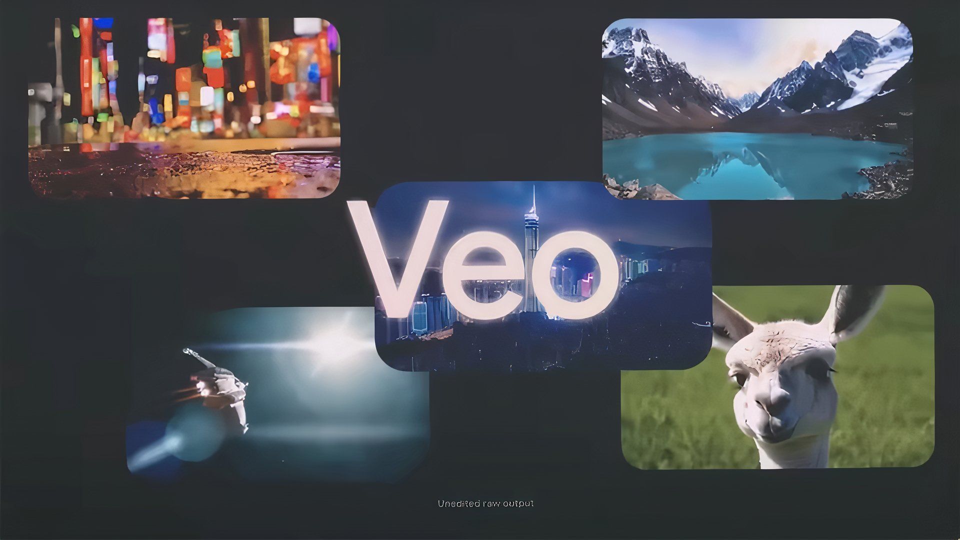
Google is working on a decluttered experience for Gemini on the web, one that streamlines access to tools like Veo 2 and its video-generating capabilities, all while cleaning up the model picker for a more intuitive selection process.
For those unaware, Google began integrating Veo 2’s capabilities into Gemini in mid-April. Since then, the functionality has rolled out widely, albeit only to those with an active Gemini Advanced subscription. It’s a fun feature that we’ve taken for a spin, and with it now being relocated to a more accessible location, we anticipate even more users that already pay for Advanced to experiment with it.
First spotted by the folks over at 9to5Google, Google is trimming down the model selector to only highlight some of its latest models, with tools like Veo 2 (listed as ‘Video’) and Deep Research being relocated to the prompt bar. The approach ensures constant selection of the model that is most relevant to your needs, all while maintaining easy access to the additional tools.
With Veo and Deep Research out of the way, the model now only highlights four models, complete with new descriptions that went live last week.
- 2.0 Flash: Fast all-around help
- 2.5 Flash (preview): Our next reasoning model built for speed
- 2.5 Pro (preview): Reasoning, math & code
- 2.0 Flash with Search history: Personalized to you
Coming soon to a device near you
From the looks of it, on large-screen devices like desktop monitors, the prompt bar will highlight the plus icon, Deep Research, Canvas, and Video simultaneously. On devices with smaller displays, like smartphones, Gemini might only highlight the plus icon and Deep Research, with Canvas and Video nested in an overflow menu.
The change hasn’t rolled out widely yet. Some of my colleagues and I are still seeing the old UI on the web and the Gemini Android app, albeit with new model picker descriptions. As is the case with Gemini UI changes, the tweak should be live widely over the next couple of days.
Has the new UI rolled out to you? Did you prefer the old UI where Veo and Deep Research were hidden behind the model picker?