You may not spend too much time thinking about how you hold your phone, but it’s worth taking a moment to consider where the keyboard is located. Is it on the top of your phone? Of course not. That would be too awkward. Your thumbs live at the bottom of the screen as you type away texts, notes, and search commands.
Something else you may not think about as an Android user is how you have to move your hand from the bottom of the screen to the top whenever you want to punch in a web address. Sure, it may not seem much of an inconvenience when you’re used to it, but wouldn’t it make more sense to keep everything toward the bottom of the screen?
Apple offers bottom address bars, so Android should follow suit
Even Safari is joining the address bar revolution
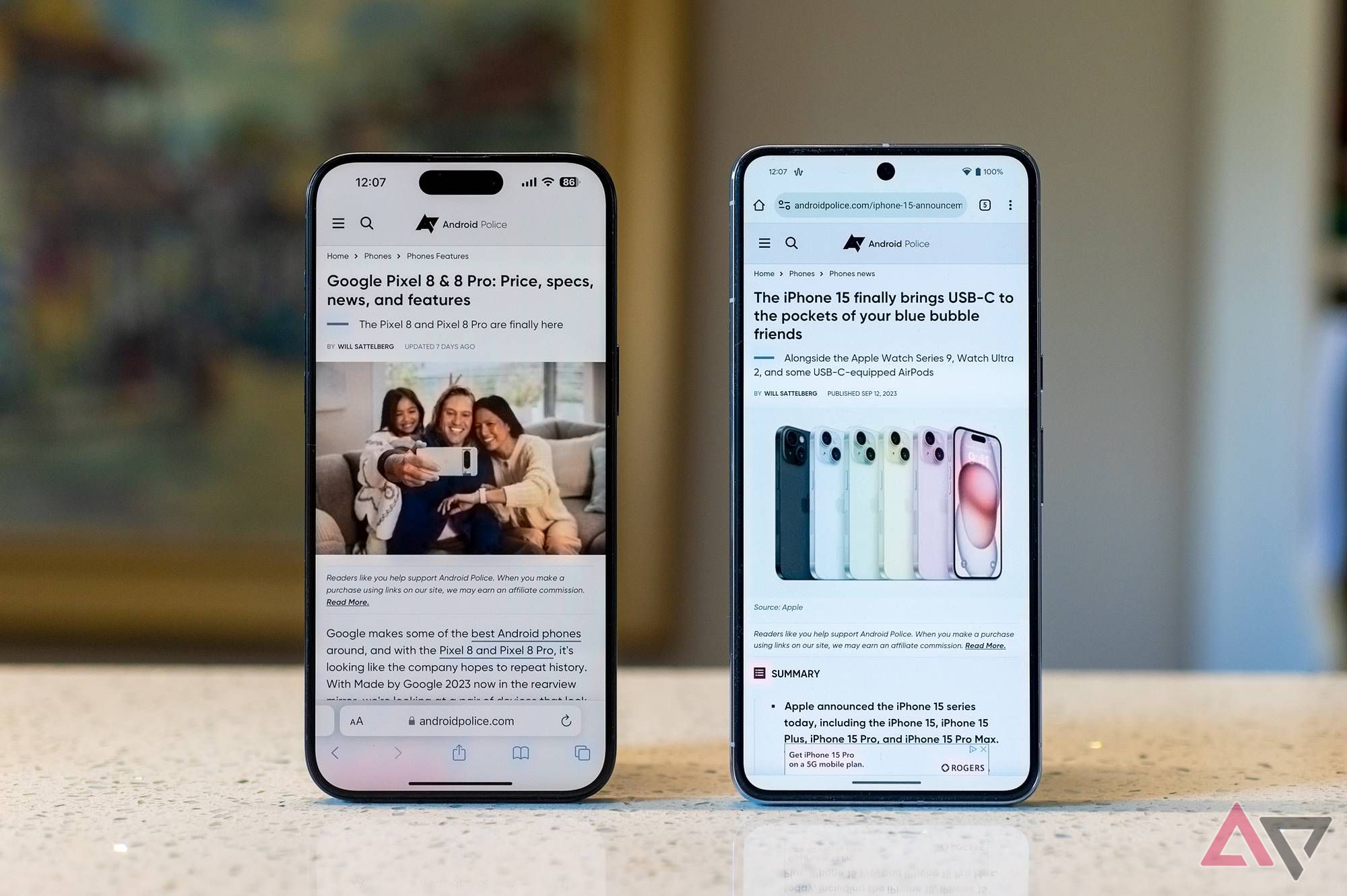
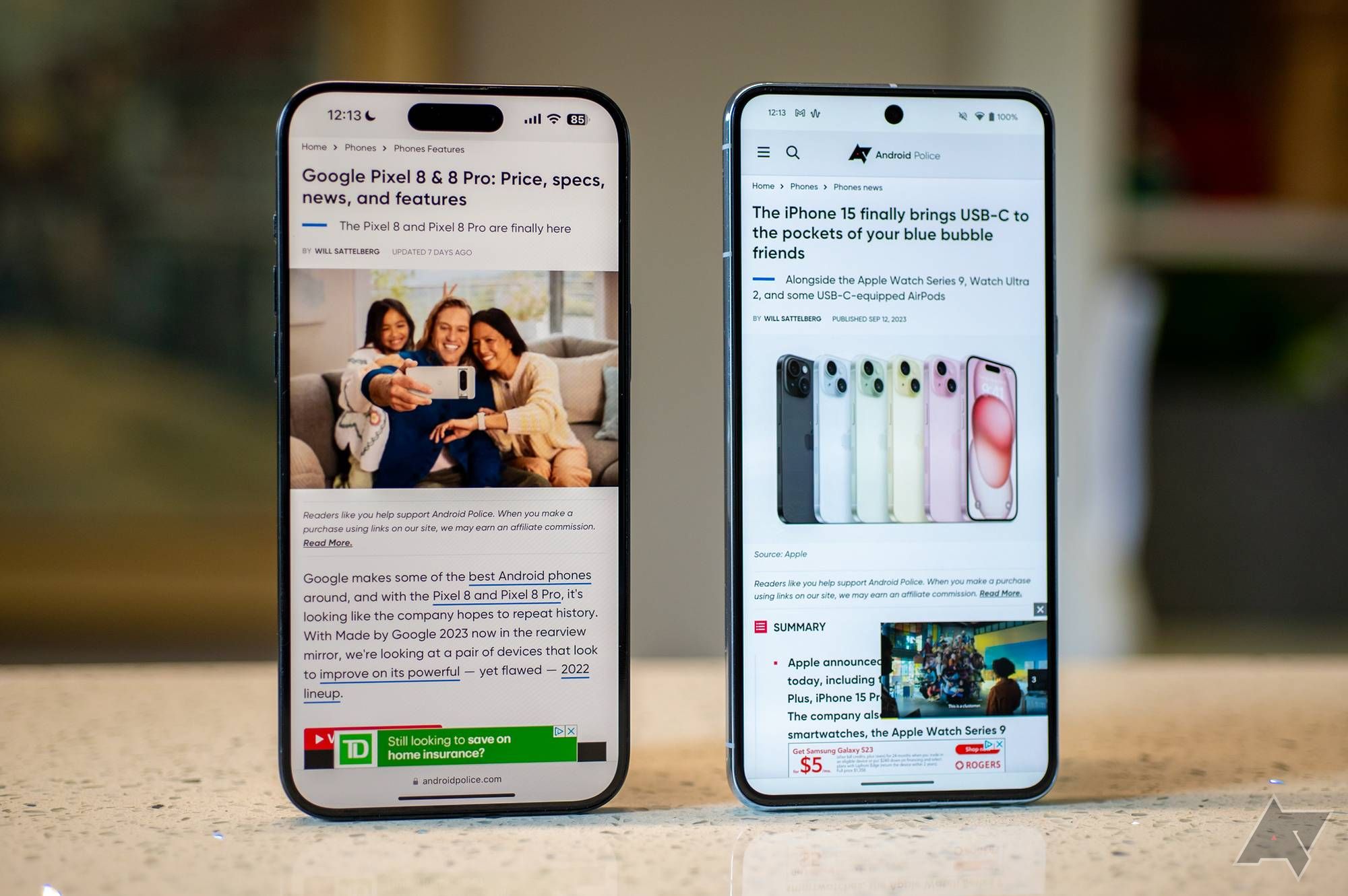
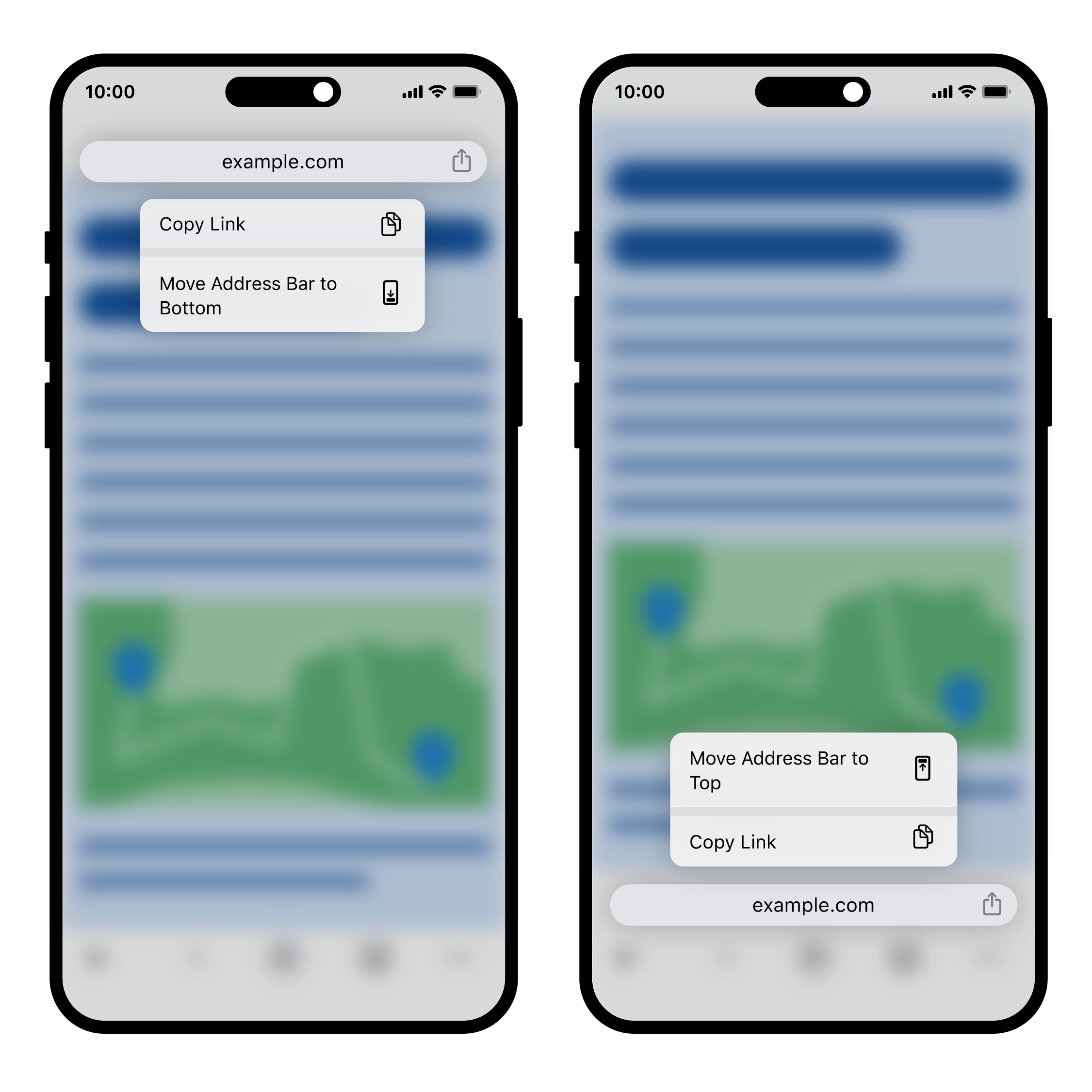
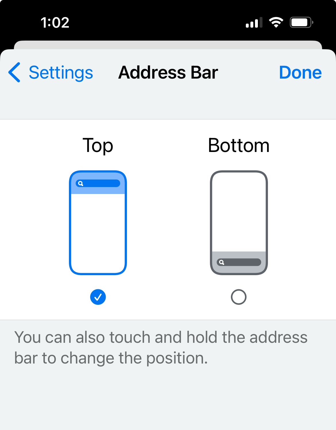
For those who struggle to recall that distant time before the pandemic, Google spent a few years testing an alternate browser layout in the form of Chrome Home’s bottom address bar. Unfortunately, the idea joined the ranks of abandoned Google experiments for a while, but perhaps it’s time to bring that address bar toward the bottom of Android devices once and for all. Folks over on the Apple side of the fence have recently been treated to an option for a bottom-screen address bar on Chrome. Even the iPhone’s iOS 15 Safari redesign gives users the bottom-bar treatment. This leaves me to wonder when it will be Android’s turn.
When Google initially tested this new layout, it received mixed reactions. In fact, some of our own readers, who were at first reluctant to embrace such a drastic shift, came around. And after Google axed the bottom address bar, those same users were unhappy to see it go.
Clearly, there was enough interest in this idea to bring it over to iOS, so why won’t Google do the same for Android? I can’t think of a single reason for this feature to exist on one but not the other, except that it didn’t initially test well. But should Android users resist such a change?

Chrome on Android really needs to learn this simple trick from Safari
With these auto-close options, tab management has never been easier
Android users should welcome change
The bottom bar could become your favorite way to browse — if you give it a chance
If you ask me, there’s an important takeaway here: We dislike change. We dislike it so much that we may write something off simply because we’re not yet used to it. And trust me, this is coming from someone who really does not do well with change. That said, there have been UI updates that truly were quality-of-life enhancements for me once I got over the initial shock of losing what I so desperately clung to.
Granted, not all layout changes are great. I’ll still never understand for the life of me why Google felt the need to move the button for YouTube video transcripts. But on the other side of that, you have updates like Google Files going tab-less, which ultimately made for a better experience. You may not like it at first because you miss the way it used to be, but if you give it a chance, you might start appreciating the more streamlined look that grants you additional on-screen real estate.
Why a bottom address bar makes more sense
Your thumbs will thank you
If you are an Android user, imagine what it would be like to have the address bar closer to the bottom. Your hands could remain where they are whenever you need to enter a new address. You might not notice now, but after an adjustment period, you may realize that having the address bar closer to the keyboard is a more comfortable way to browse. This is what Apple users get to experience, and such a change might be on its way for Android as well. As it turns out, Chrome for Android could be getting a limited bottom bar, and hopefully that’s just the beginning.
But what about those who like it the way it is?
We can have the best of both worlds
Right about now, you may be muttering, “If it ain’t broke, don’t fix it.” And to that, I say, why not compromise? Give users the option to place the address bar where they want it. After all, that’s how it works on Chrome for iOS. It could default to the bottom, forcing those of us who are too lazy to edit our settings to get used to the change. And if the new bar placement really doesn’t work for you, you can simply switch it back. That way, everybody wins.
Perhaps Google is feeling this feature out on Apple products before it takes the bottom bar over to Android. In the meantime, all we can really do is hope. And maybe beg. And plead.

5 things Chrome on Android should take from the iPhone
Is Google holding Chrome on Android back? Considering these features are iPhone-exclusive, it sure seems that way


