Introduction
Have you ever been in a scenario where you’ve created many models to solve a problem, all of which have about the same value for certain scoring matrices, and you’re not sure which one to use? When I was working on a similar issue, I came across one library that made the entire model selection procedure considerably quicker and faster.
Yes! I am talking about “YellowBrick”.
The outcomes of machine learning models may be visualized to assist make better decisions about which model to use. It also speeds up the procedure. In this article, I’ll explain how this machine learning library comes in helpful for the below few tasks and saves time.
- Visualizing feature importance and selecting features
- Interpret score of models
- Visualize model Results to get a better understanding
- Hyperparameter tuning
- Model selections
Let’s learn how to use this library for visualizing these tasks for a Linear regression problem.
Installation
Yellobrick is based on scikit-learn and matplotlib. We must first install those libraries before proceeding with the Yellowbrick installation.
We may use the instructions below to install all three, or if you already have the first two, just execute the third one.
- pip install scikit-learn
- pip install matplotlib
- pip install yellowbrick
Data Loading and Preprocessing
I’m going to utilize a dataset that predicts housing prices. The data collection includes both numerical and category variables.
I have performed all of the pre-processing steps after importing the dataset, including exploratory data analysis, adding new derived columns, and encoding categorical columns. I’m not going to go through all of these processes because we’re concentrating on the Yellowbrick for visualization.
You can always look at my git repository to grab the dataset we are using here and learn about the entire process, from data preprocessing through model building.
Visualizing Residuals
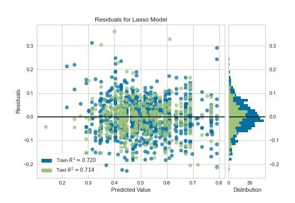
After creating a linear regression model, it’s usually a good idea to look at the residual plot to see if our model is good enough and it holds assumptions we made while building the model.
The ResidualsPlot Visualizer from Yellowbrick shows the difference between residuals (Observed value of target variable – predicted value ) on the Y (vertical) axis and the dependent variable on the X (horizontal) axis.
Let’s use the below code for it :
visualizer = ResidualsPlot(lasso_model)
#fit training data
visualizer.fit(X_train, y_train)
# Generates predicted target values on test data
visualizer.score(X_test, y_test)
#show plot and save it at given path
visualizer.show("Residual_lasso.jpg")

The fact that residuals are scattered randomly across the horizontal axis indicates that the linear model is adequate for the data. If there is a pattern in the residuals, we may conclude that the linear model is not the best option and that a non-linear model is required.
Distribution of Residuals
On the right-hand side, we can see the error distribution, which is normally distributed with a mean of 0. This is true for linear models’ assumptions.
Now we will tune the hyperparameter and visualize the process using Yellowbrick.
Hyperparameter Tuning
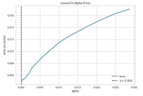
We have alpha as a hyperparameter to tune in Lasso, which is a constant that multiplies the regression term. The model is less complicated (reduces overfitting) if the alpha value is big, but we can’t use a very big value of alpha because it will make our model underfit and extremely simple.
That’s why selecting the optimal value of alpha is important.
Let’s look at how different alpha values affect model selection during the regularization of linear models. If the plot is random then we can say that the regularization we are using is not suitable.
We can use the below code to visualize hyperparameter tuning for alpha:
from yellowbrick.regressor.alphas import alphas
# quick method to immediately show plot
alphas(LassoCV(random_state=0), X_train, y_train)

Visualizing Prediction
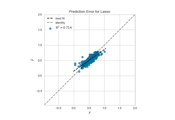
Yellowbrick allows us to visualize a plot of actual target values vs predicted values generated by the model with relatively few lines of code and saves a significant amount of time. It also aids in detecting noise along with the target variable and determining the model’s variance.
We can use the below code to visualize prediction error using PredictionError from Yellowbrick.
from yellowbrick.regressor import PredictionError
# Instantiate the linear model and visualizer
Lm = Lasso()
visualizer = PredictionError(Lm)
# fit visualizer on training data
visualizer.fit(X_train, y_train)
#Evaluate on test data
visualizer.score(X_test, y_test)
#show the plot and save in given path
visualizer.show("prediction_error.jpg")

Feature importance
Many model forms like the random forest, gradient boosting, etc. describe the underlying impact of features relative to each other. But Generalized linear models predict the target via a linear combination of input features.
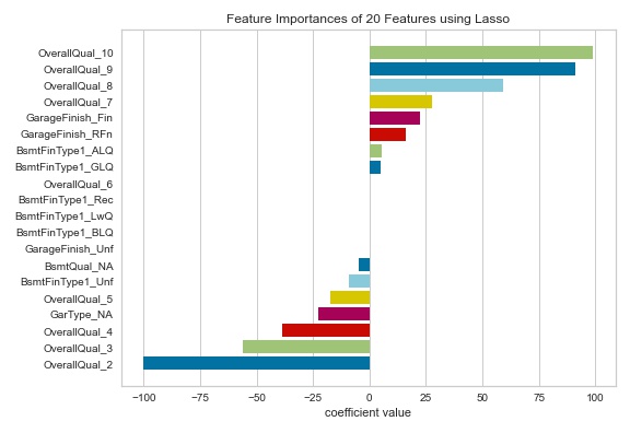
For models that do not support a feature_importances attribute, Yellowbrick’s FeatureImportances Visualizer will also draw a bar plot for the coef_ attribute that linear models provide. When using such models, we can set relative= False to plot the magnitude of coefficients(coefficients may be negative).
Let’s Visualize coef_ plot of features using the below code:
from yellowbrick.model_selection import FeatureImportances
viz = FeatureImportances(lasso2,relative=False)
#fit on train dataset
viz.fit(X_train, y_train)
#show plot and save at output path
viz.show("feature_importance.jpg")

Larger coefficients are necessary “more informative” because they contribute a greater weight to the final prediction in most cases. This cool plot can help us compare models on the ranking of features.
Yellowbrick also has a lot of nice tools for viewing classification models and feature analysis findings. We’ll go through this in more detail in the upcoming post, but in the meanwhile, you can learn more about Yellowbrick from its documentation.
Conclusion
I attempted to demonstrate how we can utilize Yellowbrick to visualize hyperparameter tweaking, model selection, and feature selection to aid in the interpretation of our model’s findings.
Also, I had a lot of fun using Yellowbrick, and it also helped me save a lot of time and make better decisions. I hope it will be useful to you as well.
You can always have a look at all the code from this article here.
Happy Learning!


