For those lurking the Changes tab in Cydia, you may have noticed an interesting new jailbreak tweak called Edge, which claims to bring a feature to iPhones that is typically found on a competing handset – the Samsung Galaxy S7.
Available in Cydia for $1.99, Edge lets you access a useful new menu from anywhere in iOS with a special slide gesture. The menu provides access to apps, tasks, contacts, and more, and in this review, we’ll be showing you all about how the tweak works!
Edge – a new shortcut menu for iOS
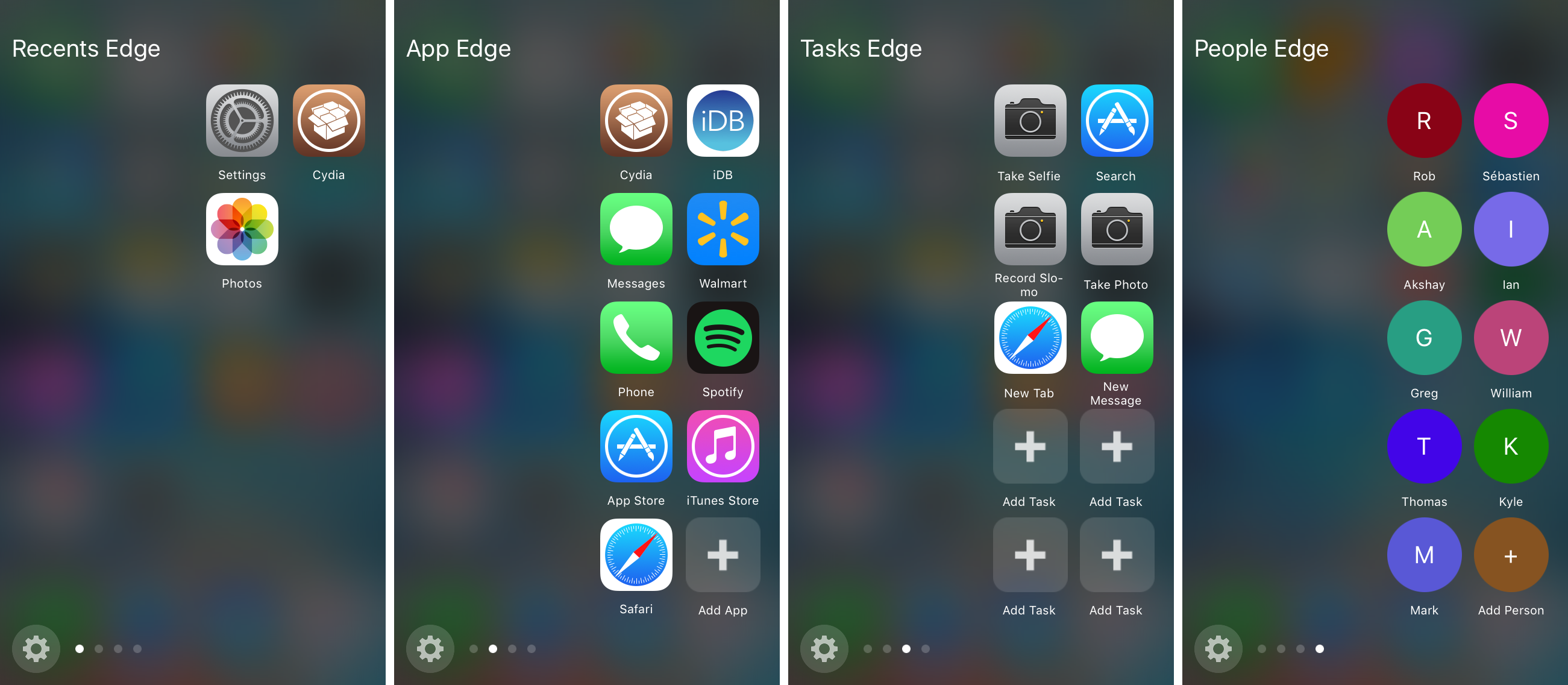
Edge is going to provide your jailbroken iOS device(s) with a new menu interface that makes it easier to get to the following things:
- A list of recently used apps
- A custom list of app shortcuts
- A custom list of task shortcuts
- A custom list of contact shortcuts
From the list of recently used apps, any apps that you’ve opened or used recently are going to appear in the order that they’ve been used, just like the App Switcher.
You can set up the custom app shortcuts page so that it shows the apps you want it to show. Blank spaces entitled “Add App” will appear and you can tap on them to select an app from your device to add to this page.
On the custom task shortcuts page, you can configure a variety of shortcuts to different tasks. For example, searching the App Store, starting a slow-motion video recording, opening a new Safari tab, or even composing a new text message. Just like the other page, you can add new tasks by tapping on blank space entitled “Add Task.”
And lastly, there is a page for displaying shortcuts to your favorite contacts. You can configure the contacts that you want to show here by tapping on the “Add Person” button and selecting names from the Contact pickers.
You can swipe back and forth between each of these pages and get from apps, to tasks, to contacts with ease, all from the same interface.
Configuring Edge to your liking
As you will notice, there is a cog button at the bottom left of the Edge interface. You can tap on that button, or you can launch the Settings app and open the Edge preferences pane instead.
There will be options here where you can configure Edge to work to your unique needs.

Among the options you’ll find that you can fine tune here are:
- Enabling or disabling the tweak on demand
- Choosing the pages that you want to appear in the Edge menu
- Configuring a custom activation area for where the invoke gesture will work
- Hiding or showing the empty placeholder icons in the Edge menu
- Enabling or disabling multi-colored Contacts shortcuts
To configure what pages are going to appear in the Edge menu, you can just tap on the Edit button from the top right of the preferences pane and then drag the items in or out of the Enabled and Disabled sections based on what you want to see.
Configuring the activation area is a good idea too, as the default option can be limited. From the activation area configuration screen, you’ll see two sliders and a white rectangle. The white rectangle represents where you need to tap and drag to open the Edge interface. The left slider moves the position of the rectangle up or down, while the right slider adjusts the height of the rectangle.
My thoughts on Edge
I really like the look of Edge, but I wonder if it would make more sense to make use of all the empty space that the tweak leaves open on the left side of the screen. I’m sure there was a reason for it to look this way based off of what it was inspired by, but I do think this blank space could be used to make the tweak a little fuller.
Nevertheless, I am a huge fan of the tweak’s blurred style background, which looks exactly how you would expect an iOS interface to look. I love the task shortcuts page, as it makes tasks easier on devices that don’t support 3D Touch, and I also like the quick Contacts page, as this is a feature I use frequently on my Apple Watch to get to my favorite people faster.
It’s useful that you can toggle pages on or off on demand, because personally I like to hide the Recents page since the App Switcher already takes care of this functionality. I also find it useful that you can personalize the invocation method by increasing the screen area you’re allowed to swipe from.
With the only real negative I can list being the lack of use of the screen space to the left, I’d say the rest of the features are pretty solid. You just have to decide if the $1.99 price tag is worth the purchase to you!
Wrapping up
Edge makes it a lot easier to get to your favorite apps, actions, and contacts from an all-in-one interface. Anyone who might be interested in giving the tweak a shot can grab it from Cydia’s BigBoss repository today for $1.99. Please keep in mind that the tweak only works on iOS 9 devices.
What are your thoughts on Edge? You can share with us in the comments below!


