This article was published as a part of the Data Science Blogathon
Overview of Electric Vehicle Sector
The supply of fossil fuels is constantly decreasing. The situation is very alarming. It is time for the world to slowly adapt to electric vehicles. A lot of change needs to happen. Major carmakers like Tesla and Porsche manufacture many electric vehicles. The improvement of battery technology in recent years has led to the higher popularity of electric vehicles. Buying an electric vehicle can be a great choice for consumers. The drive quality, low noise levels, and convenience are really great. In the United States, one year of driving a petrol car can cost from 1500 USD to 2500 USD. On the other hand, the driving cost of Electric Vehicles is 500 USD. Electric cars are more preferable. The maintenance cost of electric vehicles is also very low. They are economical to maintain. The energy conversion efficiency of electric vehicles is also high. Electric vehicles use 60-70% of electrical energy. On the other hand, vehicles based on internal combustion engines have an efficiency of 18-22% only.
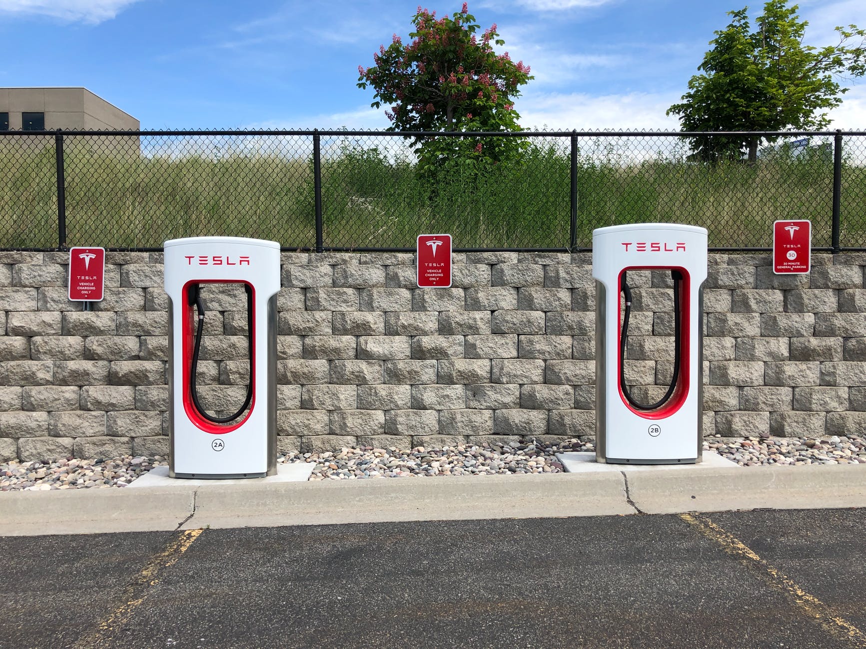
Image 1
Electric vehicles are made for the future and will be a big innovation. They are good for the environment and they do not emit any greenhouse gases.
There are, however, many challenges associated with electric vehicles. They have a limited range. Charging the vehicle takes time and can be a hassle sometimes. The availability of charging stations is also a big issue. Incompatibility of charging stations can also be a problem. Despite many challenges and issues, switching to electric vehicles is good for the environment and is more economically viable in the long term. Many have predicted that, by 2040, most of the vehicles will be electric. Rising fossil fuel costs and high maintenance costs of petrol and diesel vehicles coupled with environmental concerns are the main reasons. Many developed countries have given incentives for purchasing electric vehicles. Automobile manufacturers are already manufacturing some impressive electric vehicles.
The energy cost of manufacturing an electric vehicle is also very high, but considering everything and the fact that charging electric vehicles is very cheap, EVs are a great option. Manufacturing batteries is an important task in the production of Electric vehicles.
We will analyze some data related to various popular electric vehicles available in the European Market.
Electric Vehicle Data
- Vehicle Battery capacity (in KWH)
- Acceleration (0-100) in Seconds
- Top Speed in Km/hr
- Range of Vehicle in km
- The efficiency of Vehicle in Wh/km
- Fast charge speed in km/hr
- Drive Configuration
- Number of seats
- Price in Germany (Euro)
- Price in the UK (Pound)
Data Source on Kaggle: https://www.kaggle.com/kkhandekar/cheapest-electric-cars
The data consists of 180 vehicles and there are some missing values as well. We can conduct various data analytics visualizations to understand the data and information. This gives us an idea about the market as a whole and overall data distribution. Often, this type of data gives insight into the market and lets businesses conduct market research. The electric vehicle market is growing at a fast pace, with proper investment and research, the field can be improved and a higher level of efficiency can be achieved.
Let us get started with the code regarding the project.
Python Code for Electric Vehicle Price Prediction
First, we need to import some basic libraries.
import numpy as np
import pandas as pd
import matplotlib.pyplot as plt
import seaborn as sns
Now, we read the data.
df1= pd.read_csv("/kaggle/input/cheapest-electric-cars/Cheapestelectriccars-EVDatabase.csv")
Now, let us have a look at the data.
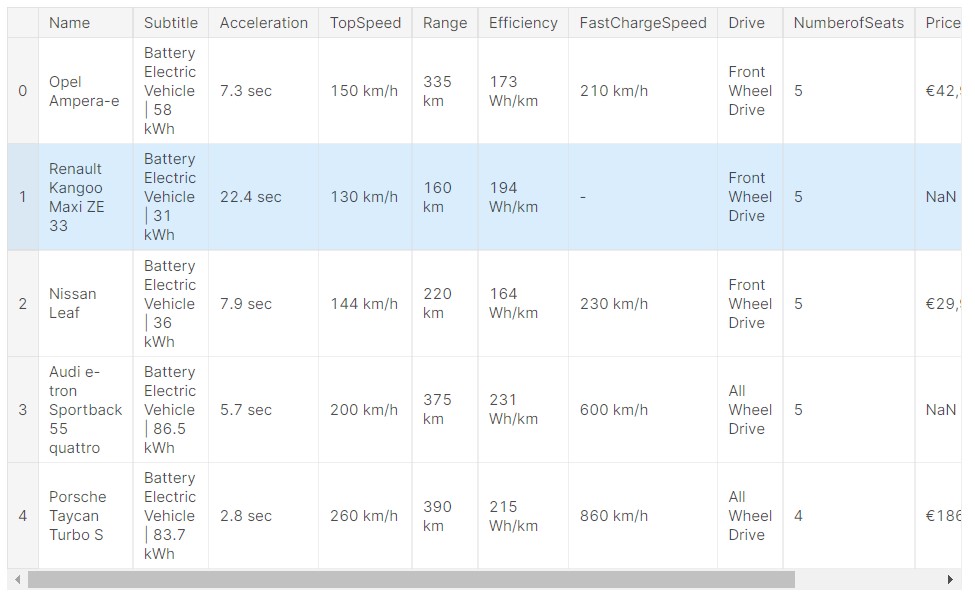
So, now we can see how the data looks like. It is a standard relational database kind of data, having rows and columns.
Exploratory Data Analysis for Electric Vehicle Price Prediction Data
Now, let us have a look at the data columns.
There are a lot of missing values in the data, so now let us fill the missing data with zero initially.
#filling empty data with 0
df1=df1.fillna('0')
Now, let us get the name of the car manufacturer from the car name.
df1['Manufacturer'] = df1.Name.str.split(' ', 1, expand=True)[0]
#cleaning the data
#removing currency sign
PriceinUK=[]
for item in df1['PriceinUK']:
    PriceinUK+=[int(item.replace('£','').replace(',',''))]
df1['PriceinUK']=PriceinUK
From the above code, we are able to do some data preparation and data cleaning.
Here, we removed the pound symbol, next we will do the same for Euros.
PriceinGermany=[]
for item in df1['PriceinGermany']:
    PriceinGermany+=[int(item.replace('€','').replace(',',''))]
df1['PriceinGermany']=PriceinGermany
Data is cleaned.
Now, we will prepare the data for Fast Charging Speed.
FastChargeSpeed=[]
for item in df1['FastChargeSpeed']:
    FastChargeSpeed+=[int(item.replace(' km/h','').replace('-','0'))]
df1['FastChargeSpeed']=FastChargeSpeed
These types of data cleaning and data preparation methods are unique and different for various different types of data. Next, we proceed to prepare the data for efficiency.
Efficiency=[]
for item in df1['Efficiency']:
    Efficiency+=[int(item.replace(' Wh/km',''))]
df1['Efficiency']=Efficiency
Similarly, we can do the data cleaning and preparation for other parameters.
Range=[]
for item in df1['Range']:
    Range+=[int(item.replace(' km',''))]
df1['Range']=Range
TopSpeed=[]
for item in df1['TopSpeed']:
    TopSpeed+=[int(item.replace(' km/h',''))]
df1['TopSpeed']=TopSpeed
Acceleration=[]
for item in df1['Acceleration']:
    Acceleration+=[float(item.replace(' sec',''))]
df1['Acceleration']=Acceleration
Subtitle=[]
for item in df1['Subtitle']:
    Subtitle+=[float(item.replace('Battery Electric Vehicle | ','').replace(' kWh','').replace('      ',''))]
df1['Subtitle']=Subtitle
df1= df1.rename(columns = {'Subtitle':'KWH'})
Now, the data preparation is done. Now, we can focus on having a look at the data and data analysis.
df1.head()
Output:
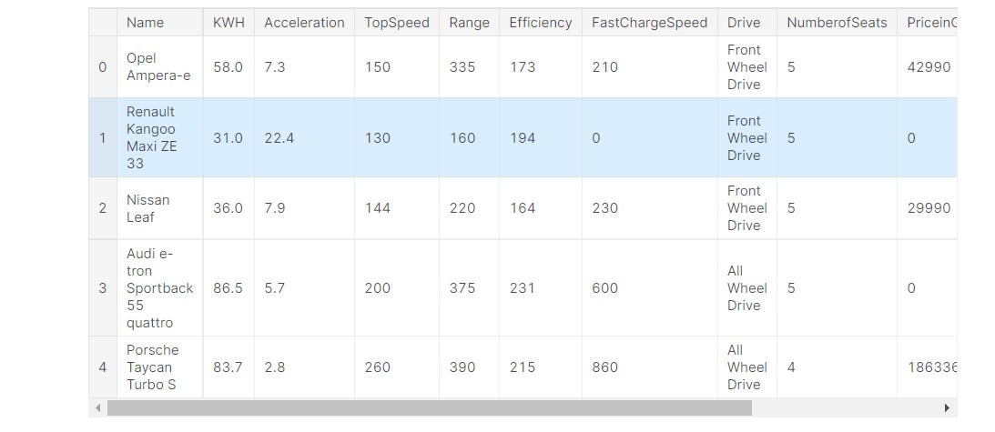
I will share the entire notebook at the end, have a look there.
Let us have a look at the nature of the data and the data types.
df1.info()
Output:
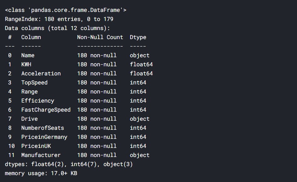
We can see that majority of the data is numeric. It is either float or integer, and 3 columns contain text data. Now, let us have a look at the correlation between the data.
df1.corr()
Output:
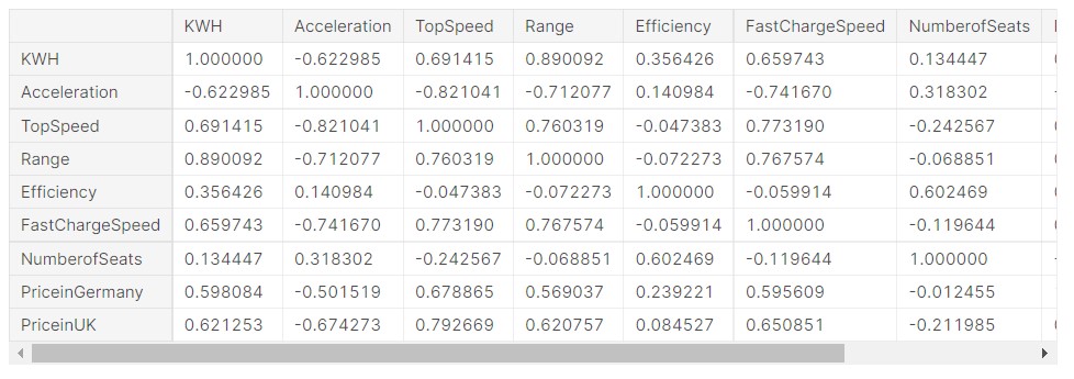
We can see that there is a good correlation between many variables. For the detailed report, please check the notebook, at the end.
Let us understand the correlation better using a heat map.
plt.figure(figsize=(8,6))
sns.heatmap(df1.corr(), annot=True)
Output:
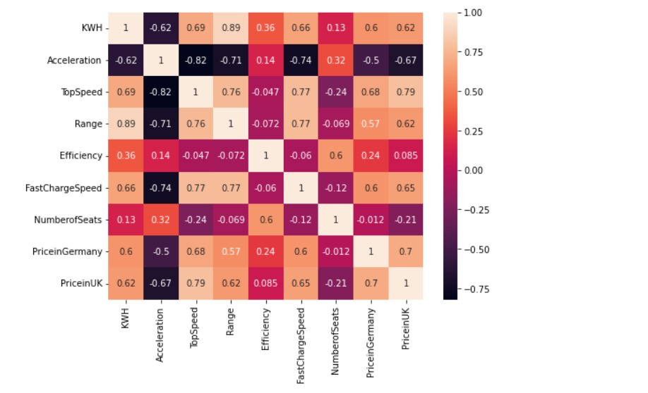
The lighter the colour, the more the correlation between the two data points. For example, we can see that price in Germany and price in the UK have a correlation of “0.7”, which is a good score. So, the correlation data has many real-life similarities.
For example, Top Speed has a high correlation to price in Germany and price in the UK. So, it makes sense. A car that has a higher top speed will have a higher price. Similarly, vehicle range and KWH has a high correlation of 0.89, it is obvious as the battery capacity, more will be the range of the vehicle. The correlation heatmap is thus, a great way to understand which data columns are related to each other.
Other data visualisations and various types of plots can be made to visualise the data distribution and understand the whole data. Doing proper data exploration can help in the overall data-driven decision-making process.
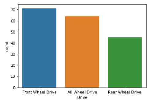
Let us have a look at the count of each type of drive for the vehicles.
sns.countplot(x = 'Drive', data = df1)
Output:
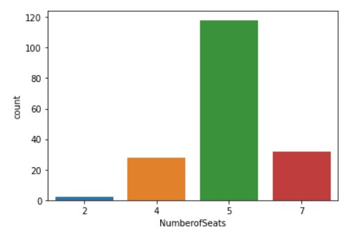
Now, let us see the distribution of the number of seats.
sns.countplot(x = 'NumberofSeats', data = df1)
Output:
Now, let us see the data distribution considering both, the number of seats and type of drive.
plt.figure(figsize=(8,6))
sns.countplot(x = 'NumberofSeats', hue='Drive', data=df1)
Output:
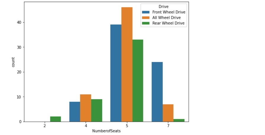
Let us see the various car manufacturers. The image might be blurred, so please check the notebook for proper visuals.
plt.figure(figsize=(18,10))
sns.countplot(y = 'Manufacturer', data = df1)
Output:
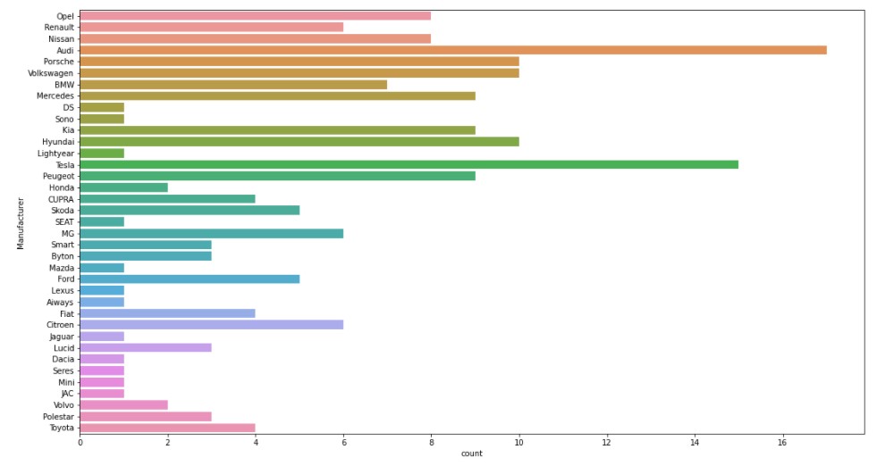
We can see that Audi and Tesla have the most types of electric vehicles.

Image 2
Now, we can plot some scatter relation plots to understand the data distribution.
First, let us have a look at the relation between acceleration and KWH capacity.
sns.relplot(x="KWH", y="Acceleration", height=6,hue="Drive",data=df1)
Output:
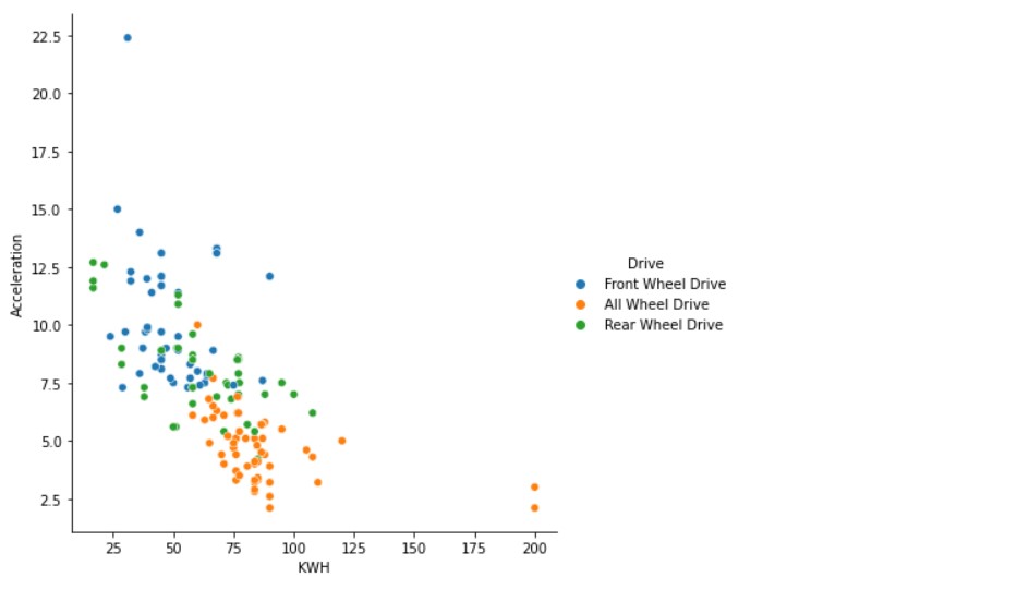
Now, let us add the factor of the number of seats.
sns.relplot(x="KWH", y="Acceleration", size="NumberofSeats", height=6,sizes=(15, 100),data=df1)
Output:
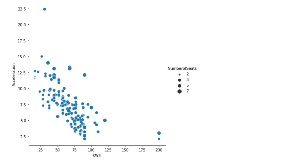
We can see that the plots can help us understand the data distribution in a better way.
Next up, we plot the relation between Top Speed and Vehicle Range.
sns.relplot(x="TopSpeed", y="Range",height=6, hue="Drive",data=df1)
Output:
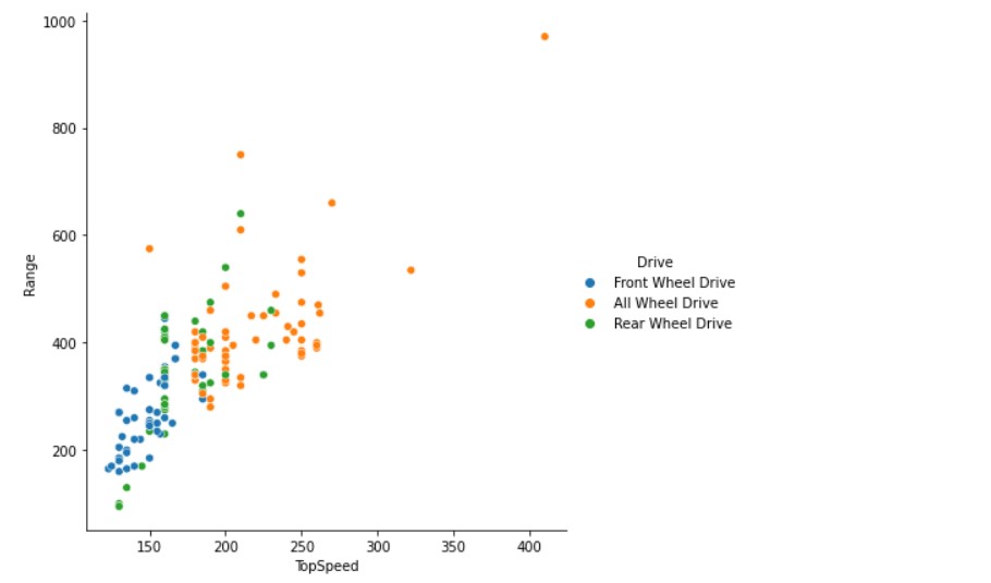
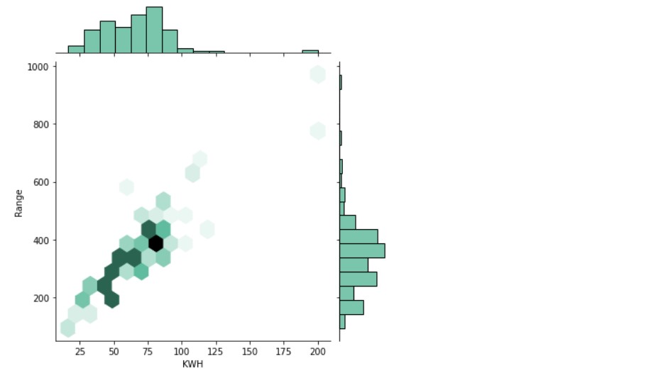
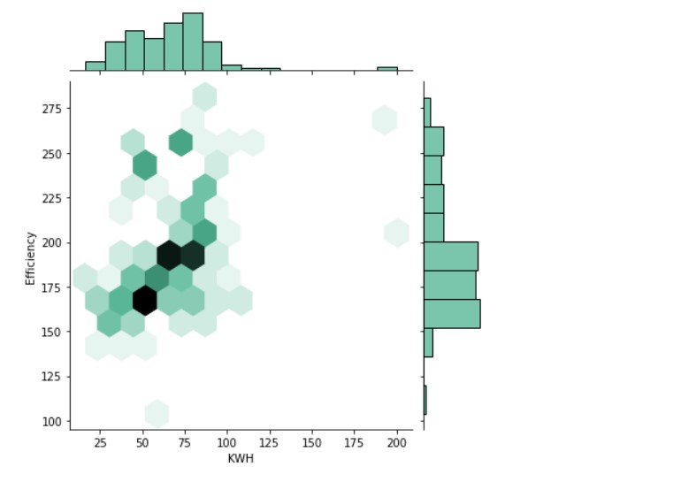
I have made more plots, please check the notebook for all visuals. But, let us check some special types of plots, which are interesting to look at.
Let us look at a joint plot type.
sns.jointplot(x=df1["KWH"], y=df1["Range"], kind="hex", color="#4CB391")
Output:
sns.jointplot(x=df1["KWH"], y=df1["Efficiency"], kind="hex", color="#4CB391")
Output:
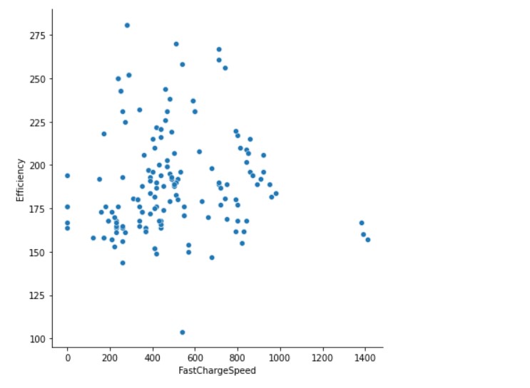
Now, we see the relationship between Fast Charge Speed and Efficiency.
sns.relplot(x="FastChargeSpeed", y="Efficiency", height=6,data=df1)
Output:
Various factors contribute to the prices of electric vehicles, a lot of parameters are also to be considered to buy electric vehicles. Let us now work on a Machine Learning model which can do the prediction.
Machine Learning Model For Price Prediction of Electric Vehicles
We will predict the price of the vehicle based on all the parameters and data, one thing to be pointed is that many data points are missing. In, the case of vehicle prices, many vehicles have prices just in Pounds, and some have prices just in euros. So, for the sake of simplicity, we take only the prices in UK Pound.
Considering 1 Euro = 0.85 Pound
Let us see the number of empty values in Pounds.
c=0
for i in range(0, len(df1["PriceinUK"])):
    if (df1["PriceinUK"][i]==0):
        c+=1
print('Empty Values:',c)
Output:

As we will modify some data, we put this setting.
pd.options.mode.chained_assignment = None
Now, we apply the conversion.
for i in range(0, len(df1["PriceinUK"])):
    if (df1["PriceinUK"][i]==0):
        val=df1["PriceinGermany"][i]*0.85
        df1["PriceinUK"][i]=val
Now, all the values having 0 will be filled with appropriate values. Though this method of filling data is not appropriate, we use this for this case, as there are no other options.
We do some data labelling.
import category_encoders as ce
train_df=df1
# create object of Ordinalencoding
encoder= ce.OrdinalEncoder(cols=['Drive'],return_df=True,
                           mapping=[{'col':'Drive',
'mapping':{'Front Wheel Drive':1,'Rear Wheel Drive':2,'All Wheel Drive':3}}])
#fit and transform train data
df_train = encoder.fit_transform(train_df)#Original data
So, basically, front-wheel drive is saved as 1, rear-wheel drive as 2 and all-wheel drive as 3. Basically, the reason is that data is as text, but is categorical data. Algorithms will not directly understand the text, so, we need to encode the text, so that ML algorithms are able to understand them.
df_train.info()
Output:
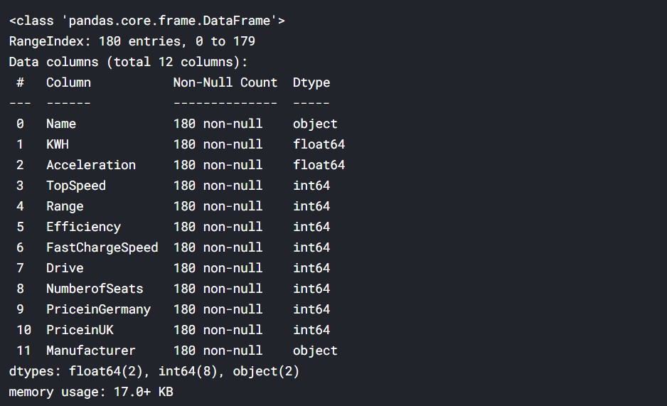
Except for vehicle name and manufacturer name, all else is a numeric value, so no problem in computing.
Now, we take the input data, which is taken as X.
X= df_train.drop(['Name', 'PriceinGermany','PriceinUK','Manufacturer'], axis=1)
X=X.values
Basically, we are removing the strings and the target data to set the columns which can be used as input data.
Let us see, how it looks like.
X
Output:

So, we can see that it is a multidimensional array.
So, now we have to take in the target, that is “y”.
y=df_train['PriceinUK'].values
Let us have a look at their dimensions once.

So, we can see that both have 180 data points.
Now, proceeding to the train, test split.
from sklearn.model_selection import train_test_split
X_train, X_test, y_train, y_test = train_test_split(X, y, test_size=0.33, random_state=7)
We kept the test set at 1/3rd of the data and 2/3rd of the data is train set.
Now, we create a Random Forest Regressor model.
from sklearn.ensemble import RandomForestRegressor
# create regressor object
regressor = RandomForestRegressor(n_estimators = 300, random_state = 0)
# fit the regressor with x and y data
regressor.fit(X_train, y_train)
With, this the model has been fed with the data.
Now, we do the predictions.
y_pred= regressor.predict(X_test)
Now, let us have a comparison between the test predictions and actual test data.
y_test
Output:

y_pred
Output:
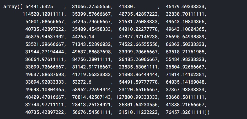
Well, there are significant deviations, but the values are somewhat in a ballpark.
Accuracy Metrics for Predicted Prices of Electric Vehicle
Mean Absolute Error:
#Mean Absolute Error(MAE)
from sklearn.metrics import mean_absolute_error
print("MAE: ",mean_absolute_error(y_test,y_pred))
Output:

Mean Squared Error:
#Mean Squared Error(MSE)
from sklearn.metrics import mean_squared_error
print("MSE: ",mean_squared_error(y_test,y_pred))
Output:

Root Mean Squared Error:
#Root Mean Squared Error(RMSE)
print("RMSE: ",np.sqrt(mean_squared_error(y_test,y_pred)))
Output:

R Squared (R2):
#R Squared (R2)
from sklearn.metrics import r2_score
r2 = r2_score(y_test,y_pred)
print("R2: ",r2)
Output:

So, we had a look at all the accuracy metrics.
Have a look at the entire code here: Kaggle
About me
Prateek Majumder
Analytics | Content Creation
Connect with me on Linkedin.
My other articles on Analytics Vidhya: Link.
Thank You.
Image Sources-
- Image 1- https://www.pexels.com/photo/two-white-and-red-tesla-charging-station-2480315/
- Image 2- https://www.telegraph.co.uk/cars/news/audi-e-tron-gt-revealed-take-tesla-luxury-electric-car-choice/


