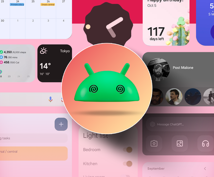
Every time I set up a new phone, I tell myself I’ll finally use widgets properly. I carefully choose the most promising ones, resize and arrange them, and admire how “productive” my home screen looks.
In reality, most widgets don’t survive long on my phone. Some take up too much space, others show too little information, and many feel like awkward shortcuts rather than thoughtfully designed tools.
If widgets were as practical as they sound, my home screen would be full of them. But after months of tinkering, I’m starting to think the problem isn’t user error.
Why widgets sound better than they work
On paper, widgets make perfect sense. They promise quick access, useful information at a glance, and fewer reasons to open full apps.
They offer a way to make your phone feel more personal and more efficient at the same time.
The problem is that this logic holds up in theory, but not in daily use.
Widgets assume that what you need from an app can be neatly summarized in a small, fixed rectangle.
Most apps don’t work that way. They’re built around movement, whether it’s scrolling through lists, tapping through steps, or reacting to changing states.
When that is squeezed into a widget, key parts of the experience are stripped away.
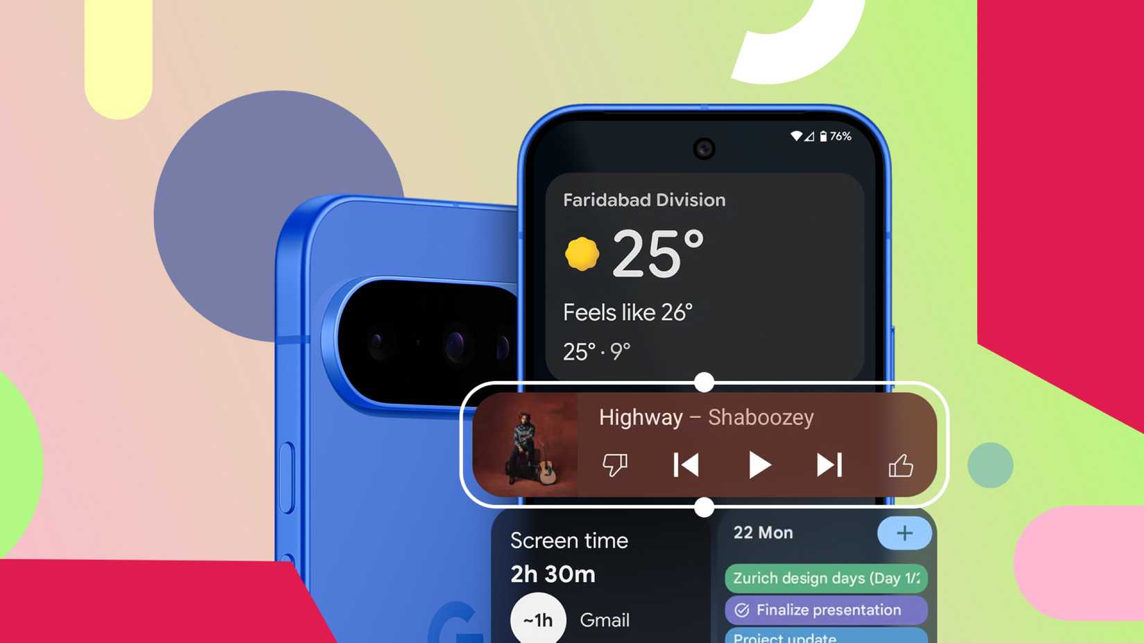
What’s left is usually a compromise: a weather widget that’s too shallow, a to-do widget that only shows a few items, a music widget that looks good but still dumps you into the app for anything beyond play and pause.
The widget is there, but it rarely replaces the thing it’s supposed to make faster.
Most widgets waste space without giving much back
The biggest problem with most Android widgets is that they require a lot of space and return very little value in exchange.
Take music widgets, for example. Spotify’s widget looks fine, but it scales poorly.
At smaller sizes, it displays the album art with play and pause controls. At larger sizes, it still doesn’t offer much beyond that. You can’t meaningfully browse your library or queue tracks from the widget, so it becomes a decorative remote rather than a genuinely useful interface.
Calendar widgets are another common offender. Google Calendar’s month view widget can be helpful, but it occupies a lot of space.
Meanwhile, the smaller schedule widget shows one or two upcoming events at best.
Widgets fail at the basics of good design
Most Android widgets don’t fail because they’re missing features. They fail because they ignore some very basic principles of good design: consistency, adaptability, and meaningful interaction.
Let’s start with visual consistency.
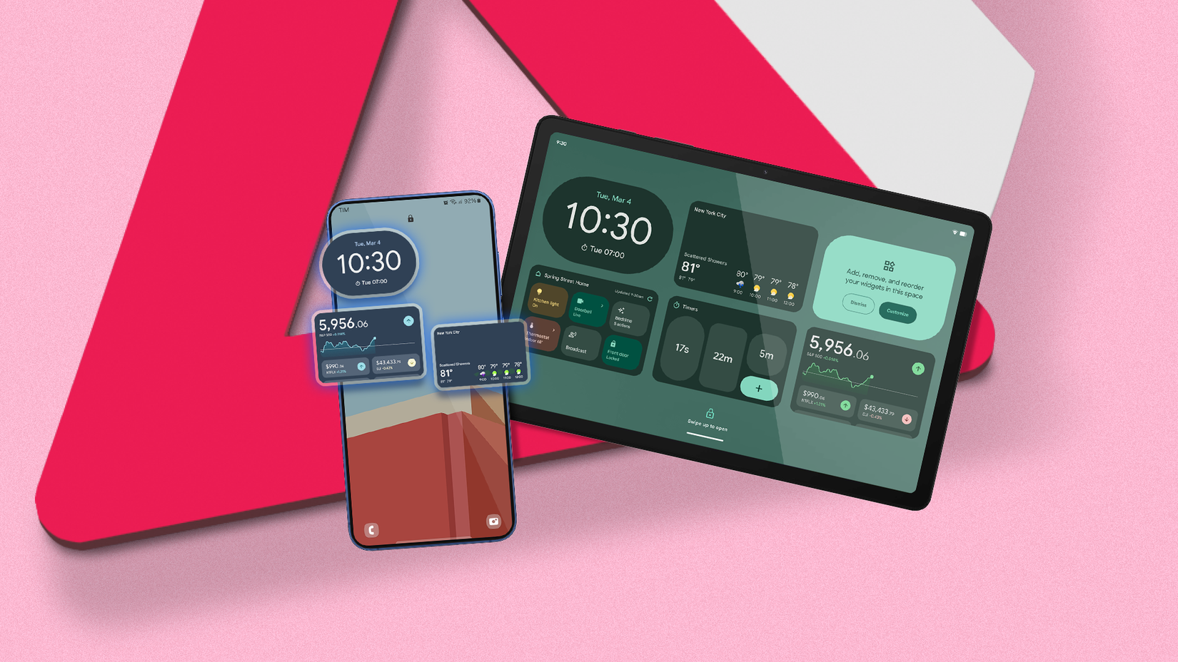
Even in 2026, widgets often feel disconnected from the rest of the system. Some respect Material You colors, while others stubbornly stick to their own palettes. Fonts don’t always match system text. Dark mode support is inconsistent at best.
When a widget looks slightly “off,” it stands out in a bad way, especially on an otherwise cohesive home screen.
Interaction is where things really fall apart. Too many widgets act like decorative previews rather than functional tools.
You tap expecting it to do something, and it just opens the app. At that point, the widget hasn’t saved you a step. Rather, it’s just taking up space to act as a glorified shortcut.
If the only meaningful interaction happens after the app opens, the widget itself becomes redundant.
How widgets could earn their space
Sometimes, a widget reminds me of the importance of certain features.
For instance, TickTick’s Quick Add widget doesn’t simply open the app; it allows you to add a task directly from the home screen. You can customize almost every aspect of this interaction, including the widget’s theme, dates, tags, and even the template it utilizes.
Google Drive’s Quick Actions widget also takes a similar approach. Instead of trying to show too much, it offers direct shortcuts to a few actions: searching for your files, uploading something new, or scanning a document.
Both widgets follow a simple rule: if a widget occupies space, it should replace part of the app experience. They justify their presence by saving real time and reducing the steps.
That’s the direction I wish more Android widgets would move toward.
First, widgets should offer real interaction, not just previews. Tapping a checkbox should check it off. If the widget’s primary job is to launch the app, it hasn’t earned its place on the home screen.
Adaptability matters too. A music widget could prioritize different controls depending on whether something is playing. A calendar widget shouldn’t be a frozen agenda; it should highlight what matters in the moment.
Finally, widgets should feel like they belong on the home screen, and not like optional add-ons. That means consistent theming, predictable behavior across sizes, and better layouts.
My home screen is mostly empty now
After years of trying to make widgets work, I stopped forcing it.
My home screen is intentionally sparse, because most widgets never earned their place there.
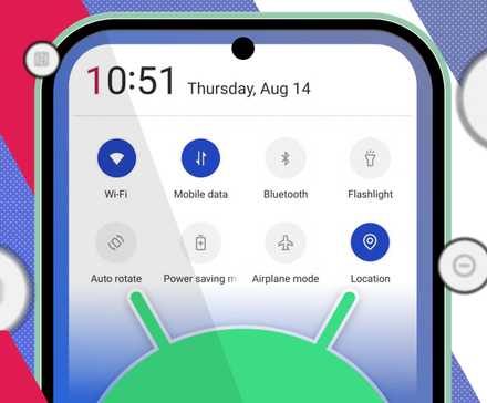
Recently, I have been using Quick Settings more frequently, since it manages the toggles and actions that I use frequently.
What’s even better is that media controls for apps like Spotify, VLC, and YouTube Music are readily accessible from the notification drawer, and they adjust without occupying permanent screen space.
Cutting the clutter made my phone simpler to use, and I do not miss the widgets at all.


