

Android 16’s initial release is available on Pixel phones right now, but it’s pretty light on new user-facing features. The big changes are coming with Android 16 QPR1, which is currently in beta.
One of my favorite new features: Android 16 QPR1’s reworked lock screen notifications. The new setup splits the difference between Google and Samsung’s default implementations, and it’s the sweet spot I never knew I was looking for.
Other setups don’t quite nail it
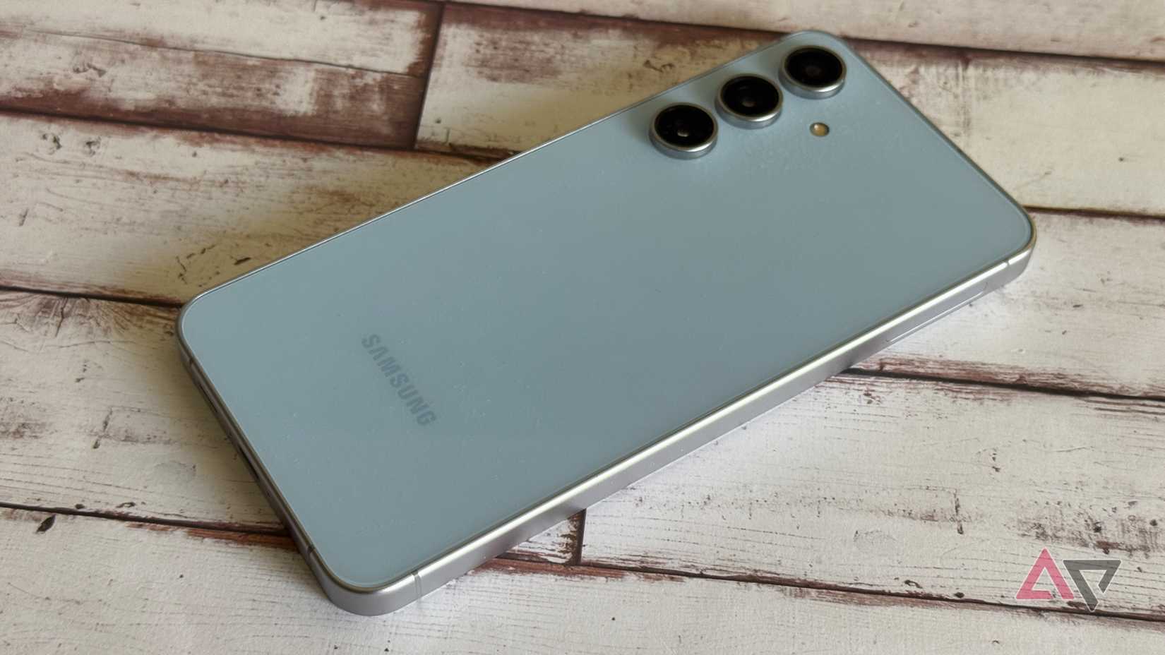
By default, the One UI lock screen on Samsung phones collapses notifications into a row of icons with no content displayed. To see what the notifications are actually notifying you about, tap these icons to expand your notification panel.
Pixel phones running Android 16 or older, on the other hand, show a lot of notification information by default, with full banner notifications displayed on the lock screen, content, and all.
Samsung gives you the option to show full notifications on the lock screen, and Google offers settings to limit what your phone will show while it’s locked. But none of these options are quite right for me; they all show too much or too little information at once for my liking.
A happy medium
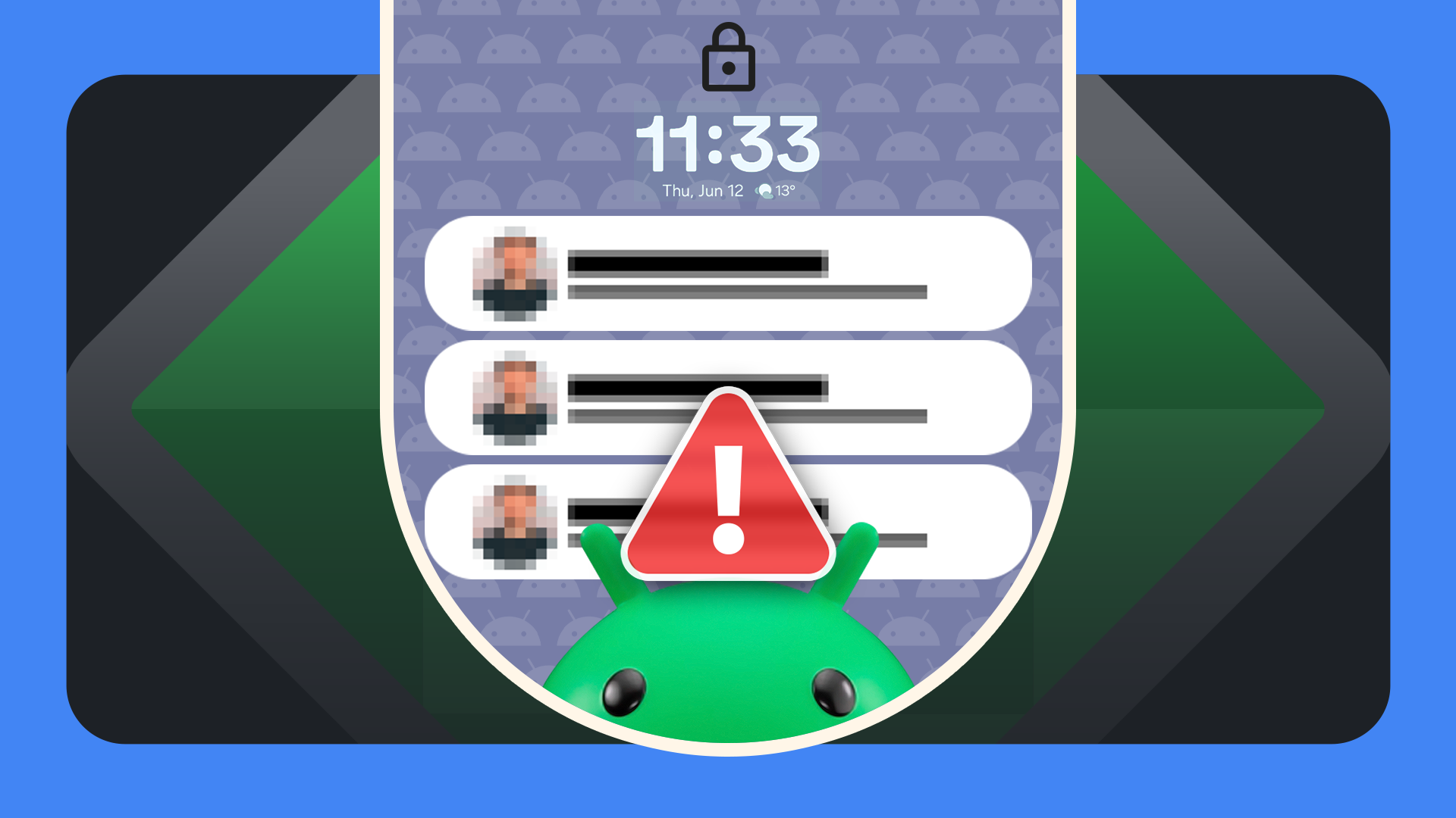
The Android 16 QPR1 beta introduced a clever new default that’s a reasonable compromise between these two implementations. New notifications are displayed as full-width banners, while ones you’ve already seen are collapsed into icons.
It may seem like a relatively minor tweak, but it has big implications for how I interact with my phone’s lock screen.
Like many of us, I practice terrible notification hygiene. I’ll let messages or emails that don’t require immediate attention sit on my lock screen for hours or days.
Occasionally, things pile up, and my lock screen gets hard to parse at a glance.
With the Android 16 QPR1 beta setup, fresh notifications are easy to spot. They appear full-size above the row of collapsed icons.
From here, I can act on these notifications if they’re urgent, dismiss them if they’re irrelevant, or leave them on my lock screen to deal with later.
Expanding your notification shade will mark any new notifications as seen, for the purposes of the lock screen, after which they’ll be shown as icons rather than banners.
It’s super easy to keep things feeling organized, which I really appreciate.
Because of the way it collapses old notifications but not new ones, Android 16 QPR1’s lock screen is also easier to understand quickly. You can tell whether there are any notifications you haven’t interacted with instantly just by the shapes on your lock screen.
You know within a fraction of a second of turning your screen on whether there’s anything new for you to deal with. It’s great.
Coming to a Pixel near you in Android 16 QPR1
For most users, the stable Android 16 release is nearly indistinguishable from Android 15. Google’s saving the bigger UI tweaks, like this new lock screen layout, Material 3 Expressive styling, and full support for Live Updates notifications, for Android 16 QPR1.
We’re currently several releases into the Android 16 QPR1 beta, which you can sign up to try on your own Pixel from Google’s official Android Beta Program website. We’re expecting to see QPR1 roll out in stable this September.