What is a Stock market?
We will use the ARIMA model to forecast the stock price of ARCH CAPITAL GROUP in this tutorial.
What is ARIMA?
Before working with non-stationary data, the Autoregressive Integrated Moving Average (ARIMA) Model converts it to stationary data. One of the most widely used models for predicting linear time series data is this one.
The ARIMA model has been widely utilized in banking and economics since it is recognized to be reliable, efficient, and capable of predicting short-term share market movements.
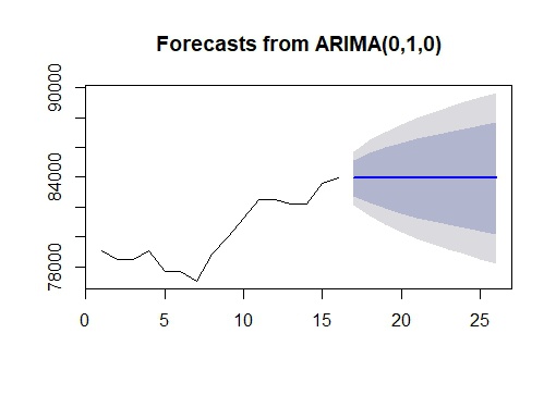
Now consider you have a certain value A that is influenced by another value B. Then you must determine the link between data points A and B in order to determine linear regression.
These two values, A and B (A’s previous value), are now linked in such a way that A’s current value is predicated on A’s previous value. As a result, any future value for A will be determined by its current value.
So, how should this relationship be represented? We create an ARIMA model based on the data. Let’s take a look at you one by one.
AR (Autoregressive)
The AR algorithm determines the linear regression of (Present fitted values) vs. (Past fitted values).
MA (Moving Average)
The linear regression of the (Present value of residuals) vs. MA is discovered by MA (Past value of residuals).
We employ a mixture of the two (ARIMA), which allows us to plot the time series and investigate it in depth.
Load required libraries
!pip install pmdarima
import os
import warnings
warnings.filterwarnings('ignore')
import numpy as np
import pandas as pd
import matplotlib.pyplot as plt
from statsmodels.tsa.stattools import adfuller
from statsmodels.tsa.seasonal import seasonal_decompose
from statsmodels.tsa.arima_model import ARIMA
from pmdarima.arima import auto_arima
from sklearn.metrics import mean_squared_error, mean_absolute_error
import math
dateparse = lambda dates: pd.datetime.strptime(dates, '%Y-%m-%d')
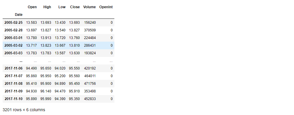
stock_data = pd.read_csv('acgl.us.txt',sep=',', index_col='Date', parse_dates=['Date'], date_parser=dateparse).fillna(0)
stock_data
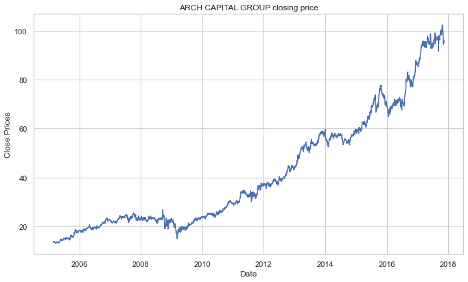
Visualize the stock’s daily closing price.
#plot close price
plt.figure(figsize=(10,6))
plt.grid(True)
plt.xlabel('Date')
plt.ylabel('Close Prices')
plt.plot(stock_data['Close'])
plt.title('ARCH CAPITAL GROUP closing price')
plt.show()
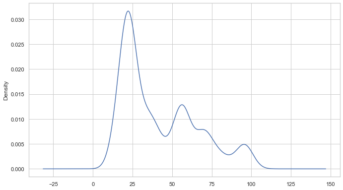
We can also use a probability distribution to visualize the data in our series.
#Distribution of the dataset
df_close = stock_data['Close']
df_close.plot(kind='kde')
A time series is also regarded to include three systematic components: level, trend, and seasonality, as well as one non-systematic component termed noise.
The following are the components’ definitions:
- The average value in the series is called the level.
- The increasing or falling value in the series is referred to as the trend.
- Seasonality is the series’ recurring short-term cycle.
- The random variance in the series is referred to as noise.
Because time series analysis only works with stationary data, we must first determine whether a series is stationary.
ADF (Augmented Dickey-Fuller) Test
One of the most widely used statistical tests is the Dickey-Fuller test. It can be used to determine whether or not a series has a unit root, and thus whether or not the series is stationary. This test’s null and alternate hypotheses are:
Null Hypothesis: The series has a unit root (value of a =1)
Alternate Hypothesis: The series has no unit root.
If the null hypothesis is not rejected, the series is said to be non-stationary. The series can be linear or difference stationary as a result of this.
The series becomes stationary if both the mean and standard deviation are flat lines (constant mean and constant variance).
#Test for staionarity
def test_stationarity(timeseries):
    #Determing rolling statistics
    rolmean = timeseries.rolling(12).mean()
    rolstd = timeseries.rolling(12).std()
    #Plot rolling statistics:
    plt.plot(timeseries, color='blue',label='Original')
    plt.plot(rolmean, color='red', label='Rolling Mean')
    plt.plot(rolstd, color='black', label = 'Rolling Std')
    plt.legend(loc='best')
    plt.title('Rolling Mean and Standard Deviation')
    plt.show(block=False)
    print("Results of dickey fuller test")
    adft = adfuller(timeseries,autolag='AIC')
    # output for dft will give us without defining what the values are.
    #hence we manually write what values does it explains using a for loop
    output = pd.Series(adft[0:4],index=['Test Statistics','p-value','No. of lags used','Number of observations used'])
    for key,values in adft[4].items():
        output['critical value (%s)'%key] =  values
    print(output)
test_stationarity(df_close)
Results of dickey fuller test
Test Statistics                   1.374899
p-value                           0.996997
No. of lags used                  5.000000
Number of observations used    3195.000000
critical value (1%)              -3.432398
critical value (5%)              -2.862445
critical value (10%)             -2.567252
dtype: float64
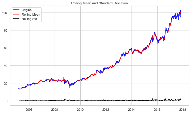
The increasing mean and standard deviation may be seen in the graph above, indicating that our series isn’t stationary.
We can’t rule out the Null hypothesis because the p-value is bigger than 0.05. Additionally, the test statistics exceed the critical values. As a result, the data is nonlinear.
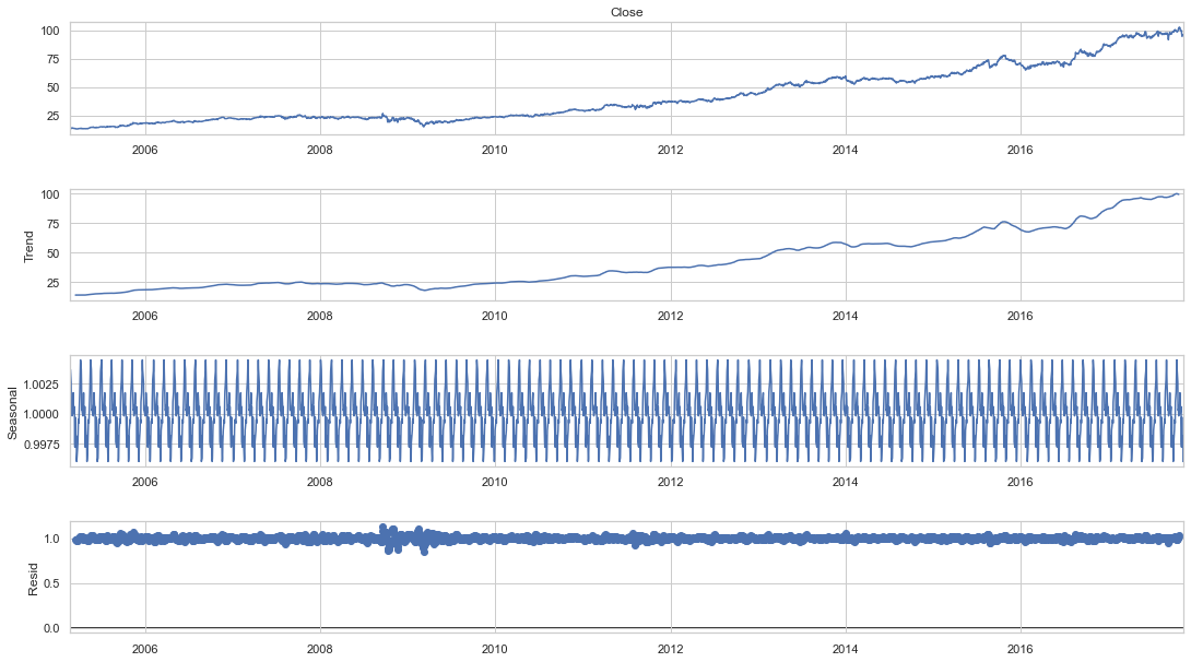
Seasonality and trend may need to be separated from our series before we can undertake a time series analysis. This approach will cause the resulting series to become stagnant.
Let’s isolate the time series from the Trend and Seasonality.
#To separate the trend and the seasonality from a time series,
# we can decompose the series using the following code.
result = seasonal_decompose(df_close, model='multiplicative', freq = 30)
fig = plt.figure()
fig = result.plot()
fig.set_size_inches(16, 9)
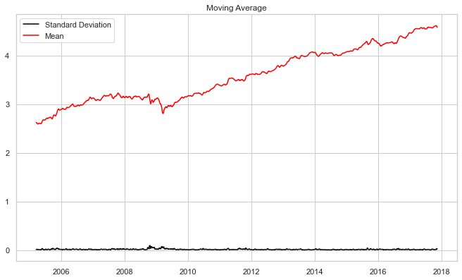
To reduce the magnitude of the values and the growing trend in the series, we first take a log of the series. We then calculate the rolling average of the series after obtaining the log of the series. A rolling average is computed by taking data from the previous 12 months and calculating a mean consumption value at each subsequent point in the series.
#if not stationary then eliminate trend
#Eliminate trend
from pylab import rcParams
rcParams['figure.figsize'] = 10, 6
df_log = np.log(df_close)
moving_avg = df_log.rolling(12).mean()
std_dev = df_log.rolling(12).std()
plt.legend(loc='best')
plt.title('Moving Average')
plt.plot(std_dev, color ="black", label = "Standard Deviation")
plt.plot(moving_avg, color="red", label = "Mean")
plt.legend()
plt.show()
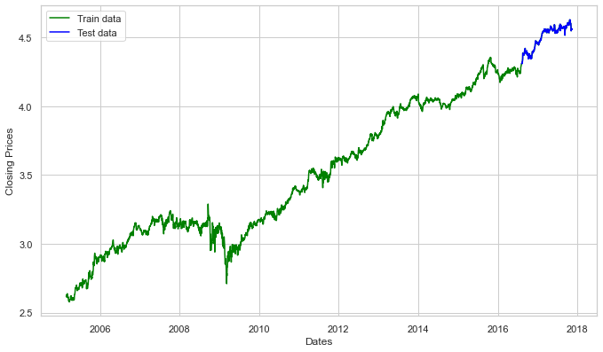
Now we’ll develop an ARIMA model and train it using the stock’s closing price from the train data. So, let’s visualize the data by dividing it into training and test sets.
#split data into train and training set
train_data, test_data = df_log[3:int(len(df_log)*0.9)], df_log[int(len(df_log)*0.9):]
plt.figure(figsize=(10,6))
plt.grid(True)
plt.xlabel('Dates')
plt.ylabel('Closing Prices')
plt.plot(df_log, 'green', label='Train data')
plt.plot(test_data, 'blue', label='Test data')
plt.legend()
It’s time to choose the ARIMA model’s p,q, and d parameters. We chose the values of p,d, and q last time by looking at the ACF and PACF charts, but this time we’ll utilize Auto ARIMA to find the best parameters without looking at the ACF and PACF graphs.
Auto ARIMA: Automatically discover the optimal order for an ARIMA model.
The auto_arima function returns a fitted ARIMA model after determining the most optimal parameters for an ARIMA model. This function is based on the forecast::auto. Arima R function, which is widely used.
The auro_arima function works by performing differencing tests (e.g., Kwiatkowski–Phillips–Schmidt–Shin, Augmented Dickey-Fuller, or Phillips–Perron) to determine the order of differencing, d, and then fitting models within start p, max p, start q, max q ranges. After conducting the Canova-Hansen to determine the optimal order of seasonal differencing, D, auto_arima also seeks to identify the optimal P and Q hyper-parameters if the seasonal option is enabled.
model_autoARIMA = auto_arima(train_data, start_p=0, start_q=0,
                      test='adf',       # use adftest to find optimal 'd'
                      max_p=3, max_q=3, # maximum p and q
                      m=1,              # frequency of series
                      d=None,           # let model determine 'd'
                      seasonal=False,   # No Seasonality
                      start_P=0,
                      D=0,
                      trace=True,
                      error_action='ignore',
                      suppress_warnings=True,
                      stepwise=True)
print(model_autoARIMA.summary())
model_autoARIMA.plot_diagnostics(figsize=(15,8))
plt.show()
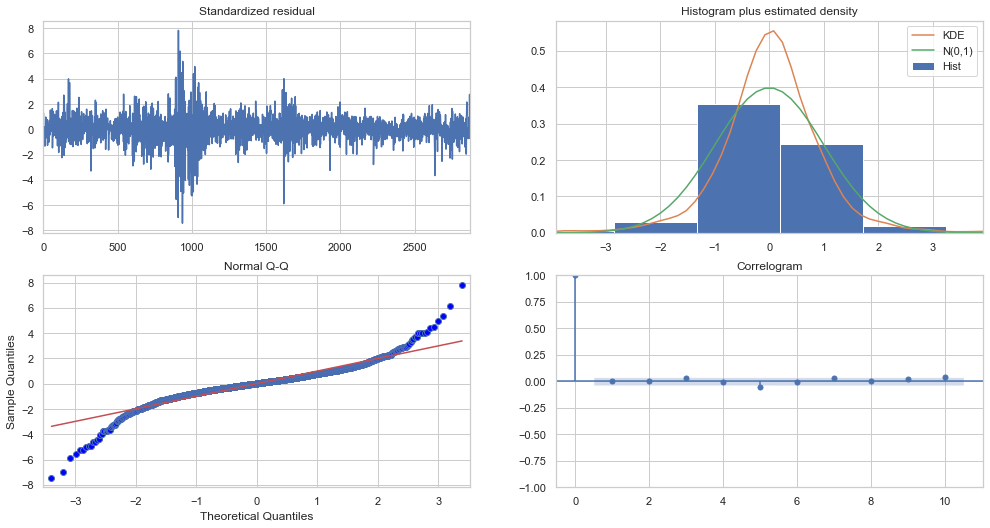
Top left: The residual errors appear to have a uniform variance and fluctuate around a mean of zero.
Top Right: The density plot on the top right suggests a normal distribution with a mean of zero.
Bottom left: The red line should be perfectly aligned with all of the dots. Any significant deviations would indicate a skewed distribution.
Bottom Right: The residual errors are not autocorrelated, as shown by the Correlogram, also known as the ACF plot. Any autocorrelation would imply that the residual errors have a pattern that isn’t explained by the model. As a result, you’ll need to add more Xs (predictors) to the model.
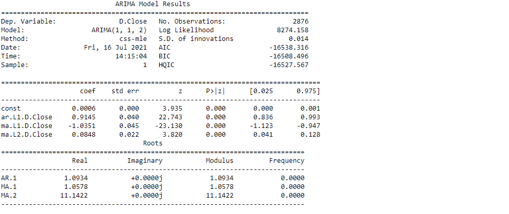
As a result, the Auto ARIMA model assigned the values 1, 1, and 2 to, p, d, and q, respectively.
#Modeling
# Build Model
model = ARIMA(train_data, order=(1,1,2))
fitted = model.fit(disp=-1)
print(fitted.summary())
Let’s now begin forecasting stock prices on the test dataset with a 95% confidence level.
# Forecast
fc, se, conf = fitted.forecast(321, alpha=0.05)  # 95% conf
# Make as pandas series
fc_series = pd.Series(fc, index=test_data.index)
lower_series = pd.Series(conf[:, 0], index=test_data.index)
upper_series = pd.Series(conf[:, 1], index=test_data.index)
# Plot
plt.figure(figsize=(10,5), dpi=100)
plt.plot(train_data, label='training data')
plt.plot(test_data, color = 'blue', label='Actual Stock Price')
plt.plot(fc_series, color = 'orange',label='Predicted Stock Price')
plt.fill_between(lower_series.index, lower_series, upper_series,
                 color='k', alpha=.10)
plt.title('ARCH CAPITAL GROUP Stock Price Prediction')
plt.xlabel('Time')
plt.ylabel('ARCH CAPITAL GROUP Stock Price')
plt.legend(loc='upper left', fontsize=8)
plt.show()
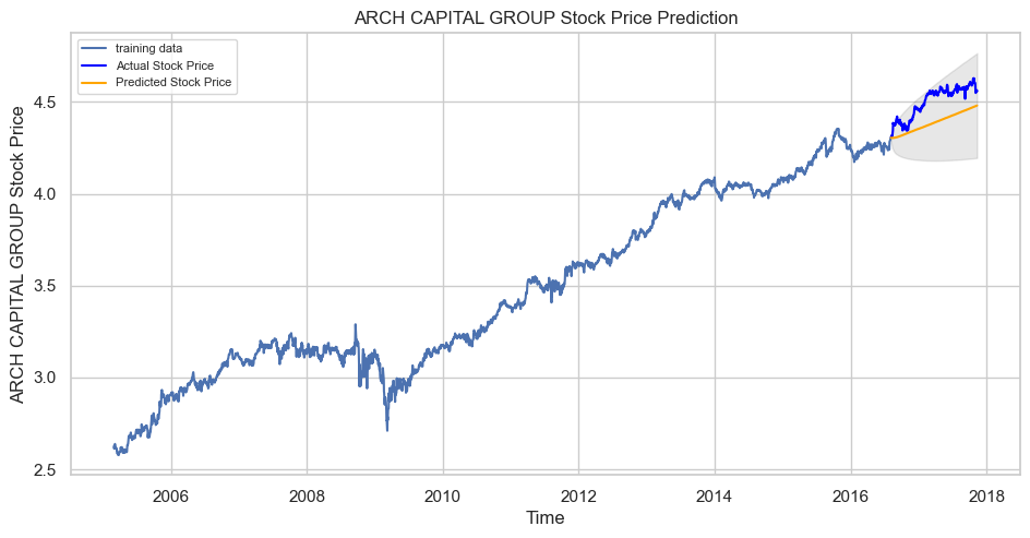
Our model played great, as you can see. Let’s take a look at some of the most common accuracy metrics for evaluating forecast results:
# report performance
mse = mean_squared_error(test_data, fc)
print('MSE: '+str(mse))
mae = mean_absolute_error(test_data, fc)
print('MAE: '+str(mae))
rmse = math.sqrt(mean_squared_error(test_data, fc))
print('RMSE: '+str(rmse))
mape = np.mean(np.abs(fc - test_data)/np.abs(test_data))
print('MAPE: '+str(mape))

With a MAPE of around 2.5%, the model is 97.5% accurate in predicting the next 15 observations.
EndNote
Thank you for reading!
I hope you enjoyed the article and increased your knowledge.
Please feel free to contact me on Email
Something not mentioned or want to share your thoughts? Feel free to comment below And I’ll get back to you.
About the Author
Hardikkumar M. Dhaduk
Data Analyst | Digital Data Analysis Specialist | Data Science Learner
Connect with me on Linkedin
Connect with me on Github
The media shown in this article are not owned by Analytics Vidhya and are used at the Author’s discretion.


