Summary
- Spotify’s algorithm benefits from user input, with the Minus button hiding disliked songs.
- Historically, the UI design has been inconsistent with the placement of Plus and Minus buttons.
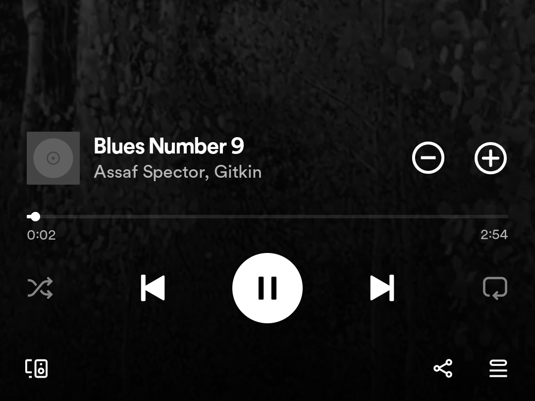
- New button placement above the seekbar feels better thought-out, encouraging deliberate user interaction.
Spotify might be one of the best music streaming apps available on Android. Even while we wait for a lossless quality setting, the app’s algorithm is a boon for discovering new music. However, the app has its shortcomings, mostly stemming from an inconsistent and poor UI design. Developers keep experimenting with new button placement, and we just chanced upon a new placement for the Dislike button, which hides songs from dynamic playlists and recommendations.

5 tweaks to improve the Spotify experience on Android
Use Spotify to the fullest with these simple features
Spotify’s music recommendation algorithm doesn’t understand your taste in music and podcasts without input from you. As much as it gathers from the tracks you play and listen to repeatedly, the algorithm also benefits from understanding what you wouldn’t want to hear again. You can provide this input using the Minus/dislike button in the player UI or player controls in your notification shade.
It shows up whenever you’re listening to Discover Weekly, Release Radar, or other dynamic playlists that spawn after a single track you picked finishes. The button is the exact opposite of the Plus button, which adds tracks to your Liked Songs playlists. The Minus button is like a Block option for songs, preventing the algorithm from recommending the song again or playing it again automatically.
However, Spotify has been inconsistent with button placement, sometimes placing this Minus button on the right, and sometimes on the left. Now, though, the developers seem to be experimenting with new placement of the Plus and Minus buttons.
Adjacent and deliberate
I don’t frequent Spotify’s algorithmically generated playlists, instead focusing on recommendations received from acquaintances and colleagues. However, I recently let the recommendation engine queue songs, and found the Plus and Minus buttons placed close together, just above the seekbar/playback progress indicator.
This placement of the buttons is better than previous tests we saw on Reddit, especially ones where theMinus button was easy to hit accidentally. When two buttons with opposite functions are placed adjacent to each other, I’d like to believe the user’s tap action would be more deliberate, and not controlled by familiarity or muscle memory.
However, the new button placement seems to be a part of a phased rollout or a randomized A/B test in version 8.9.46.426 of the Android app before the change is implemented widely. That would explain why some of my colleagues aren’t seeing the new design, and why there isn’t much chatter about it on Reddit either. Hopefully, the wait isn’t too long and Spotify doesn’t choose an inferior design instead.


