Material You debuted on Google Pixel phones with Android 12. It offered a new way to personalize devices using the phone’s wallpaper on the homescreen, which could influence the accent colors throughout the UI and, later, even in some first and third-party applications.
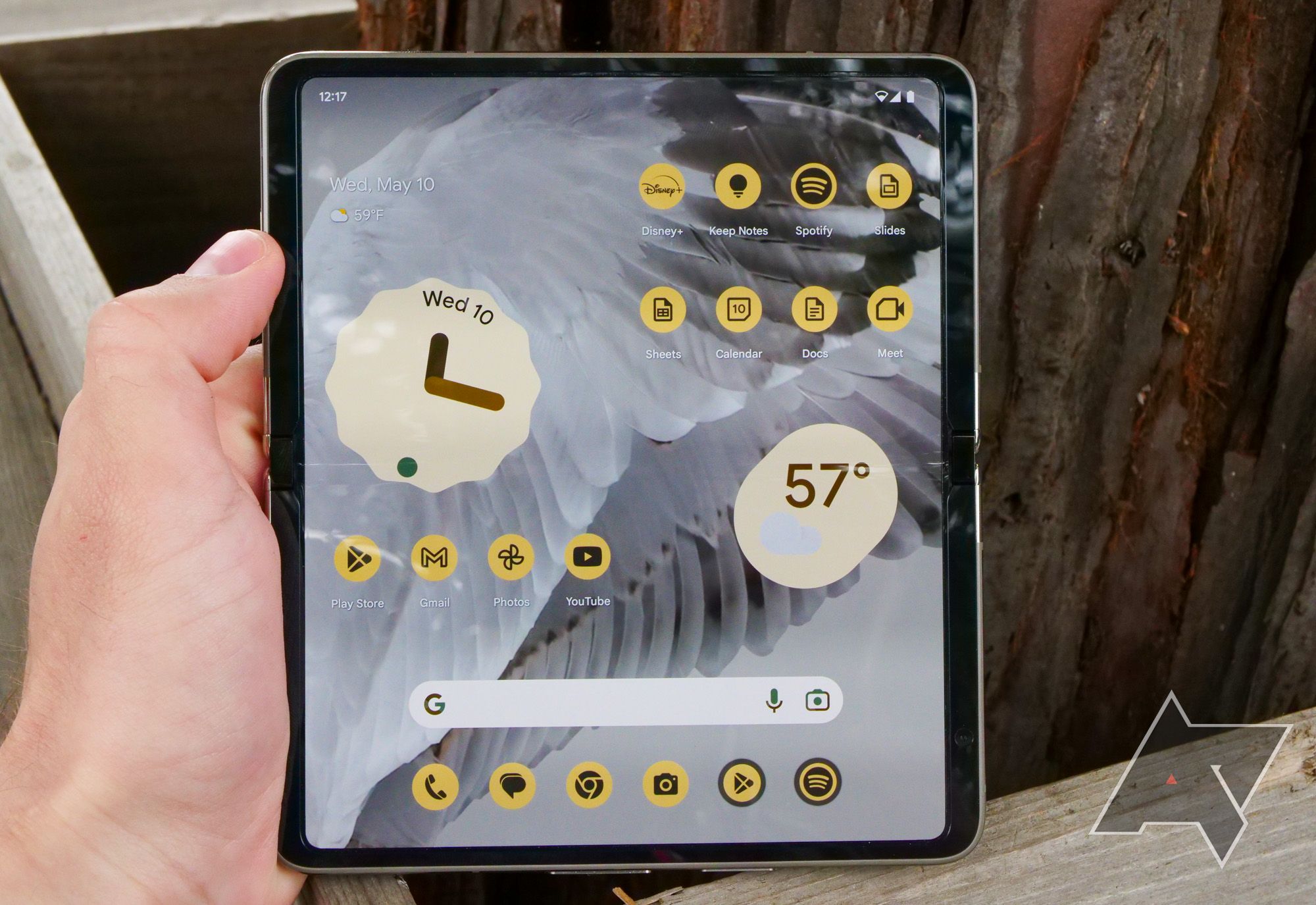
However, the change meant that Google also wanted these accent colors present in other places, including your homescreen, for individual apps and widgets. The problem is these icons, when applied, use the same color, shade, tint, and everything else. It makes apps even more difficult to find, especially when you have over 150 apps installed on your device — like most people do.
Material You: What it is and what we love about it
The most personal design you could imagine, without lifting a finger
Material You is great because it offers genuine and useful customization options
But it’s pushing the same color a bit too much
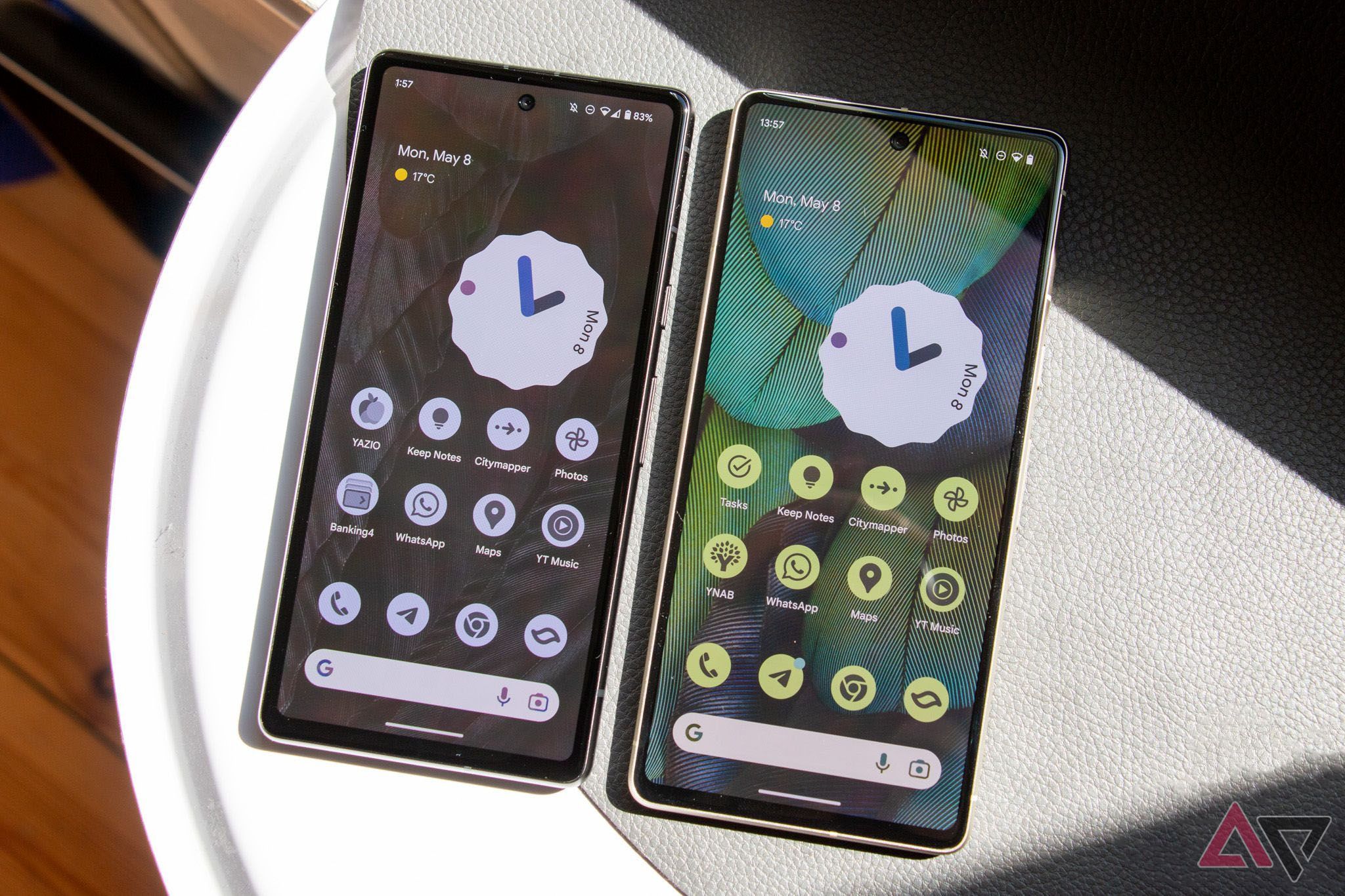
Before I start bashing Material You, I must admit that I love it. It brings a new color theme and design to Android that makes it look fresh and truly unique. It changes your themese colors based on your wallpaper, which applies to all the accent colors throughout the system, even in many apps. It’s neat, and I think it adds character to the otherwise same interface that millions of other people use and rely on.
But as much as I like its premise, there are a few issues with it. One of the main gripes is with the homescreen, more specifically the icons. When the same theme is applied to the icons, they’ll all turn into this dull-looking graphic that looks the same. It’s pretty unpleasant to look at and clashes with all the customization options it seemingly presents.
Themed icons haven’t fully materialized
A splash of color makes the UI feel fresh, but there are negative side effects
Material You on the homescreen, when applied to the icons, looks great. Except they significantly downgrade the user experience. When you have the same color applied to all icons, it makes it nearly impossible to find your favorite apps, save for a few.
I’ve used the Materia You-themed icons for several days, but I always struggle to find my favorite apps, even though I already know their exact placement. After all, my setup has barely changed over the past few years.
The other problem is that not all apps support this color theming. Even after years of having Material You, some apps still don’t support it properly. This needs to be fixed, regardless of where the blame lies. All apps, irrespective of who they’re from, should adhere to the same design principles and support the engine.
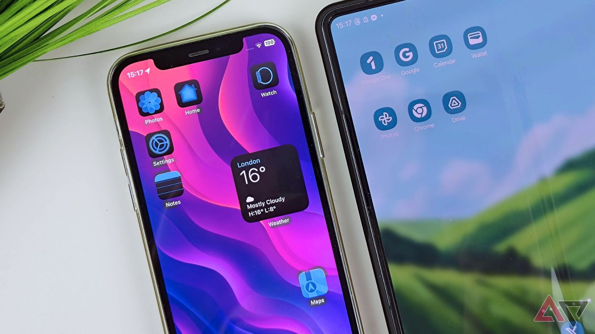
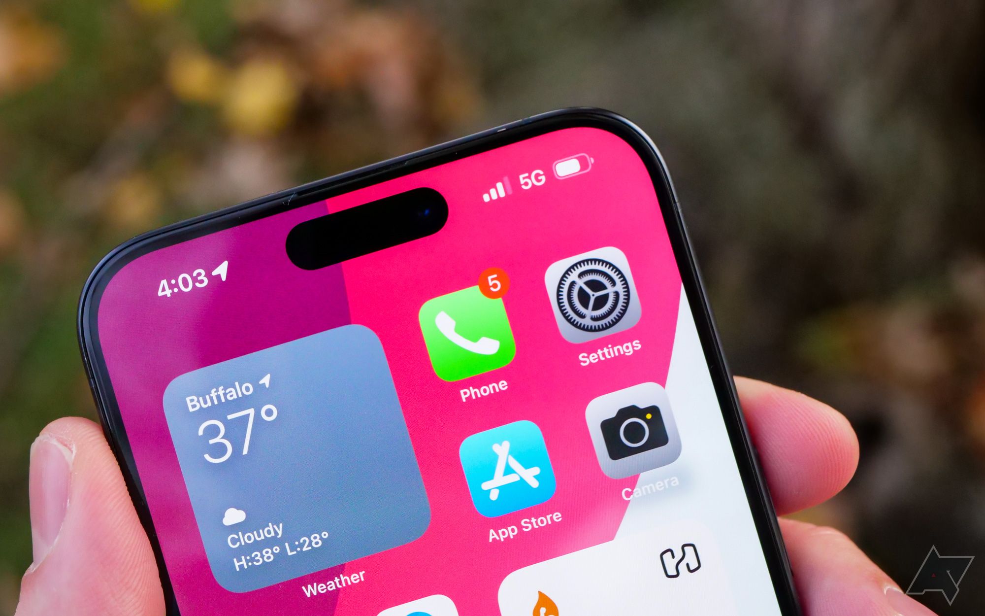
I’ve had a chance to play around with the latest iOS 18 Developer Beta, and that’s one area where Apple is slightly ahead of the curve – although it also suffers from some other issues. The fact that Apple’s tint applies to all icons is a great sign, but the contrast is way off and introduces the same problems we see on Android.
However, Apple’s aimplementation offers more colors to choose from, and it’s not restricted to the accent color you pick. It can be tailored to your liking, even if that means it’ll blend in with the background. It’s your phone, and it’s your choice — simple as that. It’s worth noting, however, that Apple’s Beta is just that, and things will likely change in the coming months.
Themed icons need adjusting
Dynamic icons, more colors, and more tints could improve the user interface
The one thing I always wanted, ever since dark and light modes were introduced for Android, are dynamic icons. Imagine if the icons could change their color based on the theme you have.
For instance, when dark mode is enabled, the icons could become darker and easier on the eyes; with light mode, they’ll turn white, or follow the theme you’ve set to make it easier to distinguish the myriad apps you have in the app drawer, and potentially on your homescreen.
This is one feature that’s already present in the latest iOS 18 Beta, and one that I hope will come to Android at some point in the future. I don’t need icons to support the Material You color theme, but I understand that many like it, and it certainly has a place.
Apple could give iPhones their own version of Material You
More built-in app customization features are down the road for iOS
The one way I could imagine Material You-themed icons working, at least for myself, is if Google added other colors. Imagine if you could have any background and set games to be blue, financial apps to be green, and social media apps to be purple. Would it look good? It’s hard to know. Would it be easier to distinguish them in the app drawer and on the homescreen, using a wallpaper that also uses these colors? Possibly.
The bottom line is that Material You icon theming needs to change. Google and Android need more guidelines for icons from app developers; we need a greater and more seamless experience that’s not fragmented. We need change, and I’m hoping we reach a point where this will be a standard. Hopefully, it’s within a few years.


