

I have used Google Sheets for years. But I’ve never really felt comfortable using spreadsheets.
They might seem simple at first, but to get any serious work done, you must know all the formulas and tools that Google Sheets offers.
That’s easier said than done, especially when spreadsheets are not a part of my daily workflow. Plus, I could not be bothered remembering so many formulas.
Thanks to Gemini’s help, this is no longer the case. I no longer have to stop and think about formulas while working in Google Sheets.

When simple Google Sheets stop feeling simple
The creeping complexity

I don’t use Google Sheets every day. It’s not central to my workflow like Docs or Gmail.
But I do maintain several spreadsheets that store important data: client lists, campaign trackers, reports, and exports from various tools.
Over time, as the data grew, the sheets evolved as well, turning from a simple table into something more complex with a plethora of formulas and conditional formatting.
Adding a new column or data type always felt like a monumental task, as it added more complexity to the sheet.
Likewise, I dreaded whenever clients added a new reporting requirement because that meant more formulas to keep things organized.
Every time I added a new formula, it made sense at that moment. I understood how it worked and what it was supposed to do. A few weeks later, though, I dreaded touching the same formula again.
I don’t have all the Google Sheets formulas memorized, so each change sent me back to square one.
I would spend anywhere from a few minutes to an hour or two trying to find the right syntax, compare different answers, paste a formula, see if it gave the desired results, and then replicate it across other rows or sheets.
Depending on the complexity, this either took a few minutes or stretched into multiple frustrating days.
The bigger problem was that I couldn’t easily recreate such sheets for new clients or projects.
I knew existing sheets worked because of the painstaking hours I put into them to get the formulas right. However, I couldn’t rebuild it from scratch without putting in hours of work again.
Making the data look presentable was another challenge
Making charts tell the right story

Another challenge in Google Sheets was to make all the data actually look clean and usable.
Sometimes, this could be as simple as changing the formatting of a column or fixing alignment issues. Other times, it involved creating charts.
On paper, this may sound simple. Select the data, click Insert chart, and you’re done. Things never worked like this in reality.
I have pulled my hair out more times than I would like to admit because Google Sheets pulled data from the wrong range or mislabeled the axes.
And things got worse when the source data wasn’t perfectly organized or consistently formatted.
Ultimately, all of these issues made using Google Sheets more frustrating than it needed to be.
I did not want to spend hours figuring out how to build a chart. I just wanted to get the work done and move on.
Gemini to the rescue
A bridge between thought and formula
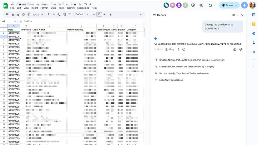
I never paid much attention to the Gemini integration in Google Sheets until a few weeks ago, and I regret not exploring it earlier.
I no longer have to stop and search for the right formula every time I want something done. Instead, I describe the outcome to Gemini, and it handles the rest.
It acts as a bridge between my intent and execution. This way, I no longer have to think about complex formulas or functions.
I just explain in the Gemini sidebar what I want the sheet to do. Gemini does the hard work. And if the output is not what I intended, I refine the instructions further.
That’s not it. I can ask Gemini to quickly make sense of complex data.
For example, I recently had to filter three months of sales data from a friend’s business and identify the top 10 clients based on total revenue.
In the past, that would have meant figuring out the right combination of filters, sorting rules, and possibly using VLOOKUP or a pivot table.
I’ve heard about VLOOKUP for years, but I still don’t fully understand how it works or when to use it confidently.
Without Gemini, I would have spent a few hours experimenting, Googling syntax, and second-guessing myself.
Instead, I typed exactly what I wanted into the Gemini side panel:
From the last three months’ data, highlight the top 10 clients by sales amount.
Within seconds, the results were in front of me in a clean, structured format.
Gemini goes a step further by offering useful prompt suggestions on its own.
After analyzing the sheet, it suggested creating a column chart comparing the total amount sold by each salesperson.
It also recommended building a pivot table to summarize total sales for each client and break them down by category.
These are not things I asked for, yet many of them were logical next steps that made the data easier to understand.
In many cases, I didn’t realize how visualizing a specific set of data would make the insights more actionable.
I’m no longer fighting Google Sheets
With Gemini by my side, I no longer struggle with manipulating or visualizing data in Google Sheets. Irrespective of how complex the task is, a few prompts are mostly enough to get the job done.
More importantly, thanks to Gemini, I no longer have to open five tabs and spend hours finding the right formula or syntax.
And I definitely don’t procrastinate anymore when it’s time to open a complex sheet or update a report with new data.
It’s not just formulas. There are more ways you can use Gemini in Google Sheets to boost your productivity.