

Google spent months updating its apps with Material 3 Expressive, but it wasn’t until the Pixel 10 launch that we got our hands on the UI redesign in full.
The Pixel 6 and later phones received the update on September 3, but some people, like myself, had to wait a few more days before the update went live.
I normally don’t await UI redesigns with such excitement, but Material 3 Expressive had me hooked from its May reveal.
Since my Pixel 8 received the update last week, I can confidently say that I’ve never enjoyed using a Pixel device more.
While the update isn’t perfect (the iPhoneification of Android is slightly uncomfortable), I can applaud Google for achieving what it set out to do.
Here are my favorite things about Material 3 Expressive, which show that it’s more than a fresh coat of paint.
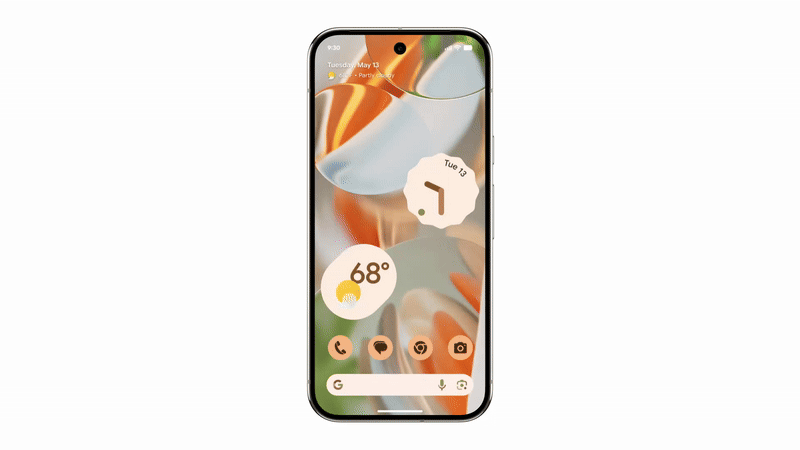
Bolder and more user-friendly Quick Settings menu
It’s perfect
![]()
The first thing I noticed about Material 3 Expressive was the redesigned Quick Settings menu. This has been overhauled from the ground up, and there’s a lot more here than meets the eye.
The most obvious change is that you can reduce the size of panels to 1×1. This is great for toggles like Airplane Mode or Battery Saver, where the icon is immediately recognizable and they only function as on/off switches.
Panels like Wi-Fi will show the network you’re connected to when in 2×1 mode, and some, like Bluetooth and Modes, have two touch points. For example, tap the Bluetooth icon to toggle it on and off, or tap the rest of the panel to open the Bluetooth menu.
There are subtler changes. When you toggle a tile on, its shape changes from an oval to a rounded rectangle. It’s a tiny effect that helps separate active and inactive settings.
Reorganizing the Quick Settings menu is also incredibly easy. When in edit mode, you can tap and hold to resize or rearrange a tile, double-tap to place it somewhere else without dragging it, and tap to remove it.
The experience of using the Quick Settings menu is made more satisfying thanks to Material 3 Expressive’s animations (more on this later), so I’d be remiss if I didn’t share my three favorite Quick Settings tips.
- Swipe down from the top of your phone’s screen with two fingers to open the panel fully.
- Tap the Internet panel and then your data network to switch to data without having to turn off Wi-Fi.
- Scroll all the way to the bottom of the Edit tiles menu to see which apps have their own tiles you can add.
Tactile animations evoke the days of phones with buttons in the best way
Things vibrate, bump, and rumble in satisfying ways
Google
If I had to sum up Material 3 Expressive in one word, it would be responsive. I feel like my actions on my Pixel 8, whether I’m dismissing a notification or swiping through the recent apps menu, have weight behind them.
This tactile feedback on our devices is something many of us yearn for and achieve through tools like mechanical keyboards and cases with well-designed buttons.
There’s something so satisfying about the simple press of a button, and Google has brought that feeling to every part of your phone.
For example, if you try to swipe the volume bar further than it can go, the entire volume window will follow your finger for a short distance before snapping back in place.
Notifications will react when you dismiss one; there’s a sticky element to notifications now that evokes feelings of peeling stickers off in one go.
I’ve noticed more haptic feedback for actions. My phone quietly rumbles as I’m using it. These are scattered throughout Android and apps updated to use Material 3 Expressive.
Wallet is the best example of this I’ve noticed. The animations and rumbles that play as I’m using tap-to-pay make it more obvious when a payment has successfully gone through.
It’s amazing how much animation changes can improve the usability of an app.
It’s important to note that despite the number of new animations, my phone doesn’t feel more sluggish. There are no performance improvements, but my phone feels faster than ever to use.
It’s a similar effect to how increasing the animation speed on your Android phone makes it feel faster while the performance remains the same.
The new animations neatly bridge the millisecond gap between an input and a response.
Impactful customization options
Themed icons feel like ancient tech now
![]()
Something I didn’t clock until I’d spent a few days with Material 3 Expressive was the range of new customization options.
I’m the kind of person who sets a single wallpaper, then leaves it for months. I’m not one to scour the Play Store every week for new app icons and wallpapers.
However, Material 3 Expressive’s customization options make such a difference to my phone experience that I’ve been adjusting them daily.
The most significant customization update for me is calling cards in Phone by Google. When set up, an incoming call will display a full-screen photo with a custom font and color.
It’s a great way to add a personal touch to your contacts. I’ve loved setting up custom calling cards for all of my friends and family.
Live wallpapers have made me use my own photos as a wallpaper for the first time in years.
You can add 3D animations to your photos, layered frames, or a weather effect that plays over the photo.
The 3D animations are a little too awkward for me to use, but I love the weather effect when it’s synced to my local climate.
A few days a week, I spend most of the day in a windowless warehouse. Adding the weather effect to my wallpaper lets me tell the weather at a glance.
It’s also surprisingly well-implemented. It’s most obvious in the rain effect as the drops splash and run off the object in your photo.
Third-party apps and widgets feel more cohesive than ever
A unified Android experience that doesn’t feel sterile
9to5Google
Since Material You, many developers have produced apps that follow Google’s design language to the letter. However, the flat nature of Material You made using these apps feel somewhat lifeless and depressing.
While Material 3 Expressive isn’t widespread on third-party apps yet, adoption so far has shown how unifying your Android experience under one design language feels more cohesive than ever without sacrificing personality.
Backdrops and M3 Expressive Widgets are two apps I use that have fully embraced Material 3 Expressive.
Navigating the Backdrops app feels as responsive and satisfying as any Google app, while M3 Expressive Widgets has transformed my home screen into a cohesive collection of apps and widgets that each look distinct while sharing the same visual language.
I’m keen to see how developers make use of the new toys available to them in the biggest UI update since Material You. Even adopting the feedback effects will make my favorite apps much more fun to use.
Material 3 Expressive is my favorite Android update
I’ve always preferred function over form when it comes to my Android devices. I’ve shunned the bloated customization options of Samsung’s One UI in favor of the stripped-down experience of Pixel phones.
However, Google has changed my view by showing me that function can also be fun.
While I can nitpick endlessly (I particularly dislike the iPhone battery icon that Google adopted), my overall experience has been universally positive. Thanks, Google, for making Android fun again.
… [Trackback]
[…] Read More Information here on that Topic: geeksforgeeks.org/my-4-favorite-things-about-material-3-expressive/ […]
… [Trackback]
[…] Info to that Topic: geeksforgeeks.org/my-4-favorite-things-about-material-3-expressive/ […]
… [Trackback]
[…] Info to that Topic: geeksforgeeks.org/my-4-favorite-things-about-material-3-expressive/ […]
… [Trackback]
[…] Read More Information here to that Topic: geeksforgeeks.org/my-4-favorite-things-about-material-3-expressive/ […]