

For long-time Android users, Material 3 Expressive was a breath of fresh air, bringing back customizations in a new way. Over the past few months, we’ve seen the new design language arrive in many popular apps and services across Google’s portfolio. And it now appears to be arriving to one more, with the Digital Wellbeing app getting a welcome makeover.
However, this change isn’t going to be available to everyone according to Android Authority, with the new UI rolling out to those running the latest Android 16 QPR1 Beta or Canary builds, while also running the beta version of the Digital Wellbeing app. When it comes to looks, the changes aren’t subtle, and it’s easy to see that the new look goes for something bold and simple.
Easy to read even at a glance
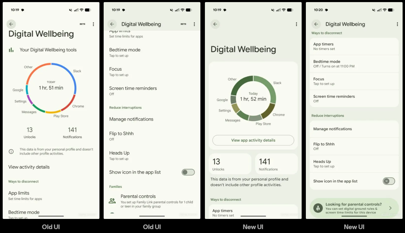
Perhaps one of the biggest changes that’s easiest to spot is that the chart loses its bold and bright colors, instead, opting for something more muted. The good news about this is that it doesn’t take anything away from the chart, still allowing you to see all the details you need at a glance.
There’s also better contrast across the menu, properly dividing each section, making it easier to distinguish what’s what. And the round corners for each section make everything look more cohesive without adding too much to what we’re already seeing. For the most part, things look good, but it appears that this is only the beginning.
Android Authority notes that the facelift is only present in the primary view, which suggests that there are a lot more changes to come. As stated before, Google’s steadily been making changes to its apps and services in order to bring a fresh new look. There’s also a pretty big chance that we’ll see a lot more of this at Google’s upcoming event.
Luckily, we won’t have to wait long in order to find out, with the Made by Google event set to take place on August 20. In addition to new phones, a smartwatch, and earbuds, there’s a pretty good chance that we’re going to hear more about Material 3 Expressive.
… [Trackback]
[…] Find More to that Topic: geeksforgeeks.org/digital-wellbeing-gets-a-makeover-with-a-cleaner-and-more-readable-layout/ […]
… [Trackback]
[…] Find More Info here on that Topic: geeksforgeeks.org/digital-wellbeing-gets-a-makeover-with-a-cleaner-and-more-readable-layout/ […]