This article was published as a part of the Data Science Blogathon.
Table of Contents
Introduction
Working with dataset
Creating loss dataframe
Visualizations
Analysis from Heatmap
Overall Analysis
Conclusion
Introduction
In this article, I am going to perform an Exploratory Data Analysis on the Sample Superstore dataset.
The link for the Dataset is: https://bit.ly/3i4rbWl
You can download it from the link.
In this dataset, we have many features like ship mode, Segment, country, City, State, Postal code, Region, category, sub-category, sales, Quantity, discount, and the Dependent variable is profit. The remaining are independent variables.
Here we will see for weak areas where there is less profit and will see how to overcome it.
Working with Dataset
Let us start by importing libraries such as numpy and pandas.
import numpy as np
import pandas as pd
Import superstore dataset using pandas and pass the path to the dataset into read_csv.
#import superstore dataset
superstore_df=pd.read_csv(r'C:UsersAdminDownloadsSampleSuperstore.csv')
Let us view it. To view the dataset, run the name of that Dataframe.
superstore_df
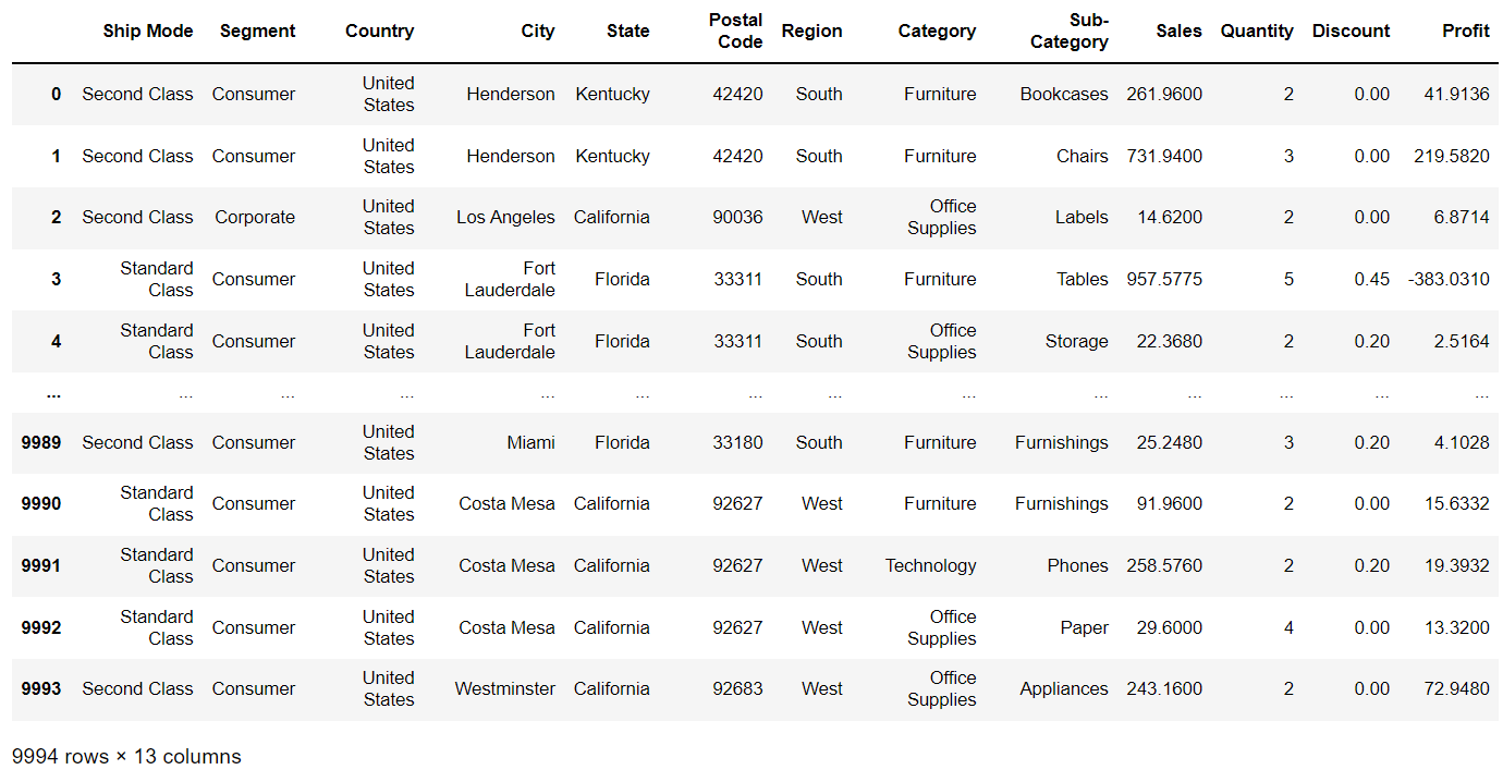
View the first 5 rows of our dataset. To view the first five rows of the Dataframe, use the head() method.
superstore_df.head()

Similarly, to view the last five rows of the dataset, use the tail() method.
View the shape of the Dataframe that contains the number of rows and the number of columns.
superstore_df.shape
(9994, 13)
In this Dataframe, there are 9994 rows and 13 columns.
View all the columns in the Dataframe.
superstore_df.columns
Index(['Ship Mode', 'Segment', 'Country', 'City', 'State', 'Postal Code',
       'Region', 'Category', 'Sub-Category', 'Sales', 'Quantity', 'Discount',
       'Profit'],
      dtype='object')
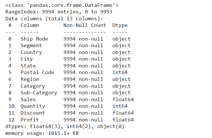
View the information like Range index, datatypes, number of non-null entries for each column by using the info() method.
superstore_df.info()
To check if there are null values in the df, use isnull() method.
superstore_df.isnull().sum()
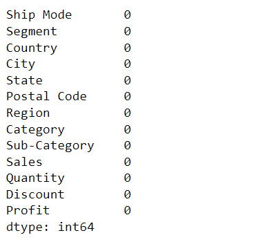
There are no null values over the entire data.
View the unique categories in the data frame.
print(superstore_df['Category'].unique())
['Furniture' 'Office Supplies' 'Technology']
View the states in the dataset.
print(superstore_df['State'].unique())
['Kentucky' 'California' 'Florida' 'North Carolina' 'Washington' 'Texas'
'Wisconsin' 'Utah' 'Nebraska' 'Pennsylvania' 'Illinois' 'Minnesota'
'Michigan' 'Delaware' 'Indiana' 'New York' 'Arizona' 'Virginia'
'Tennessee' 'Alabama' 'South Carolina' 'Oregon' 'Colorado' 'Iowa' 'Ohio'
'Missouri' 'Oklahoma' 'New Mexico' 'Louisiana' 'Connecticut' 'New Jersey'
'Massachusetts' 'Georgia' 'Nevada' 'Rhode Island' 'Mississippi'
'Arkansas' 'Montana' 'New Hampshire' 'Maryland' 'District of Columbia'
'Kansas' 'Vermont' 'Maine' 'South Dakota' 'Idaho' 'North Dakota'
'Wyoming' 'West Virginia']
Similarly, to view the number of unique entries in the column, use the unique() method.
no_of_states=superstore_df['State'].nunique()
print("There are %d states in this df."%no_of_states)
There are 49 states in this df.
print(superstore_df['Sub-Category'].unique())
['Bookcases' 'Chairs' 'Labels' 'Tables' 'Storage' 'Furnishings' 'Art'
'Phones' 'Binders' 'Appliances' 'Paper' 'Accessories' 'Envelopes'
'Fasteners' 'Supplies' 'Machines' 'Copiers']
no_of_subcategory=superstore_df['Sub-Category'].nunique()
print("Categories are divided into %d subcategories"%no_of_subcategory)
Categories are divided into 17 subcategories.
superstore_df['Segment'].value_counts()
Consumer 5191
Corporate 3020
Home Office 1783
Name: Segment, dtype: int64
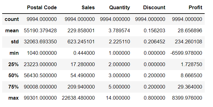
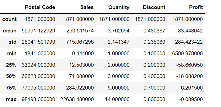
View the statistical description of the Dataframe. Description contains the count of features, mean of them, Standard deviation, minimum and maximum values in that particular attribute, 25%, 50%, 75% of the values in the dataset. To view the statistical description of the dataset, use the describe() method.
superstore_df.describe()
Creating Loss Dataframe
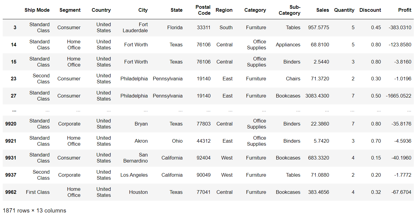
Now let’s divide the overall data to draw some more accurate conclusions. Create a new Dataframe, where profit is negative which means loss, and concentrate on these areas to improve.
loss_df=superstore_df[superstore_df['Profit'] < 0]
This will create a new df with all the features where profit is less than Zero.
Now View it.
loss_df
View the shape of loss df.
loss_df.shape
(1871, 13)
This loss df contains 1871 rows and 13 columns.
We can see that there are 9994 rows in the overall superstore Dataframe. Now we have only 1871 rows that are related to loss.
View the statistical description of the loss Dataframe.
loss_df.describe()
Total_loss=np.negative(loss_df['Profit'].sum())
print("Total loss = %.2f" %Total_loss)
Total loss = 156131.29
loss_df.groupby(by='Segment').sum()

More discount leads to more loss, so, to make more profit provide fewer discounts.
loss_df.groupby(by='Sub-Category').sum()
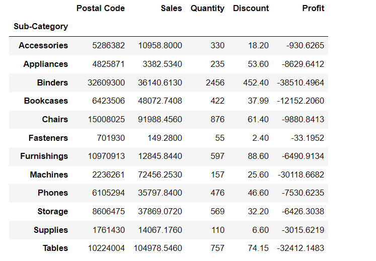
–> We can observe more loss in the Binders category, machines category, and tables category when compared to other categories.
–> Binders are more getting sold. So even giving less discount may lead to vast loss.
–> So better to give discounts on which are getting less sold so that even they will start getting sold more.
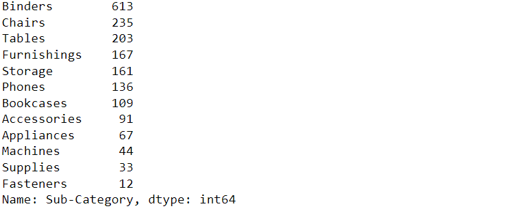
loss_df['Sub-Category'].value_counts()
loss_df.groupby(by='City').sum().sort_values('Profit',ascending=True).head(10)
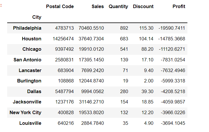
The above-mentioned list shows the names of the top 10 cities where loss is high.
loss_df.sort_values(['Sales'],ascending=True).groupby(by='Category').mean()

While calculating an average, we observed that more loss is in the technology category.
superstore_df.groupby(['State']).sum()['Sales'].nsmallest(10)
State
North Dakota             919.910
West Virginia           1209.824
Maine                   1270.530
South Dakota            1315.560
Wyoming                 1603.136
District of Columbia    2865.020
Kansas                  2914.310
Idaho                   4382.486
Iowa                    4579.760
New Mexico              4783.522
Name: Sales, dtype: float64
These are the last 10 states where sales are very less.
superstore_df.sort_values(['Segment'],ascending=True).groupby('Segment').sum()

Here Consumer segment sales might be less when compared to other segments, but this is the only segment that provides the highest profits. So, if we increase sales in this Segment by advertisements or something else then, for sure, we can gain more profits.
superstore_df.groupby(by='Region').sum()

Here we can see that sales are less in the South Region. So, to get better profits or more sales we should focus on this area too.
Visualizations
Import matplotlib for visualizations.
import matplotlib.pyplot as plt
set the figsize.
plt.rcParams['figure.figsize']=(15,3)
plt.bar(loss_df['Sub-Category'],loss_df['Sales']);
plt.rcParams.update({'font.size':10});
plt.xlabel('Sub_Category');
plt.ylabel('Sales');

Here, we observed that the Sales for Fasteners, Appliances, Furnishings, and Accessories is very low.
plt.rcParams['figure.figsize']=(28,8)
plt.bar(superstore_df['Sub-Category'],superstore_df['Sales']);
plt.rcParams.update({'font.size':14});
plt.xlabel('Sub_Category');
plt.ylabel('Sales');

When it comes to comparison in overall supermarket data, Fasteners, Labels, Furnishings, Art, paper, Envelopes, etc., sub-categories have very fewer sales, that’s why it needs to be improved.
plt.rcParams['figure.figsize']=(28,8)
plt.bar(superstore_df['Sub-Category'],superstore_df['Discount']);
plt.rcParams.update({'font.size':14});
plt.xlabel('Sub_Category');
plt.ylabel('Discount');

plt.rcParams['figure.figsize']=(10,8)
plt.bar(superstore_df['Ship Mode'],superstore_df['Sales']);
plt.rcParams.update({'font.size':14});
plt.xlabel('Ship Mode');
plt.ylabel('Sales');
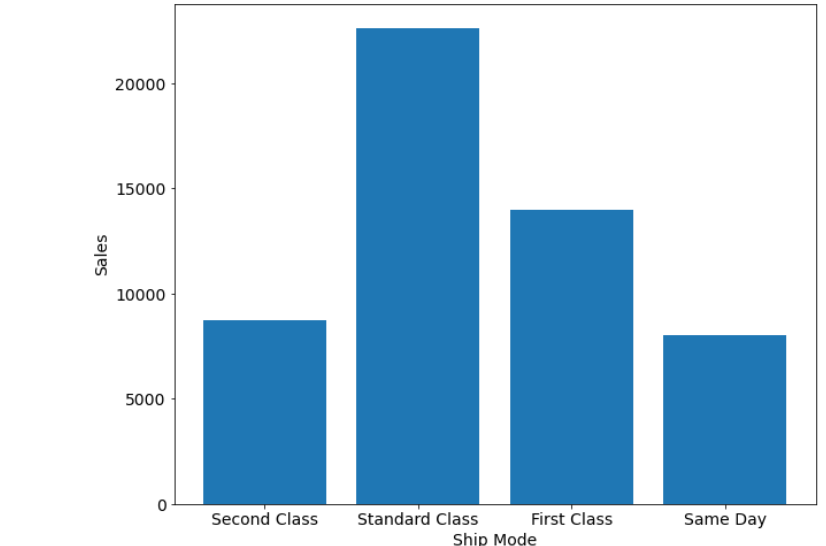
Here we observe that the sales are high if the ship mode is standard class, and sales are low if the ship mode is either second class or same day.
Import seaborn library for visualization.
import seaborn as sns
plt.rcParams['figure.figsize']=(10,5)
sns.countplot(x=superstore_df.Segment)
plt.show();
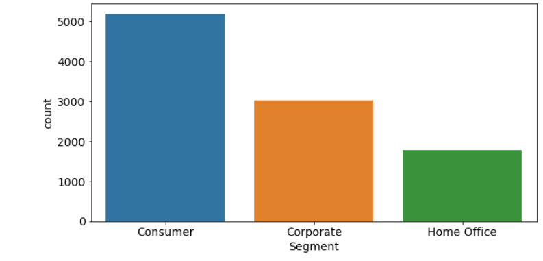
In the Home Office Segment, we observe that the count is less. So convergent strategy and improvement is a necessity for this Segment.
plt.rcParams['figure.figsize']=(20,5)
plt.rcParams.update({'font.size':12})
sns.countplot(x='Sub-Category',data=superstore_df)
plt.show()

From the above data, it’s very much clear that the Copiers and Machines Subcategory needs improvement.
plt.rcParams['figure.figsize']=(20,5)
plt.rcParams.update({'font.size':12})
sns.countplot(x='Region',data=superstore_df)
plt.show()

If we look into the data region-wise, we can conclude that the south region needs more improvement compared to others.
superstore_df.corr()
sns.heatmap(superstore_df.corr(),cmap='Reds',annot=True);
plt.rcParams['figure.figsize']=(10,5)
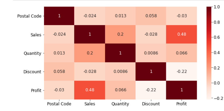
Analysis from Heatmap
- Sales and Profit are Moderately Correlated
- Discount and Profit are Negatively Correlated
Overall Analysis
- The main reason which leads to loss is Discount as if some areas lead to loss due to more discounts, and some areas lead to fewer sales due to fewer discounts, hence it needs to be improved.
- It is better to give more discounts during festival seasons, additionally, that will result in more sales.
- The Home office segment needs better improvement.
- Some cities have fewer sales, lack of awareness can be the reason for this, hence advertising in those cities might help in more sales.
Conclusion
–> We have learned how to perform Exploratory Data Analysis.
–> We performed it by using the sample superstore dataset.
–>We have seen the loss areas in it and have seen some measures to overcome them.
–> We have seen visualizations and drawn conclusions.
Read the latest blog posts on our website.
Colab notebook link:
https://colab.research.google.com/drive/1dyxvR9thp615KQyVBxCOdRda7d_Rm56d?usp=sharing
Connect with me on Linkedin: https://www.linkedin.com/in/srivani-k-83571a193/
Thanks!
The media shown in this article is not owned by Analytics Vidhya and are used at the Author’s discretion.


