Summary
- Android 15 DP2 introduces redesigned volume sliders with new functionality and cleaner aesthetics.
- This is a big step up from Android 14, which features relatively outdated volume sliders.
- The latest update also brings animations to volume sliders, ensuring the slider’s name is always visible.
Google has already rolled out two Android 15 developer previews so far, providing a glimpse into what’s coming with this fall’s stable release. Based on what we’ve found so far, most of the changes appear to be minimal in nature, such as fixing quality issues with the Pixel’s webcam mode or a privacy-related change allowing the system to block location requests from mobile carriers in some scenarios. It looks like some visual changes are also on the cards with Android 15.

Android 15: News, leaks, timeline, and everything new in DP2
Here’s what we know about Android 15 now that the first developer preview has landed
The volume sliders in Android 14 aren’t drastically different from Android 13, or even Android 12 for that matter, which introduced us to Material You. Of course, there have been some minor changes to the volume sliders since Android 12, such as the separation of the Ring and Notification volume sliders with Android 14. But as Mishaal Rahman reports for Android Authority, Android 15 DP2 introduces a redesigned set of sliders with some new functionality to go along with it.
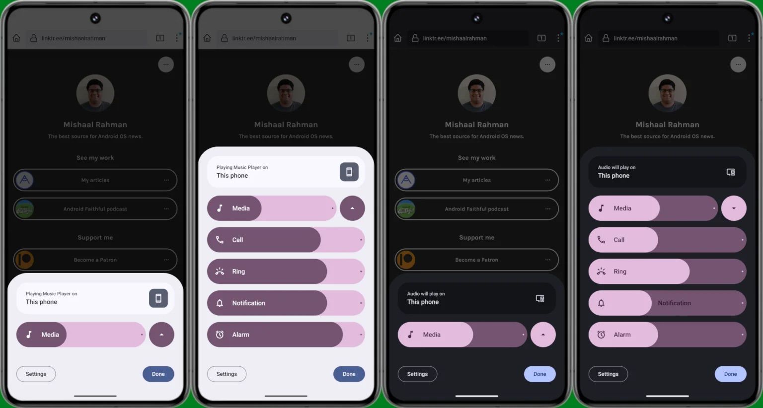
The new volume sliders in Android 15 DP2
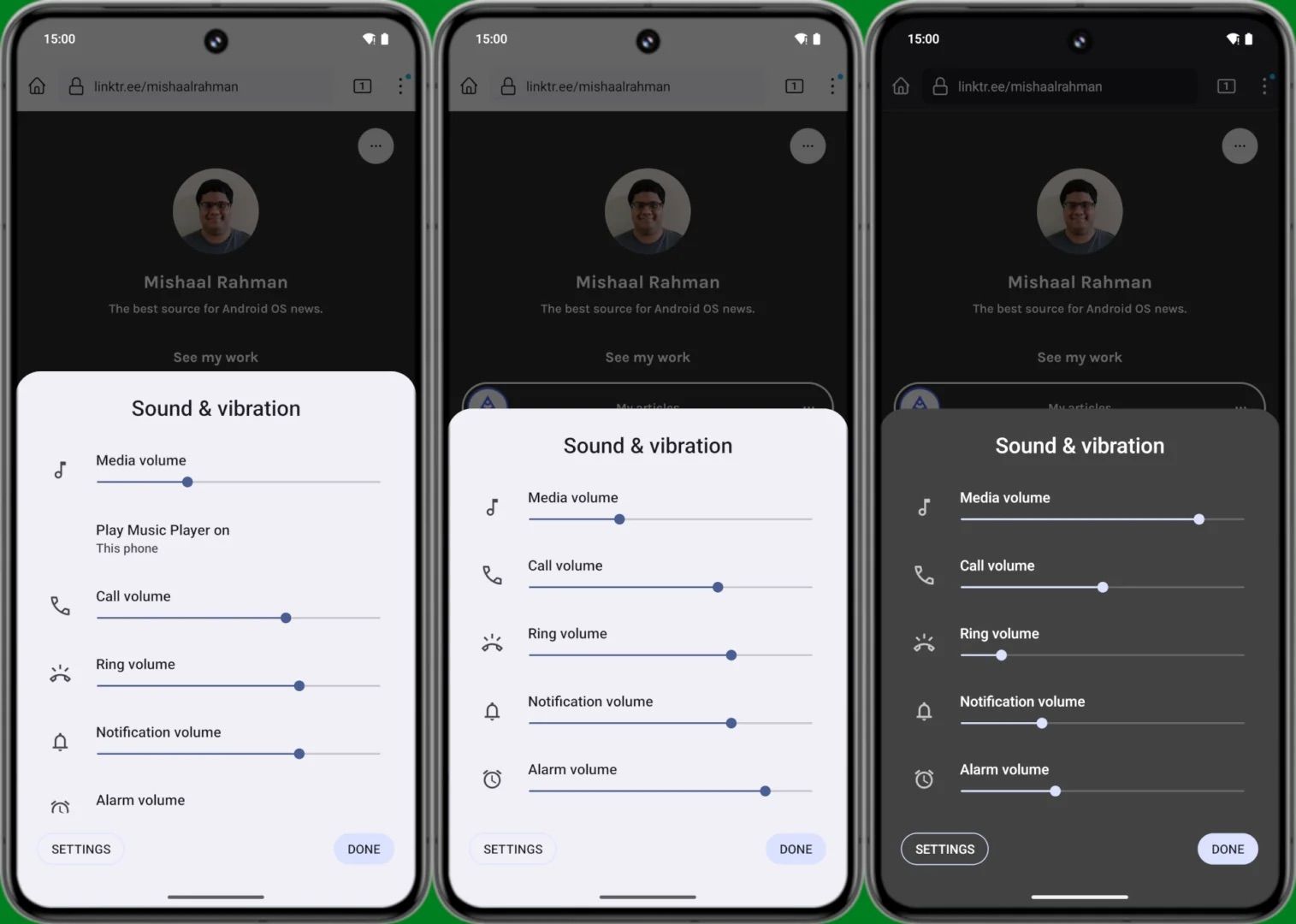
Android 14’s Sound and vibration panel is activated by pressing either of the two volume keys and tapping the three-dot menu in the slider. This opens a settings panel containing all the five volume control options. But with Android 15 DP2, Rahman managed to activate the new pill-shaped sliders shown above.
In addition to being a complete departure from the older volume sliders, the redesigned version can also be minimized or collapsed with the help of an arrow situated next to the Media slider. Rahman notes that the panel will only display the Media slider if there’s something playing on the device, while all five controls will be shown when no media is playing. Each slider has a dot at the end depicting the maximum volume for each attribute. Meanwhile, each slider can be fully muted with a single tap in Android 15 DP2, something that isn’t possible with Android 14.
The new software also doesn’t contain the word volume in each individual toggle, so they’re now simply called Media, Call, Ring, Notification, and Alarm, making them look a lot cleaner. Speaking of saving space, Android 15 DP2 also lets go of the Sound & vibration header in this panel, with a persistent media output switcher now appearing there instead.
The Sound & vibration panel in Android 14
As Rahman notes, this is a change from Android 14, which only displays the output switcher (below the Media volume slider) in this panel when there’s media playing in the background. This partially hides the Alarm slider at the very bottom, as Rahman’s screenshots above show.
Additionally, Rahman says he found evidence for attributes like “noise control” and spatial audio within this redesigned volume panel but was apparently unable to activate them. This indicates that what we’re seeing here may not be the final implementation of the volume panel redesign. We should have a clearer idea of what to expect from Android 15 as the first beta begins rolling out next month.
Android 15’s volume sliders also get a nice animation
A video published by Android Authority details a subtle change coming to these new sliders — animations. The text on the pill-shaped sliders (Media, Ring, etc.) cleverly adjusts as the user increases or decreases the volume, ensuring the slider’s name is always visible. This also explains why the word “volume” was removed from each slider.


