This article was published as a part of the Data Science Blogathon
Overview
The hardest thing is to keep things simple and that’s true in data science as well. In any data science project, the iterative process of refining the data, fine-tuning the models, deploying them is a continuous process. With all the advancements in tools, algorithms, and with the advent of MLOps things are much easier and it will continue to evolve in the future as well – technology takes care of itself.
What about the business side? How easy or difficult is it to convince clients of the predictive powers of sophisticated models built with advanced tools and technologies?. Is the client willing to fund the project and trust our model’s recommendations?. Well, try explaining the ROC curve of the model, try to convince clients with specificity and sensitivity metrics – all that you will see are the eyes balls rolling.
But, what if we are able to answer the business questions without the complex metrics and technical jargon? well, we might stand a chance to get a buy-in from them. In this blog, we will take a look at a use case where we will still build our models but explain it in a different way – the business way.
Approach to Extract Business Value using ML model
In this blog, we will explore the use of deciles, understand various evaluation plots like Cumulative Gain plots and Lift plots, etc to assess the business value of ML models. The approach would help us explain the predictive power of our ML models and also makes it simple enough to interpret the model outcome. The plots and metrics would enable the business to make informed decisions with a lot more confidence.
We will explore the below topics as we go along in this blog.
- Data exploration
- Data processing
- Model building
- Generating deciles and reports
- Model comparison
- Business scenarios
- Conclusion
Getting Started
We will be using the publicly available bank dataset from UCI Machine learning Repository There are four datasets in the zip file but our interest is in the bank-additional-full.csv. All the attributes information can be found in the above URL. The data is from the direct marketing phone calls made to contact the client to assess if the client is interested to subscribe to bank term deposits. It would be Yes if subscribed and No if not. Our interest in this blog is to understand how to evaluate the business value of the ML model/models.
Data Loading & Processing:
Let us load the data and take a look to get a better understanding.
import wget
import zipfile
import pandas as pd
import numpy as np
url = 'https://archive.ics.uci.edu/ml/machine-learning-databases/00222/bank-additional.zip'
wget.download(url)
zf = zipfile.ZipFile('bank-additional.zip')
df= pd.read_csv(zf.open('bank-additional/bank-additional-full.csv'), sep=';')
We can carry out complete EDA/feature engineering/selection/select significant variables and then build models but to keep it simple, we will select few variables for model building.
df= df[['y', 'duration', 'campaign', 'pdays', 'previous', 'euribor3m']]
Also, let’s explore data a bit more, convert the target variable to categorical and encode it.
df.y[df.y == 'yes'] = 'term deposit'
df.y = pd.Categorical(df.y)
df['y'] = df.y.cat.codes
df.info()
Output:
df.head()
	y	duration	campaign	pdays	previous	euribor3m
	0	261		1		999	0		4.857
	0	149		1		999	0		4.857
	0	226		1		999	0		4.857
	0	151		1		999	0		4.857
	0	307		1		999	0		4.857
df.describe()
	y	duration	campaign	pdays	previous	euribor3m
count	41188.000000	41188.000000	41188.000000	41188.000000	41188.000000	41188.000000
mean	0.112654	258.285010	2.567593	962.475454	0.172963	3.621291
std	0.316173	259.279249	2.770014	186.910907	0.494901	1.734447
min	0.000000	0.000000	1.000000	0.000000	0.000000	0.634000
25%	0.000000	102.000000	1.000000	999.000000	0.000000	1.344000
50%	0.000000	180.000000	2.000000	999.000000	0.000000	4.857000
75%	0.000000	319.000000	3.000000	999.000000	0.000000	4.961000
max	1.000000	4918.000000	56.000000	999.000000	7.000000	5.045000
Model Building to Extract Business Value
Logistic Regression
Step1: Define independent and target variables
y = df.y
X = df.drop('y', axis = 1)
Step2: Split the dataset into train/test with a test size of 0.2
X_train, X_test, y_train, y_test = train_test_split(X, y, test_size = 0.2, random_state = 2021)
Step3: Building logistic regression model
from sklearn.model_selection import train_test_split

from sklearn.linear_model import LogisticRegression

# Logistic regression model

clf_glm = LogisticRegression(multi_class = 'multinomial', solver = 'newton-cg').fit(X_train, y_train)

prob_glm = clf_glm.predict_proba(X_test)

max_prob_glm = round(pd.DataFrame(np.amax(prob_glm, axis=1), columns = ['prob_glm']),2)
So, we have built the model and also scored (predicted) it on the test data which gives us predicted probabilities for each of the observations.
Building Deciles
The deciles simply put are splitting our data into ten different bins. So, we take all our predicted probabilities, segregate them into ten groups, and rank them meaning that the highest predicted probabilities will be in decile 1 and the lowest setting will be in decile 10. We will use the pandas’s cut() function to split the data.
The below line of code creates a new column by the name Decile_rank_glm which holds the rank of each predicted record.
max_prob_glm['Decile_rank_glm'] = pd.cut(max_prob_glm['prob_glm'], 10, labels = np.arange(10,0, -1))
     prob_glm	Decile_rank_glm
0	0.99	1
1	0.59	9
2	0.96	1
3	0.83	4
4	0.85	4
...	...	...
8233	0.98	1
8234	0.98	1
8235	0.99	1
8236	0.99	1
8237	0.93	2
Note: The probability of 0.99 is ranked 1, 0.93 is 2, 0.85 is 4, and 0.59 is 9 in the above decile ranks. We will see the visual representation of this result in the later sections.
Model Evaluation to Extract Business Value
Any model that we build will have to be compared with the baseline model to see if how the model fairs in its performance. Let us explore this further below.
- Random Model: The baseline model will be a random model meaning it is as good as the flip of a coin meaning there is 50% probability that the call to a customer will be positive / customer buys our product. Our logistic regression model’s performance should obviously be better than this.
- Wizard Model: This is the other extreme model which is perfect in its prediction meaning it predicts nearly with 100% accuracy. This model should never be used in production or for any business decision as there is a heavy chance of overfitting.
- Logistic Model: Our model should be somewhere in between these two extreme models which give us enough confidence to make our business decisions.
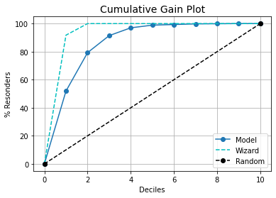
We will visualize the above models in a cumulative gain plot. This will give us an indication of where the logistic model stands in terms of performance.
kds.metrics.plot_cumulative_gain(y_test.to_numpy(), prob_glm[:,1])

Looks good so far, the plot is on the expected lines and the logistic regression model is in between the two extreme models we have discussed.
Insights from the cumulative gain plot:
- If we can select only the top 20% (decile 1 and decile 2) then we have coverage of nearly 80% of the target class.
- As this is a cumulative plot, we see that the curve flattens after decile 5 which means the deciles 6 to 10 either have minimal records or none.
- The wizard model hits the 100% mark in decile 2 – we already know this is an idealistic model just for reference. In case our model starts nearing/resembling any of these two extreme models then we need to review our model.
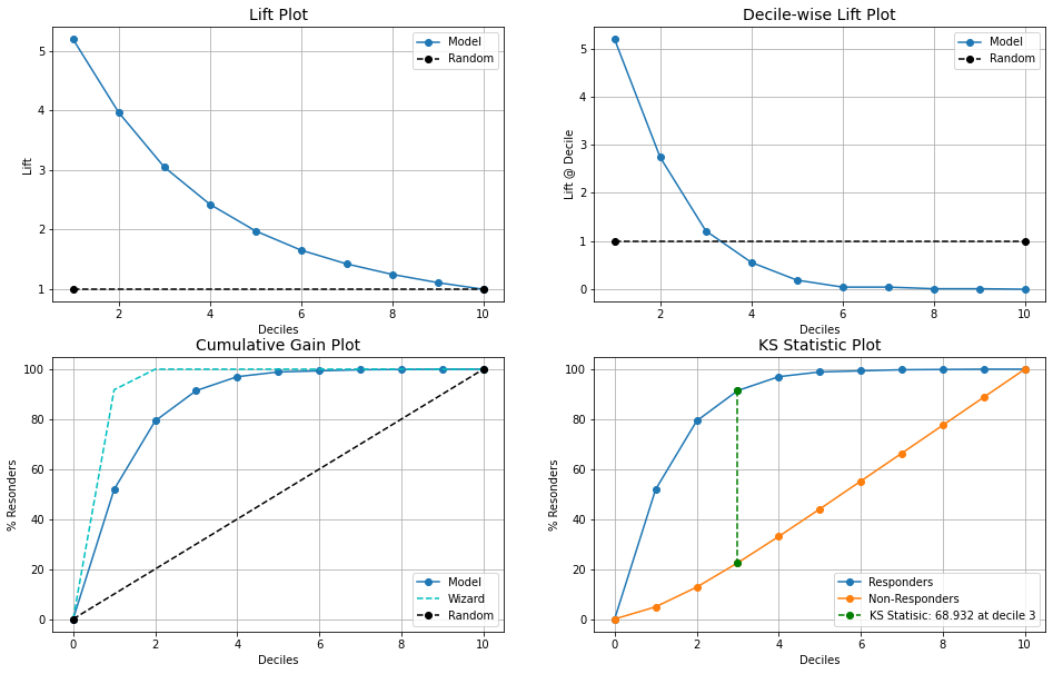
We have so far discussed models, deciles, and their performance comparison. Let us explore this further at the decile level to get a better understanding of what is at play here and how we can explain the process better. We will carry out our analysis with help of visuals which makes it much easier. The kds package has a very nice function to generate all the metrics reports in one line of code.
kds.metrics.report(y_test, prob_glm[:,1])

Let us understand each of these plots. Please note that the x-axis of all the plots is Deciles.
- Lift Plot: This plot shows us how much better is logistic regression model is compared to the random model at all. Eg: decile 2 gives us a lift almost 4 times meaning we can do 4 times better than the random model approach. As we go to higher deciles the lift drops and eventually meets the random model line, this is because all the higher probability score values are in the top deciles (1 to 3) which we had already seen in the cumulative gains plot too. So, bottom deciles will have probabilities that are lower and almost the same as the random model.
- Decile-wise Lift Plot: This plot shows us the percentage of the target class observation in each of the deciles and we observe that decile 1 had maximum and as we go higher deciles the percentage drops and after a certain point it even goes below random model line. This is because the random model has equally distributed observations that are randomly set whereas our model has predicted fewer observations in the higher deciles.
- Cumulative Gain Plot: We discussed this in the earlier section and also looked into the interpretation of the plot.
- KS Statistic Plot: The KS plot evaluates different distributions i.e events and non-events and the KS value is a point where the difference is maximum between the distributions. In short, it helps us in understanding the ability of the ML model to differentiate between two events. The KS score is greater than 40 and if it happens to be in the top 3 deciles then it is considered to be good. In our case, we have a score of 68.932 and decile 3 from the plot.
Let us build one more model with a random forest and see how the results will be.
clf_rf = RandomForestClassifier().fit(X_train, y_train)
prob_rf = clf_rf.predict_proba(X_test)
max_prob_rf = pd.DataFrame(np.amax(prob_rf, axis=1), columns = ['prob_rf'])
max_prob_rf['Decile_rank_rf'] = pd.cut(max_prob_rf['prob_rf'], 10, labels = np.arange(10,0, -1))
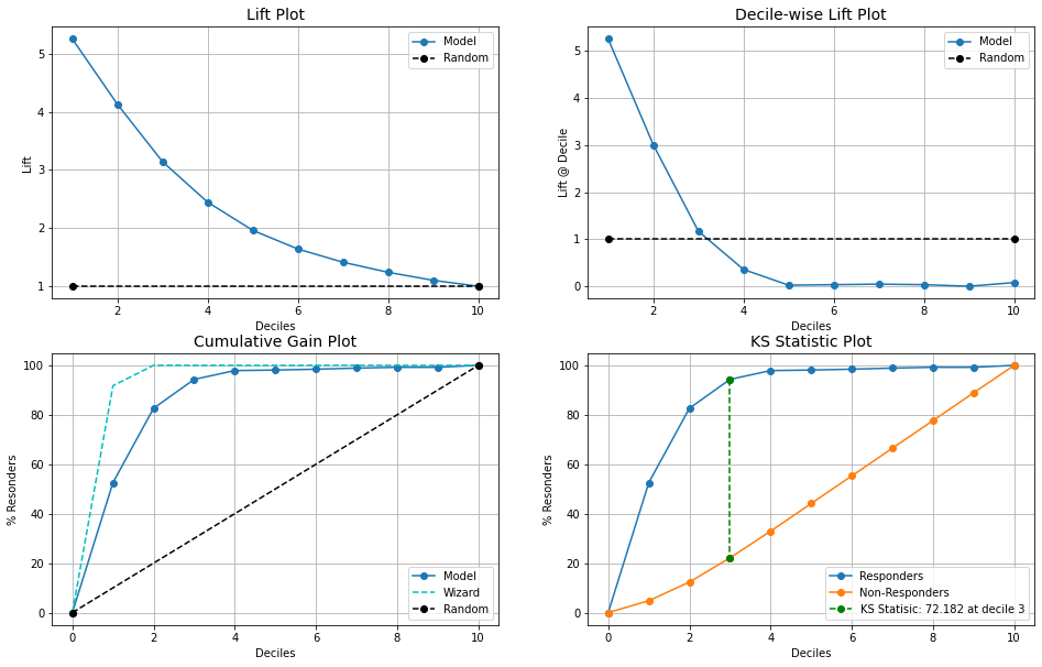
kds.metrics.plot_cumulative_gain(y_test.to_numpy(), prob_rf[:,1])
kds.metrics.report(y_test, prob_rf[:,1])

Observations:
- The random forest model is slightly better than the logistic model.
- Decile 2 gives marginally higher lift and KS statistics is 72.18 compared to logistic which had 68.93
Business scenarios
Control Over Recommendations: There are situations where the client has a business demand that a minimum of X number of recommendations should always be generated. In such cases, we can have larger recommendations by considering the top 3 deciles instead of 2 deciles and also have granular control on additional records.
Measure Market Response: The post recommendation analysis and market response are easy to measure. For instance, from the previous point, we can separately track how was the performance of all additional recommendations from decile 3. Did additional push from decile 3 generate any impact (positive or negative)?
Optimizing Marketing Spend: By focusing on the top 20-30%, businesses can save time, resources, and money that they would spend on non-responders or targeting the wrong customers.
Closing Note
Technology has its place and businesses have their say. At the end of the day, It is all about the business value that technology brings. It will always be more effective when these gains are explained in business terms. It not only helps in gaining confidence from the business but also opens up new opportunities to explore.
Please note that we built two classification models but didn’t look into the ROC curve, confusion matrix, precision, recall, and other standard metrics that we generally do for such models. It is highly recommended that these metrics are tracked and measured to assess the model’s performance and then follow the decile approach from this blog. Depending on the target audience and the goal, use the pitch that best suits the objective.
Hope you liked the blog. Happy learnings !!!!
You can connect with me – Linkedin
You can find the code on Github
References:
https://pypi.org/project/kds/
https://scikit-learn.org/stable/
https://unsplash.com/
The media shown in this article are not owned by Analytics Vidhya and are used at the Author’s discretion.


