Android 15 has had a weird road to release. Google announced the Pixel 9 lineup with Android 14 in tow, leaving enthusiasts and regular users alike scratching their heads. When Android 15 did eventually arrive a couple of months later, it did so without one of the world’s most popular OEMs throwing its support behind it. Yes, despite rumors that One UI 7 would launch in beta as early as July, Samsung kept a lid on its OS rebuild, only briefly teasing it at the company’s developer conference in October before going silent yet again.
No Thanks, Keep Reading
Finally, just a few short weeks before we expect the Galaxy S25 series to take the stage, the first One UI 7 beta is here. For the most part, it’s exactly what we expected from the leaks, with lots of iOS-inspired features and design changes that could threaten to frustrate Samsung fans. Personally, however, this is the update to my Galaxy S24 Ultra that I’ve been waiting for, one that makes the entire system feel a little more cohesive. If anything, I wish it went farther.
Let’s be honest — plenty of One UI 7 pulls from Apple’s playbook
That doesn’t mean some of Samsung’s DNA doesn’t threaten to break through, though
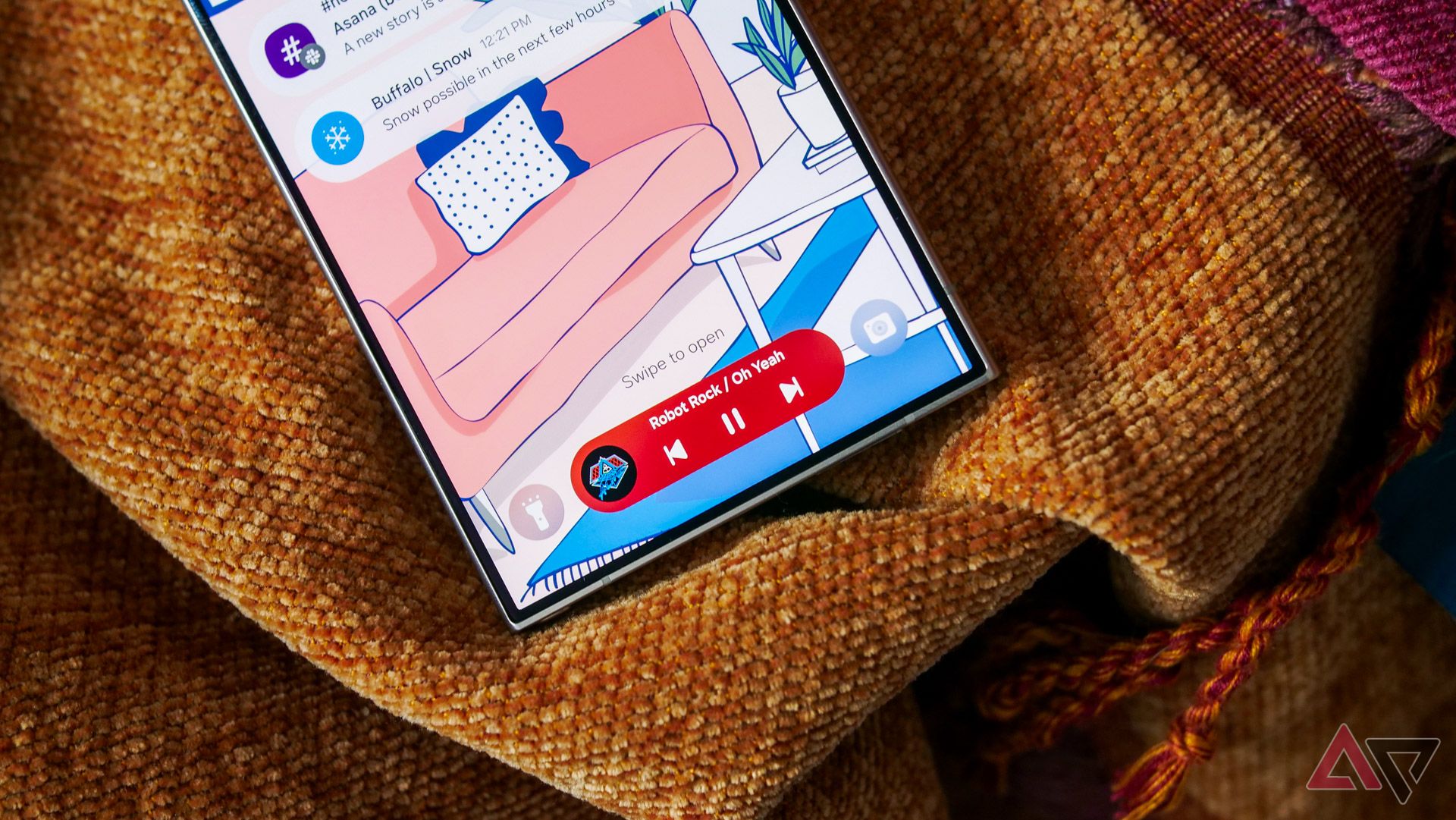
As months of leaks predicted, One UI 7 wears its iOS inspiration on its sleeve. The marquee changes this time around — the Now Bar (a real name Samsung chose), Live Notifications, splitting up quick settings and the notification tray — are all concepts we’ve seen on the iPhone. And with just a couple of exceptions, I’m not sure Samsung is pulling off any of those ideas any better than the competition.
Take the Now Bar, for example. This is, effectively, a take on Apple’s Dynamic Island, placing a pill-shaped widget on your lock screen to control things like music playback or your clock’s stopwatch. But unlike the Dynamic Island, Samsung’s only built this tool for a handful of its own apps, without the necessary APIs to allow for third-party support. The same goes for Live Notifications, which pulls from Live Activities on the iPhone. After a couple of years, Live Activities have grown into one of my favorite iOS features, but as implemented in One UI 7, the best use cases on the iPhone remain locked to third-party apps.
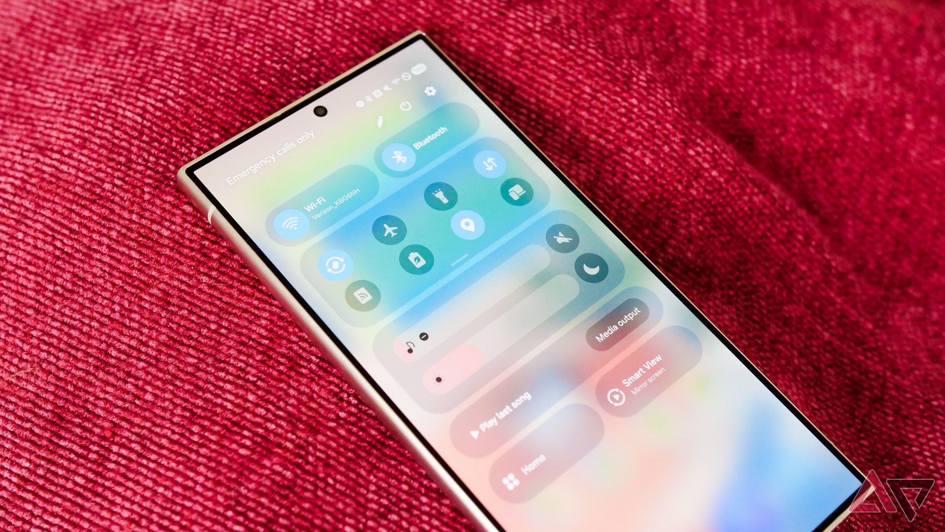
The quick settings redesign is bound to be controversial, but on its face, I don’t mind it. Samsung is far from the first company to deliver this sort of experience, pulling inspiration from the Vivo, Oppo, and Motorola’s of the world. It’s also similar to Apple’s Control Center redesign in iOS 18, though with a distinct Samsung flavor that didn’t quite carry over into the Now Bar or Live Notifications.
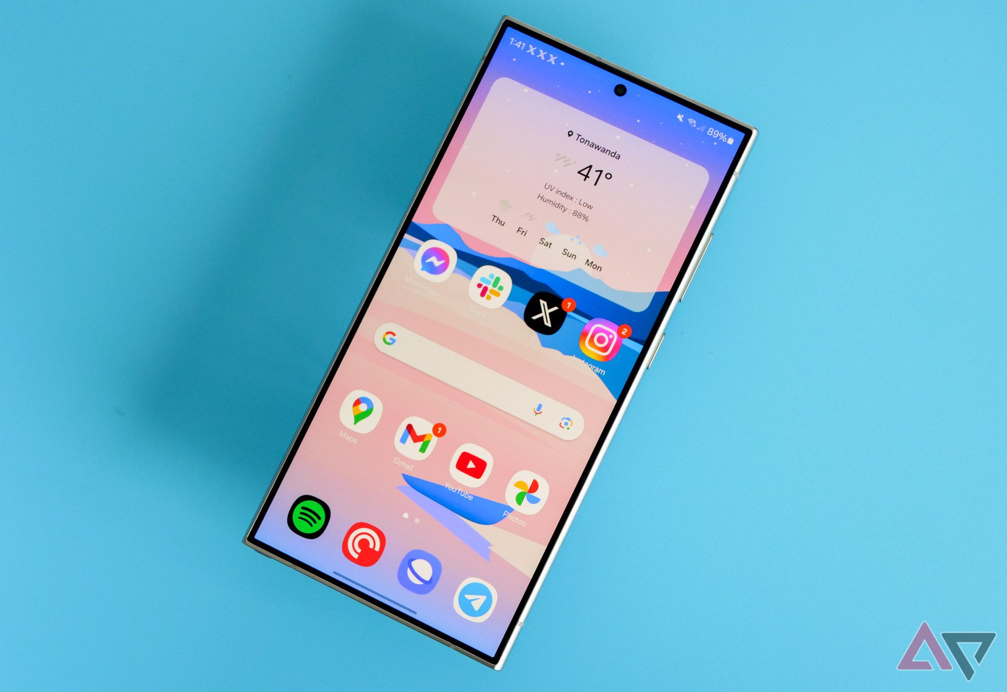
I’m still getting used to the new swipe methods here, though. Swiping down anywhere on the home screen loads notifications, as does swiping from the left side of the status bar. Swiping down from the right side loads quick settings, but you can swap between the two pages by moving left or right from either screen. Thankfully, you can change this by tapping on the edit icon in quick settings, before tapping Panel settings on this page. This isn’t particularly well marked though, and I really wish Samsung would move this into the settings menu proper.
All things considered, One UI 7 isn’t as iOS-inspired as the leaks might have suggested. That’s not to say that influence isn’t obviously here — it’s spread throughout Samsung’s entire mobile product catalog, to be honest. But the changes are so minor, and so easy to ignore, that I don’t think most people will notice that, say, the photo mode font in the camera app looks identical to Apple. It’s shameless, and I think Samsung can and should be above its reliance on looking over Apple’s shoulder, but it’ll fade into the background.
Related
Review: My favorite Android 15 features are far from flashy
A minor update with welcome quality-of-life tweaks
One UI 7 feels momentous, but it’s a smaller upgrade than you might think
After just a couple of hours, it feels like home
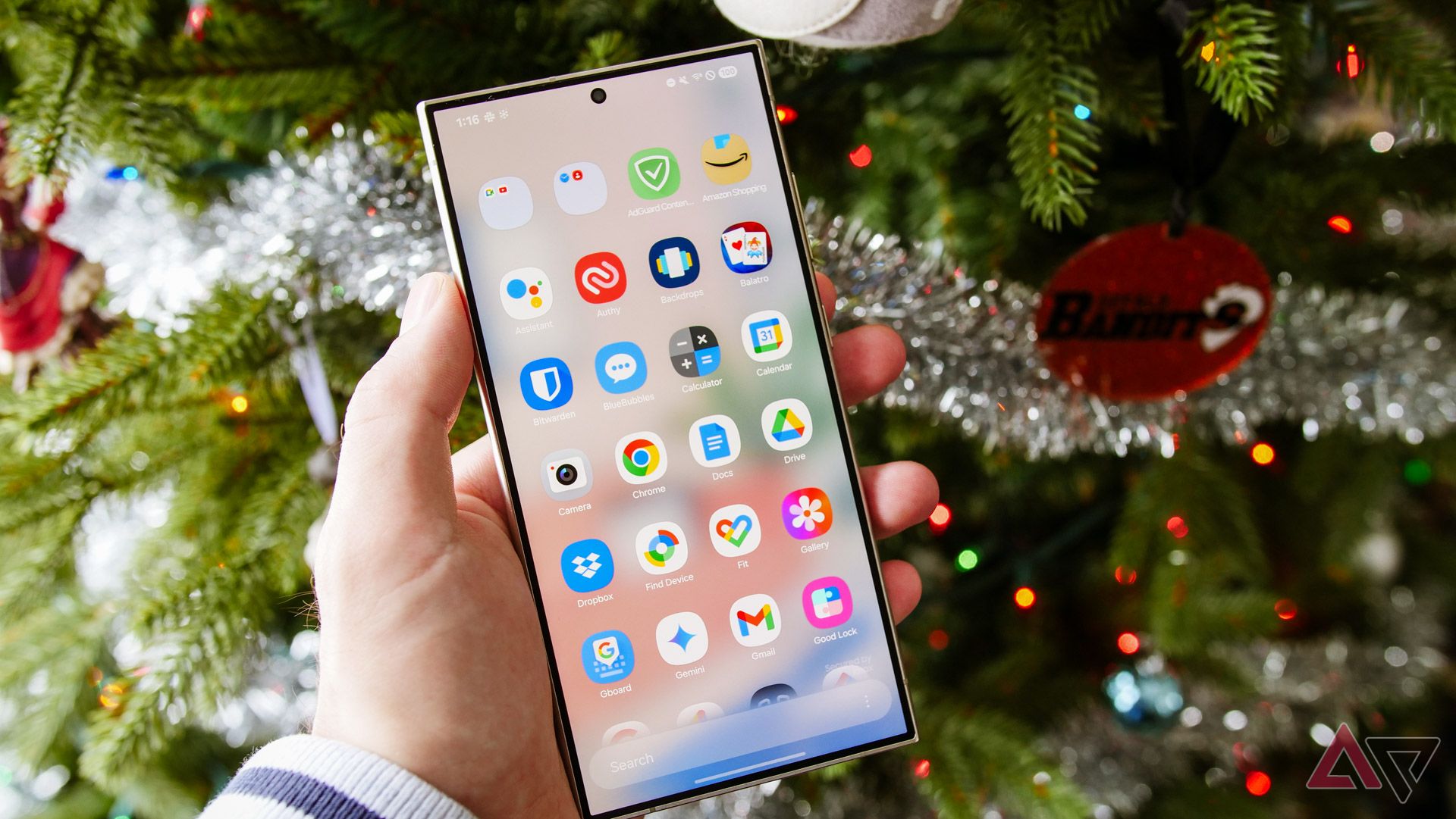
For as monumental as One UI 7 looked in its various leaks, I actually think this is a smaller update than you might think. Sure, the actual list of changes is huge — big props to the folks at 9to5Google for taking the time to put together an intensely cohesive list — but once you’re actually using One UI 7 for longer than a couple of hours, it doesn’t particularly feel like a groundbreaking upgrade.
Take, for example, Samsung’s new icons. I actually don’t like the look of most of them — the gradients feel out of place among the rest of the interface, especially considering how much translucency Samsung still employs. But really, this change only matters if you’re deeply dedicated to using Samsung’s first-party apps. Personally, the company’s mobile browser is the one I keep on all of my devices; otherwise, I’m sticking with Google or other alternatives.
One of the biggest — and most unexpected — changes came in the app drawer. Having a vertical list of my installed apps available in the default launcher is a huge deal for me (and, no, the Good Lock vertical app drawer did not count). Yet, for as much excitement as I felt after installing the update, within a couple of hours, it was simply a part of the phone. Could this be because Samsung was an outlier in this space, and practically every other Android phone uses a vertical layout? Maybe, but it still took the wind out of my sails.
There are other little changes I like quite a bit, like the new recent apps menu. From a utility perspective, it works just as it always has, offering a scrolling list of app cards along with suggestions in the bottom row. But now, these cards feel smoother, with a 3D effect that feels reminiscent of the Palm Pre, of all things. I’m as aware as anyone that practically all modern mobile multitasking originated from WebOS, but this is the first design I’ve seen in a while to bring that feeling into modern times.
But, if you can’t tell, none of this builds to a revolution. The end result is something that feels cleaner, smoother, and faster in ways I can’t really articulate on paper. The marquee features — the ones Samsung made sure to include in its press release — have barely made an impact on me. And yet, I find myself eagerly awaiting the Galaxy S25, because this version of One UI feels just a little more welcoming than before.
It’s early days, but I’m liking what I’m seeing here
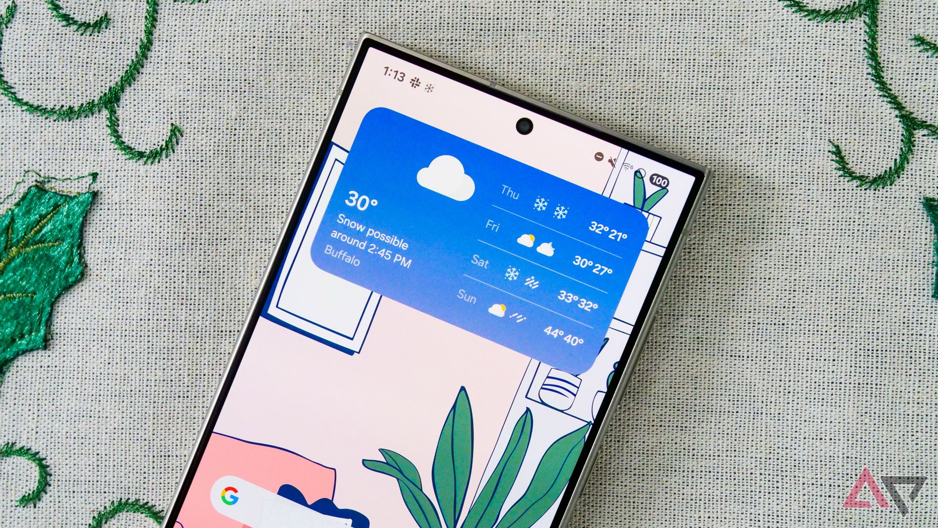
No matter how positive I’m feeling coming out of my first 24 hours with this software, I’d still like to see Samsung make some serious changes, both within this beta period and beyond. It’s about time for the company to cull through some of its lesser-used features, most of which have been buried in an advanced menu within One UI for years now. That vertical app drawer also includes one of the most garish watermarks I’ve ever seen — stop trying to make Knox a household name, I’m begging.
If you’re curious on when you’ll be able to try One UI 7 for yourself, I wouldn’t be surprised if a stable launch is planned for around the Galaxy S25’s rumored announcement next month. That doesn’t leave much time for incremental changes within this beta, but considering I didn’t run into much in the way of bugs, that’s probably fine. And if you’re already on a Galaxy S24, you can sign up to get an OTA beta upgrade right this very moment.
As for when you’ll be able to try it, I wouldn’t be surprised if a stable launch happened around the S25 next month. If you’re feeling impatient and you’re on an S24, feel free to grab the beta.
Related
Samsung Galaxy S25: News, leaks, rumored price, and release window
The Galaxy S25 trio is coming early next year — here’s what we know


