If there’s one thing that many Android fans can agree on, it’s that Google can design some great-looking hardware and, sometimes, software. However, an area I’ve felt that Google could improve on was customization; this feeling really ramped up when Google released the original Pixel Watch in October 2012, when the watch faces seemed bland.
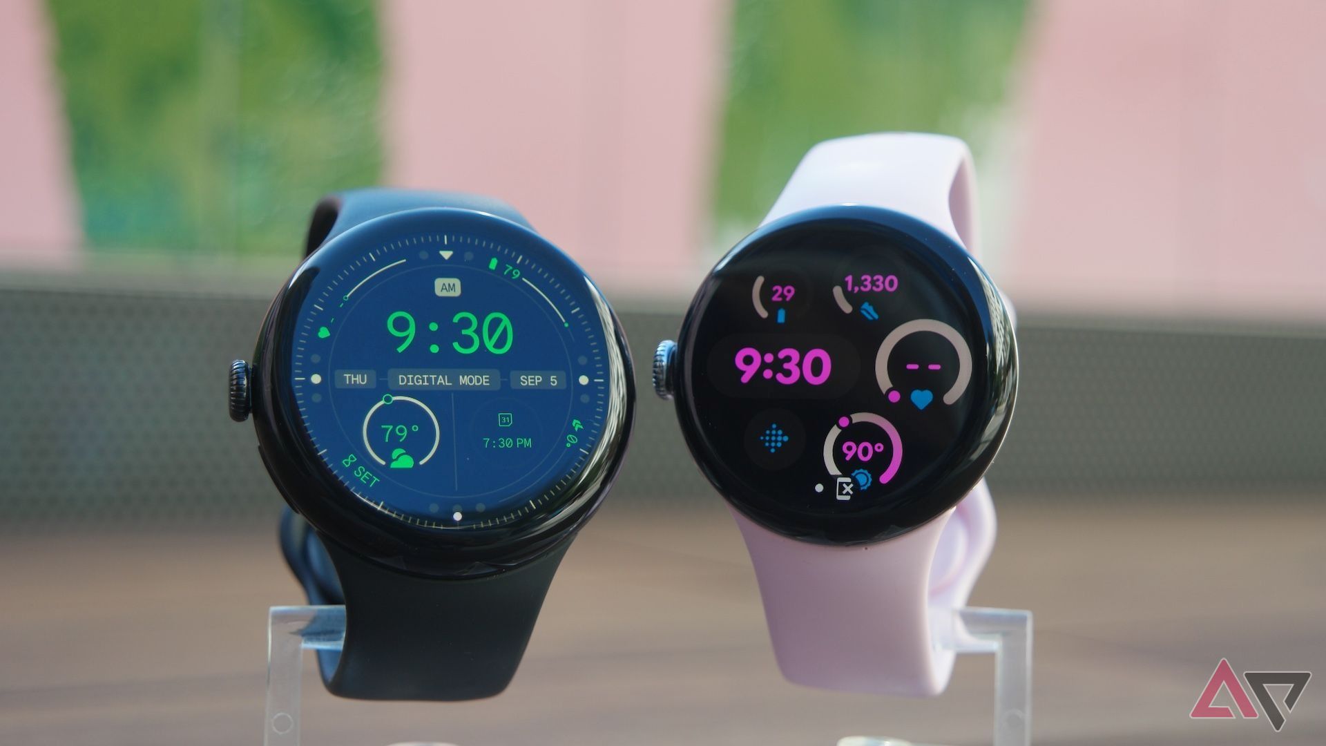
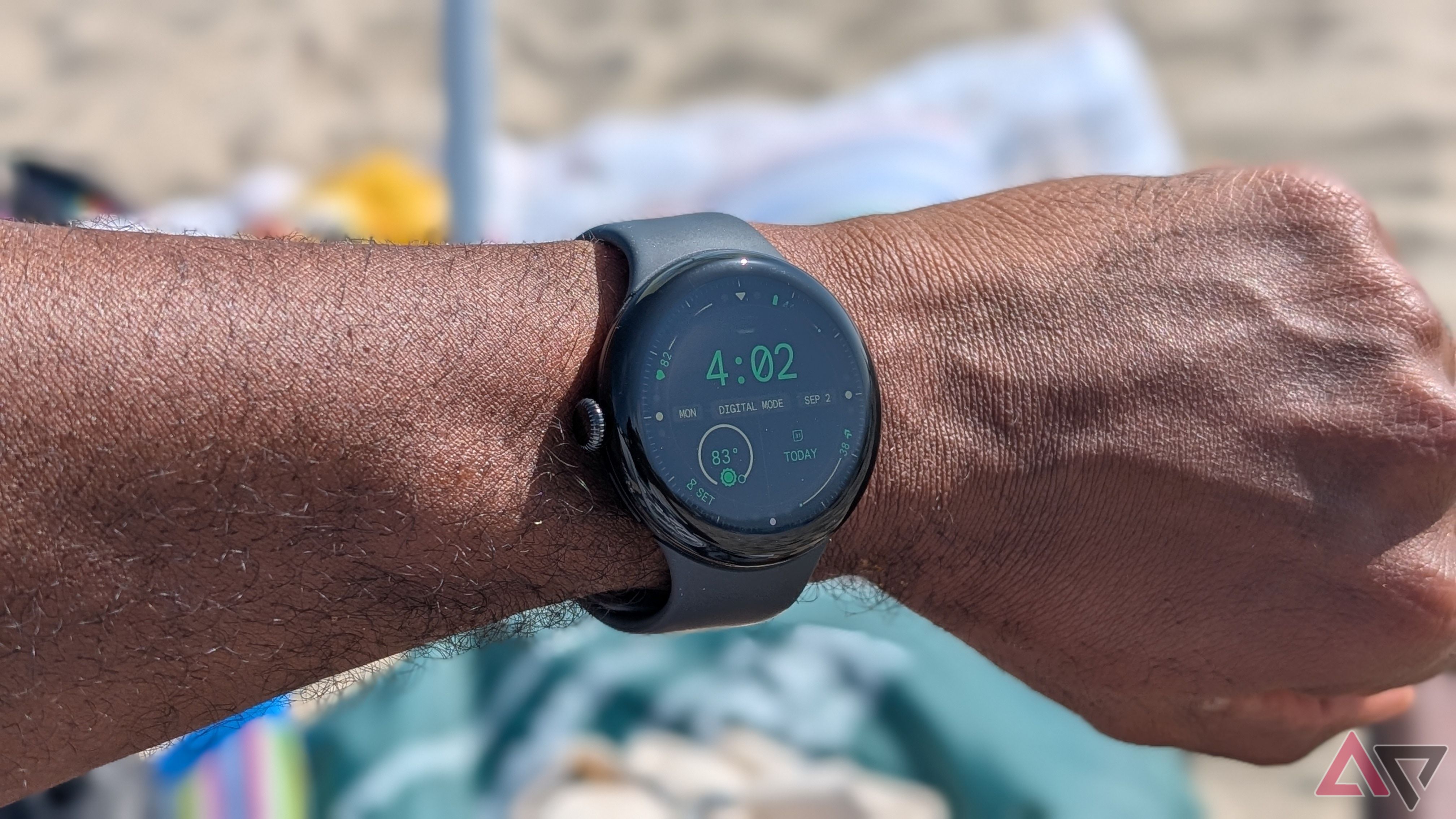
Since then, Google has been working on giving its users additional options and more customizations. I’ve rarely enjoyed the preloaded watch faces on even the best smartwatches, instead opting to download designs from the Play Store or through Facer. With the Pixel Watch 3 launch this past September, we got three new Google-designed watch faces — and I love them.
3 Active
Colors and info abound
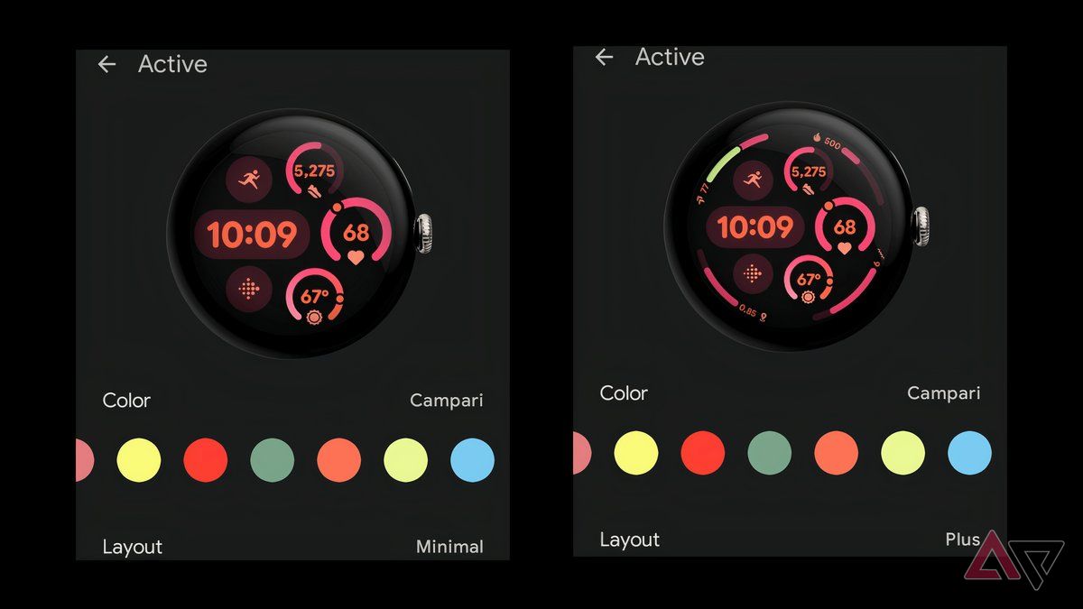
This is the watch face that has spent the most time on my Pixel Watch 3. I have the 45mm variant and I love the way the Active face uses all the screen real estate. To top it off, there are loads of customization options for it.
For starters, there are two versions of the Active face. Minimal has a digital clock and five complications, while Plus adds four more complications around the outer ring of the watch face. While this may sound like overkill, the design style and font choices by Google allow the info to be visible, but not cramped. The same can’t be said with the smaller 41mm Pixel Watch 3, as it can get very busy when all complications are active.
Related
Google Pixel Watch 3 vs. Pixel Watch 2: Same design, better activity tracking
Should you upgrade to the Pixel Watch 3?
But what really makes the Active face stay locked to my watch is the color choices and combinations available. Google has loaded 37 different colors and combos; some of the options, like Terra, Pebble, and Celadon, offer a monochromatic look using a couple of different shades of the primary color. However, other color options, like Nightcrawler, Nocturnal, and Ooze, use two or more contrasting, but complimentary colors.
Regardless of the layout used or colors picked, I can always find a combination that I like.
2 Field
Complicated modern analog
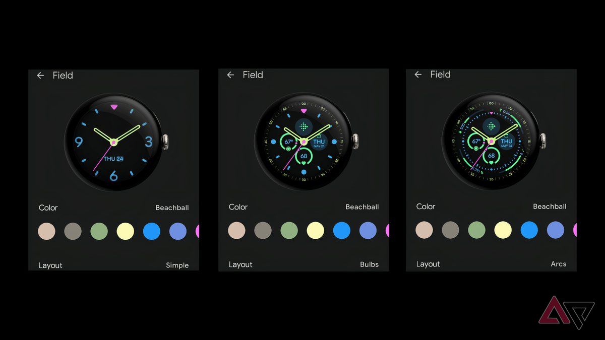
Field is a fantastic option for those times when you want your smartwatch to look more watch-like, but with a modern flair. This option is my second favorite and is frequently my choice for a weekend out option. Field offers three different layouts — Simple, Bulbs, and Arcs — which expand across the Pixel Watch 3’s face with plenty of negative space or to utilize as much screen real estate as possible to allow for useful complications. Aren’t choices great?
Simple is the most minimal layout of the three, with 3, 6, and 9 being the only numbers on the face. You get a triangle to mark 12 o’clock and tics for the rest of the numbers. The hands are hollow, and you get a contrasting colored second hand. The Simple layout doesn’t allow for any complications, but you do get the date towards the bottom of the face.
The Bulbs layout brings more data to the watch’s face by shrinking the Simple layout a little to make room for second marks on the outer ring of the face and ditching the numbers for circles. In addition to the second markings, Bulbs brings in four circular complications around the central point of the hands.
Lastly, Arcs shrink the hours and minutes even more than Bulbs to make room for four more complications that are shaped like, you guessed it, arcs. These complications rest between the second markings and the hour and minute markings. Of course, regardless of what layout you choose, you’ll get access to the same 37 colors and combos found with the Active watch face.
1 Track
Sparse, yet effective
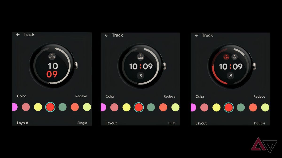
I like the Track watch face whenever I’m exercising or when I just want a simple layout I can glance at. Track isn’t new to the Pixel Watch, but it has received a pretty hefty overhaul. The original version of the watch face had a thick outer ring that illustrated your progress, along with a horizontally or vertically stacked centered digital clock. The new version offers three different layouts and thins out the outer rings a bit.
The Single layout is essentially the Pixel Watch 1 and 2 versions, but with a thinner ring and an offcenter vertically stacked digital clock. Bulb shifts the clock to be horizontally centered and adds a second complication, with the outer ring still illustrating the progress of the first complication. Lastly, there’s Double, which splits the ring into two for visualizations of two complications and allows room for a third complication.
The last big change for the Track face is the color options. Originally, there were only five choices, but now you have 37.
Google has cracked the code
While I do still check out the watch faces on the Play Store from time to time, I have been quite happy with what Google has designed for the Pixel Watch 3. It makes sense that Google should know how to make the best watch faces for the Pixel Watch. Finally, with the latest model. It’s true.
Google Pixel Watch 3
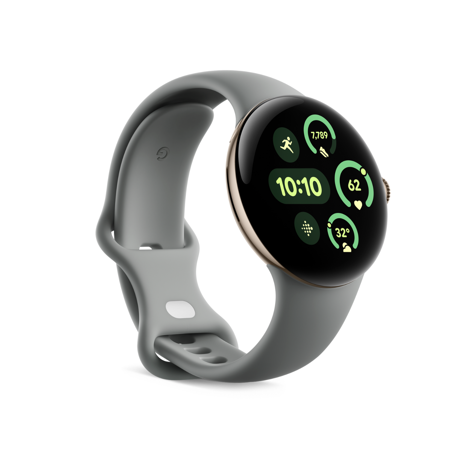
The Pixel Watch 3 is a great smartwatch with unmatched style. Thanks to the new watch faces Google launched with it, the wearable has top-notch customization to go with its design.


