Key Takeaways
- Google is bringing a revamped Drive location picker to Android, simplifying file access.
- The new Android Drive file picker features a carousel design, which makes it easier to navigate between different folders and view recent files.
- The update will roll out to all Google Workspace users before the end of the year.
Back in April 2023, Google revamped Google Drive’s location picker UI on the web, allowing users to quickly and efficiently organize files and folders, alongside the introduction of “helpful suggestions when moving files and folders or adding shortcuts to items in Drive.”
Now, similar improvements are headed to the Google Drive file picker experience on Android, allowing users on Workspace applications like Gmail to pick out files to share seamlessly.

Related
Google Drive’s redesigned location picker makes moving files a breeze
It’ll save you a few taps when looking for a destination folder
As highlighted by the tech giant in a new blog post today, the updated UI is rolling out now, with users in its Rapid Release domains potentially being able to see the change now. For users in the Scheduled Release domains, the UI tweak will begin rolling out on December 2, which means that all eligible Google Workspace customers, Google Workspace Individual subscribers, and users with personal Google accounts should have access to a new file picker before EOY.
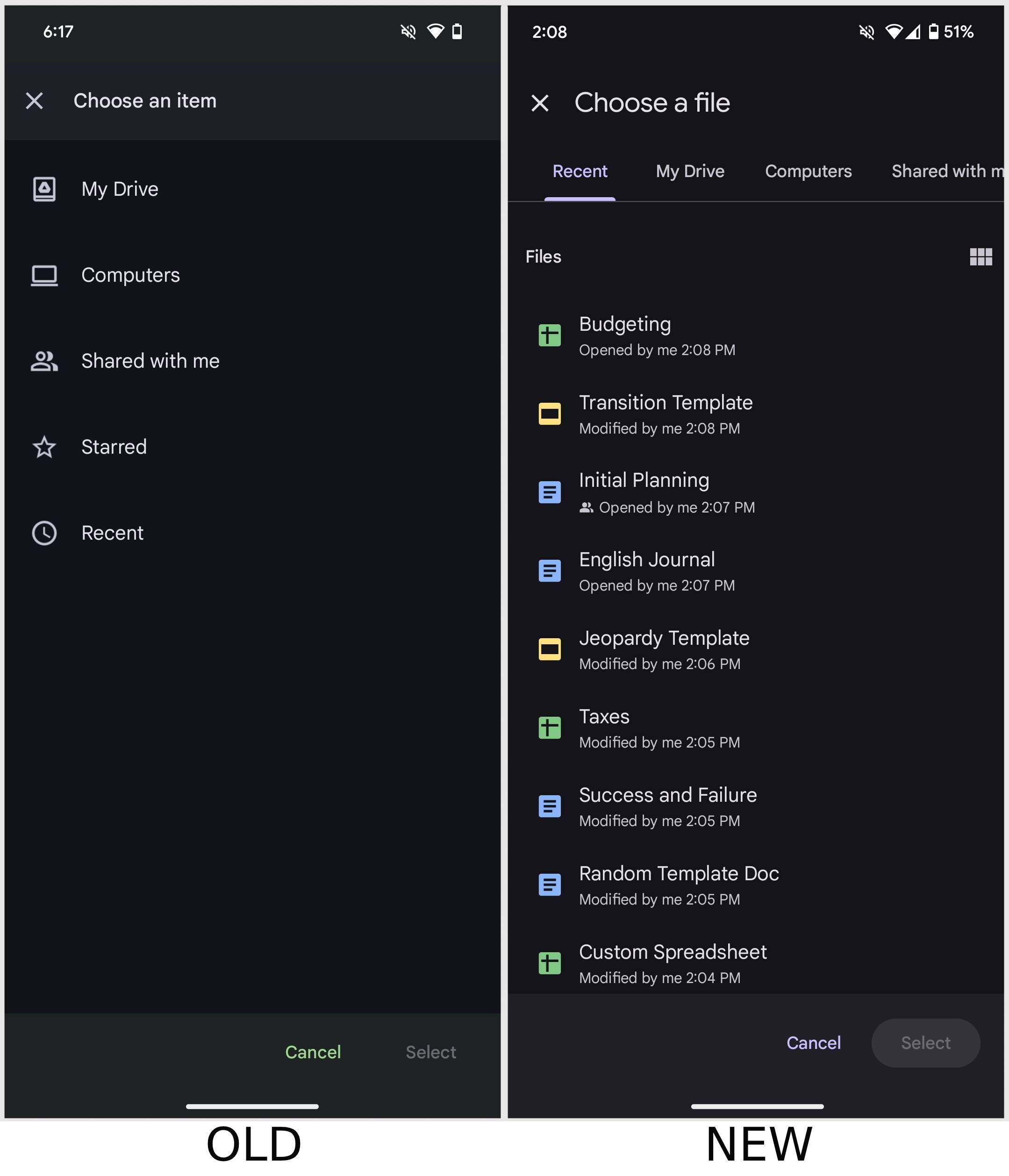
The UI change essentially makes it easier for users to find recently viewed Drive items. It still offers the same file locations to parse through, including ‘My Drive,’ ‘Computers,’ ‘Shared with me,’ ‘Starred,’ and ‘Recent,’ albeit in a vastly more user-friendly carousel layout.
You should soon begin seeing a more intuitive file picker layout
For reference, if you open the Gmail app on Android and tap on the paperclip attachment button when composing a new email, you’ll be presented with an ‘Insert from Drive’ button. Tapping it, at least for me, still surfaces the old UI with the list of folders to parse through. With the update, the list of folders should change into a carousel, alongside a view of recent files within the selected folder, as seen in the second screenshot below. Previously, users had to navigate into the folders to see the files that they housed.
“This update will make it easier to find recently viewed Drive items and clearly see what other storage locations besides “My Drive” are available to you, such as items you have access to within shared drives,” wrote Google.
This comes alongside a Google Calendar update for Android that finally brings a full-screen view of tasks, similar to its web counterpart.

Related
Google Calendar for Android gets a long-awaited dedicated Tasks view
No mention of iOS support for now


