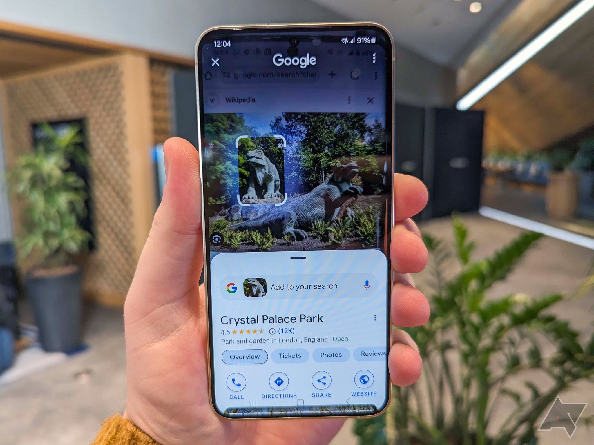
Key Takeaways
- Circle to Search’s app drawer is rolling out to more users, bringing subtle UI tweaks and hinting at even more features to come.
- The app drawer replaces the Google Translate button with access to features like Google Lens, song ID, and more.
- Google Lens is back after being swapped out for ‘Identify a song’ in October, but now it’s buried in the app drawer, which might slow down users who rely on it.
Google’s Circle to Search has made it super easy to find anything on your screen, no matter the app. Now, it looks like Google is gearing up to take it even further. A few days back, we got a hint that the search giant was planting the seeds for a full-blown feature garden in Circle to Search, and now it’s rolling out a new button to some users for extra functions.
As spotted by Mishaal Rahman, Google’s new app drawer for Circle to Search is rolling out to more users. It first popped up in the Google app beta recently, bringing subtle UI tweaks and hinting at even more features in the pipeline.
The new look is a bit bulkier, with UI elements tucked into a rounded box. The standout change, of course, is that the Google Translate button is gone, swapped out for a handy app drawer.
old vs new Circle to Search UI
It adds an extra tap, but it’s smart as Circle to Search grows
Switching to an app drawer means features like Google Lens and translation now take an extra tap, but it fits with Circle to Search’s growing complexity. As more tools get added, the app drawer sets the stage for future features without cramming the screen or messing with the search bar.
The app drawer makes it easy to access features like “Translate,” “Identify a song,” and Google Lens. The best part is that Lens is back after being replaced by the ‘Identify a song’ button in October. Taking away the Lens shortcut has been a bummer for many. It was super handy for quick visual searches. The app drawer helps, but you have to tap an extra time, which could slow things down for regular Lens users—especially those who rely on it for things like translating text or identifying plants and animals.
It would be great if Google let users personalize the app drawer, putting their go-to actions front and center for faster access. While it’s still early days for this feature, there’s hope that future updates will bring this much-needed customization option.


