We knew it was coming, we even asked for it to happen, but we didn’t expect it would be quite so quick: almost exactly two months after Apple launched its iPhone 16 series, we have the first Android competitor with its own version of the Camera Control button.
No Thanks, Keep Reading
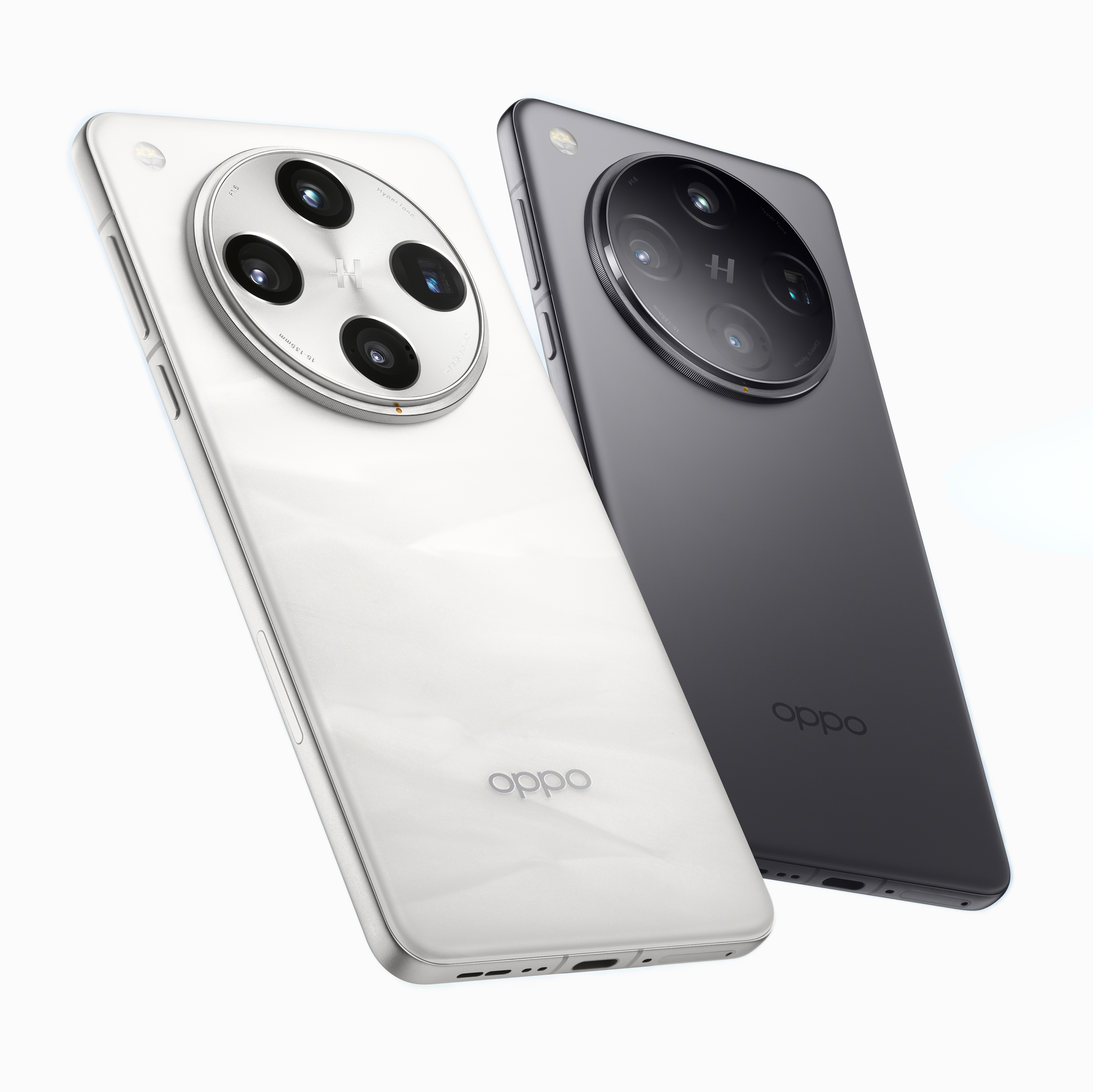
Oppo Find X8 Pro
The Oppo Find X8 Pro is a full-on flagship phone, with dual periscope cameras, plenty of AI-powered software features, and Android’s first take on the touch-sensitive Camera Control button introduced in the iPhone 16 series.
- SoC
- MediaTek Dimensity 9400
- Display type
- OLED, 120Hz
- Display dimensions
- 6.78″
- Display resolution
- 1264 x 2780
- RAM
- Up to 16GB
- Storage
- Up to 512GB
- Battery
- 5,910mAh
- Charge speed
- 80W wired, 50W wireless
- Operating System
- Android 15 with ColorOS
- Front camera
- 32MP
- Rear camera
- 50MP main; 50MP ultrawide; 50MP 3x telephoto; 50MP 6x telephoto
- Weight
- 215g
- IP Rating
- IP68/69
- Colors
- White, black
Oppo’s Find X8 Pro, the company’s first flagship phone to launch in the West for almost three years, is also the first to feature what it calls the ‘Quick Button’.
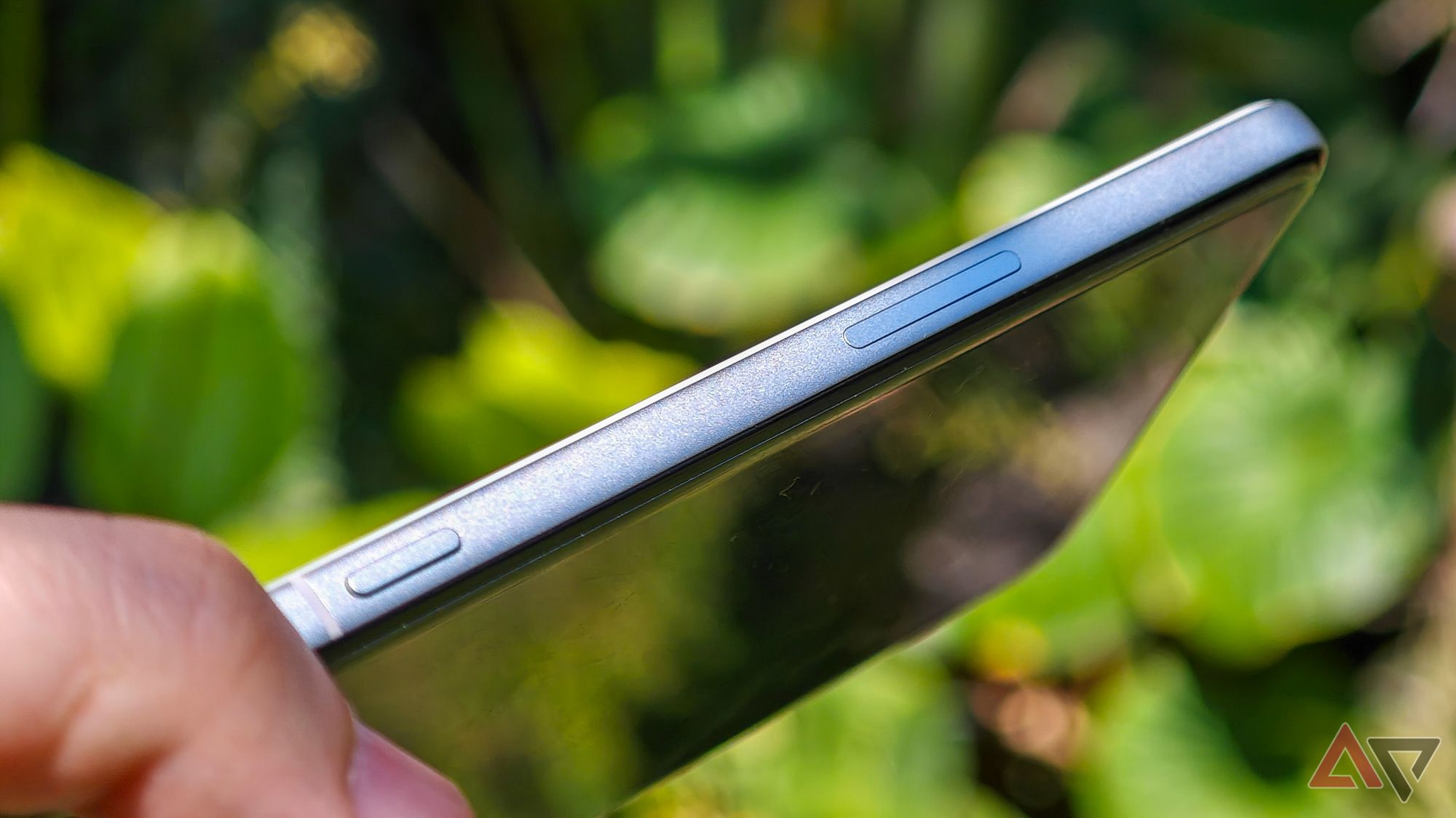
This is a touch-sensitive strip along the right-hand side of the phone’s body that doubles as a haptic button, and is used for quick access to basic camera controls. So far, so Apple.
Perhaps smartly, Oppo has limited how much you can do with the Quick Button. While Apple’s Camera Control can be used to adjust exposure or switch between lenses, Oppo’s approach is simpler: double-press to open the camera, press again to take a photo or start recording video, hold it down to take a series of burst shots, and slide along to zoom in or out (though this last one only works when the phone is in landscape mode, for reasons).
That makes this much closer to a plain ol’ shutter button, but I think that simplicity works in its favor. I haven’t used Apple’s implementation for more than a minute or two on a friend’s iPhone 16, but in his iPhone 16 Pro Max review my colleague Will Sattelberg called it “convoluted to the point of actual madness,” so I think I’ll take Oppo’s approach, which is streamlined enough that I do actually find myself using it.
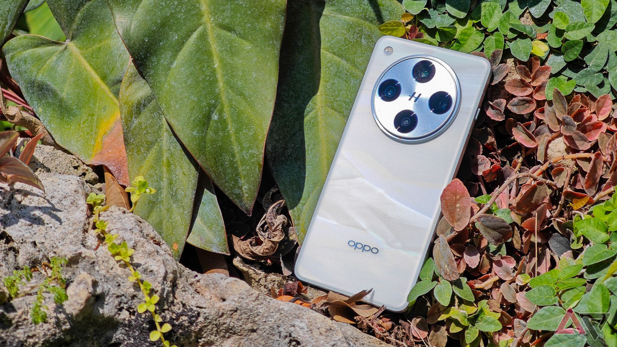
One small disappointment is that despite the generic ‘Quick Button’ naming, Oppo hasn’t taken the opportunity to make this button versatile or customizable. You can turn any of the camera shortcuts, and adjust the haptic pressure sensitivity, but you can’t set the button to open a different app or do, well, anything else at all. Hopefully Oppo adds some more options down the line.
The other edge it has over the iPhone is positioning. While I still find it’s just a touch too close to the center of the phone, and away from where my finger naturally rests for a shutter button, it’s clearly in a much more comfortable spot than Apple managed. I remain baffled that neither company has managed to get this quite right though — if I struggle to reach with my big hands, plenty of people will find it near unusable.

Related
The iPhone 16 proves it’s past time for shortcut buttons to return to Android
Finding inspiration in Camera Control
I may have jokingly called this a ‘Camera Control clone’, but it is probably worth addressing the timeline here: with Apple’s hardware only announced two months ago, and the first leaks not too long before that, it’s likely that Oppo has been developing this design in parallel with Apple rather than just hitting copy-paste, though the timing hasn’t done the Chinese company any favors.
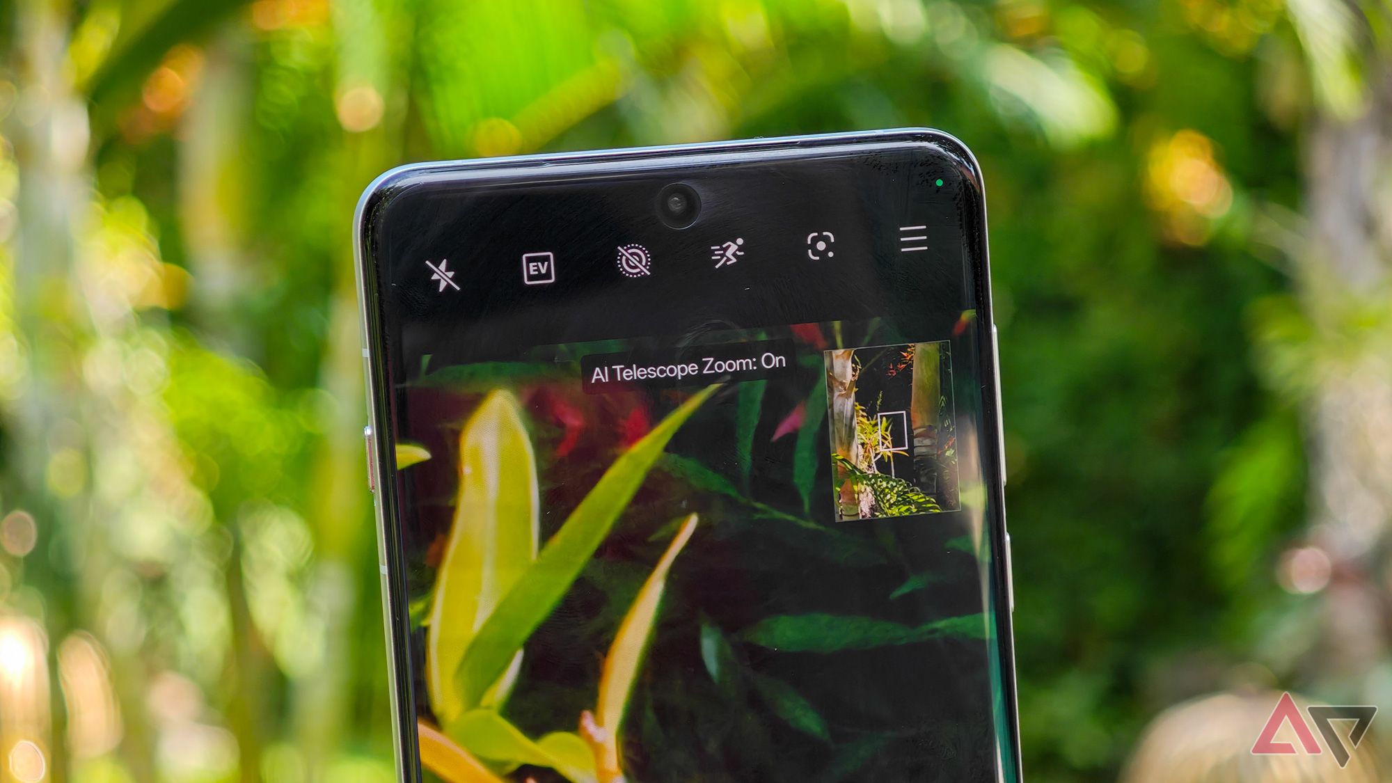
Of any phone, it might make sense that the Find X8 Pro is the first to lean into Applesque camera controls. This is a phone that takes its photos seriously, with a quadruple Hasselblad rear camera featuring 50MP sensors behind every single lens. The highlights are the dual periscope lenses, one at 3x zoom and the other at 6x, which are bolstered by ‘AI Telescope Zoom’ when you hit a certain zoom depth.
I’ll admit I’m spoilt by using the Xiaomi 14 Ultra as my daily driver, probably the best camera phone in the world right now, and with exceptional telephoto lenses. Still, I’ve enjoyed the results from these cameras, including some rather respectable low-light performance from the two periscopes.
Oppo’s usually over-saturated color tuning seems to have been calmed down somewhat — their relationship with Hasselblad is one of the rare camera partnerships that really does seem to be shaping their color science and processing for the better — allowing me to capture some unexpectedly beautiful, naturalistic shots out of the phone.
My only real gripe is with the periscopes’ focus. Neither are capable of short-throw focus, ruling these out for either telemacro photography or even just close-ups of anything nearby. Strangely, this problem is worse on the 3x lens, which is fundamentally useless on anything closer than an arm’s length away, while the 6x shooter is a little more versatile. Both do well at long-distance, but that’s only half of what a telephoto lens should be good for.
Elsewhere, the phone doesn’t skimp on much. It’s powered by the new MediaTek Dimensity 9400 chipset, boasts a 6.78in OLED display with micro-curving on every edge, and despite a slender build it somehow squeezes in a silicon-carbon battery that’s a hair under 6,000mAh.
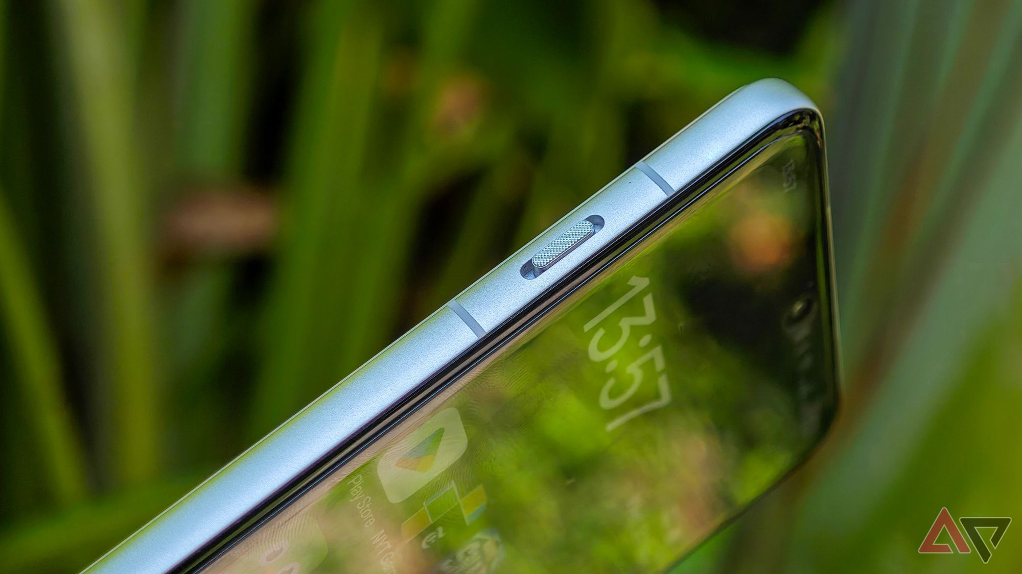
It shares a number of specs in common with the OnePlus 13, along with the trademark knurled alert slider on the left-hand side, though leans a little harder on the cameras and a little less on pure performance.
The Find X8 Pro launches worldwide, though not in the US, from today. In Asia it’s joined by the slightly lower-specced Find X8, which has a simplified camera and smaller design, but in the process omits the Quick Button entirely.


