Overview
- You can perform predictive modeling in Excel in just a few steps
- Here’s a step-by-step tutorial on how to build a linear regression model in Excel and how to interpret the results
Introduction
Excel for predictive modeling? Really?
That’s typically the first reaction I get when I bring up the subject. This is followed by an incredulous look when I demonstrate how we can leverage the flexible nature of Excel to build predictive models for our data science and analytics projects.
Let me ask you a question – if the shops around you started collecting customer data, could they adopt a data-based strategy to sell their goods? Can they forecast their sales or estimate the number of products that might be sold?
Now you must be wondering how in the world will they build a complex statistical model that can predict these things? And learning analytics or hiring an analyst might be beyond their scope. Here’s the good news – they don’t need to. Microsoft Excel offers us the ability to conjure up predictive models without having to write complex code that flies over most people’s heads.
We can easily build a simple model like linear regression in MS Excel that can help us perform analysis in a few simple steps. And we don’t need to be a master in Excel or Statistics to perform predictive modeling!
In this article, I am going to explain how to build a linear regression model in Excel and how to analyze the result so that you can become a superstar analyst!
This is the seventh article in my Excel for Analysts series. I highly recommend going through the previous articles to become a more efficient analyst:
- 3 Advanced Excel Charts Every Analytics Professional Should Try
- 5 Powerful Excel Dashboards for Analytics Professionals
- 5 Useful Excel Tricks to Become an Efficient Analyst
- 5 Excel Tricks You’ll Love Working with as an Analyst
- 5 Handy Excel Tricks for Conditional Formatting Every Analyst Should Know
- 3 Classic Excel Tricks to Become an Efficient Analyst
I encourage you to check out the below resources if you’re a beginner in Excel and Business Analytics:
Table of Contents
- What is Linear Regression?
- Getting the All-Important Add Analytics ToolPak in Excel
- Implementing Linear Regression in Excel
- Interpreting the Results of our Predictive Model
- How can we Improve the Model?
- Making Predictions in Excel!
What is Linear Regression?
Linear Regression is the first machine learning technique most of us learn. It’s also the most commonly used supervised learning technique in the industry.
But what is linear regression?
It is a linear approach to statistically model the relationship between the dependent variable (the variable you want to predict) and the independent variables (the factors used for predicting). Linear regression gives us an equation like this:
Here, we have Y as our dependent variable, X’s are the independent variables and all C’s are the coefficients. Coefficients are basically the weights assigned to the features, based on their importance.
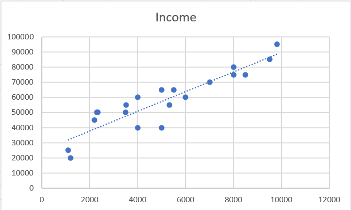
The most common method to perform regression is the OLS (Ordinary Least Squares). Its goal is to reduce the sum of squares to produce the line of best fit like this:
If you want to learn more about linear regression, here are some resources:
- Fundamentals of Linear Regression
- Diagnostic Plots in a Linear regression model
- A Beginner’s Guide to Linear Regression in Excel
Getting the All-Important Analysis ToolPack Excel Add-in
To perform a regression analysis in Excel, we first need to enable Excel’s Analysis ToolPak Add-in. The Analysis ToolPak in Excel is an add-in program that provides data analysis tools for statistical and engineering analysis.
To add it in your workbook, follow these steps.
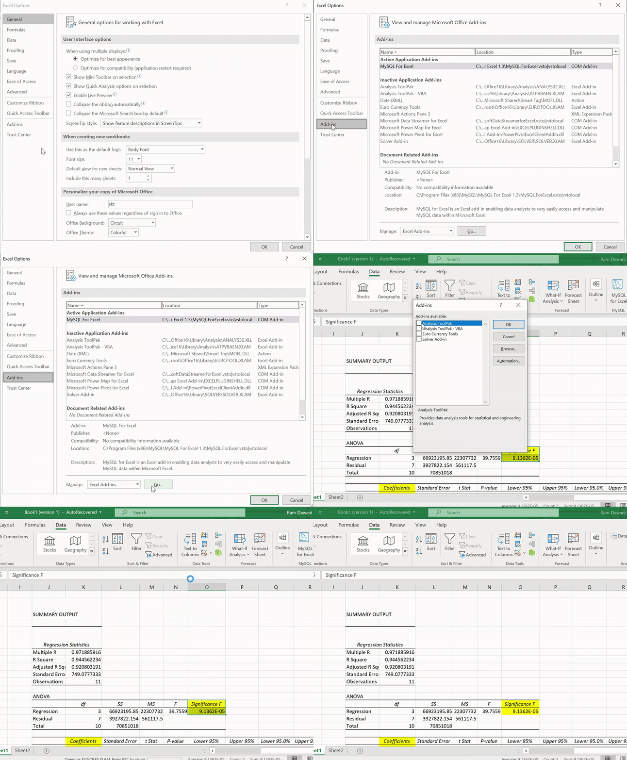
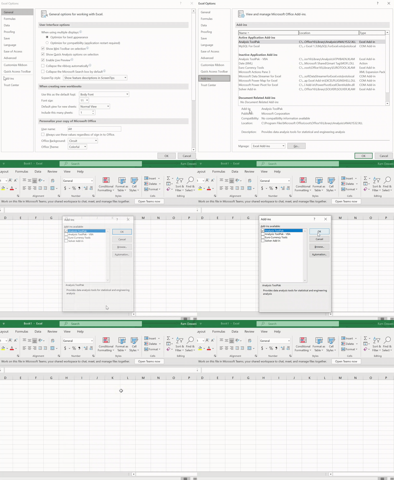
Step 1 – Excel Options
Go to Files -> Options:
Step 2 – Locate Analytics ToolPak
Go to Add-ins on the left panel -> Manage Excel Add-ins -> Go:
Step 3 – Add Analytics ToolPak
Select the “Analysis ToolPak” and press OK:
You have successfully added the Analysis ToolPak in Excel! You can check it by going to the Data bar in the Ribbon.
Let’s start building our predictive model in Excel!
Implementing Linear Regression in Excel
A lot of the stuff was theoretical so far. Now, let’s deep-dive into Excel and perform linear regression analysis!
Here is the problem statement we will be working with:
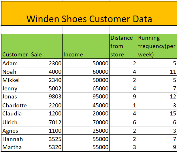
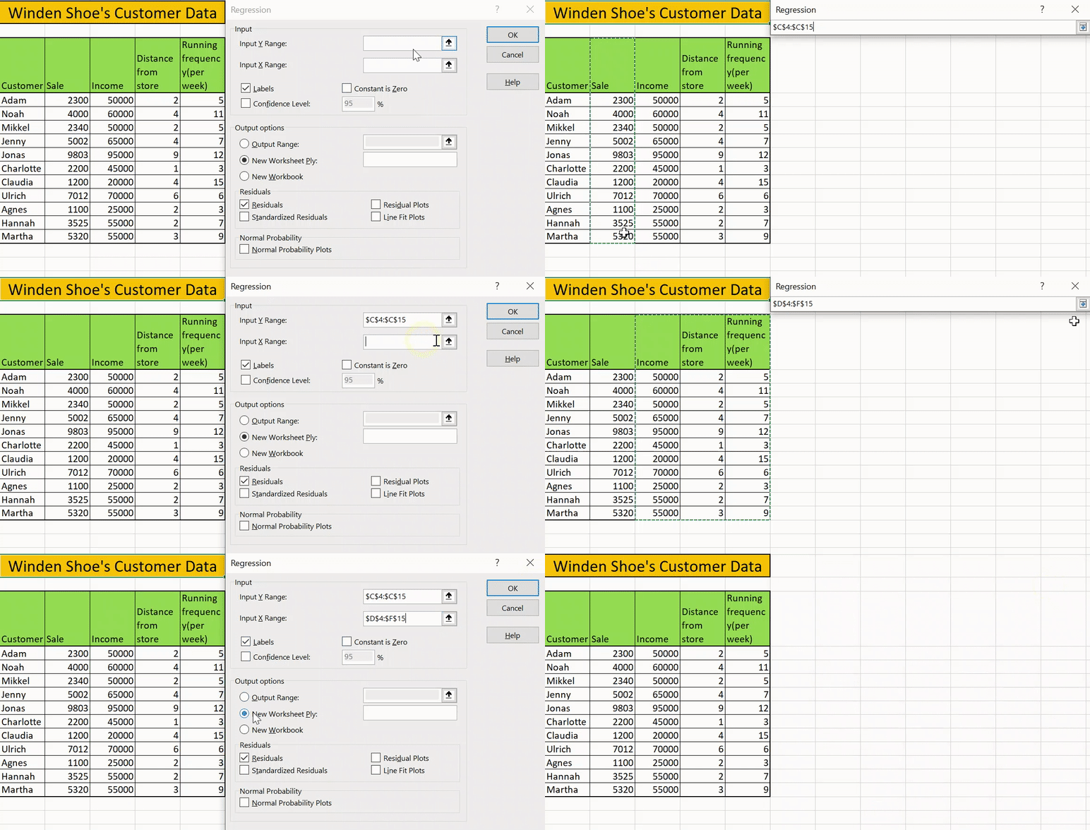
There is a shoe selling company in the town of Winden. The company wants to predict the sales through each customer by considering the following factors – Income of customer, Distance of home from store, customer’s running frequency per week.
Step 1 – Select Regression
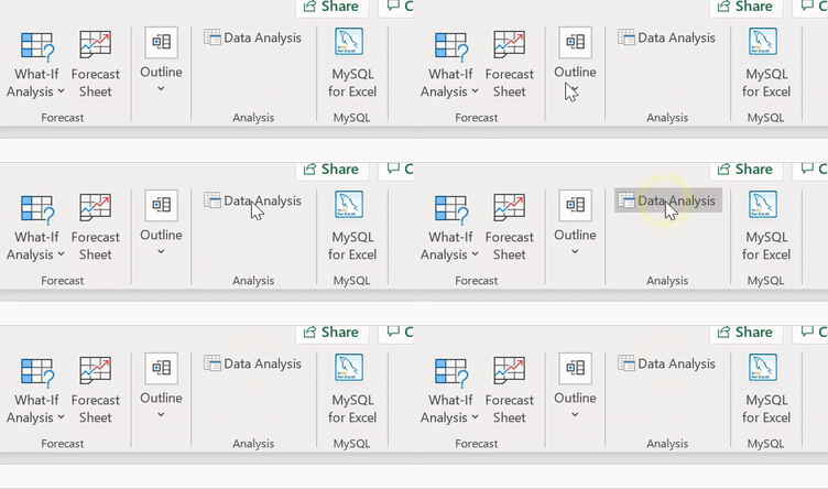
Go to Data -> Data Analysis:
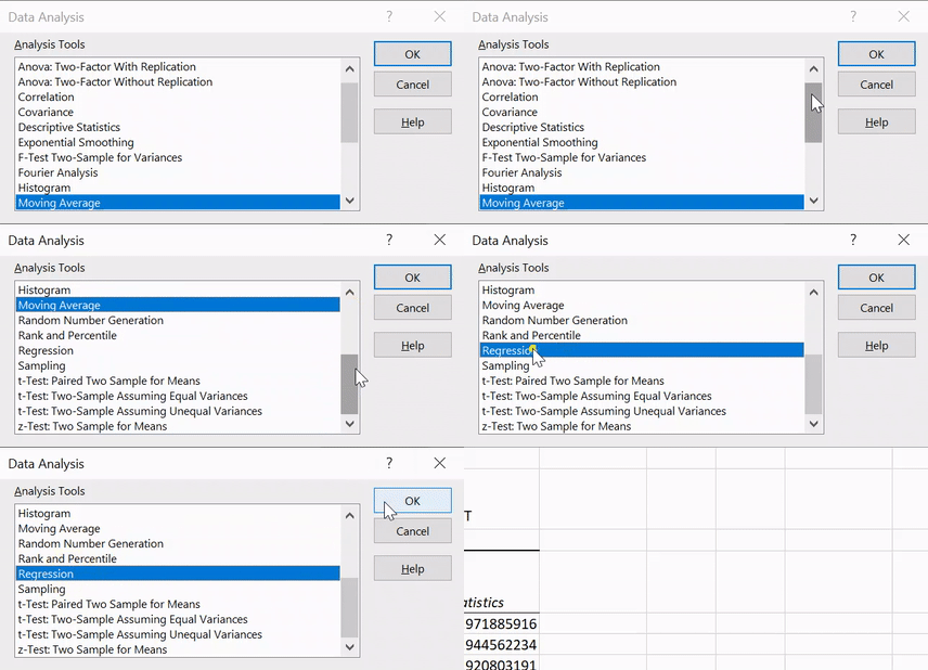
Go to Data Analysis in the Data ToolPak, select Regression and press OK:
Step 2 – Select Options
In this step, we will select some of the options necessary for our analysis, such as :
- Input y range – The range of independent factor
- Input x range – The range of dependent factors
- Output range – The range of cells where you want to display the results
The other options are discretionary and you may select them for your specific purpose.
Press OK and we have finally made a regression analysis in Excel in just two steps! Wasn’t that easy? Now we will see the result of regression analysis in excel.
Analyzing our Predictive Model’s Results in Excel
Implementing the linear regression model was the easy part. Now comes the tricky aspect of our analysis – interpreting the predictive model’s results in Excel.
In the summary, we have 3 types of output and we will cover them one-by-one:
- Regression statistics table
- ANOVA table
- Regression coefficients table
- Residual Table
Regression Statistics Table
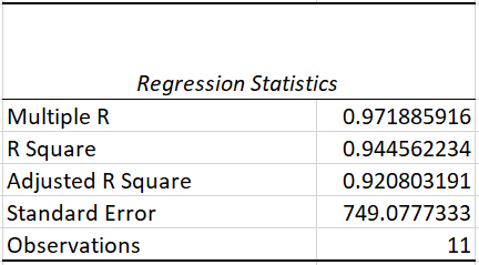
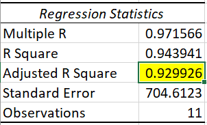
The regression statistics table tells us how well the line of best fit defines the linear relationship between the independent and dependent variables. Two of the most important measures are the R squared and Adjusted R squared values.
The R-squared statistic is the indicator of goodness of fit which tells us how much variance is explained by the line of best fit. R-squared value ranges from 0 to 1. In our case, we have the R-squared value of 0.953 which means that our line is able to explain 95% of the variance – a good sign.
But there is a problem – as we keep adding more variables, our R squared value will keep increasing even though the variable might not be having any effect. Adjusted R-squared solves this problem and is a much more reliable metric.
ANOVA Table
ANOVA stands for Analysis of Variance. This table breaks down the sum of squares into its components to give details of variability within the model.
It includes a very important metric, Significance F (or the P-value) , which tells us whether your model is statistically significant or not. In a nutshell, it means that our results are likely not due to randomness but because of an underlying cause. The most used threshold for the p-value is 0.05. If we are getting a value less than this, than we are good to go. Otherwise, we would need to choose another set of independent variables.
In our case, we have a value well below the threshold of 0.05. Awesome, we can move forward now!
Regression Coefficient Table
The Coefficient table breaks down the components 0f the regression line in the form of coefficients. We can understand a lot from these.
For the Winden shoe company, it seems that for each unit increase in income, the sale increases by 0.08 units, and an increase in one unit of distance from store increases by 508 units!
It seems that an increase in running frequency decreases the sales by 24 units, but can we actually believe in this feature? If you look in the image above, you will notice that it’s p-value is greater than 0.5 which means it is not statistically significant. We will look into how we can handle this situation in the next section.
Residual Table
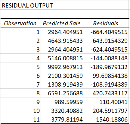
The residual table reflects how much the predicted value varies from the actual value. It consists of the values predicted by our model:
How can we Improve our Model?
As we saw previously, the p-value for the variable running frequency is more than 0.05 so let us check our results by removing this variable from our analysis.
We will follow all the steps mentioned above but we will not include the running frequency column:
We notice that the value of adjusted R-squared improved slightly here from 0.920 to 0.929!
Making Predictions in Excel!
We have the regression analysis ready so what can we do now? Let’s see.
An old customer of yours named Aleksander walks in and we wish to predict the sales from him. We can simply plug in the number from the data in the linear regression model and we are good to go!
Aleksander has an income of 40k and lives 2km away from the store. What is the estimated sales?
The equation becomes:
Here, our model has estimated that Mr. Aleksander would pay 4218 units to buy his new pair of shoes! That’s the power of linear regression done simply in Microsoft Excel.
End Notes
In this article, we learned how to build a linear regression model in Excel and how to interpret the results. I hope this guide helps you to become better as an analyst or a data scientist.
The Analytics ToolPak consists of a lot of other analysis choices in Excel. You can try a lot of other statistical analysis in your daily life!


