Summary
- Dark mode is now available in Google Arts & Culture app.
- The update follows a Material You redesign last year.
- Google is moving towards offering dark mode in all apps and services, with progress in mobile and web apps.
Google is adding another product to its roster of dark mode-enabled apps. As reported by 9to5Google, Google Arts & Culture has picked up a new dark theme, so you can now peruse Google’s digital museum in low light without straining your eyes.
We’re seeing dark mode as an option in version 10.9.5 of the Google Arts & Culture app on our own devices, too. It’s a pretty by-the-numbers dark theme: with dark mode enabled, the areas of the UI that were previously white or light gray by default are instead rendered in black or dark gray. The app matches your system theme by default, but there are also options to force Arts & Culture into either theme, regardless of your device’s setting.
The next step in modernizing Arts & Culture
A slick, responsive design
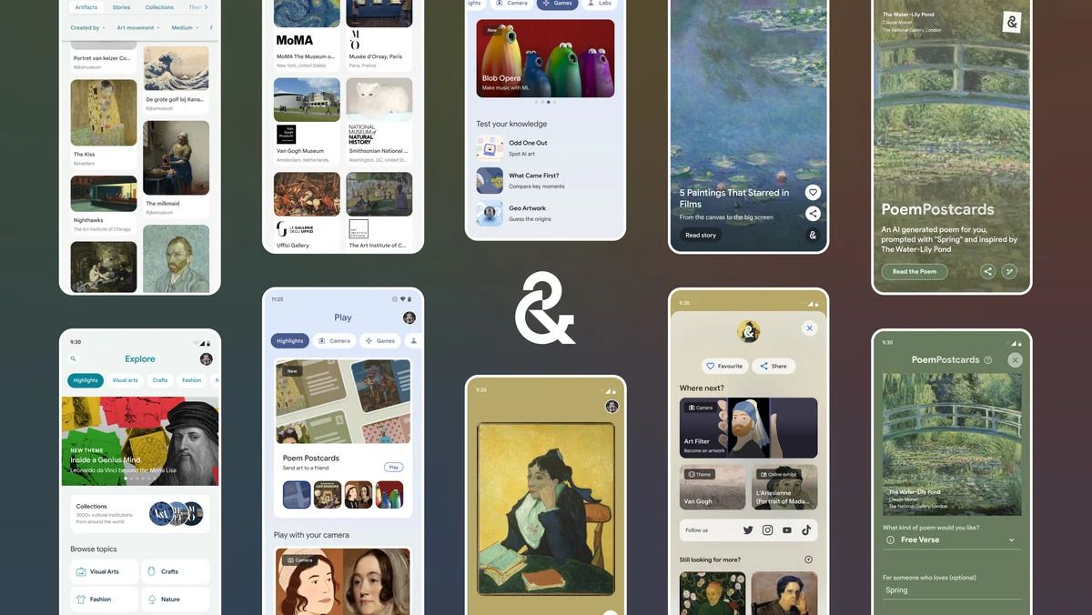
Google Arts & Culture is an educational app from Google that lets users view and learn about works of art housed at thousands of institutions around the world. The app has long had features that let you interact with art in interesting ways, including viewing art in your own environment using AR and applying ML-driven artist filters to your photos.
Coming on the heels of a substantial Material Design makeover last summer, and this latest dark mode update signals that Google hasn’t yet lost interest in the Arts & Culture app. It’s also another step toward Google offering dark mode in all its apps and services. Most of Google’s mobile apps support the feature anymore, and the company is making progress in its web apps — dark mode is rolling out to Google Drive’s web interface right now. (Google Arts & Culture’s web app, meanwhile, is still light mode-only.)


