Introduction
This article is best suited for people who actively (or are aspiring to) participate in data science / machine learning competitions and try hard to improve their model’s accuracy.
Many a times, we face problems (data sets) whose evaluation metric is LogLoss. It’s mostly seen in problems where probabilities needs to be predicted. Recently, I came across a similar problem. You know, it’s being said, ‘when you know no boundaries, you do things which were seen improbable’. So, in the quest of my accuracy improvement, I discovered 2 powerful methods to improve accuracy of predicted probabilities.
In this article, you’ll learn about these methods and how to implement them in R to improve your rankings and score. Also, I’ll show you how I achieved a uplift of 87 ranks on competition leaderboard using one of these methods.
Note: I’ve participated in Predict Blood Donations competition which is currently active and uses Log Loss as its evaluation metric.
What is LogLoss Metric ?
This Evaluation Metric is employed in the classification tasks where rather than predicting the actual classes, one needs to predict the probabilities corresponding to that classes. So, in a way this metric measures the quality of predictions rather than the accuracy. The formula for Log Loss goes as-
Where is the actual class value (i.e 0 or 1 in case of binary classification) of a particular observation(row) and
is the predicted probability of that class.
Now, lets take an example of a single row where the actual class is 0 and you predict the probability with absolute certainty i.e 1. Log Loss in this case turns out to be infinity. So, it is easy to see that Log Loss metric penalizes absurd misclassification with a high certainty such that the rest of predictions become irrelevant.
So in a way, a better model is one which gives average probability to the observation about which it is unsure of. The closer the predicted probability to the actual class value, the better it is.
Here I provide you the relevant code in R which can be used to calculate the Log Loss during the cross-validation stage while model building:
# Log Loss as defined on the kaggle forum
LogLoss<-function(act, pred)
{
eps = 1e-15;
nr = length(pred)
pred = matrix(sapply( pred, function(x) max(eps,x)), nrow = nr)
pred = matrix(sapply( pred, function(x) min(1-eps,x)), nrow = nr)
ll = sum(act*log(pred) + (1-act)*log(1-pred))
ll = ll * -1/(length(act))
return(ll);
}
LogLoss(actual,predicted)
Why do we need calibration (adjustment) of probabilities ?
I’m sure many of you would have this question, ‘ why and under what circumstances will I need to calibrate the probabilities?’.
Over time and due to the efforts of a scholarly researchers and data scientists, experiments have shown that maximum margin methods such as SVM, boosted trees etc push the real posterior probability away from 0 and 1 while methods such as Naive Bayes tend to push the probabilities towards 0 and 1. And in cases where predicting the accurate probabilities is more important, this poses a serious problem.
It has also been noticed empirically that boosted trees, random forests and SVMs performs best after calibration. Let’s see what works best!
2 Calibration Methods to Minimize LogLoss Error
Here, we discuss two methods of calibrating the posterior probabilities – Platt Scaling and Isotonic Regression with the help of a real data set. I’ll show you how I achieved a boosting of 87 ranks just by applying Platt Scaling on my model.
First of all, I would like to introduce reliability plots which can be used to visualize our calibration. As described in Niculescu-Mizil et al:
On real problems where the true conditional probabilities are not known, model calibration can be visualized with reliability diagrams (DeGroot & Fienberg, 1982). First, the prediction space is discretized into ten bins. Cases with predicted value between 0 and 0.1 fall in the first bin, between 0.1 and 0.2 in the second bin, etc.
For each bin, the mean predicted value is plotted against the true fraction of positive cases. If the model is well calibrated the points will fall near the diagonal line.
Now, let’s learn to create reliability diagrams in R. The number of bins have been converted into an user-entered parameter.
plot(c(0,1),c(0,1), col="grey",type="l",xlab = "Mean Prediction",ylab="Observed Fraction") reliability.plot <- function(obs, pred, bins=10, scale=T) { # Plots a reliability chart and histogram of a set of predicitons from a classifier # # Args: # obs: Vector of true labels. Should be binary (0 or 1) # pred: Vector of predictions of each observation from the classifier. Should be real # number # bins: The number of bins to use in the reliability plot # scale: Scale the pred to be between 0 and 1 before creating reliability plot require(plyr) library(Hmisc)
min.pred <- min(pred) max.pred <- max(pred) min.max.diff <- max.pred - min.pred if (scale) { pred <- (pred - min.pred) / min.max.diff } bin.pred <- cut(pred, bins) k <- ldply(levels(bin.pred), function(x) { idx <- x == bin.pred c(sum(obs[idx]) / length(obs[idx]), mean(pred[idx])) }) is.nan.idx <- !is.nan(k$V2) k <- k[is.nan.idx,] return(k) }I would like you to pay attention to the very first line of this code. This line creates a simple plot with a grey line inclined at an angle of 45° . This line will form our benchmark solution. Any line closer to this diagonal line in comparison to the other lines will be a better solution on Log Loss metric.
You should probably save this function somewhere and keep it handy since we will be using it to graphically view the performance of our model on Log Loss metric.
Practice time! It is better if we understand all this using a real dataset. The dataset that I will be using is the Predict Blood Donations dataset.
Since our motive is to understand the usage and impact of Platt Scaling, we won’t be dealing with pre-processing and feature engineering. I have also removed the ID and the Total Volume Donated variable since ID is of no use for the prediction purpose and Total Volume Donated is perfectly correlated to Number of Donations.
1. Platt Scaling
Platt scaling is a way of transforming classification output into probability distribution. For example: If you’ve got the dependent variable as 0 & 1 in train data set, using this method you can convert it into probability.
Let’s now understand how Platt Scaling is applied in real Predictive Modeling problems (in order):
- Split the train data set into training set and Cross Validation set
- Train the model on the training data set
- Score test data set and Cross Validation data set
- Run a logistic model on the Cross Validation data set using the actual dependent variable and the predicted values.
- Score the test data set using the model created in step 4 with feature as the output of scoring on test data set in step 3.
I hope that was easy to visualize and understand. Now let’s start with the actual coding process for a practical understanding.
# reading the train dataset
train <-read.csv("train.csv")
# reading the test dataset
test <-read.csv("test.csv")
#converting the dependent variable into factor for classification purpose.
train$Made.Donation.in.March.2007<-as.factor(train$Made.Donation.in.March.2007)
# removing the X column since it is irrelevant for our training and total colume column since it is perfectly correlated to number of donations
train<-train[-c(1,4)]
# splitting the train set into training and cross validation set using random sampling
set.seed(221)
sub <- sample(nrow(train), floor(nrow(train) * 0.85))
training<-train[sub,]
cv<-train[-sub,]
# training a random forest model without any feature engineering or pre-processing
library(randomForest)
model_rf<-randomForest(Made.Donation.in.March.2007~.,data = training,keep.forest=TRUE,importance=TRUE)
#predicting on the cross validation dataset
result_cv<-as.data.frame(predict(model_rf,cv,type="prob"))
#calculating Log Loss without Platt Scaling
LogLoss(as.numeric(as.character(cv$Made.Donation.in.March.2007)),result_cv$`1`)
# performing platt scaling on the dataset
dataframe<-data.frame(result_cv$`1`,cv$Made.Donation.in.March.2007)
colnames(dataframe)<-c("x","y")
# training a logistic regression model on the cross validation dataset
model_log<-glm(y~x,data = dataframe,family = binomial)
#predicting on the cross validation after platt scaling
result_cv_platt<-predict(model_log,dataframe[-2],type = "response")
LogLoss(as.numeric(as.character(cv$Made.Donation.in.March.2007)),result_cv_platt)
# plotting reliability plots
# The line below computes the reliability plot data for cross validation dataset without platt scaling
k <-reliability.plot(as.numeric(as.character(cv$Made.Donation.in.March.2007)),result_cv$`1`,bins = 5)
lines(k$V2, k$V1, xlim=c(0,1), ylim=c(0,1), xlab="Mean Prediction", ylab="Observed Fraction", col="red", type="o", main="Reliability Plot")
#This line below computes the reliability plot data for cross validation dataset with platt scaling
k <-reliability.plot(as.numeric(as.character(cv$Made.Donation.in.March.2007)),result_cv_platt,bins = 5)
lines(k$V2, k$V1, xlim=c(0,1), ylim=c(0,1), xlab="Mean Prediction", ylab="Observed Fraction", col="blue", type="o", main="Reliability Plot")
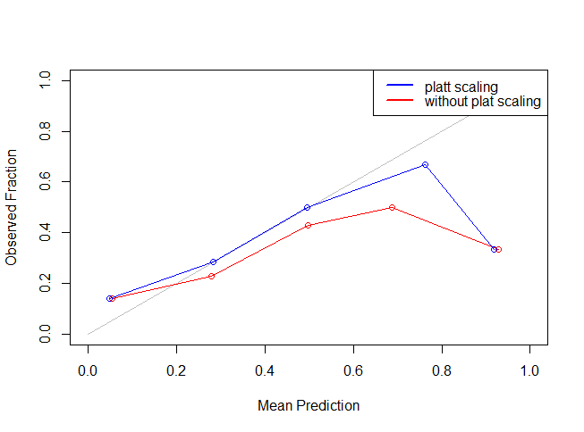
legend("topright",lty=c(1,1),lwd=c(2.5,2.5),col=c("blue","red"),legend = c("platt scaling","without plat scaling"))
As you can see the blue line is more closer to the grey line indicating that Platt Scaling actually improved (or reduced) our Log Loss error metric. The most important point to be noted here is that other metrics like accuracy, AUC etc are not influenced to an appreciable extent using the Platt Scaling.
Now, we will use the above method to make predictions on the data set. Let’s find out how much improvement did we achieve:
# The below line makes the test data set similar to train data set by removing the X and the Total Volume Donated column.
test<-test[-c(1,4)]
# Predicting on the test dataset without Platt Scaling
result_test<-as.data.frame(predict(model_rf,newdata = test,type = "prob"))
# Predicting on the test dataset using Platt Scaling
dataframe1<-data.frame(result_test$`1`)
colnames(dataframe1)<-c("x")
result_test_platt<-predict(model_log,dataframe1,type="response")
The result_test scored 1.6932 on the Public Leaderboard without any feature engineering and Platt Scaling, whereas result_test_platt scored 0.4895 without feature engineering but platt scaling.
So, the method we used is simple, but its results are astonishing. You can see, I got a massive improvement in my error score. This must have given you enough idea about the prowess of Platt Scaling.
Next, let’s discuss another interesting method which can be used to improve the performance on a Log Loss metric- Isotonic Regression.
2.Isotonic Regression
Isotonic Regression is similar to Platt Scaling. It’s a non-parametric regression technique. Non-parametric means that it doesn’t make any assumptions such as of linearity among variables, constant error variance etc.
The only difference lies in the function being fit. The function we fit in isotonic regression continuously increases/decreases. The below code builds upon the Platt Scaling code mentioned above, to build the reliability plot before followed by isotonic regression. The method employs the use of isoreg function in the stats package:
fit.isoreg <- function(iso, x0)
{
o = iso$o
if (is.null(o))
o = 1:length(x)
x = iso$x[o]
y = iso$yf
ind = cut(x0, breaks = x, labels = FALSE, include.lowest = TRUE)
min.x <- min(x)
max.x <- max(x)
adjusted.knots <- iso$iKnots[c(1, which(iso$yf[iso$iKnots] > 0))]
fits = sapply(seq(along = x0), function(i) {
j = ind[i]
# Handles the case where unseen data is outside range of the training data
if (is.na(j)) {
if (x0[i] > max.x) j <- length(x)
else if (x0[i] < min.x) j <- 1
}
# Find the upper and lower parts of the step
upper.step.n <- min(which(adjusted.knots > j))
upper.step <- adjusted.knots[upper.step.n]
lower.step <- ifelse(upper.step.n==1, 1, adjusted.knots[upper.step.n -1] )
# Perform a liner interpolation between the start and end of the step
denom <- x[upper.step] - x[lower.step]
denom <- ifelse(denom == 0, 1, denom)
val <- y[lower.step] + (y[upper.step] - y[lower.step]) * (x0[i] - x[lower.step]) / (denom)
# Ensure we bound the probabilities to [0, 1]
val <- ifelse(val > 1, max.x, val)
val <- ifelse(val < 0, min.x, val)
val <- ifelse(is.na(val), max.x, val) # Bit of a hack, NA when at right extreme of distribution
val
})
fits
}
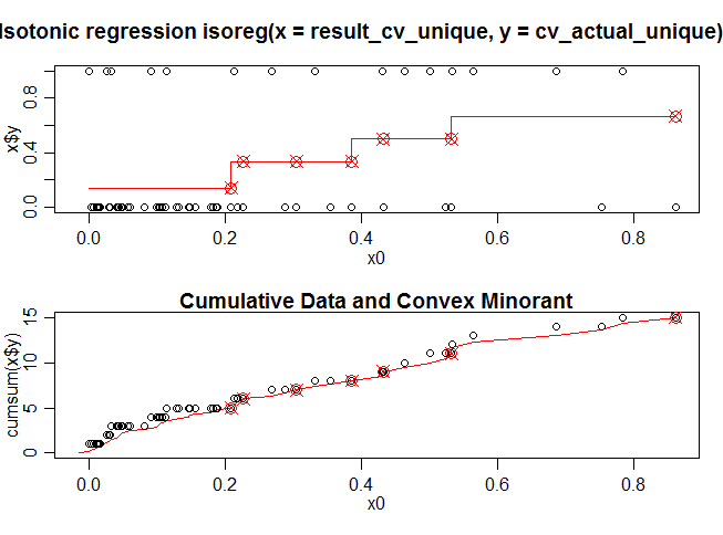
fit.isoreg function fits a linear line to the function since the isoreg function fits a step wise function to the data. Let’s visualise the iso.model function fitted through the isoreg function.
#This part of the code removes the duplicate predicted values of the cross validation set
idx <- duplicated(result_cv$`1`)
result_cv_unique <- result_cv$`1`[!idx]
cv$Made.Donation.in.March.2007<-as.numeric(as.character(cv$Made.Donation.in.March.2007))
cv_actual_unique<- cv$Made.Donation.in.March.2007[!idx]
# This line of code creates an isotonic regression model on the cross validation dataset
iso.model <- isoreg(result_cv_unique, cv_actual_unique)
plot(iso.model,plot.type = "row")
Here x0 is the predicted value on the cross validation data set using the model_rf (random forest) and x$y consist of actual dependent values on the cross validation data set. The red line in the first diagram shows a isotonic function fitted to the cross validation data set. Figure 2 is the cumulative version of the the Figure 1.
The fit.isoreg function mentioned above smooths (makes more flexible) the stepping function for better prediction. Now, lets actually compute the reliability plot data for the isotonic regression and then calculate the LogLoss.
# Predicting the cross validation dataset after the isotonic regression
result_cv_isotonic <- fit.isoreg(iso.model, result_cv$`1`)
# plotting isotonic reliabililty plot
plot(c(0,1),c(0,1), col="grey",type="l",xlab = "Mean Prediction",ylab="Observed Fraction")
k<-reliability.plot(as.numeric(as.character(cv$Made.Donation.in.March.2007)),result_cv$`1`,bins = 5)
lines(k$V2, k$V1, xlim=c(0,1), ylim=c(0,1), xlab="Mean Prediction", ylab="Observed Fraction", col="red", type="o", main="Reliability Plot")
k<-reliability.plot(as.numeric(as.character(cv$Made.Donation.in.March.2007)),result_cv_isotonic,bins = 5)
lines(k$V2, k$V1, xlim=c(0,1), ylim=c(0,1), xlab="Mean Prediction", ylab="Observed Fraction", col="blue", type="o", main="Reliability Plot")
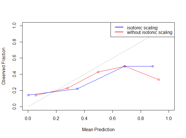
legend("topright",lty=c(1,1),lwd=c(2.5,2.5),col=c("blue","red"),legend = c("isotonic scaling","without isotonic scaling"))
It might seem like isotonic function didn’t work because of the restriction of number of bins. But, you can change the number of bins to have a better view. Let’s see if isotonic function actually worked by making the calibrated prediction on test data set and uploading the results.
result_test_isotonic<-as.data.frame(fit.isoreg(iso.model,dataframe1$x))
The Log Loss for the result_test on the Public Leaderboard was 1.6932 without any feature engineering and isotonic regression and after isotonic regression on the Public Leaderboard was 0.5050.
End Notes
This article is code intensive and focused mainly in providing the readers about the technique that kagglers often employ to improve their scores on Log Loss metric.
These methods work because of the underlying assumptions of the algorithms. This is by no means an exhaustive list of the methods. I’d encourage you to experiment with these methods since they can be heavily modified according to the problem at hand.
Also, please feel free to suggest any more methods that are currently being employed or you can think of. For your convenience, I have explained the above two examples with a particular seed value so that you can reproduce exact results. I have also uploaded the code file in R on Github.
Did you like reading this article ? Do share your experience / suggestions in the comments section below. I’d love to know your intuitive solutions to learn more ways of solving LogLoss problems.


